The article I want to share with you today is
Cone EB, Marchese M, Paciotti M, Nguyen DD, Nabi J, Cole AP, Molina G, Molina RL, Minami CA, Mucci LA, Kibel AS, Trinh QD. Assessment of Time-to-Treatment Initiation and Survival in a Cohort of Patients With Common Cancers. JAMA Netw Open. 2020 Dec 1;3(12):e2030072. doi: 10.1001/jamanetworkopen.2020.30072. PMID: 33315115; PMCID: PMC7737088.
The authors studied the relationship between cancer outcome and delayed treatment time . The author hopes to provide empirical evidence for the practical problem of how to better shunt cancer patients in the context of the epidemic . The author included 4 A cancer , Found that basically Time-to-treatment initiation (TTI) About length , Cancer patients 5 Years and 10 The higher the annual mortality rate . This result is actually contradictory to some current guidelines , So the whole article still has some practical significance .
This article is still concerned about how the article is statistically reproduced in practice , Inspire everyone how to use their own data to do the same design research .
Article review
The author will be concerned about the main variable TTI Classified , Divide the delayed treatment time 4 class :
TTI was a categorical variable with 4 levels: 8 to 60, 61 to 120, 121 to 180, and greater than 180 days
In order to answer accurately TTI How does it affect all-cause mortality , The author also included a series of covariates including :clinical demographic variables,clinical demographic variables,Modality of any treatment. Built a cox Model .
The results presented by the author include two tables , Here's the picture , They are the population characteristics of different cancer populations included and the cancer characteristics grouped according to the delayed treatment time :
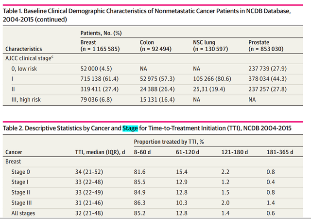
These two tables are very simple descriptive statistics , For everyone tableone perhaps gtsummary Can be easily made ( Please refer to the previous article ).
Specific to the main analysis , The author all-cause mortality Is the outcome variable , With training cox The model shows the difference in the form of a graph TTI Groups change over time predicted 5-year and 10-year all-cause mortality The change of :

The above figure is the excerpt from the article , What is shown is through cox The difference predicted by the model TTI Survival probability of category group over time . This is the main statistical work of the whole article , So what we need to do today is to reproduce the whole prediction probability and plot .
Practice with examples
I have the following data :

I hope to train one cox The model then predicts the situation through the model like the article , How does the survival probability of different drug groups change over time .
First, I use my data to train a simple cox Model , Need to use coxph function , The overall code is as follows :
fit <- coxph(Surv(Time, death) ~ CD4 + drug + gender, data = data)In the above code, I just choose at random 3 A variable :CD4 + drug + gender, Or I'm CD4 + gender I care about different things when they exist drug( Corresponding to... In the article TTI) The impact on the survival probability of patients over time . Show you the results of the model

You can see drug The effect of is not significant , But it does not affect our example drawing .
So far our cox Model training is ready , Next, we need to use this model to predict each group ( Now it's Drug Different levels of variables ) So as to get the predicted value of the model , This prediction value must be after controlling a series of covariates cox The predicted value obtained by the model , The author's solution is to fix the covariates at the mean level :
Deriving predicted outcomes, while setting the covariate values at their mean, allowed us to estimate the mean difference in outcomes for each patient under different TTI while conserving their clinical and demographic characteristics
For our cox In terms of models , What we care about is drug This variable , Other variables also need to be fixed at the mean level , The code for generating new data is as follows :
ND1 <- with(aids.id, expand.grid(CD4 = 3, drug = levels(drug), gender = factor("male", levels = levels(gender))))In the code above , We will take the covariate 1--CD4 Fixed in 3, The covariate gender was fixed to male , At this time, we will bring the data into the trained cox The predicted value can be obtained in the model surv_probs_Cox, Direct use plot Drawing :
plot(surv_probs_Cox, col = c("black", "red"), xlab = "Follow-Up Time (months)", ylab = "Survival Probabilities", bty='l', lwd=2 ) grid(ny=5,nx=NA,col='gray',lty = 1)After running the code, you get the following figure , The following figure shows the difference in the probability of death of patients with different drugs over time .
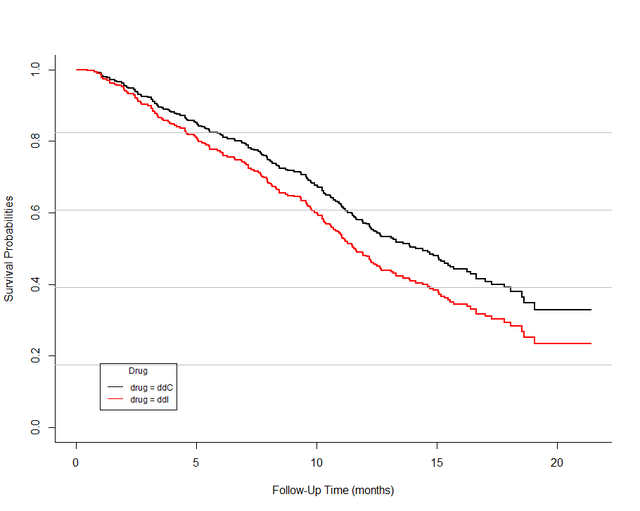
Of course! , In order to be more like the original , We can use the same data in ggplot2 Draw again , And change the curve into smoothed curve, The effect is as follows :
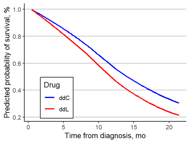
It is basically the same as the display form of the original . Every cancer is finished , Form a big picture , The main analysis of the whole article is completed , Okay , End of this paper .
Summary
Today I wrote an article about the result presentation method , The message we hope to convey is that we do cox Model , Not all of them are given in the text HR, When we can receive little clinical data, it is more likely that we use graphs to show the results easily interpreted by clinicians and policymakers.
![Jericho turns on the display icon of the classic Bluetooth hid mobile phone to set the keyboard [chapter]](/img/f4/8464bf9b66a1215265ac873f286688.png)
