当前位置:网站首页>Detailed explanation of navigation component of openharmony application development
Detailed explanation of navigation component of openharmony application development
2022-07-05 12:59:00 【InfoQ】
Page navigation (Navigation)
NavigationNavigationCustomBuilderNavigationCustomBuilderNavigation Definition Introduction
interface NavigationInterface {
 /**
 * Called when the navigator view interface is used.

 */
 (): NavigationAttribute;
}
NavigationNavigation@Entry
@Component
struct ResourceTest {
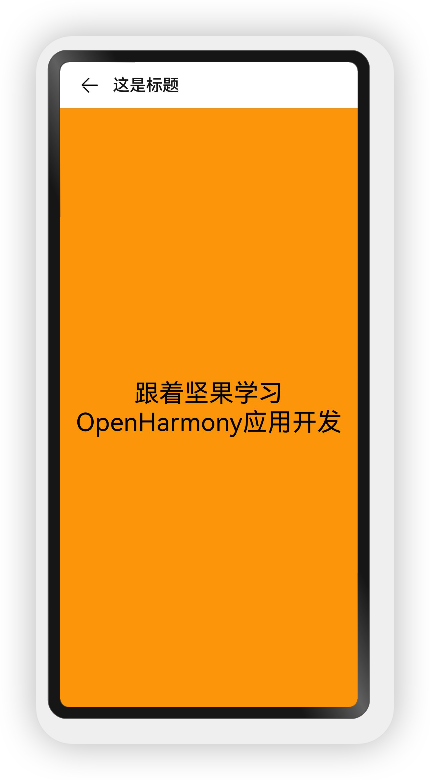
@State text_string: string = " Learn from nuts OpenHarmony application development ";
build() {
Navigation() { // Navigation Can only contain one subcomponent
}
}
}
NavigationNavigation Property introduction
declare class NavigationAttribute extends CommonMethod<NavigationAttribute> {
 /**
 *  Set the title of the navigation bar , When the parameter type is  `string`  when , You can set the title directly , When the parameter is  `CustomBuilder`  when , You can customize the title style .

 */
 title(value: string | CustomBuilder): NavigationAttribute;

 /**
 * Navigation subtitle

 */
 subTitle(value: string): NavigationAttribute;

 /**
 * Hide navigation bar
 */
 hideTitleBar(value: boolean): NavigationAttribute;

 /**
 * Hide navigation back button

 */
 hideBackButton(value: boolean): NavigationAttribute;

 /**
 * Navigation title mode

 */
 titleMode(value: NavigationTitleMode): NavigationAttribute;

 /**
 * Navigation title bar's menus

 */
 menus(value: Array<NavigationMenuItem> | CustomBuilder): NavigationAttribute;

 /**
 * Tool bar

 */
 toolBar(value: object | CustomBuilder): NavigationAttribute;

 /**
 * Hide tool bar

 */
 hideToolBar(value: boolean): NavigationAttribute;

 /**
 * Trigger callback when title mode change finished at free mode.

 */
 onTitleModeChange(callback: (titleMode: NavigationTitleMode) => void): NavigationAttribute;
}
stringCustomBuilder- Parameter type is
string, A simple example is shown below :
@Entry
@Component
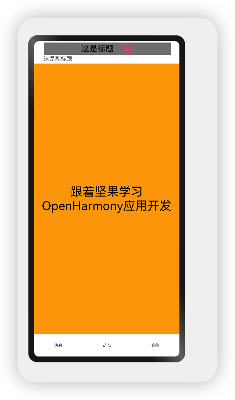
struct ResourceTest {
@State content: string = " Learn from nuts OpenHarmony application development ";
@State title: string = " This is a title, ";
build() {
Navigation() {
Text(this.content)
.textAlign(TextAlign.Center)
.fontSize(30)
.backgroundColor(Color.Orange)
.size({ width: '100%', height: '100%' })
}
.size({ width: '100%', height: '100%' })
.title(this.title) // Set up title, Changing the text size is not supported at this time , Color, etc
}
}
- Parameter type is
CustomBuilder, A simple example is shown below :
@Entry
@Component
struct ResourceTest {
@State content: string = " Learn from nuts OpenHarmony application development ";
@State title: string = " This is a title, ";
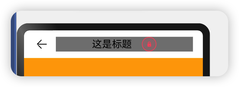
@Builder titleWidget() {// adopt Builder Custom title bar , You can flexibly set the title style
Row() {
Text(this.title).textAlign(TextAlign.Center)
.fontSize(20).margin({right:20})
Image($r("app.media.door_lock")).width(30)
}.justifyContent(FlexAlign.Center)
.width('100%')
.height(30)
.backgroundColor(Color.Gray)
}
build() {
Navigation() {
Text(this.content)
.textAlign(TextAlign.Center)
.fontSize(30)
.backgroundColor(Color.Orange)
.size({ width: '100%', height: '100%' })
}
.size({ width: '100%', height: '100%' })
.title(this.titleWidget) // Set up title, Changing the text size is not supported at this time , Color, etc
}
}
@Entry
@Component
struct ResourceTest {
@State content: string = " Learn from nuts OpenHarmony application development ";
@State title: string = " This is a title, ";
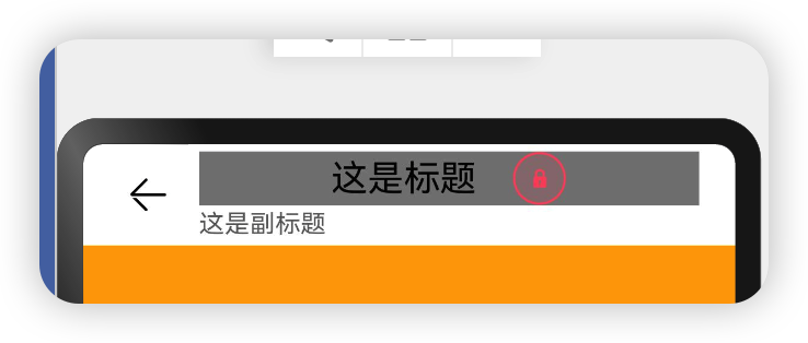
@State sub_title: string = " This is the subtitle ";
@Builder titleWidget() {// adopt Builder Custom title bar , You can flexibly set the title style
Row() {
Text(this.title).textAlign(TextAlign.Center)
.fontSize(20).margin({right:20})
Image($r("app.media.door_lock")).width(30)
}.justifyContent(FlexAlign.Center)
.width('100%')
.height(30)
.backgroundColor(Color.Gray)
}
build() {
Navigation() {
Text(this.content)
.textAlign(TextAlign.Center)
.fontSize(30)
.backgroundColor(Color.Orange)
.size({ width: '100%', height: '100%' })
}
.size({ width: '100%', height: '100%' })
.title(this.titleWidget) // Set up title, Changing the text size is not supported at this time , Color, etc
.subTitle(this.sub_title)
}
}
@Entry
@Component
struct ResourceTest {
 @State content: string = " Learn from nuts OpenHarmony application development ";
 @State title: string = " This is a title, ";
 @State sub_title: string = " This is the subtitle ";
 @Builder titleWidget() {//  adopt Builder Custom title bar , You can flexibly set the title style
 Row() {

 Text(this.title).textAlign(TextAlign.Center)
 .fontSize(20).margin({right:20})
 Image($r("app.media.door_lock")).width(30)
 }.justifyContent(FlexAlign.Center)
 .width('100%')
 .height(30)
 .backgroundColor(Color.Gray)
 }


 build() {
 Navigation() {
 Text(this.content)
 .textAlign(TextAlign.Center)
 .fontSize(30)
 .backgroundColor(Color.Orange)
 .size({ width: '100%', height: '100%' })
 }
 .size({ width: '100%', height: '100%' })
 .title(this.titleWidget) //  Set up title, Changing the text size is not supported at this time , Color, etc
 .subTitle(this.sub_title)//  Set up subTitle, Changing the text size is not supported at this time , Color, etc
 .hideBackButton(true)
 }
}

objectCustomBuilder- When the parameter is
objectType , Parameters need to be defined in the following format :
- value: The display text of a single option in the toolbar .
- icon: Icon resource path of a single option in the toolbar .
- action: Event callback when the current option is selected .
- A simple example is shown below :
@Entry
@Component
struct ResourceTest {
@State content: string = " Learn from nuts OpenHarmony application development ";
@State title: string = " This is a title, ";
@State sub_title: string = " This is the subtitle ";
@Builder titleWidget() { // adopt Builder Custom title bar , You can flexibly set the title style
Row() {
Text(this.title).textAlign(TextAlign.Center)
.fontSize(20).margin({ right: 20 })
Image($r("app.media.door_lock")).width(30)
}.justifyContent(FlexAlign.Center)
.width('100%')
.height(30)
.backgroundColor(Color.Gray)
}
build() {
Navigation() {
Text(this.content)
.textAlign(TextAlign.Center)
.fontSize(30)
.backgroundColor(Color.Orange)
.size({ width: '100%', height: '100%' })
}
.size({ width: '100%', height: '100%' })
.title(this.titleWidget) // Set up title, Changing the text size is not supported at this time , Color, etc
.subTitle(this.sub_title) // Set up subTitle, Changing the text size is not supported at this time , Color, etc
.hideBackButton(true)
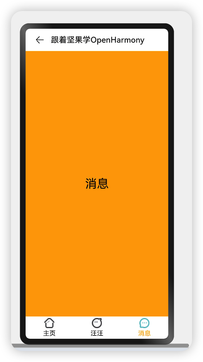
.toolBar({ items: [ // toolBar Receive an array
{
value: " news ", // Text
action: () => { // event
console.log(" Click on the message ")
}
},
{
value: " dynamic ",
action: () => {
console.log(" Click the home page ")
}
},
{
value: " my ",
action: () => {
console.log(" Click the home page ")
}
}
] })
}
}
- When the parameter is
CustomBuilderType , Styles can be customized , A simple example is shown below :
 @Entry @Component struct ComponentTest {

 @State index: number = 0;//  Tab subscript , Default to first

 @Builder toolbarWidget() {//  adopt builder Customize toolbar
 Row() {
 Column() {
 Image(this.index == 0 ? 'common/images/tab-home-Select.png' : 'common/images/tab-home-Unchecked.png')
 .size({width: 25, height: 25}).margin({bottom:4,top:4})
 Text(' Home page ')
 .fontSize(16)
 .fontColor(this.index == 0 ? Color.Orange : null)
 }
 .alignItems(HorizontalAlign.Center)
 .height('100%')
 .layoutWeight(1)
 .onClick(() => {
 this.index = 0;
 })

 Column() {
 Image(this.index == 1 ? 'common/images/tab-my-Select.png' : 'common/images/tab-my-Unchecked.png')
 .size({width: 25, height: 25}).margin({bottom:4,top:4})
 Text(' Wang Wang ')
 .fontSize(16)
 .fontColor(this.index == 1 ? Color.Orange : null)
 }
 .alignItems(HorizontalAlign.Center)
 .height('100%')
 .layoutWeight(1)
 .onClick(() => {
 this.index = 1;
 })

 Column() {
 Image(this.index == 2 ? 'common/images/tab-news-Select.png' : 'common/images/tab-news-Unchecked.png')
 .size({width: 25, height: 25}).margin({bottom:4,top:4})
 Text(' news ')
 .fontSize(16)
 .fontColor(this.index == 2 ? Color.Orange : null)
 }
 .alignItems(HorizontalAlign.Center)
 .height('100%')
 .layoutWeight(1)
 .onClick(() => {
 this.index = 2;
 })
 }
 .width('100%')
 .height(60)
 }

 build() {
 Navigation() {
 Text(this.index == 0 ? " Home page " : this.index == 1 ? " Wang Wang " : " news ")
 .textAlign(TextAlign.Center)
 .fontSize(30)
 .size({width: '100%', height: '100%'})
 .backgroundColor(Color.Orange)
 }
 .size({width: '100%', height: '100%'})
 .title(" Learn from nuts OpenHarmony")
 .toolBar(this.toolbarWidget())
 }
 }
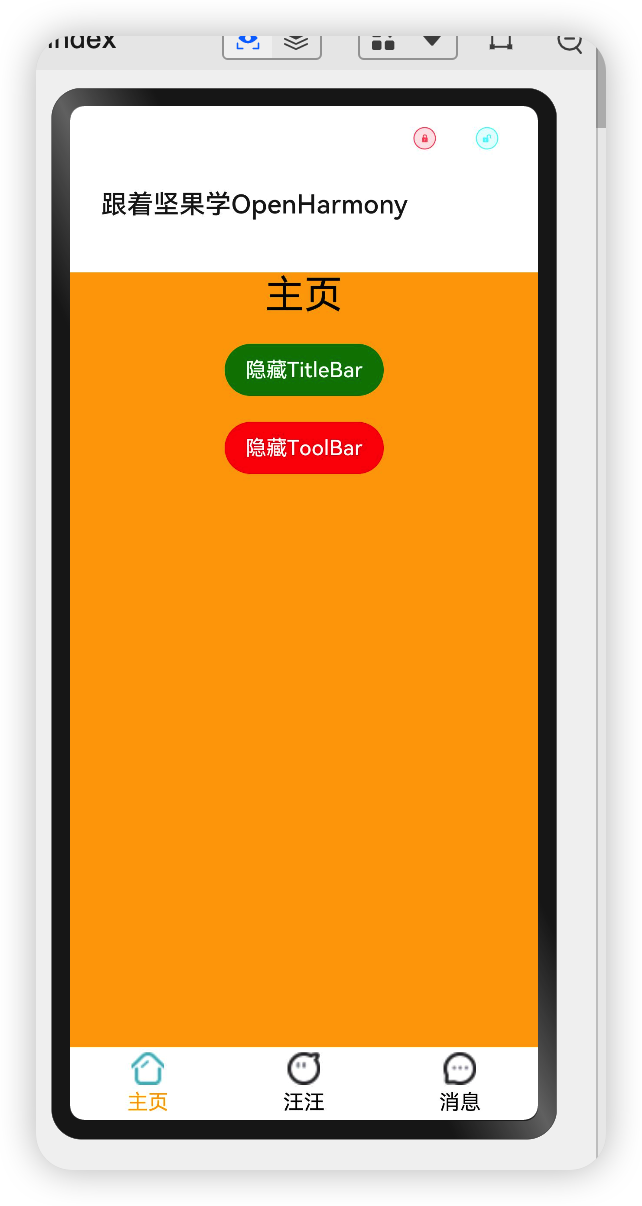
@Entry @Component struct ComponentTest {
@State index: number = 0;// Tab subscript , Default to first
@State hideToolBar: boolean = false;
@State hideTitleBar: boolean = false;
@Builder toolbarWidget() {// adopt builder Customize toolbar
Row() {
Column() {
Image(this.index == 0 ? 'common/images/tab-home-Select.png' : 'common/images/tab-home-Unchecked.png')
.size({width: 25, height: 25}).margin({bottom:4,top:4})
Text(' Home page ')
.fontSize(16)
.fontColor(this.index == 0 ? Color.Orange : null)
}
.alignItems(HorizontalAlign.Center)
.height('100%')
.layoutWeight(1)
.onClick(() => {
this.index = 0;
})
Column() {
Image(this.index == 1 ? 'common/images/tab-my-Select.png' : 'common/images/tab-my-Unchecked.png')
.size({width: 25, height: 25}).margin({bottom:4,top:4})
Text(' Wang Wang ')
.fontSize(16)
.fontColor(this.index == 1 ? Color.Orange : null)
}
.alignItems(HorizontalAlign.Center)
.height('100%')
.layoutWeight(1)
.onClick(() => {
this.index = 1;
})
Column() {
Image(this.index == 2 ? 'common/images/tab-news-Select.png' : 'common/images/tab-news-Unchecked.png')
.size({width: 25, height: 25}).margin({bottom:4,top:4})
Text(' news ')
.fontSize(16)
.fontColor(this.index == 2 ? Color.Orange : null)
}
.alignItems(HorizontalAlign.Center)
.height('100%')
.layoutWeight(1)
.onClick(() => {
this.index = 2;
})
}
.width('100%')
.height(60)
}
build() {
Navigation() {
Column({space: 20}) {
Text(this.index == 0 ? " Home page " : this.index == 1 ? " Wang Wang " : " news ")
.textAlign(TextAlign.Center)
.fontSize(30)
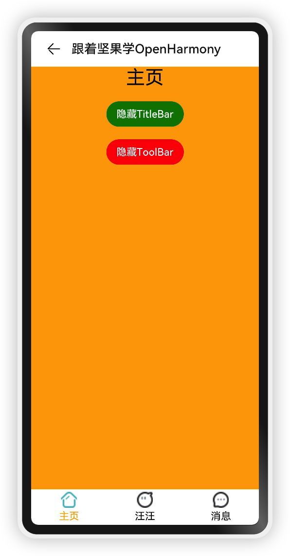
Button(this.hideTitleBar ? " Show TitleBar" : " hide TitleBar")
.onClick(() => {
this.hideTitleBar = !this.hideTitleBar;
}).backgroundColor(Color.Green)
Button(this.hideToolBar ? " Show ToolBar" : " hide ToolBar")
.onClick(() => {
this.hideToolBar = !this.hideToolBar;
}).backgroundColor(Color.Red)
}
.backgroundColor(Color.Orange).justifyContent(FlexAlign.SpaceAround).alignItems(HorizontalAlign.Center).justifyContent(FlexAlign.Center)
.size({width: '100%', height: '100%'})
}
.size({width: '100%', height: '100%'})
.title(" Learn from nuts OpenHarmony")
.toolBar(this.toolbarWidget()) .hideToolBar(this.hideToolBar)
.hideTitleBar(this.hideTitleBar)
}
}
CustomBuilder- When the parameter is
NavigationMenuItemArray time , The parameters are described as follows :
- value: The display text of the menu item .
- icon: Display icon path of menu item .
- action: Click the event callback of the menu item .
- A simple example is shown below :
@Entry @Component struct ComponentTest {
@State index: number = 0;// Tab subscript , Default to first
@State hideToolBar: boolean = false;
@State hideTitleBar: boolean = false;
@Builder toolbarWidget() {// adopt builder Customize toolbar
Row() {
Column() {
Image(this.index == 0 ? 'common/images/tab-home-Select.png' : 'common/images/tab-home-Unchecked.png')
.size({width: 25, height: 25}).margin({bottom:4,top:4})
Text(' Home page ')
.fontSize(16)
.fontColor(this.index == 0 ? Color.Orange : null)
}
.alignItems(HorizontalAlign.Center)
.height('100%')
.layoutWeight(1)
.onClick(() => {
this.index = 0;
})
Column() {
Image(this.index == 1 ? 'common/images/tab-my-Select.png' : 'common/images/tab-my-Unchecked.png')
.size({width: 25, height: 25}).margin({bottom:4,top:4})
Text(' Wang Wang ')
.fontSize(16)
.fontColor(this.index == 1 ? Color.Orange : null)
}
.alignItems(HorizontalAlign.Center)
.height('100%')
.layoutWeight(1)
.onClick(() => {
this.index = 1;
})
Column() {
Image(this.index == 2 ? 'common/images/tab-news-Select.png' : 'common/images/tab-news-Unchecked.png')
.size({width: 25, height: 25}).margin({bottom:4,top:4})
Text(' news ')
.fontSize(16)
.fontColor(this.index == 2 ? Color.Orange : null)
}
.alignItems(HorizontalAlign.Center)
.height('100%')
.layoutWeight(1)
.onClick(() => {
this.index = 2;
})
}
.width('100%')
.height(60)
}
build() {
Navigation() {
Column({space: 20}) {
Text(this.index == 0 ? " Home page " : this.index == 1 ? " Wang Wang " : " news ")
.textAlign(TextAlign.Center)
.fontSize(30)
Button(this.hideTitleBar ? " Show TitleBar" : " hide TitleBar")
.onClick(() => {
this.hideTitleBar = !this.hideTitleBar;
}).backgroundColor(Color.Green)
Button(this.hideToolBar ? " Show ToolBar" : " hide ToolBar")
.onClick(() => {
this.hideToolBar = !this.hideToolBar;
}).backgroundColor(Color.Red)
}
.backgroundColor(Color.Orange).justifyContent(FlexAlign.SpaceAround).alignItems(HorizontalAlign.Center).justifyContent(FlexAlign.Center)
.size({width: '100%', height: '100%'})
}
.size({width: '100%', height: '100%'})
.title(" Learn from nuts OpenHarmony")
.toolBar(this.toolbarWidget()) .hideToolBar(this.hideToolBar)
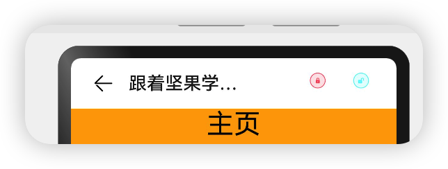
.hideTitleBar(this.hideTitleBar) .menus([
{
value: " close ",
icon: 'common/images/door_lock.svg',
action: () => {
}
},
{
value: " Kai men ",
icon: 'common/images/door_unlock.svg',
action: () => {
}
}
])
}
}
Navigation Introduction to the incident
declare class NavigationAttribute extends CommonMethod<NavigationAttribute> {
 onTitleModeChange(callback: (titleMode: NavigationTitleMode) => void): NavigationAttribute;
}
- onTitleModeChange: When
titleModebyNavigationTitleMode.Freewhen , This callback is triggered when the sliding title bar mode of the scrollable component changes .
@Entry @Component struct ComponentTest {

 @State index: number = 0;//  Tab subscript , Default to first
 @State hideToolBar: boolean = false;
 @State hideTitleBar: boolean = false;

 @Builder toolbarWidget() {//  adopt builder Customize toolbar
 Row() {
 Column() {
 Image(this.index == 0 ? 'common/images/tab-home-Select.png' : 'common/images/tab-home-Unchecked.png')
 .size({width: 25, height: 25}).margin({bottom:4,top:4})
 Text(' Home page ')
 .fontSize(16)
 .fontColor(this.index == 0 ? Color.Orange : null)
 }
 .alignItems(HorizontalAlign.Center)
 .height('100%')
 .layoutWeight(1)
 .onClick(() => {
 this.index = 0;
 })

 Column() {
 Image(this.index == 1 ? 'common/images/tab-my-Select.png' : 'common/images/tab-my-Unchecked.png')
 .size({width: 25, height: 25}).margin({bottom:4,top:4})
 Text(' Wang Wang ')
 .fontSize(16)
 .fontColor(this.index == 1 ? Color.Orange : null)
 }
 .alignItems(HorizontalAlign.Center)
 .height('100%')
 .layoutWeight(1)
 .onClick(() => {
 this.index = 1;
 })

 Column() {
 Image(this.index == 2 ? 'common/images/tab-news-Select.png' : 'common/images/tab-news-Unchecked.png')
 .size({width: 25, height: 25}).margin({bottom:4,top:4})
 Text(' news ')
 .fontSize(16)
 .fontColor(this.index == 2 ? Color.Orange : null)
 }
 .alignItems(HorizontalAlign.Center)
 .height('100%')
 .layoutWeight(1)
 .onClick(() => {
 this.index = 2;
 })
 }
 .width('100%')
 .height(60)
 }

 build() {
 Navigation() {
 Column({space: 20}) {
 Text(this.index == 0 ? " Home page " : this.index == 1 ? " Wang Wang " : " news ")
 .textAlign(TextAlign.Center)
 .fontSize(30)

 Button(this.hideTitleBar ? " Show TitleBar" : " hide TitleBar")
 .onClick(() => {
 this.hideTitleBar = !this.hideTitleBar;
 }).backgroundColor(Color.Green)


 Button(this.hideToolBar ? " Show ToolBar" : " hide ToolBar")
 .onClick(() => {
 this.hideToolBar = !this.hideToolBar;
 }).backgroundColor(Color.Red)
 }
 .backgroundColor(Color.Orange).justifyContent(FlexAlign.SpaceAround).alignItems(HorizontalAlign.Center).justifyContent(FlexAlign.Center)
 .size({width: '100%', height: '100%'})
 }
 .size({width: '100%', height: '100%'})
 .title(" Learn from nuts OpenHarmony")
 .toolBar(this.toolbarWidget()) .hideToolBar(this.hideToolBar)
 .hideTitleBar(this.hideTitleBar) .menus([
 {
 value: " close ",
 icon: 'common/images/door_lock.svg',
 action: () => {

 }
 },
 {
 value: " Kai men ",
 icon: 'common/images/door_unlock.svg',
 action: () => {

 }
 }
 ]).onTitleModeChange((titleModel: NavigationTitleMode) => {
 console.log('titleMode')
 }) .titleMode(NavigationTitleMode.Free)
 }
}
Summary
NavigationReference resources
- [Navigation](ying y
边栏推荐
- Difference between JUnit theories and parameterized tests
- 946. Verify stack sequence
- Kotlin process control and circulation
- Taobao short videos are automatically released in batches without manual RPA open source
- 使用 jMeter 对 SAP Spartacus 进行并发性能测试
- A specific example of ABAP type and EDM type mapping in SAP segw transaction code
- 从39个kaggle竞赛中总结出来的图像分割的Tips和Tricks
- 百日完成国产数据库opengausss的开源任务--openGuass极简版3.0.0安装教程
- 滴滴开源DELTA:AI开发者可轻松训练自然语言模型
- 跨平台(32bit和64bit)的 printf 格式符 %lld 输出64位的解决方式
猜你喜欢
Transactions from December 29, 2021 to January 4, 2022
无密码身份验证如何保障用户隐私安全?
滴滴开源DELTA:AI开发者可轻松训练自然语言模型
【云原生】Nacos-TaskManager 任务管理的使用
10 minute fitness method reading notes (5/5)
Simply take stock reading notes (2/8)
Taobao, pinduoduo, jd.com, Doudian order & Flag insertion remarks API solution
《信息系统项目管理师》备考笔记---信息化知识

Research: data security tools cannot resist blackmail software in 60% of cases
SAP UI5 DynamicPage 控件介紹
随机推荐
JXL notes
How can non-technical departments participate in Devops?
JSON parsing error special character processing (really speechless... Troubleshooting for a long time)
Neural network of PRML reading notes (1)
946. 验证栈序列
Introduction to sap ui5 flexiblecolumnlayout control
开发者,云原生数据库是未来吗?
Taobao short videos are automatically released in batches without manual RPA open source
关于 SAP UI5 floating footer 显示与否的单步调试以及使用 SAP UI5 的收益
Transactions on December 23, 2021
10 minute fitness method reading notes (2/5)
以VMware创新之道,重塑多云产品力
Insmod prompt invalid module format
Distance measuring sensor chip 4530a used in home intelligent lighting
奔跑,开路
Discussion on error messages and API versions of SAP ui5 getsaplogonlanguage is not a function
无密码身份验证如何保障用户隐私安全?
NFT: how to make money with unique assets?
Association modeling method in SAP segw transaction code
深度长文探讨Join运算的简化和提速