当前位置:网站首页>Summary of front-end interview questions (C, s, s) that front-end engineers need to understand (2)
Summary of front-end interview questions (C, s, s) that front-end engineers need to understand (2)
2020-11-06 20:48:00 【Tell me Zhan to hide】
Several methods to realize the horizontal and vertical center of elements :
<div id="wrap">
  <div class="box"></div>
</div>
1. Positioning method to achieve horizontal and vertical center
<style> *{

	margin: 0;
  padding: 0;
}
#wrap {

	width: 500px;
  height: 500px;
  background: grey;
  position: relative;
}
#wrap .box {

	width: 200px;
  height: 200px;
  background: pink;
  left: 0;
  right: 0;
  top: 0;
  bottom: 0;
	margin: auto;
	position: absolute;
}
</style>
Positioning and transform Method to realize the horizontal and vertical center of elements
<style> *{

	margin: 0;
  padding: 0;
}
#wrap {

	width: 500px;
  height: 500px;
  background: grey;
  position: relative;
}
#wrap .box {

	width: 200px;
  height: 200px;
  background: pink;
	position: absolute;
	left: 50%;
	top: 50%;
	transform: translate(-50%, -50%);
}
</style>
3. Latest version flex Achieve horizontal and vertical centering of elements
<style> *{

	margin: 0;
  padding: 0;
}
#wrap {

	width: 500px;
  height: 500px;
  background: grey;
  display: flex;
	justify-content: center;
	align-items: center;
}
#wrap .box {

	width: 200px;
  height: 200px;
  background: pink;
}
</style>
4. Use old version flex Realize the horizontal and vertical center of elements
<style> *{

	margin: 0;
  padding: 0;
}
#wrap {

	width: 500px;
  height: 500px;
  background: grey;
  display: -webkit-box;
	-webkit-box-pack: center;
	-webkit-box-align: center;
}
#wrap .box {

	width: 200px;
  height: 200px;
  background: pink;
}
</style>
In pure css Create a triangle
The main thing is to set the height and width to 0, Use borders to achieve triangle effect
html Code :
<div id="box">
	</div>
css Code :
<style> *{

	margin: 0;
  padding: 0;
}
#box {

	width: 0px;
	height: 0px;
	border: 100px solid ;
	border-top-color: red;
	border-right-color: blue;
	border-left-color: yellowgreen;
	border-bottom-color: deeppink;

}
</style>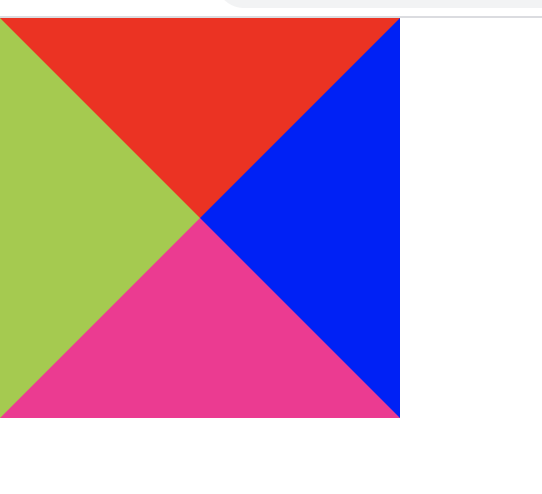
From the above effect, you can change the triangle type to the corresponding border color according to your own needs , Unnecessary borders are set to transparent
As an example : The left and top borders are set to red
#box {

	width: 0px;
	height: 0px;
	border: 100px solid ;
	border-top-color: red;
	border-right-color: transparent;
	border-left-color: red;
	border-bottom-color:transparent ;

}
How to realize mobile terminal rem adapter
html The font size of the root element sets the width of the screen area
<div id="box">
</div><style> *{
margin: 0;
padding: 0;
}
#box {
width: 1rem;
height: 1rem;
background: red;
}
</style><script type="text/javascript"> window.onload = function () {
// Get screen area width
var width=document.documentElement.clientWidth
// obtain html
var htmlNode = document.querySelector('html')
// Set font size
htmlNode.style.fontSize= width + 'px'
}
</script>版权声明
本文为[Tell me Zhan to hide]所创,转载请带上原文链接,感谢
边栏推荐
- C + + and C + + programmers are about to be eliminated from the market
- Pn8162 20W PD fast charging chip, PD fast charging charger scheme
- StickEngine-架构12-通信协议
- 文件过多时ls命令为什么会卡住?
- 【:: 是什么语法?】
- Use modelarts quickly, zero base white can also play AI!
- Tron smart wallet PHP development kit [zero TRX collection]
- PHP application docking justswap special development kit【 JustSwap.PHP ]
- Building a new generation cloud native data lake with iceberg on kubernetes
- 只有1个字节的文件实际占用多少磁盘空间
猜你喜欢

Look! Internet, e-commerce offline big data analysis best practice! (Internet disk link attached)
Kubernetes and OAM to build a unified, standardized application management platform knowledge! (Internet disk link attached)
Some operations kept in mind by the front end foundation GitHub warehouse management
游戏开发中的新手引导与事件管理系统
Gather in Beijing! The countdown to openi 2020
What are the criteria for selecting a cluster server?
How to understand Python iterators and generators?
From overseas to China, rancher wants to do research on container cloud market
事务的本质和死锁的原理
CloudQuery V1.2.0 版本发布
随机推荐
如何对数据库账号权限进行精细化管理?
Use modelarts quickly, zero base white can also play AI!
Top 5 Chinese cloud manufacturers in 2018: Alibaba cloud, Tencent cloud, AWS, telecom, Unicom
Small program introduction to proficient (2): understand the four important files of small program development
ERD-ONLINE 免费在线数据库建模工具
【自学unity2d传奇游戏开发】如何让角色动起来
行为型模式之解释器模式
GUI engine evaluation index
It's time for your financial report to change to a more advanced style -- financial analysis cockpit
What is alicloud's experience of sweeping goods for 100 yuan?
Behind the first lane level navigation in the industry
递归、回溯算法常用数学基础公式
华为云微认证考试简介
Asp.Net Core learning notes: Introduction
游戏主题音乐对游戏的作用
An article will take you to understand CSS alignment
解决 WPF 绑定集合后数据变动界面却不更新的问题
Description of phpshe SMS plug-in
The legality of IPFs / filecoin: protecting personal privacy from disclosure
Jmeter——ForEach Controller&Loop Controller