当前位置:网站首页>搜索框效果的实现【每日一题】
搜索框效果的实现【每日一题】
2022-07-07 11:52:00 【zx_20220104】
搜索框是很常用的一个功能,因此,今天我们一起来练习写一个搜索框的效果,希望今天的这个练习对你有帮助,下面我们一起来看今天练习的最终效果:

HTML代码:
<!DOCTYPE html>
<html>
<head>
    <meta charset="UTF-8">
    <title>【每日一练】18—搜索框效果的实现</title>
</head>
<body>
  <div class="search">
    <div class="icon"></div>
    <div class="input">
      <input type="text" name="" id="SearchInput" placeholder="Search">
    </div>
    <span class="clear" onclick="document.getElementById('SearchInput').value = ''"></span>
  </div>
  <script type="text/javascript">
    const icon = document.querySelector('.icon');
    const search = document.querySelector('.search');
    icon.onclick = function(){
      search.classList.toggle('active');
    }
</script>
</body>
</html>
CSS代码:
*
{
  margin: 0;
  padding: 0;
  box-sizing: border-box;
  font-family: 'Poppins', sans-serif;
}
body
{
  position: relative;
  display: flex;
  justify-content: center;
  align-items: center;
  min-height: 100vh;
  background: #fafafa;
}
.search
{
  position: relative;
  width: 60px;
  height: 60px;
  background: #fff;
  border-radius: 60px;
  overflow: hidden;
  transition: 0.5s;
    box-shadow: 0 0 0 2px #00a6bc;
}
.search.active
{
  width: 360px;
}
.search .icon
{
  position: absolute;
  left: 0;
  top: 0;
  width: 60px;
  height: 60px;
  background: #fff;
  display: flex;
  justify-content: center;
  align-items: center;
  cursor: pointer;
  z-index: 1;
}
.search .icon:before
{
  content: '';
  position: absolute;
  width: 15px;
  height: 15px;
  border: 3px solid #00a6bc;
  border-radius: 50%;
  transform: translate(-4px,-4px);
  transition: 0.5s;
}

.search .icon:after
{
  content: '';
  position: absolute;
  width: 3px;
  height: 12px;
  background:#00a6bc;
  transform: translate(6px,6px) rotate(315deg);
}

.search .input
{
  position: relative;
  width: 300px;
  height: 60px;
  left: 60px;
  background: #f0f;
  display: flex;
  justify-content: center;
  align-items: center;
}
.search .input input
{
  position: absolute;
  top: 0;
  width: 100%;
  height: 100%;
  padding: 10px 0;
  border: none;
  outline: none;
  font-size: 18px;
}

.clear
{
  position: absolute;
  top: 50%;
  transform: translateY(-50%);
  right: 15px;
  width: 15px;
  height: 15px;
  display: block;
  background: #fff;
  cursor: pointer;
  display: flex;
  justify-content: center;
  align-items: center;
}
.clear:before
{
  position: absolute;
  content: '';
  width: 1px;
  height: 15px;
  background: #999;
  transform: rotate(45deg);
}
.clear:after
{
  position: absolute;
  content: '';
  width: 1px;
  height: 15px;
  background: #999;
  transform: rotate(315deg);
}
以上就是每日一练的全部内容,希望今天的小练习对你有用,如果你觉得有帮助的话,请点赞我,关注我!
边栏推荐
- Dry goods | summarize the linkage use of those vulnerability tools
- What are the principles for distinguishing the security objectives and implementation methods that cloud computing security expansion requires to focus on?
- User management summary of mongodb
- What parameters need to be reconfigured to replace the new radar of ROS robot
- 干货|总结那些漏洞工具的联动使用
- Server to server (S2S) event (adjust)
- QQ medicine, Tencent ticket
- Build a secure and trusted computing platform based on Kunpeng's native security
- Write it down once Net a new energy system thread surge analysis
- Best practice | using Tencent cloud AI willingness to audit as the escort of telephone compliance
猜你喜欢
![Scripy tutorial classic practice [New Concept English]](/img/bc/f1ef8b6de6bfb6afcdfb0d45541c72.png)
Scripy tutorial classic practice [New Concept English]
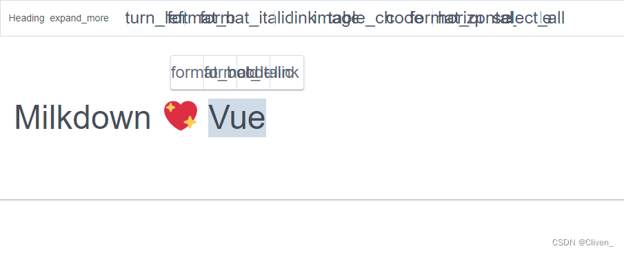
Milkdown control icon
Show the mathematical formula in El table
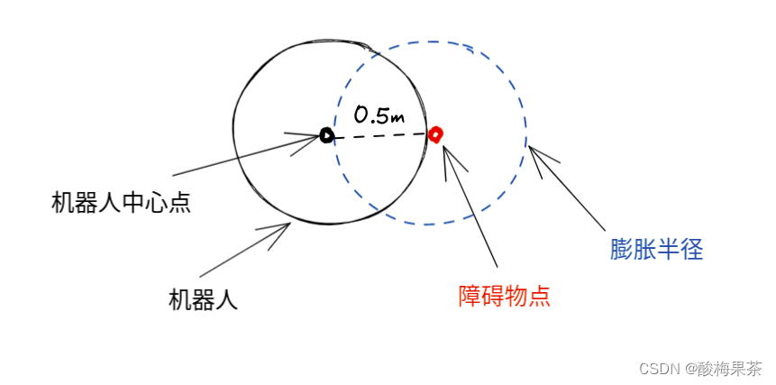
室內ROS機器人導航調試記錄(膨脹半徑的選取經驗)
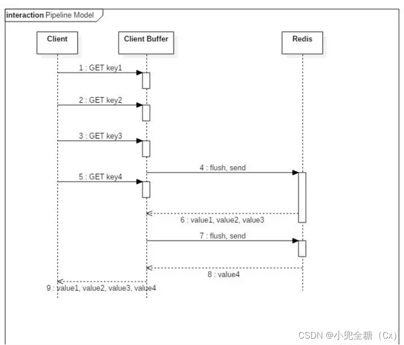
. Net core about redis pipeline and transactions
如何让join跑得更快?
cmake 学习使用笔记(一)
高等数学---第八章多元函数微分学1
得物客服热线的演进之路

The delivery efficiency is increased by 52 times, and the operation efficiency is increased by 10 times. See the compilation of practical cases of financial cloud native technology (with download)
随机推荐
内存溢出和内存泄漏的区别
为租客提供帮助
JS function returns multiple values
Getting started with MySQL
Sliding rail stepping motor commissioning (national ocean vehicle competition) (STM32 master control)
1. Deep copy 2. Call apply bind 3. For of in differences
Data refresh of recyclerview
2022-7-6 Leetcode 977. Square of ordered array
My "troublesome" subordinates after 00: not bad for money, against leaders, and resist overtime
ROS机器人更换新雷达需要重新配置哪些参数
mysql导入文件出现Data truncated for column ‘xxx’ at row 1的原因
118. Yanghui triangle
记一次 .NET 某新能源系统 线程疯涨 分析
Flink | 多流转换
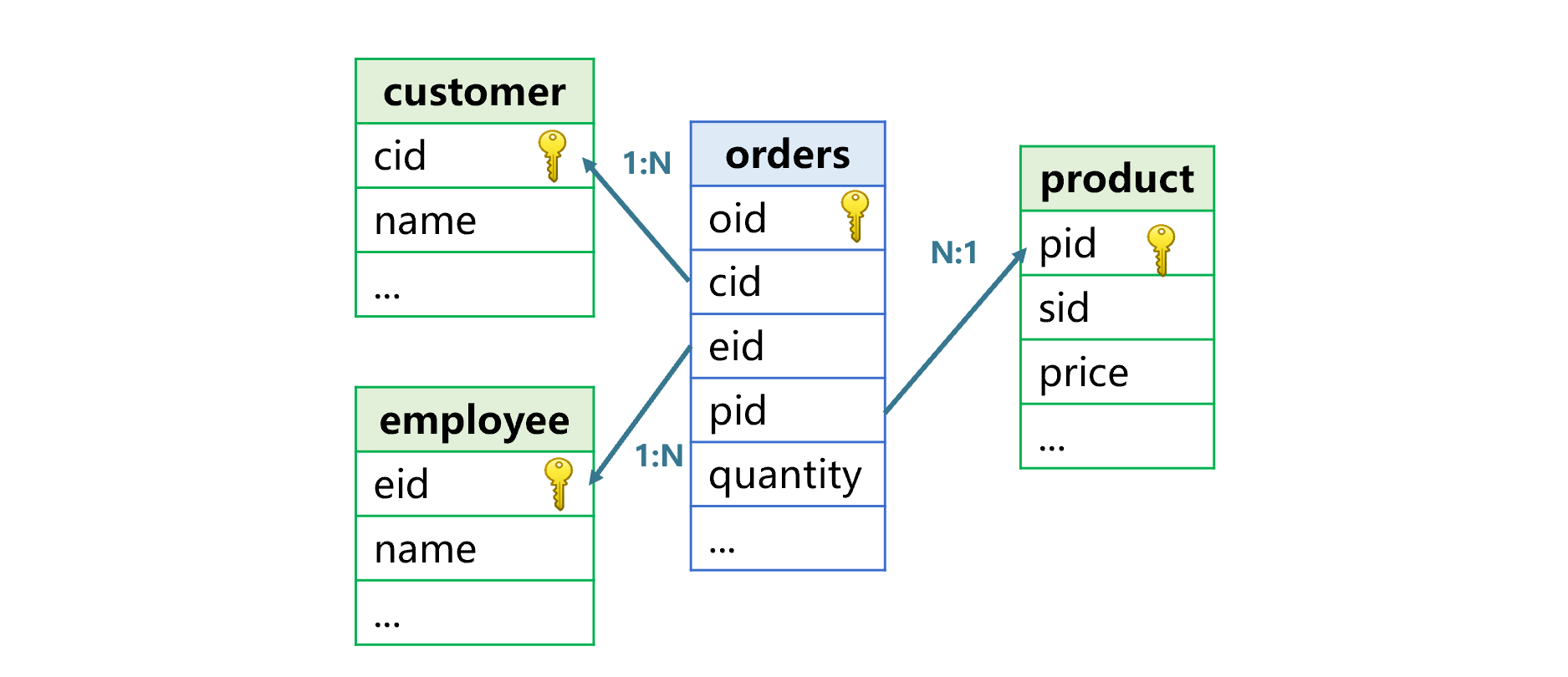
数据库系统概论-第一章绪论【概念模型、层次模型和三级模式(外模式、模式、内模式)】
Mongodb slice summary
Supply chain supply and demand estimation - [time series]
Leetcode simple question sharing (20)
Realbasicvsr test pictures and videos
社会责任·价值共创,中关村网络安全与信息化产业联盟对话网信企业家海泰方圆董事长姜海舟先生