当前位置:网站首页>MATLAB signal processing [Q & A essays · 2]
MATLAB signal processing [Q & A essays · 2]
2022-07-07 23:21:00 【Goose feather is on the way】
1. Matlab Simple interpolation 、 Fitting method
answer :
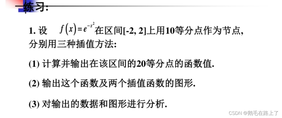
clc,clear,close all;
x = linspace(-2,2,10);
y = exp(-x.^2);
figure(1)
stem(x,y,"LineWidth",1.5)
grid on
title('f(x)')
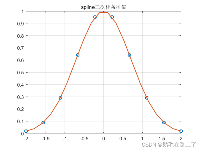
%interp1 linear interpolation
xq = linspace(-2,2,20);
vq1 = interp1(x,y,xq);
figure(2)
plot(x,y,'o',xq,vq1,':.',"LineWidth",1.5);
xlim([-2 2]);
grid on
title('interp1 linear interpolation ');
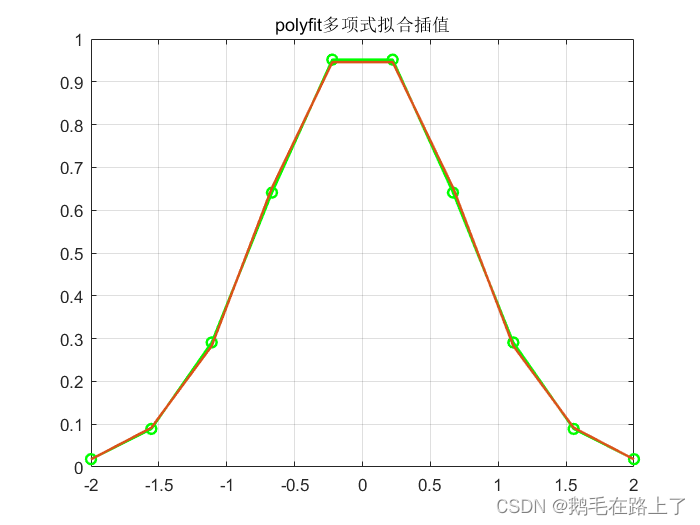
%polyfit Polynomial fitting interpolation
p = polyfit(x,y,7);
y1 = polyval(p,x);
figure(3)
plot(x,y,'g-o',"LineWidth",1.5)
hold on
plot(x,y1,"LineWidth",1.5)
hold off
xlim([-2 2]);
grid on
title('polyfit Polynomial fitting interpolation ');
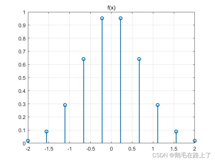
%spline Cubic spline interpolation
yy = spline(x,y,xq);
figure(4)
plot(x,y,'o',xq,yy,"LineWidth",1.5)
xlim([-2 2]);
grid on
title('spline Cubic spline interpolation ');
2. Digital signal processing experiment ——FIR Filter design
ask : It is known that the input signal is a signal mixed with noise
x(t)=sin(250πt)+cos(500πt)+cos(700πt)
① Draw the time domain waveform and spectrum diagram of the input signal , And point out the frequency components it contains ( With Hz In units of );
② Assume that the intermediate frequency component of the input signal is a noise signal , How to design a digital filter to process the mixed signal , Give reasonable design indicators and explain the reasons , Draw the frequency response characteristics of the filter : More than two implementation schemes are required .
③ use (2) The filter designed in completes filtering and verifies the design scheme , Draw the time domain waveform and spectrum of the filter output signal .
answer :
clc,clear,close all;
t = -0.08:0.0001:0.08;
n = -100:100;
L = length(n);
fs = 1000;
x0 = sin(2*pi*125.*n/fs);  % Time domain sampled signal t=nT=n/fs
x1 = cos(2*pi*250.*n/fs);
x2 = cos(2*pi*350.*n/fs);
x3 = x0 + x1 + x2;
% Time domain signal
figure(1)
subplot(411)
plot(t,sin(2*pi*125.*t),"LineWidth",1.5)
grid on
subplot(412)
plot(t,cos(2*pi*250.*t),"LineWidth",1.5)
grid on
subplot(413)
plot(t,cos(2*pi*350.*t),"LineWidth",1.5)
grid on
subplot(414)
plot(t,sin(2*pi*125.*t)+cos(2*pi*250.*t)+cos(2*pi*350.*t),"LineWidth",1.5)
grid on
% Filter design
wn = 3/5;  % Cut off frequency wn by 3/5pi(300Hz),wn = 2pi*f/fs
N = 60;  % Order selection
hn = fir1(N-1,wn,boxcar(N));  %10 rank FIR low pass filter
figure(2)
freqz(hn,1);
figure(3)
y = fftfilt(hn,x3);  % after FIR The signal obtained after the filter
plot(n,y,"LineWidth",1.5)
grid on
% Spectrum analysis
X = fft(x3); % Unfiltered spectrum
p2 = abs(X/L);
p1 = p2(1:L/2+1);
p1(2:end-1) = 2*p1(2:end-1);
Y = fft(y);  % Of the output signal fft
P2 = abs(Y/L);
P1 = P2(1:L/2+1);
P1(2:end-1) = 2*P1(2:end-1);
f = fs*(0:(L/2))/L;
figure(4)
subplot(211)
plot(f,p1,"LineWidth",1.5)
title('Single-Sided Amplitude Spectrum of X(t)')
xlabel('f (Hz)')
ylabel('|p1(f)|')
grid on
subplot(212)
plot(f,P1,"LineWidth",1.5)
title('Single-Sided Amplitude Spectrum of Y(t)')
xlabel('f (Hz)')
ylabel('|P1(f)|')
grid on
Time domain waveform : Respectively 125(2pi*125=250pi)、250 and 350Hz Cosine signal 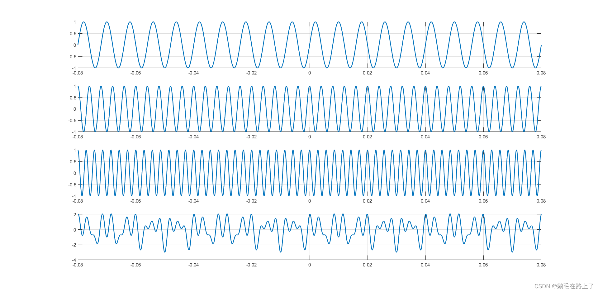
The cut-off frequency is 300Hz Of FIR low pass filter :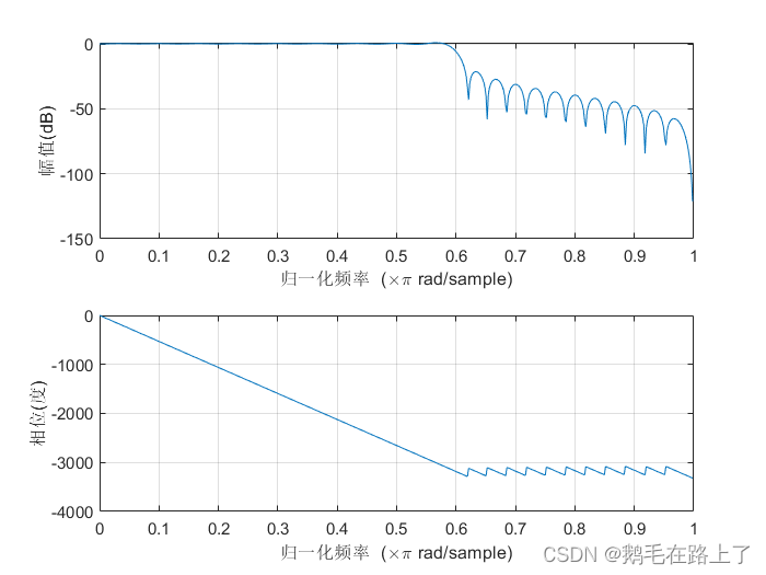
Spectrum before and after filtering :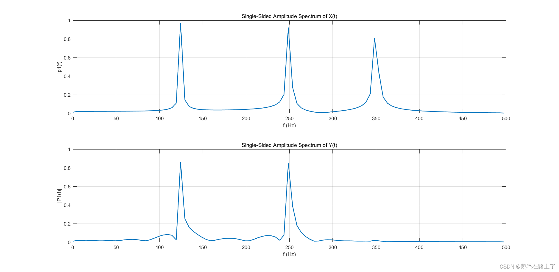
Filtered time domain signal :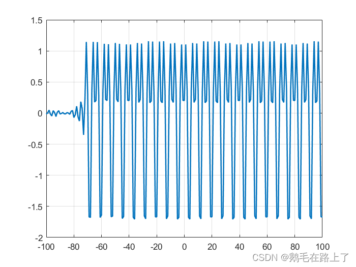
3. Matlab Why is the heat map not a smooth transition ?—— Pseudo color map function pcolor() Usage of
Problem related code :
clear; clc; close all
[,,raw ] = xlsread(' Heat map data of sports facilities .xlsx');
mat = cell2mat(raw(2:end, 2:end));
imagesc(mat); % Generate heat map
c=colorbar;
colormap hot;
ylabel(c,'Population Heat');
caxis([1 11]) % Change the maximum and minimum values of the right color bar
xticks(1:13) %x Axis Division 13 Equal division
xticklabels(raw(1,2:end))
yticks(1:15)
yticklabels(raw(2:end,1))
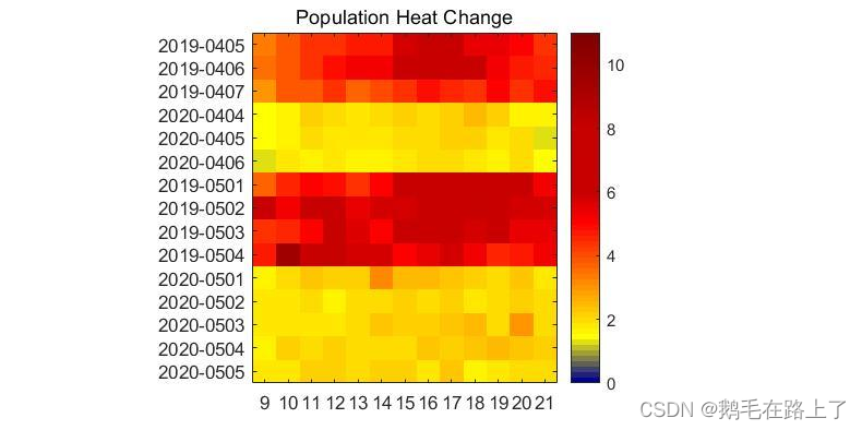
Expected effect :
answer : It may be the reason for the small amount of data , The expected effect is not just for use imagesc(), It is more like a pseudo color image after color interpolation , Suggested attempt pcolor():
clc,clear,close all;
data=round(rand(1,900)*100);
data=reshape(data,10,90);
h=pcolor(data);
h.FaceColor = 'interp';
set(h,'LineStyle','none');
clc,clear,close all;
data=round(rand(1,900)*100);
data=reshape(data,10,90);
h=pcolor(data);
h.FaceColor = 'interp';
colormap jet;
colorbar;
set(h,'LineStyle','none');
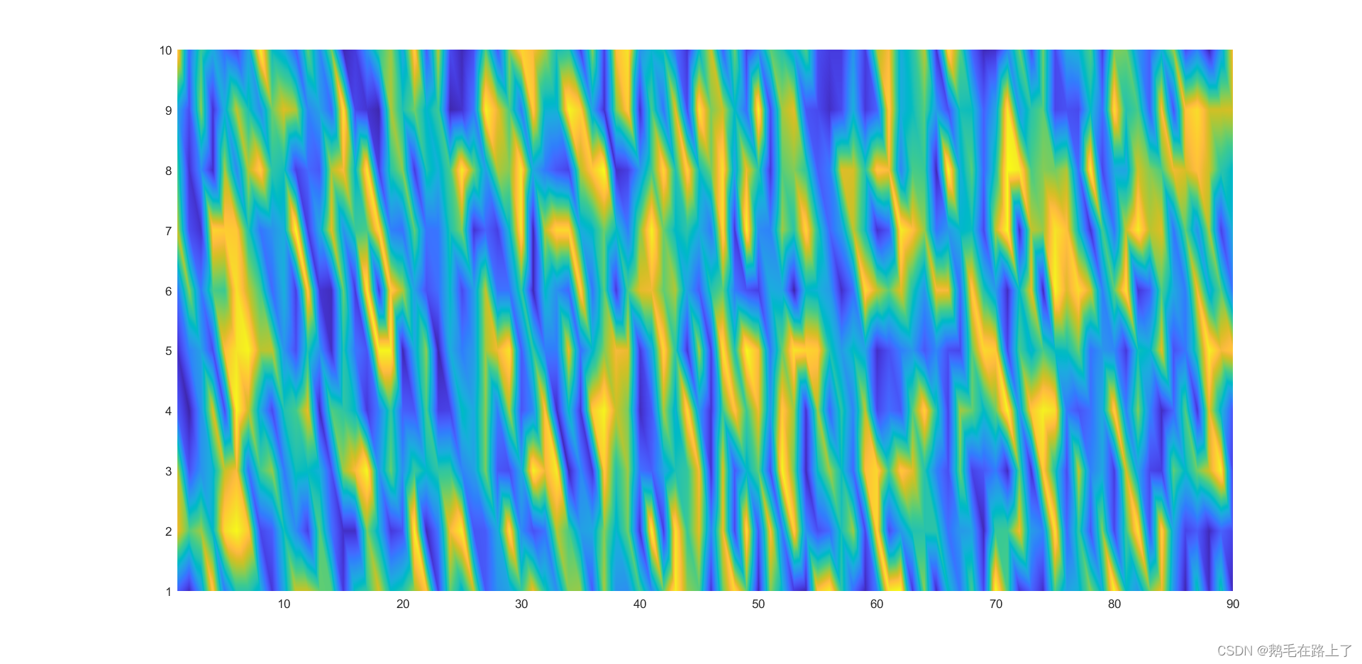
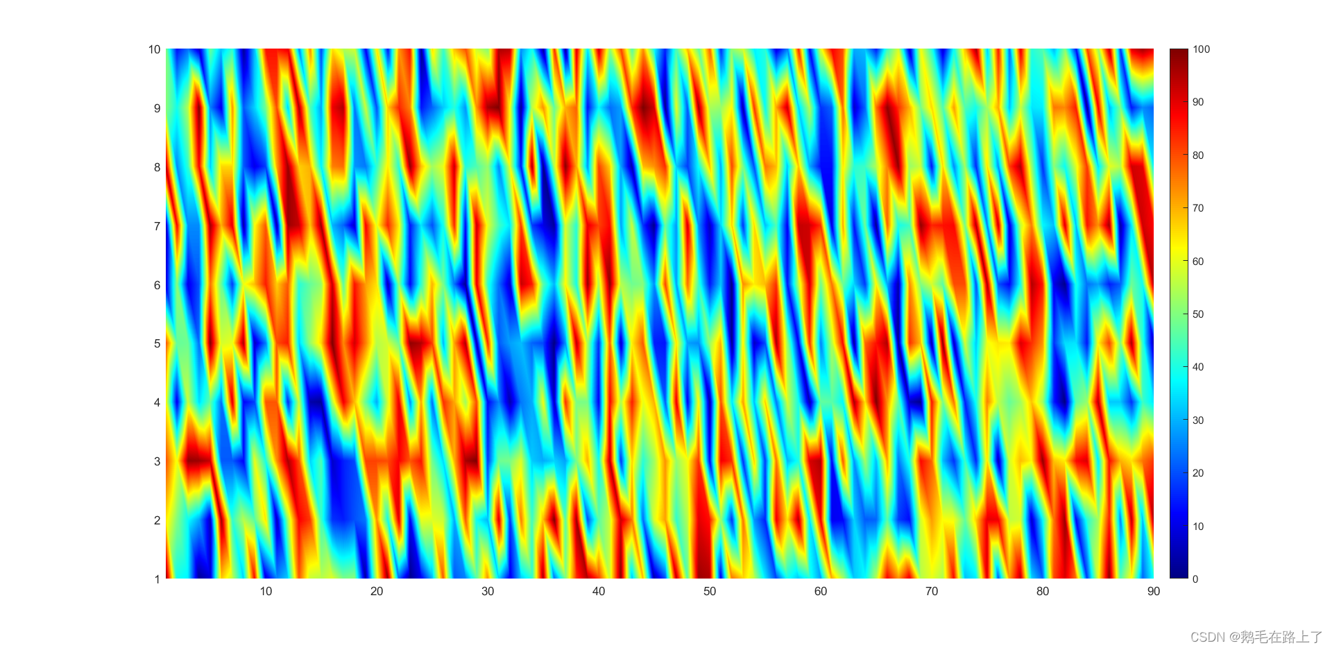
Pseudo color map function pcolor() Usage of :pcolor Official documents
边栏推荐
- 2021ICPC上海 H.Life is a Game Kruskal重构树
- Oracle-数据库的备份与恢复
- leetcode-520. 检测大写字母-js
- Install a new version of idea. Double click it to open it
- Wechat forum exchange applet system graduation design (3) background function
- 网络安全-beef
- 微信论坛交流小程序系统毕业设计毕设(3)后台功能
- 微信论坛交流小程序系统毕业设计毕设(2)小程序功能
- 微信论坛交流小程序系统毕业设计毕设(4)开题报告
- 解决:信息中插入avi格式的视频时,提示“unsupported video format”
猜你喜欢
Installing spss25
LDO穩壓芯片-內部框圖及選型參數
LeeCode -- 6. Z 字形变换
PMP project management exam pass Formula-1
【编译原理】词法分析设计实现
STL标准模板库(Standard Template Library)一周学习总结
Inftnews | web5 vs Web3: the future is a process, not a destination

RE1 attack and defense world reverse
高级程序员必知必会,一文详解MySQL主从同步原理,推荐收藏

Cloud native is devouring everything. How should developers deal with it?
随机推荐
深入理解Mysql锁与事务隔离级别
FPGA基础篇目录
U盘拷贝东西时,报错卷错误,请运行chkdsk
Wechat forum exchange applet system graduation design (2) applet function
Description of longitude and latitude PLT file format
About idea cannot find or load the main class
leetcode-520. 检测大写字母-js
Locate to the bottom [easy to understand]
Inftnews | the wide application of NFT technology and its existing problems
Unity3D学习笔记6——GPU实例化(1)
FreeLink开源呼叫中心设计思想
In the field of software engineering, we have been doing scientific research for ten years!
Wechat forum exchange applet system graduation design completion (6) opening defense ppt
微信论坛交流小程序系统毕业设计毕设(1)开发概要
Clean C disk
Solution: prompt "unsupported video format" when inserting avi format video into the message
网络安全-永恒之蓝
V20变频器手自动切换(就地远程切换)的具体方法示例
ROS2专题(03):ROS1和ROS2的区别【01】
微信论坛交流小程序系统毕业设计毕设(5)任务书