当前位置:网站首页>Gee (IV): calculate the correlation between two variables (images) and draw a scatter diagram
Gee (IV): calculate the correlation between two variables (images) and draw a scatter diagram
2022-07-07 23:12:00 【BetterQ.】
Recently used Google Earth Engine(GEE) Analyze the elevation and NDVI The relevance of , And draw the scatter diagram of the two , Calculate the coefficient of determination .
The calculation mainly uses GEE Medium Chart ui.Chart.image.byRegion(), The elevation and NDVI The scatter diagram of is drawn first , Add a trend line , Calculate the coefficient of determination , You can know how high the correlation between the two is .
NDVI- The implementation code of elevation scatter diagram and determination coefficient calculation is as follows :
// Study area , You can draw or import by yourself
var roi = /* color: #d63000 */ee.Geometry.Polygon(
        [[[104.34385678174718, 27.233899188878446],
          [114.80284115674718, 28.477166904461537],
          [117.52745053174718, 34.61402019968164],
          [111.99034115674718, 40.99546927185892],
          [95.11534115674718, 37.87379212761336]]]);

// Import  DEM
var DEM=ee.Image("CGIAR/SRTM90_V4").reproject('SR-ORG:6974',null,500);
// from DEM Sample points from , Select here 500 individual
var rroi = DEM.sample(
    {
    region: roi, scale: 30, numPixels: 500, geometries: true});

// Import NDVI data
var ndvi=ee.ImageCollection('MODIS/006/MOD13A1')
                     .filter(ee.Filter.date('2020-01-01', '2020-02-01'))
                     .first()
                     .multiply(0.0001);

//  Set chart properties , Including style, color, etc
var chartStyle = {

  title: 'NDVI-DEM',
  hAxis: {

    title: 'elevation',
    titleTextStyle: {
    italic: false, bold: true},
    gridlines: {
    color: 'FFFFFF'}
  },
  vAxis: {

    title: 'NDVI',
    titleTextStyle: {
    italic: false, bold: true},
    gridlines: {
    color: 'FFFFFF'},
  },
  pointSize: 4,
  dataOpacity: 0.6,

  chartArea: {
    backgroundColor: 'EBEBEB'},

  // Add trendline
  trendlines: {

    0: {
      // add a trend line to the 1st series
      type: 'polynomial',  // or 'polynomial', 'exponential'
      color: 'green',
      showR2:'true', //show R2 cofficient
      lineWidth: 5,
      opacity: 0.2,
      visibleInLegend: true,
    }
  }
};

// Draw a scatter plot
var charten=ui.Chart.image.byRegion({

  image:ndvi.select('NDVI'),
  regions:rroi,
  reducer:ee.Reducer.mean(),
  scale:500,
  xProperty: 'elevation'
  });
charten.setChartType('ScatterChart').setOptions(chartStyle);
print(charten)
The result is shown in the figure :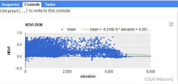
.
.
.
.
The relationship between temperature and elevation is also made here , Implementation code :
// Load SRTM elevation data.
var elev = ee.Image('CGIAR/SRTM90_V4').select('elevation');

// Subset Colorado from the TIGER States feature collection.
var colorado = ee.FeatureCollection('TIGER/2018/States')
                   .filter(ee.Filter.eq('NAME', 'Colorado'));

// Draw a random sample of elevation points from within Colorado.
var samp = elev.sample(
    {
    region: colorado, scale: 30, numPixels: 500, geometries: true});

// Load PRISM climate normals image collection; convert images to bands.
var normClim = ee.ImageCollection('OREGONSTATE/PRISM/Norm81m').toBands();

// Define the chart and print it to the console.
var chartte = ui.Chart.image
                .byRegion({

                  image: normClim.select(['01_tmean', '07_tmean']),
                  regions: samp,
                  reducer: ee.Reducer.mean(),
                  scale: 500,
                  xProperty: 'elevation'
                })
                .setSeriesNames(['Jan', 'Jul'])
                .setChartType('ScatterChart')
                .setOptions({

                  title: 'Average Monthly Colorado Temperature by Elevation',
                  hAxis: {

                    title: 'Elevation (m)',
                    titleTextStyle: {
    italic: false, bold: true}
                  },
                  vAxis: {

                    title: 'Temperature (°C)',
                    titleTextStyle: {
    italic: false, bold: true}
                  },
                  pointSize: 4,
                  dataOpacity: 0.6,
                  colors: ['1d6b99', 'cf513e'],
                  trendlines: {

                    0: {
      // add a trend line to the 1st series
                    type: 'linear',  // or 'polynomial', 'exponential'
                    color: 'green',
                    showR2:'true', //R2 cofficient
                    lineWidth: 5,
                    opacity: 0.2,
                    visibleInLegend: true,
                    },
                    1: {
      // add a trend line to the 1st series
                    type: 'linear',  // or 'polynomial', 'exponential'
                    color: 'green',
                    showR2:'true', //R2 cofficient
                    lineWidth: 5,
                    opacity: 0.2,
                    visibleInLegend: true,
                    }
                  }});
print(chartte);
.
The result is shown in Fig. :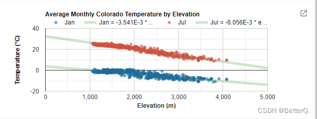
.
.
.
.
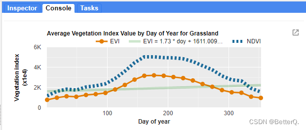
And draw the curve of vegetation index changing with time :
// Import the example feature collection and subset the glassland feature.
var grassland = ee.FeatureCollection('projects/google/charts_feature_example')
                    .filter(ee.Filter.eq('label', 'Grassland'));

// Load MODIS vegetation indices data and subset a decade of images.
var vegIndices = ee.ImageCollection('MODIS/006/MOD13A1')
                     .filter(ee.Filter.date('2010-01-01', '2020-01-01'))
                     .select(['NDVI', 'EVI']);

// Set chart style properties.
var chartStyle = {

  title: 'Average Vegetation Index Value by Day of Year for Grassland',
  hAxis: {

    title: 'Day of year',
    titleTextStyle: {
    italic: false, bold: true},
    gridlines: {
    color: 'FFFFFF'}
  },
  vAxis: {

    title: 'Vegetation index (x1e4)',
    titleTextStyle: {
    italic: false, bold: true},
    gridlines: {
    color: 'FFFFFF'},
    format: 'short',
    baselineColor: 'FFFFFF'
  },
  series: {

    0: {
    lineWidth: 3, color: 'E37D05', pointSize: 7},
    1: {
    lineWidth: 7, color: '1D6B99', lineDashStyle: [4, 4]}
  },
  chartArea: {
    backgroundColor: 'EBEBEB'},
  trendlines: {

    0: {
      // add a trend line to the 1st series
      type: 'linear',  // or 'polynomial', 'exponential'
      color: 'green',
      showR2:'true',
      lineWidth: 5,
      opacity: 0.2,
      visibleInLegend: true,
    }
  }
};

// Define the chart.
var chart =
    ui.Chart.image
        .doySeries({

          imageCollection: vegIndices,
          region: grassland,
          regionReducer: ee.Reducer.mean(),
          scale: 500,
          yearReducer: ee.Reducer.mean(),
          startDay: 1,
          endDay: 365
        })
        .setSeriesNames(['EVI', 'NDVI']);

// Apply custom style properties to the chart.
chart.setOptions(chartStyle);

// Print the chart to the console.
print(chart);
边栏推荐
- Brush question 6
- Some parameters of Haikang IPC
- QT graphicsview graphical view usage summary with flow chart development case prototype
- I wish you all the best and the year of the tiger
- 网络安全-钓鱼
- Network security -beef
- Byte hexadecimal binary understanding
- U盘拷贝东西时,报错卷错误,请运行chkdsk
- 解决:信息中插入avi格式的视频时,提示“unsupported video format”
- Network security - phishing
猜你喜欢
Cases of agile innovation and transformation of consumer goods enterprises

I wish you all the best and the year of the tiger

Digital collections accelerated out of the circle, and marsnft helped diversify the culture and tourism economy!
Use JfreeChart to generate curves, histograms, pie charts, and distribution charts and display them to jsp-2

Personal statement of testers from Shuangfei large factory: is education important for testers?

数据库每日一题---第22天:最后一次登录
30讲 线性代数 第五讲 特征值与特征向量
微信论坛交流小程序系统毕业设计毕设(6)开题答辩PPT
Unity and webgl love each other
ArcGIS:矢量要素相同字段属性融合的两种方法
随机推荐
ADC采样率(HZ)是什么怎么计算
Bit operation
The author of LinkedList said he didn't use LinkedList himself
PCL . VTK files and Mutual conversion of PCD
【刷题记录】3. 无重复字符的最长子串
Interview questions: how to test app performance?
Use JfreeChart to generate curves, histograms, pie charts, and distribution charts and display them to jsp-2
Unity and webgl love each other
面试百问:如何测试App性能?
[untitled] reprint melting ice - track icedid server with a few simple steps
Network security -beef
Network security sqlmap and DVWA explosion
十三、系统优化
Byte hexadecimal binary understanding
Network security - phishing
定位到最底部[通俗易懂]
Transparent i/o model from beginning to end
网络安全-sqlmap与DVWA爆破
30讲 线性代数 第五讲 特征值与特征向量
Cases of agile innovation and transformation of consumer goods enterprises