当前位置:网站首页>一篇文章带你了解CSS 渐变知识
一篇文章带你了解CSS 渐变知识
2020-11-06 20:42:00 【Python进阶者】
CSS3 渐变使您能够是你的背景颜色在两个或多个颜色之间平滑过渡。
早些时候,你必须使用图像实现这些效果。 然而, 通过使用CSS3渐变可以减少下载时间和带宽的使用. 此外,缩放的元素在缩放时看起来更好,因为渐变是由浏览器生成的。
一、浏览器支持
表中的数字指定完全支持该属性的第一个浏览器版本。(来源于百度)
数字后面的 -webkit- 或者 -moz- 使用时需要指定前缀。
| 属性 | Chrome | Firefox | Safari | Opera | IE |
|---|---|---|---|---|---|
| linear-gradient | 26.0 10.0 -webkit- | 10.0 | 16.0 3.6 -moz- | 6.1 5.1 -webkit- | 12.1 11.1 -o- |
| radial-gradient | 26.0 10.0 -webkit- | 10.0 | 16.0 3.6 -moz- | 6.1 5.1 -webkit- | 12.1 11.6 -o- |
| repeating-linear-gradient | 26.0 10.0 -webkit- | 10.0 | 16.0 3.6 -moz- | 6.1 5.1 -webkit- | 12.1 11.1 -o- |
| repeating-radial-gradient | 26.0 10.0 -webkit- | 10.0 | 16.0 3.6 -moz- | 6.1 5.1 -webkit- | 12.1 11.6 -o- |
二、CSS3 线性渐变(向下/向上/向左/向右/倾斜)
要创建线性渐变,必须定义至少两个颜色停止。颜色停止是你想要渲染平滑过渡之间的颜色。 您还可以设置一个起始点和一个方向(或角度)和渐变效果。
语法:
background: linear-gradient(direction, color-stop1, color-stop2, ...);
HTML代码:
<!DOCTYPE html>
<html lang="en">
<head>
  <meta charset="UTF-8">
  <title>项目</title>

</head>
<body>

  <div id="grad1"></div>
</body>
</html>
例如:
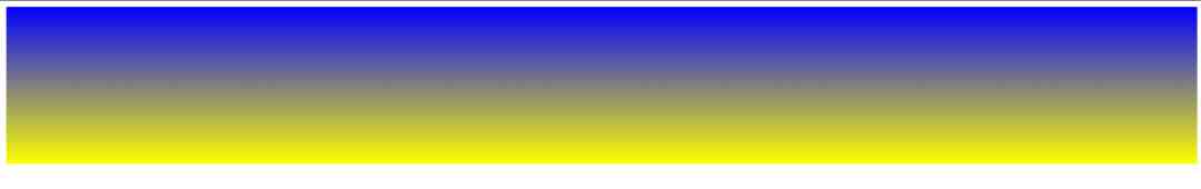
线性渐变 - 上到下
显示从顶部开始的线性渐变。它从开始的红色,过渡到黄色:
<style>
    #grad1 {
        height: 200px;
        background: blue; /* 对于那些不支持渐变的浏览器 */
        background: -webkit-linear-gradient(blue, yellow); /* Safari 5.1 到 6.0 */
        background: -o-linear-gradient(blue, yellow); /* Opera 11.1 到 12.0 */
        background: -moz-linear-gradient(blue, yellow); /* Firefox 3.6 到 15 */
        background: linear-gradient(blue, yellow); /* 标准语法 (必须是最后一个) */
    }
</style>
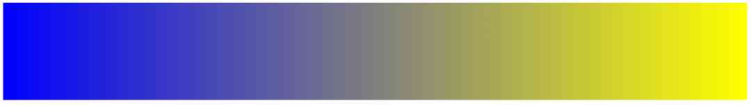
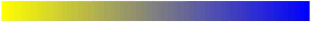
线性渐变 - 左到右
例如:
显示从左开始的线性渐变。它从开始的红色,过渡到黄色
<style>
    #grad1 {
        height: 200px;
        background: blue; /* 对于那些不支持渐变的浏览器 */
        background: -webkit-linear-gradient(left, blue , yellow); /* Safari 5.1 到 6.0 */
        background: -o-linear-gradient(right, blue, yellow); /* Opera 11.1 到 12.0 */
        background: -moz-linear-gradient(right, blue, yellow); /* Firefox 3.6 到 15 */
        background: linear-gradient(to right, blue , yellow); /* 标准语法 (必须是最后一个) */
    }
</style>
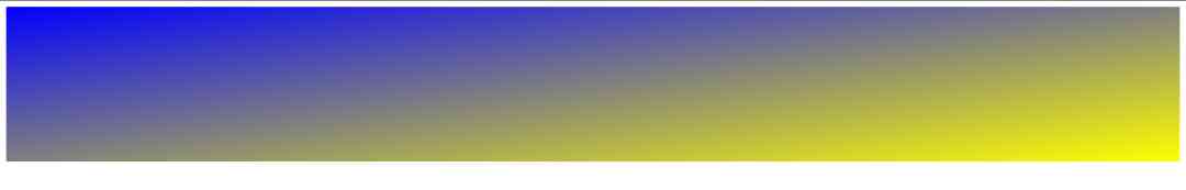
线性渐变 - 对角线
可以通过指定水平和垂直起始位置来实现对角线渐变。
下面的示例显示从左上角开始的线性渐变(到右下角)。它开始红色,过渡到黄色:
<style>
    #grad1 {
        height: 200px;
        background: blue; /*对于那些不支持渐变的浏览器 */
        background: -webkit-linear-gradient(left top, blue, yellow); /* Safari 5.1 到 6.0 */
        background: -o-linear-gradient(bottom right, blue, yellow); /* Opera 11.1 到 12.0 */
        background: -moz-linear-gradient(bottom right, blue, yellow); /* Firefox 3.6 到 15 */
        background: linear-gradient(to bottom right, blue, yellow); /* 标准语法(必须是最后一个) */
    }
</style>
1. 使用角度
如果你想在渐变方向上有更多的控制,你可以定义一个角度,而不是预定的方向(下、上、左、右等)。
语法
background: linear-gradient(angle, color-stop1, color-stop2);
下面的示例演示如何使用在线性渐变上使用角度:
例如:
#grad {
  width: 100%;
  height: 100px;
  background: blue; /* 对于那些不支持渐变的浏览器 */
  background: -webkit-linear-gradient(-90deg, blue, yellow); /*  Safari 5.1 到 6.0 */
  background: -o-linear-gradient(-90deg, blue, yellow); /*  Opera 11.1 到 12.0 */
  background: -moz-linear-gradient(-90deg, blue, yellow); /*  Firefox 3.6 到 15 */
  background: linear-gradient(-90deg, blue, yellow); /*  标准语法 */
}
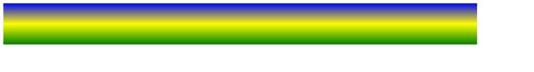
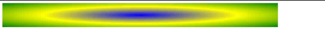
2. 使用多个停止颜色
下面的示例显示一个具有多个停止颜色的线性渐变(从上到下)
例如:
#grad {
  background: blue; /* 对于那些不支持渐变的浏览器 */
  background: -webkit-linear-gradient(blue, yellow, green); /*  Safari 5.1 到 6.0 */
  background: -o-linear-gradient(blue, yellow, green); /*  Opera 11.1 到 12.0 */
  background: -moz-linear-gradient(blue, yellow, green); /*  Firefox 3.6 到 15 */
  background: linear-gradient(blue, yellow, green); /* 标准语法 */
}
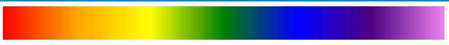
下面实例演示了如何使用彩虹颜色和一些文本来创建一个线性渐变(从左到右)
渐变背景
例如:
#grad {
  background: blue; /*对于那些不支持渐变的浏览器 */
  /*  Safari 5.1 到 6.0 */
  background: -webkit-linear-gradient(left,red,orange,yellow,green,blue,indigo,violet);
  /*  Opera 11.1 到 12.0 */
  background: -o-linear-gradient(left,red,orange,yellow,green,blue,indigo,violet);
  /*  Fx 3.6 到 15 */
  background: -moz-linear-gradient(left,red,orange,yellow,green,blue,indigo,violet);
  /* Standard syntax */
  background: linear-gradient(到 right, red,orange,yellow,green,blue,indigo,violet);
}
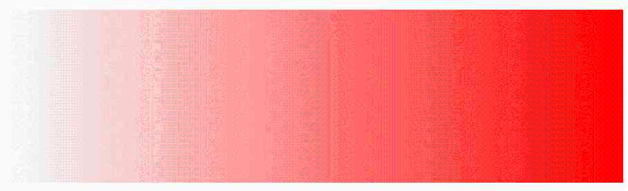
3. 使用的透明度
CSS3 渐变也支持透明度,可以用来创建淡入淡出效果。
添加透明度,我们用rgba()函数来定义停止颜色。在rgba()函数的最后一个参数可以从0到1的值,并定义颜色的透明度:0表示完全透明,1表示完全的颜色(不透明度)。
下面的示例显示从左开始的线性渐变。它开始完全透明,过渡到全红色:
#grad {
  background: blue; /*  不支持渐变的浏览器 */
  background: -webkit-linear-gradient(left,rgba(255,0,0,0),rgba(255,0,0,1)); /*Safari 5.1-6*/
  background: -o-linear-gradient(right,rgba(255,0,0,0),rgba(255,0,0,1)); /*Opera 11.1-12*/
  background: -moz-linear-gradient(right,rgba(255,0,0,0),rgba(255,0,0,1)); /*Fx 3.6-15*/
  background: linear-gradient(to right, rgba(255,0,0,0), rgba(255,0,0,1)); /*Standard*/
}
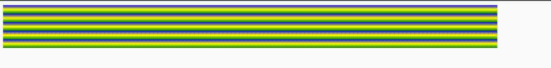
4. 重复线性渐变
repeating-linear-gradient() 函数用于重复线性渐变:
例如:
#grad {
  background: blue; /*  不支持渐变的浏览器 */
  /* Safari 5.1 到 6.0 */
  background: -webkit-repeating-linear-gradient(blue, yellow 10%, green 20%);
  /* Opera 11.1 到 12.0 */
  background: -o-repeating-linear-gradient(blue, yellow 10%, green 20%);
  /* Firefox 3.6 到 15 */
  background: -moz-repeating-linear-gradient(blue, yellow 10%, green 20%);
  /* Standard syntax */
  background: repeating-linear-gradient(blue, yellow 10%, green 20%);
}
三、CSS3 径向渐变 (由中心定义)
径向渐变是由其中心定义的。
要创建径向渐变,还必须定义至少两个停止颜色。
语法
background: radial-gradient(shape size at position, start-color, ..., last-color);
径向渐变-均匀的间隔停止颜色 (默认)
下面的示例显示一个径向渐变,其颜色间隔均匀:
#grad {
  background: blue; /*  browsers that do not support gradients */
  background: -webkit-radial-gradient(blue, yellow, green); /* Safari 5.1 到 6.0 */
  background: -o-radial-gradient(blue, yellow, green); /*  Opera 11.6 到 12.0 */
  background: -moz-radial-gradient(blue, yellow, green); /*  Firefox 3.6 到 15 */
  background: radial-gradient(blue, yellow, green); /* Standard syntax */
}
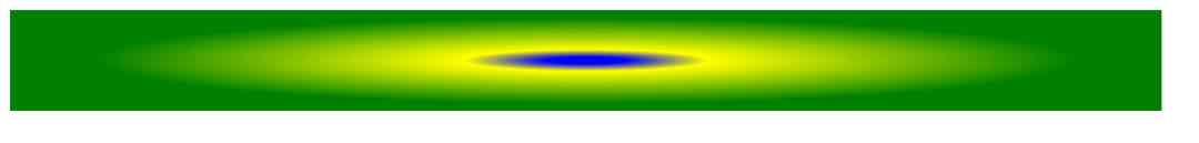
径向渐变-不同间隔的停止颜色
下面的例子显示了一个具有不同间距的颜色渐变的径向渐变:
#grad {
  background: blue; /*不支持渐变的浏览器 */
  background: -webkit-radial-gradient(blue 5%, yellow 15%, green 60%); /* Safari 5.1-6.0 */
  background: -o-radial-gradient(blue 5%, yellow 15%, green 60%); /*  Opera 11.6-12.0 */
  background: -moz-radial-gradient(blue 5%, yellow 15%, green 60%); /*  Firefox 3.6-15 */
  background: radial-gradient(blue 5%, yellow 15%, green 60%); /* Standard syntax */
}
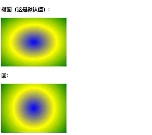
1. 设置形状
形状参数定义形状。它可以取值圆或椭圆。默认值为椭圆形。
下面的例子显示了一个圆形的径向渐变:
<!DOCTYPE html>
<html lang="en">
  <head>
    <meta charset="UTF-8">
    <title>项目</title>
    <style>
      #grad1 {
        height: 150px;
        width: 200px;
        background: -webkit-radial-gradient(blue, yellow, green);
        /*  Safari 5.1 到 6.0 */
        background: -o-radial-gradient(blue, yellow, green);
        /*  Opera 11.6 到 12.0 */
        background: -moz-radial-gradient(blue, yellow, green);
        /*  Fx 3.6 到 15 */
        background: radial-gradient(blue, yellow, green);
        /* 标准语法(必须是最后一个) */
      }

      #grad2 {
        height: 150px;
        width: 200px;
        background: -webkit-radial-gradient(circle, blue, yellow, green);
        /*  Safari 5.1 到 6.0 */
        background: -o-radial-gradient(circle, blue, yellow, green);
        /*  Opera 11.6 到 12.0 */
        background: -moz-radial-gradient(circle, blue, yellow, green);
        /*  Fx 3.6 到 15 */
        background: radial-gradient(circle, blue, yellow, green);
        /* 标准语法(必须是最后一个) */
      }
</style>
  </head>
  <body>

    <h3>径向渐变-形状</h3>

    <p><strong>椭圆(这是默认值):</strong></p>
    <div id="grad1"></div>

    <p><strong>圆:</strong></p>
    <div id="grad2"></div>

    <p><strong>注意:</strong> Internet Explorer 9 和早期的版本不支持渐变。</p>

  </body>
</html>
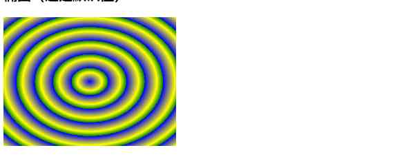
2. 重复径向渐变
repeating-radial-gradient() 函数用于重复径向渐变:
例如:
#grad {
  background: blue; /*不支持渐变的浏览器*/
  /*  Safari 5.1 到 6.0 */
  background: -webkit-repeating-radial-gradient(blue, yellow 10%, green 15%);
  /*  Opera 11.6 到 12.0 */
  background: -o-repeating-radial-gradient(blue, yellow 10%, green 15%);
  /*  Firefox 3.6 到 15 */
  background: -moz-repeating-radial-gradient(blue, yellow 10%, green 15%);
  /* Standard syntax */
  background: repeating-radial-gradient(blue, yellow 10%, green 15%);
}
四、总结
本文基于html基础, 通过对css中渐变效果做了详细的讲解,介绍来了常见的两种渐变方式。通过丰富的案例让大家能够更好的去了解,去体会渐变的用法,希望可以帮助大家更好的学习。
想学习更多Python网络爬虫与数据挖掘知识,可前往专业网站:http://pdcfighting.com/ 想学习更多Python网络爬虫与数据挖掘知识,可前往专业网站:http://pdcfighting.com/
版权声明
本文为[Python进阶者]所创,转载请带上原文链接,感谢
https://my.oschina.net/u/4521128/blog/4693295
边栏推荐
- Leetcode's ransom letter
- This article will introduce you to jest unit test
- Using Es5 to realize the class of ES6
- Polkadot series (2) -- detailed explanation of mixed consensus
- 教你轻松搞懂vue-codemirror的基本用法:主要实现代码编辑、验证提示、代码格式化
- 至联云解析:IPFS/Filecoin挖矿为什么这么难?
- Programmer introspection checklist
- Computer TCP / IP interview 10 even asked, how many can you withstand?
- Examples of unconventional aggregation
- 容联完成1.25亿美元F轮融资
猜你喜欢

合约交易系统开发|智能合约交易平台搭建
比特币一度突破14000美元,即将面临美国大选考验

Summary of common string algorithms
至联云分享:IPFS/Filecoin值不值得投资?
The difference between Es5 class and ES6 class

Face to face Manual Chapter 16: explanation and implementation of fair lock of code peasant association lock and reentrantlock
(1) ASP.NET Introduction to core3.1 Ocelot
Arrangement of basic knowledge points
Thoughts on interview of Ali CCO project team

Technical director, to just graduated programmers a word - do a good job in small things, can achieve great things
随机推荐
速看!互联网、电商离线大数据分析最佳实践!(附网盘链接)
Vue 3 responsive Foundation
Didi elasticsearch cluster cross version upgrade and platform reconfiguration
如何将数据变成资产?吸引数据科学家
Did you blog today?
Process analysis of Python authentication mechanism based on JWT
Python + appium automatic operation wechat is enough
Using consult to realize service discovery: instance ID customization
向北京集结!OpenI/O 2020启智开发者大会进入倒计时
Use of vuepress
Introduction to Google software testing
多机器人行情共享解决方案
After reading this article, I understand a lot of webpack scaffolding
How long does it take you to work out an object-oriented programming interview question from Ali school?
Basic principle and application of iptables
怎么理解Python迭代器与生成器?
OPTIMIZER_ Trace details
人工智能学什么课程?它将替代人类工作?
從小公司進入大廠,我都做對了哪些事?
Don't go! Here is a note: picture and text to explain AQS, let's have a look at the source code of AQS (long text)