当前位置:网站首页>视差特效的原理和实现方法
视差特效的原理和实现方法
2022-07-02 05:08:00 【德育处主任】
前言
- 本文的案例代码并非作者原创。
- 本文主要讲解 视差效果是如何实现的(原生三件套) ,本文并不涉及性能优化相关的知识点讲解(你就当我耍流氓吧)。
- 本文会从原理讲起,然后结合多个案例由浅入深去实现最终效果。
- 学废后帮我点个赞呗~
<br>
本文的 『推荐』 部分也别错过喔~ <br> 因为日常开发很少使用原生的方式去做视差效果。
<br>
<br>
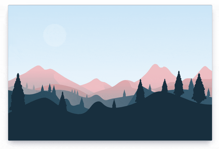
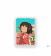
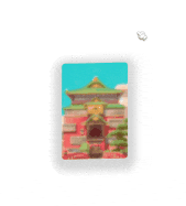
本文案例如图所示

<br><br>
原理
pc端的视差效果通常是 根据鼠标、键盘、滚动条的变化和操作 进行视觉上的差异化控制。
移动端可能还会有 重力陀螺仪 之类的交互,本文不讲移动端。
<br>
举些例子:
- 鼠标移到屏幕左上方:某元素就飞到屏幕右下方(跟鼠标反着来)。
- 页面往下滑动:背景图不动,文本元素等其他元素往上移动。
- ……
<br>
我放几个例子让大家直观感受一下:

<br>
【点击跳转在线预览:使用GSAP的视差层效果特效(滚动鼠标滚轮)】
<br>
<br>
<br><br>
实现
理解了实现的原理,那实现的关键就是 事件监听 addEventListener 了。
<br>
简单例子
先来一个简单的例子玩玩
这个例子实现的效果是:鼠标往左移,元素就网右移;鼠标往上移,元素就往下移。
<style>.box { width: 200px; height: 300px; background: lightblue; position: absolute; /* 绝对定位 */}</style><div class="box"></div><script> // 获取 .box 元素 const box = document.querySelector('.box') // 整个文档的事件监听(鼠标移动 mousemove) document.addEventListener('mousemove', e => { // 获取鼠标当前位置的x也y坐标,分别设置在 .box 的 right 和 bottom box.style.right = e.clientX + 'px' box.style.bottom = e.clientY + 'px' })</script><br>
当鼠标在页面左上方(加入x和y坐标分别是 10 和 20),就设置元素在页面右下方(右:10,下:20)。
就是根据 《原理》里讲的那样去实现。
<br>
如果不懂 clientX 和 clientY ,可以看看下面这篇文章:
《JS 事件对象 clientX , clientY , screenX , screenY , offsetX , offsetY 的区别》
<br>
注意:
本例使用了 right 和 left 移动元素。之所以这样做,是为了从最简单的方式讲解和实现。
实际开发中这会带来一定的 布局问题 和 性能问题(会导致布局更改或重新绘制,并会导致动画不稳定。) ,推荐优先考虑使用 transforms 对元素进行移动等操作。
<br><br>
进阶版
好玩的交互除了移动元素外,还可以移动背景图位置、旋转元素等操作。
同时还需要考虑元素的 动画幅度。像上面的例子就完全没控制元素移动幅度,所以当鼠标移动到屏幕最右侧或者最底部的时候,元素就会超出屏幕。这也许不是一种好的操作体验。
<br>
说到 动画幅度,就要考虑 参照物 的事情。常见的参照物有浏览器宽高、容器宽高、容器位置等。
<br>
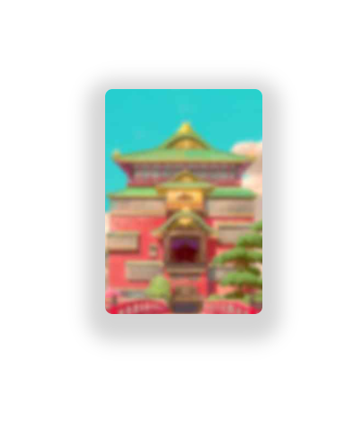
比如这个例子:
这个例子所操控的元素看上去很多,但其实逐层拆分,逐层控制起来就很简单。
要考虑的因素包括:
- 容器旋转
- 背景图轻微移动
- 人物跟随鼠标移动
<br>
这里的参照物是 鼠标位置与文档的宽高比例 ,并通过自己设置的公式来限制元素移动或旋转的范围。
<br>
1、容器旋转
创建一个 div 容器,设置了阴影。

<div class="card"></div><style> html, body { width: 100%; height: 100%; margin: 0; padding: 0; } body { display: flex; justify-content: center; align-items: center; } /* 容器 */ .card { width: 175px; height: 250px; border-radius: 8px; box-shadow: 0px 10px 20px 20px rgba(0, 0, 0, 0.17); }</style><br>
通过JS控制容器旋转
// 获取容器元素const card = document.querySelector('.card')// 计算函数function computedTransform(num, doc) { return (num / doc * 40 - 20).toFixed(1)}// 给文档添加一个鼠标移动的事件监听document.addEventListener('mousemove', e => { // 旋转容器 card.style.transform = ` rotateX(${computedTransform(e.clientX, window.innerWidth)}deg) rotateY(${computedTransform(e.clientY, window.innerHeight)}deg) `})<br>
2、移动背景图
添加背景图
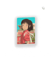
<!-- 省略部分重复代码 --><style> .card { width: 175px; height: 250px; border-radius: 8px; box-shadow: 0px 10px 20px 20px rgba(0, 0, 0, 0.17); background-image: url(./img/3dr_spirited.jpg); background-repeat: no-repeat; background-position: 50% 50%; background-size: 110% 110%; }</style>这段css主要看最后添加的4行(background 相关)。
直接在 css 里通过 background-image 添加一个背景图,背景图不重复,起始位置在中心,背景图比容器稍微大一点点,但不会超出容器。
<br>
JS控制:背景图也跟随鼠标移动
录制的GIF有点小问题,最后出现了鼠标残影,先将就看着效果吧。
/* 省略部分重复代码 */const card = document.querySelector('.card')// 计算function computedBGPosition(num, doc) { return (60 - Number((num / doc * 20).toFixed(1)) + '%')}// 给文档添加鼠标移动的事件监听document.addEventListener('mousemove', e => { // 移动背景 card.style.backgroundPosition = ` ${computedBGPosition(e.clientX, window.innerWidth)} ${computedBGPosition(e.clientY, window.innerHeight)} `})这部分的移动幅度我控制在一个比较小的范围内,使用 background-position 来控制背景图起始位置。
再结合 『1、容器旋转』 的代码,就变成如下所示的效果:
<br>
3、移动图片(人物)
人物跟随鼠标移动
完整代码
<style> html, body { width: 100%; height: 100%; margin: 0; padding: 0; } body { display: flex; justify-content: center; align-items: center; } /* 容器 */ .card { width: 175px; height: 250px; overflow: hidden; background-image: url(./img/3dr_spirited.jpg); background-repeat: no-repeat; background-position: 50% 50%; background-size: 110% 110%; transform-origin: 50% 50%; perspective: 1800px; transform-style: preserve-3d; border-radius: 8px; box-shadow: 0px 10px 20px 20px rgba(0, 0, 0, 0.17); } /* 图片样式(小千) */ .card img { height: 100%; position: relative; top: 25px; left: 25px; }</style><div class="card"> <img src="./img/3dr_chihiro.png" alt=""></div><script> // 容器 const card = document.querySelector('.card') // 人物(小千) const img = card.querySelector('img') // 移动背景图的计算方法 function computedBGPosition(num, doc) { return (60 - Number((num / doc * 20).toFixed(1)) + '%') } // 计算 translate function computedTransform(num, doc) { return (num / doc * 40 - 20).toFixed(1) } // 给文档添加一个鼠标移动的事件监听 document.addEventListener('mousemove', e => { // 旋转容器 card.style.transform = ` rotateX(${computedTransform(e.clientX, window.innerWidth)}deg) rotateY(${computedTransform(e.clientY, window.innerHeight)}deg) ` // 移动背景 card.style.backgroundPosition = ` ${computedBGPosition(e.clientX, window.innerWidth)} ${computedBGPosition(e.clientY, window.innerHeight)} ` // 移动图片 img.style.transform = ` translateX(${computedTransform(e.clientX, window.innerWidth)}px) translateY(${computedTransform(e.clientY, window.innerHeight)}px) ` })</script>样式部分:
- 容器:需要设置
overflow: hidden;,图片在移动过程中超出的部分不展示 - 人物图片:人物需要设置
position: relative;, 并且往下移动一点,这样可以隐藏下半身。
JS部分:
const img = card.querySelector('img')// 计算 translatefunction computedTransform(num, doc) { return (num / doc * 40 - 20).toFixed(1)}img.style.transform = ` translateX(${computedTransform(e.clientX, window.innerWidth)}px) translateY(${computedTransform(e.clientY, window.innerHeight)}px)`主要添加了这部分,通过 鼠标当前位置和屏幕宽高 来计算出图片移动的距离。
<br><br>
终极版
上面的 『进阶版』 讲解了实现视差效果的秘密。
平时见到更加复杂的效果,其实可以把元素逐一拆分,逐一控制。
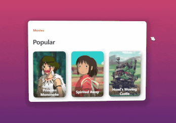
比如本文的终极版效果:
<br>
这部分的讲解都放在代码注释里,建议自己建一个项目来运行。
有不懂的地方可以在评论区交流讨论。
完整代码如下所示。
<style> .page__x { width: 1000px; height: 700px; /* 居中布局 */ display: flex; justify-content: center; align-items: center; overflow: hidden; /* 设置元素被查看位置的视图 */ perspective: 1800px; /* 背景色(兼容性写法) */ background: #642b73; background: linear-gradient(to bottom, #c6426e, #642b73); } /* Popular */ h1 { /* 底部外边距 */ margin-bottom: 30px; /* z轴偏移 */ transform: translateZ(35px); /* 字母间距 */ letter-spacing: -1px; /* 字号 */ font-size: 32px; /* 字体粗细 */ font-weight: 800; /* 字体颜色 */ color: #3e3e42; } /* Movies */ h3 { /* 底部外边距 */ margin-bottom: 6px; /* z轴偏移 */ transform: translateZ(25px); /* 字号 */ font-size: 16px; /* 字体颜色 */ color: #eb285d; } /* 卡片主容器 */ .cards { /* 行内块元素 */ display: inline-block; /* 最小宽度 */ min-width: 595px; /* 内边距 */ padding: 30px 35px; /* 设置元素被查看位置的视图 */ perspective: 1800px; /* 旋转基点 */ transform-origin: 50% 50%; /* 使被转换的子元素保留其 3D 转换 */ transform-style: preserve-3d; /* 圆角 */ border-radius: 15px; /* 文本左对齐 */ text-align: left; /* 背景色 */ background: #fff; /* 投影 */ box-shadow: 0px 10px 20px 20px rgba(0, 0, 0, 0.17); } /* 卡片 */ .card { /* 行内块元素 */ display: inline-block; /* 宽 */ width: 175px; /* 高 */ height: 250px; /* 相对定位 */ position: relative; /* 隐藏溢出部分 */ overflow: hidden; /* 设置元素被查看位置的视图 */ perspective: 1200px; /* 使被转换的子元素保留其 3D 转换 */ transform-style: preserve-3d; /* z轴偏移 */ transform: translatez(35px); /* 过渡 */ transition: transform 200ms ease-out; /* 文本居中对齐 */ text-align: center; /* 圆角 */ border-radius: 15px; /* 投影 */ box-shadow: 5px 5px 20px -5px rgba(0, 0, 0, 0.6); } /* 除了最后一个卡片之外的卡片 */ .card:not(:last-child) { /* 右侧外边距 */ margin-right: 30px; } /* 卡片的图片 */ .card__img { /* 相对定位 */ position: relative; /* 高度 */ height: 100%; } /* 卡片背景 */ .card__bg { bottom: -50px; left: -50px; position: absolute; right: -50px; top: -50px; /* 旋转基点 */ transform-origin: 50% 50%; transform: translateZ(-50px); z-index: 0; } /* 幽灵公主 图片 */ .princess-mononoke .card__img { top: 14px; right: -10px; height: 110%; } /* 幽灵公主 背景 */ .princess-mononoke .card__bg { background: url("img/3dr_monobg.jpg") center/cover no-repeat; } /* 千与千寻 图片 */ .spirited-away .card__img { top: 25px; } /* 千与千寻 背景 */ .spirited-away .card__bg { background: url("img/3dr_spirited.jpg") center/cover no-repeat; } /* 哈尔的移动城堡 图片 */ .howl-s-moving-castle .card__img { top: 5px; left: -4px; height: 110%; } /* 哈尔的移动城堡 背景 */ .howl-s-moving-castle .card__bg { background: url("img/3dr_howlbg.jpg") center/cover no-repeat; } /* 卡片的文本内容 */ .card__text { /* 弹性布局 */ display: flex; /* 主轴为垂直方向 */ flex-direction: column; /* 主轴居中对齐 */ justify-content: center; /* 交叉轴的中点对齐 */ align-items: center; /* 宽 */ width: 100%; /* 高 */ height: 70px; /* 绝对定位 */ position: absolute; /* 堆叠顺序 */ z-index: 2; /* 离底部距离 */ bottom: 0; /* 背景色:渐变 */ background: linear-gradient(to bottom, rgba(0, 0, 0, 0) 0%, rgba(0, 0, 0, 0.55) 100%); } /* 卡片的标题 */ .card__title { /* 底部外边距 */ margin-bottom: 3px; /* 设置左右10px内边距 */ padding: 0 10px; /* 字号 */ font-size: 18px; /* 字体的粗细 */ font-weight: 700; /* 字体颜色 */ color: #fff; }</style><div class="page__x" id="pageX"> <div class="cards"> <h3>Movies</h3> <h1>Popular</h1> <!-- 幽灵公主 --> <div class="card princess-mononoke"> <div class="card__bg"></div> <img class="card__img" src="./img/3dr_mono.png" /> <div class="card__text"> <p class="card__title">Princess Mononoke</p> </div> </div> <!-- 千与千寻 --> <div class="card spirited-away"> <div class="card__bg"></div> <img class="card__img" src="./img/3dr_chihiro.png" /> <div class="card__text"> <p class="card__title">Spirited Away</p> </div> </div> <!-- 哈尔的移动城堡 --> <div class="card howl-s-moving-castle"> <div class="card__bg"></div> <img class="card__img" src="./img/3dr_howlcastle.png" /> <div class="card__text"> <p class="card__title">Howl's Moving Castle</p> </div> </div> </div></div><script>// 页面容器const pageX = document.querySelector('#pageX')// 卡片容器const cards = document.querySelector('.cards')// 所有图片const images = document.querySelectorAll('.card__img')// 所有背景const backgrounds = document.querySelectorAll('.card__bg')// 旋转角度系数let range = 40// 旋转公式(返回-20 ~ 20,保留1为小数)let calcValue = (a, b) => (a / b * range - range / 2).toFixed(1)// 默认返回 undefinedlet timeout = void 0// 视差动画函数// e:鼠标移动事件的参数function parallax(e) { let x = e.x // 指针x轴位置 let y = e.y // 指针y轴位置 // 如果 timeout 已经存在,就取消一个先前通过调用 window.requestAnimationFrame() 方法添加到计划中的动画帧请求。 if (timeout) { // 这是一个实验中的功能,此功能某些浏览器尚在开发中 window.cancelAnimationFrame(timeout); } // 在下次重绘之前调用指定的回调函数更新动画 timeout = window.requestAnimationFrame(function () { // 通过 calcValue 根据鼠标当前位置和容器宽高比计算得出的值 let xValue = calcValue(x, pageX.offsetWidth) let yValue = calcValue(y, pageX.offsetHeight) // 设置卡片容器的旋转角度 cards.style.transform = "rotateX(" + yValue + "deg) rotateY(" + xValue + "deg)"; // 设置所有图片的位移 images.forEach(item => { item.style.transform = "translateX(" + -xValue + "px) translateY(" + yValue + "px)" }) // 设置所有背景图的位置 backgrounds.forEach(item => { item.style.backgroundPosition = xValue * .45 + "px " + -yValue * .45 + "px" }) })}window.onload = () => { // 监听鼠标在 pageX 容器移动 pageX.addEventListener('mousemove', parallax, false)}// 离开页面前移除监听window.onbeforeunload = () => { pageX.removeEventListener('mousemove', parallax)}</script><br>
<br>
知识点补充说明
《JS 事件对象 clientX , clientY , screenX , screenY , offsetX , offsetY 的区别》
《JS 移除事件侦听器 removeEventListener()》
<br>
<br>
推荐
日常开发中很少直接用原生的方式去实现视差效果的。
这里推荐一个 轻量JS动画库:『Anime.js』
这个库的用法太简单了,直接看 《官方文档》 就知道怎么用了,本文不进行讲解。
<br>
《视差特效的原理和实现方法》点赞 + 关注 + 收藏 = 学会了
边栏推荐
猜你喜欢
List of common bugs in software testing

Fabric.js IText设置指定文字的颜色和背景色

Paddlepaddle project source code
C case of communication between server and client based on mqttnet
Knowledge arrangement about steam Education
Dark horse notes -- map set system

数学知识(欧拉函数)
关于Steam 教育的知识整理

Virtual machine installation deepin system
10 minute quick start UI automation ----- puppeter
随机推荐
Virtual machine installation deepin system
Line by line explanation of yolox source code of anchor free series network (7) -- obj in head_ loss、Cls_ Loss and reg_ Calculation and reverse transmission of loss I
Fabric.js IText 上标和下标
数学知识——快速幂的理解及例题
DMA Porter
Exercise notes 13 (effective letter ectopic words)
[bus interface] Axi interface
Video multiple effects production, fade in effect and border background are added at the same time
Latest: the list of universities and disciplines for the second round of "double first-class" construction was announced
Practical problem solving ability of steam Education
画波形图_数字IC
Implementation of leetcode two number addition go
Pytest learning ----- pytest assertion of interface automation testing
Pyechats 1.19 generate a web version of Baidu map
Pyflink writes MySQL examples with JDBC
Basic differences between Oracle and MySQL (entry level)
Collectors.groupingBy 排序
Draw a wave chart_ Digital IC
Record my pytorch installation process and errors
2022阿里巴巴全球数学竞赛 第4题 虎虎生威(盲盒问题、集卡问题)解决思路