当前位置:网站首页>HR wonderful dividing line
HR wonderful dividing line
2022-07-02 11:59:00 【@I don't know you】
Preface
Recently I saw an article written by Zhang Xinxu, the great God, about hr The article , It's interesting , Here is a simple study , The writings of the great god .
original text :666, see hr The label realizes how to play with the separation line
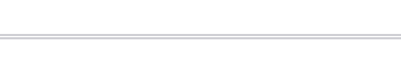
Common split lines
Solid line
<hr>

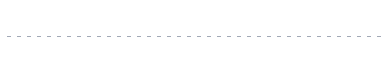
Dotted line
<hr class="hr1">
.hr1{

   border: 0;
   border-top: 2px dotted blue;
}

Dotted line
<hr class="hr2">
.hr2{

	 border: 0;
 	 border-top: 2px dashed blue;
}

Double solid line
<hr class="hr3" />
.hr3 {

	border: 0;
	border-top: 5px double #d0d0d5;
}
Density controllable dotted line
 <hr class="hr4" />
.hr4 {

	border: 0;
	padding-top: 1px;
	background: repeating-linear-gradient(
		to right,
		#a2a9b6 0px,
		#a2a9b6 4px,
		transparent 0px,
		transparent 10px
	);
}
This is a little complicated , It is realized by means of repeated linear gradient . It mainly simulates the split line through gradient , Here with hr It doesn't matter , Change to one div This effect can also be achieved .border: 0; Is to make the split line not display ,padding-top: 1px; Add a padding So that the gradient behind it can be displayed .
For gradients, use repeated linear gradients , The gradient direction is from left to right , Then by setting the position of the center line to control the spacing of the dotted line .
A virtual separation line at both ends
<hr class="hr5" />
.hr5{

    border: 0;
    padding-top: 2px;
    background: linear-gradient(to right, transparent, #d0d0d5, transparent);
}

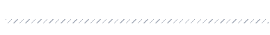
Twill separator
<hr class="hr6" />
.hr6 {

  border: 0;
  padding: 3px;
  background: repeating-linear-gradient(
    135deg,
    #a2a9b6 0px,
    #a2a9b6 1px,
    transparent 1px,
    transparent 6px
  );
}
Colorful twill dividing line
 <hr class="hr7" />
 .hr7 {

  border: 0;
  padding: 3px;
  background: linear-gradient(135deg, red, orange, green, blue, purple);
  mask-image: repeating-linear-gradient(
    135deg,
    #000 0px,
    #000 1px,
    transparent 1px,
    transparent 6px
  );
}

Say this , Mainly through the mask to achieve the effect of separation , If it is not masked, it is a simple linear gradient , Here's the picture :
Wavy lines
  <hr class="hr8" />

  .hr8 {

	  border: 0;
	  color: #d0d0d5;
	  height: 0.5em;
	  // Specify how to deal with white space in the element .  Text does not wrap , The text will continue on the same line , Until I met  <br>  Label until .
	  white-space: nowrap;
	  // Letter spacing
	  letter-spacing: 100vw;
	  padding-top: 0.5em;
	  &::before {

	    content: "\2000\2000";
	    // overline  Define a line on the text .
	    text-decoration: overline;
	    // Style of line   The lines will appear as wavy lines .
	    text-decoration-style:wavy;
	  }
}
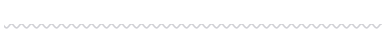
Only know that the wavy line can be realized through radial gradient , I haven't touched it in the above way , If the principle is correct, you can check the original ( Mainly because I didn't find content: "\2000\2000"; It stands for something )
Shadow line
 <hr class="hr9" />
 .hr9 {

  border: 0;
  padding-top: 10px;
  color: #d0d0d5;
  border-top: 1px solid rgba(0, 0, 0, 0.1);
  box-shadow: inset 0 10px 10px -10px;
}

This is mainly to add a shadow under the division line , If you remove box-shadow It's a solid line
Separator with text content
Solid lines at both ends
<hr class="hr11" data-content=" Separation line " />

.hr11 {

  color: #a2a9b6;
  border: 0;
  font-size: 12px;
  padding: 1em 0;
  position: relative;

  &::before {

    content: attr(data-content);
    position: absolute;
    padding: 0 10px;
    line-height: 1px;
    border: solid #d0d0d5;
    border-width: 0 99vw;
    // Width adaptive text
    width: fit-content;
    // Specify how to deal with white space in the element .  Text does not wrap , The text will continue on the same line , Until I met  <br>  Label until .
    white-space: nowrap;
    //  In the middle
    left: 50%;
    transform: translateX(-50%);
  }
}

Dotted line at both ends
 <hr class="hr12" data-content=" Separation line " />

.hr12 {

  color: #a2a9b6;
  border: 0;
  font-size: 12px;
  padding: 1em 0;
  position: relative;

  &::before {

    content: attr(data-content);
    position: absolute;
    padding: 0 10px;
    line-height: 1px;
    border: solid #d0d0d5;
    border-width: 0 99vw;
    // Width adaptive text
    width: fit-content;
    // Specify how to deal with white space in the element .  Text does not wrap , The text will continue on the same line , Until I met  <br>  Label until .
    white-space: nowrap;
    //  In the middle
    left: 50%;
    transform: translateX(-50%);
    //  By repeating the linear gradient  border Separation of
    border-image: repeating-linear-gradient(
        90deg,
        #d0d0d5,
        #d0d0d5 1px,
        transparent 1px,
        transparent 2px
      )
      0 85%;
  }
}

Fade out at both ends
  <hr class="hr13" data-content=" Separation line " />

  .hr13 {

	  color: #a2a9b6;
	  border: 0;
	  font-size: 12px;
	  padding: 1em 0;
	  position: relative;
	  // Mask
	  mask-image: linear-gradient(to right, transparent, black, transparent);

	  &::before {

	    content: attr(data-content);
	    position: absolute;
	    padding: 0 10px;
	    line-height: 1px;
	    border: solid #d0d0d5;
	    border-width: 0 99vw;
	    // Width adaptive text
	    width: fit-content;
	    // Specify how to deal with white space in the element .  Text does not wrap , The text will continue on the same line , Until I met  <br>  Label until .
	    white-space: nowrap;
	    //  In the middle
	    left: 50%;
	    transform: translateX(-50%);
	  }
}

Add a mask on the basis of the solid line
Content decoration
  <hr class="hr14" data-content=" Separation line " />

.hr14 {

  color: #a2a9b6;
  border: 0;
  font-size: 12px;
  padding: 1em 0;
  position: relative;

  &::before {

    content: attr(data-content);
    position: absolute;
    padding: 0 10px;
    line-height: 1px;
    border: solid #d0d0d5;
    border-width: 0 99vw;
    // Width adaptive text
    width: fit-content;
    // Specify how to deal with white space in the element .  Text does not wrap , The text will continue on the same line , Until I met  <br>  Label until .
    white-space: nowrap;
    //  In the middle
    left: 50%;
    transform: translateX(-50%);
  }

  &::after {

    content: attr(data-content);
    position: absolute;
    padding: 4px 1ch;
    top: 50%;
    left: 50%;
    transform: translate(-50%, -50%);
    color: transparent;
    border: 1px solid #d0d0d5;
  }
}

边栏推荐
- How to Create a Beautiful Plots in R with Summary Statistics Labels
- Esp32 audio frame esp-adf add key peripheral process code tracking
- This article takes you to understand the operation of vim
- PgSQL string is converted to array and associated with other tables, which are displayed in the original order after matching and splicing
- 基于 Openzeppelin 的可升级合约解决方案的注意事项
- Log4j2
- GGPlot Examples Best Reference
- Seriation in R: How to Optimally Order Objects in a Data Matrice
- Repeat, tile and repeat in pytorch_ The difference between interleave
- PHP query distance according to longitude and latitude
猜你喜欢

ESP32存储配网信息+LED显示配网状态+按键清除配网信息(附源码)

Seriation in R: How to Optimally Order Objects in a Data Matrice
Cluster Analysis in R Simplified and Enhanced

Always report errors when connecting to MySQL database

R HISTOGRAM EXAMPLE QUICK REFERENCE

GGPUBR: HOW TO ADD ADJUSTED P-VALUES TO A MULTI-PANEL GGPLOT
HOW TO EASILY CREATE BARPLOTS WITH ERROR BARS IN R
HOW TO EASILY CREATE BARPLOTS WITH ERROR BARS IN R
Yygh-9-make an appointment to place an order

【2022 ACTF-wp】
随机推荐
Pytorch builds LSTM to realize clothing classification (fashionmnist)
[visual studio 2019] create and import cmake project
to_ Bytes and from_ Bytes simple example
数据分析 - matplotlib示例代码
GGPUBR: HOW TO ADD ADJUSTED P-VALUES TO A MULTI-PANEL GGPLOT
HOW TO CREATE AN INTERACTIVE CORRELATION MATRIX HEATMAP IN R
Esp32 audio frame esp-adf add key peripheral process code tracking
文件操作(详解!)
Mish-撼动深度学习ReLU激活函数的新继任者
to_bytes与from_bytes简单示例
H5,为页面添加遮罩层,实现类似于点击右上角在浏览器中打开
How to Create a Beautiful Plots in R with Summary Statistics Labels
How to Create a Nice Box and Whisker Plot in R
6方面带你认识LED软膜屏 LED软膜屏尺寸|价格|安装|应用
Enter the top six! Boyun's sales ranking in China's cloud management software market continues to rise
Yygh-10-wechat payment
Mish shake the new successor of the deep learning relu activation function
Summary of flutter problems
HOW TO EASILY CREATE BARPLOTS WITH ERROR BARS IN R
Fabric.js 3个api设置画布宽高