当前位置:网站首页>GGPlot Examples Best Reference
GGPlot Examples Best Reference
2022-07-02 11:50:00 【Xiaoyu 2022】
library(tidyverse)
library(ggpubr)
theme_set(
theme_bw() +
theme(legend.position = "top")
)
library("ggpubr")
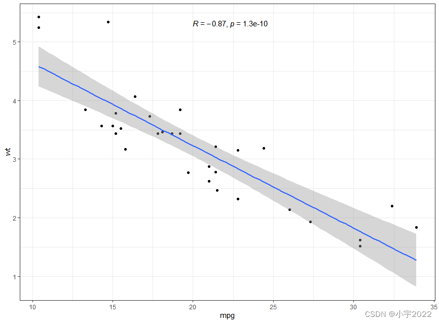
p <- ggplot(mtcars, aes(mpg, wt)) +
geom_point() +
geom_smooth(method = lm) +
stat_cor(method = "pearson", label.x = 20)
p
library(tidyverse)
library(ggpubr)
theme_set(
theme_bw() +
theme(legend.position = "top")
)
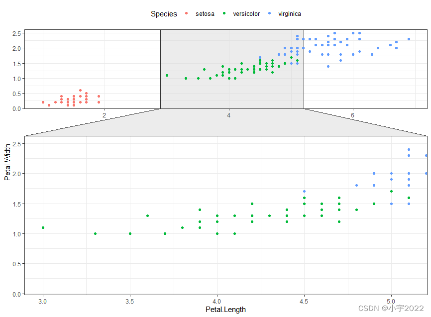
library(ggforce)
ggplot(iris, aes(Petal.Length, Petal.Width, colour = Species)) +
geom_point() +
facet_zoom(x = Species == "versicolor")
library(tidyverse)
library(ggpubr)
theme_set(
  theme_bw() +
    theme(legend.position = "top")
)
# Encircle setosa group
library("ggalt")
circle.df <- iris %>% filter(Species == "setosa")
ggplot(iris, aes(Petal.Length, Petal.Width)) +
  geom_point(aes(colour = Species)) +
  geom_encircle(data = circle.df, linetype = 2)

library(tidyverse)
library(ggpubr)
theme_set(
theme_bw() +
theme(legend.position = "top")
)
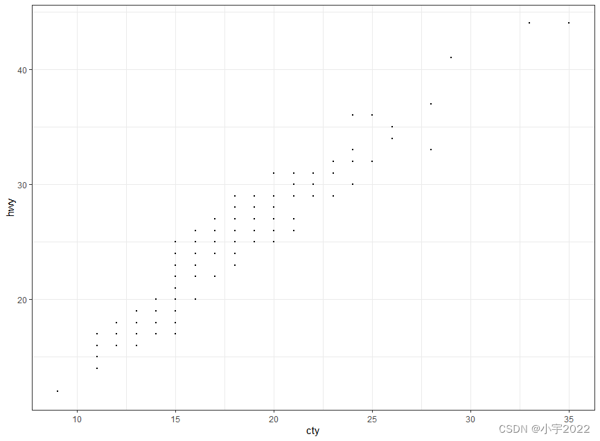
# Basic scatter plot
ggplot(mpg, aes(cty, hwy)) +
geom_point(size = 0.5)
library(tidyverse)
library(ggpubr)
theme_set(
  theme_bw() +
    theme(legend.position = "top")
)

# Jittered points
ggplot(mpg, aes(cty, hwy)) +
  geom_jitter(size = 0.5, width = 0.5)

library(tidyverse)
library(ggpubr)
theme_set(
theme_bw() +
theme(legend.position = "top")
)
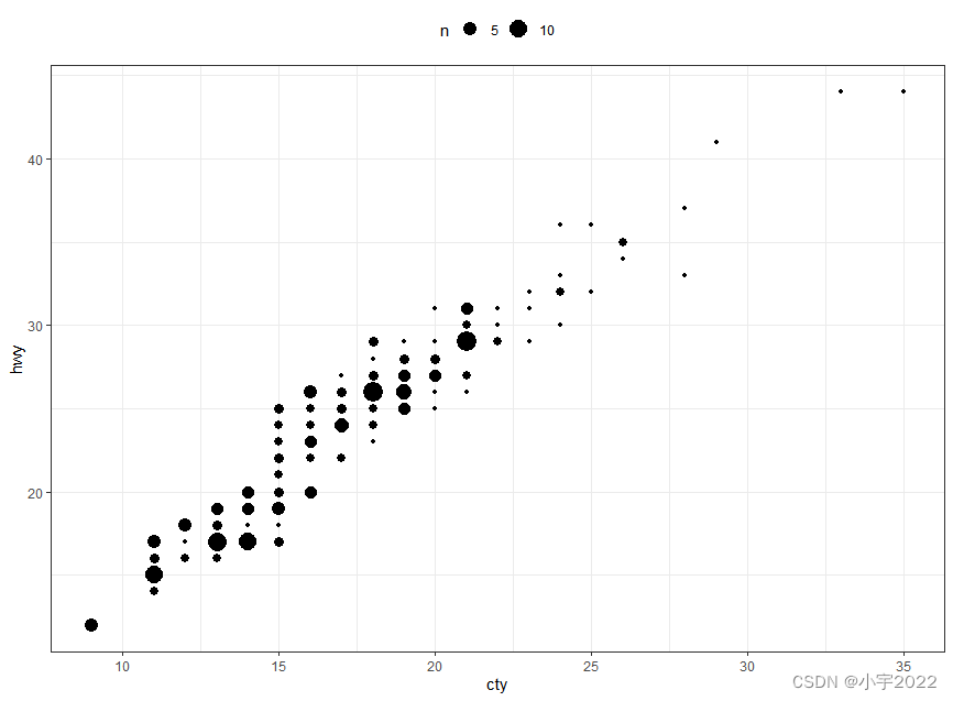
ggplot(mpg, aes(cty, hwy)) +
geom_count()
library(tidyverse)
library(ggpubr)
theme_set(
theme_bw() +
theme(legend.position = "top")
)
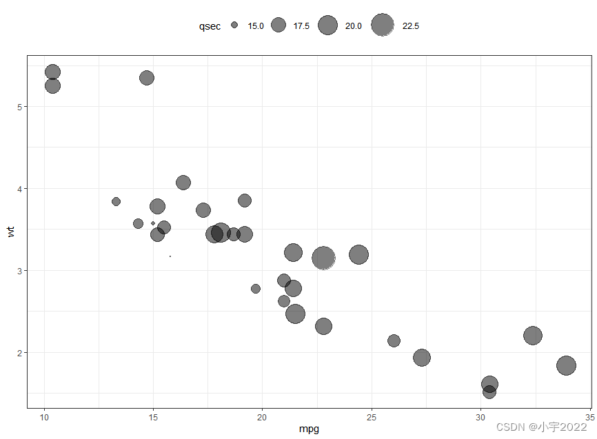
ggplot(mtcars, aes(mpg, wt)) +
geom_point(aes(size = qsec), alpha = 0.5) +
scale_size(range = c(0.5, 12)) # Adjust the range of points size
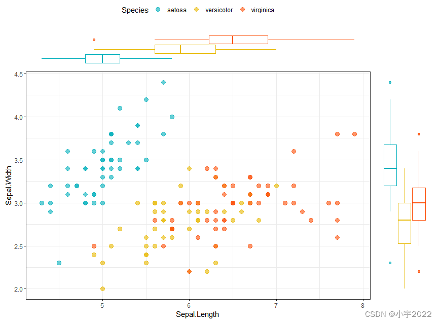
library(ggpubr)
# Grouped Scatter plot with marginal density plots
ggscatterhist(
  iris, x = "Sepal.Length", y = "Sepal.Width",
  color = "Species", size = 3, alpha = 0.6,
  palette = c("#00AFBB", "#E7B800", "#FC4E07"),
  margin.params = list(fill = "Species", color = "black", size = 0.2)
)

library(ggpubr)
# Use box plot as marginal plots
ggscatterhist(
  iris, x = "Sepal.Length", y = "Sepal.Width",
  color = "Species", size = 3, alpha = 0.6,
  palette = c("#00AFBB", "#E7B800", "#FC4E07"),
  margin.plot = "boxplot",
  ggtheme = theme_bw()
)
# Basic density plot
ggplot(iris, aes(Sepal.Length)) +
  geom_density()

# Add mean line
ggplot(iris, aes(Sepal.Length)) +
  geom_density(fill = "lightgray") +
  geom_vline(aes(xintercept = mean(Sepal.Length)), linetype = 2)

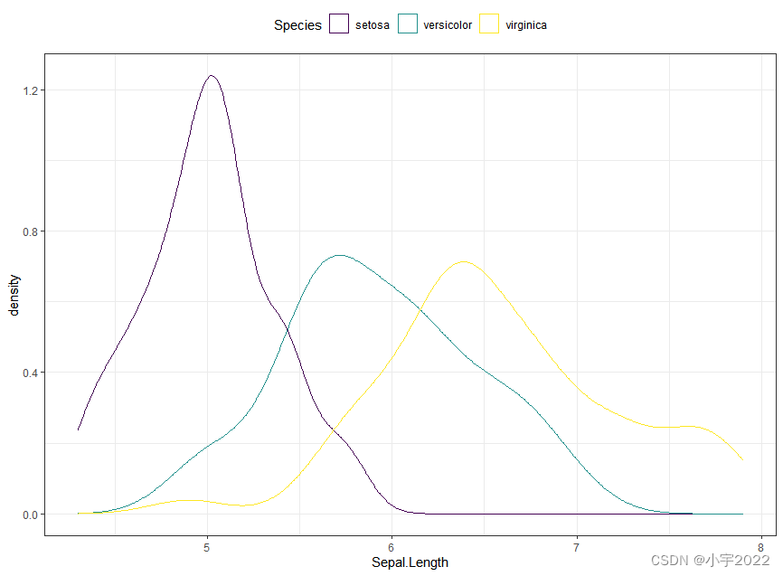
# Change line color by groups
ggplot(iris, aes(Sepal.Length, color = Species)) +
  geom_density() +
  scale_color_viridis_d()
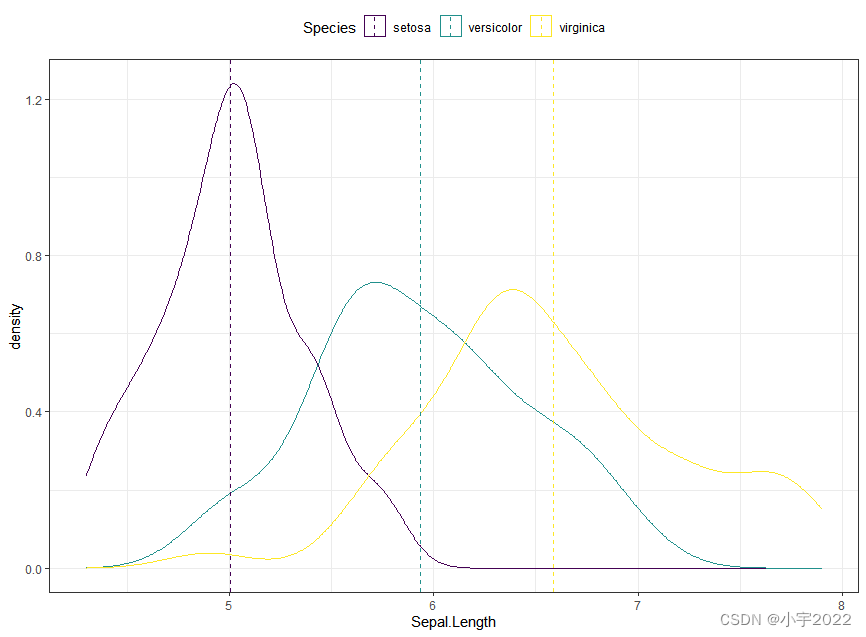
# Add mean line by groups
mu <- iris %>%
  group_by(Species) %>%
  summarise(grp.mean = mean(Sepal.Length))

ggplot(iris, aes(Sepal.Length, color = Species)) +
  geom_density() +
  geom_vline(aes(xintercept = grp.mean, color = Species),
             data = mu, linetype = 2) +
  scale_color_viridis_d()
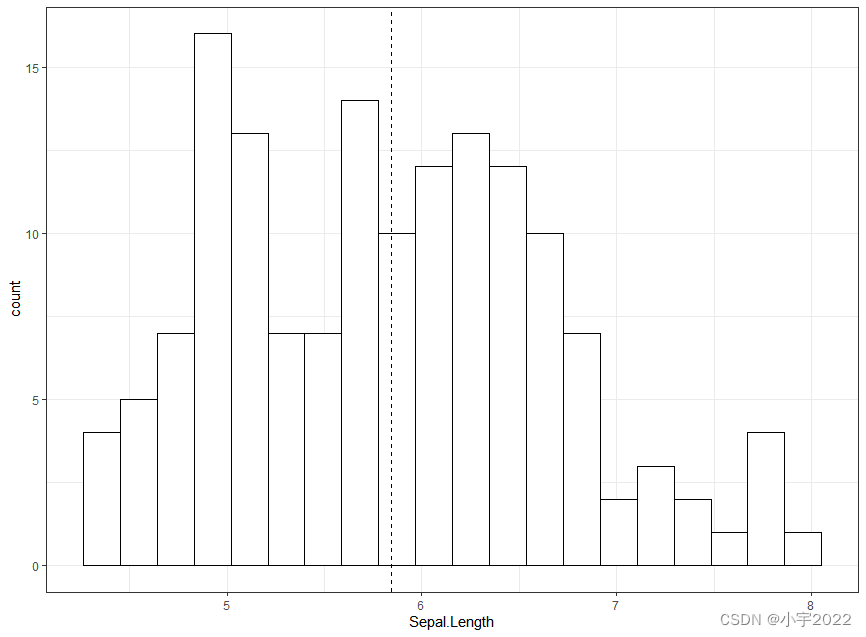
# Basic histogram with mean line
ggplot(iris, aes(Sepal.Length)) +
  geom_histogram(bins = 20, fill = "white", color = "black")  +
  geom_vline(aes(xintercept = mean(Sepal.Length)), linetype = 2)
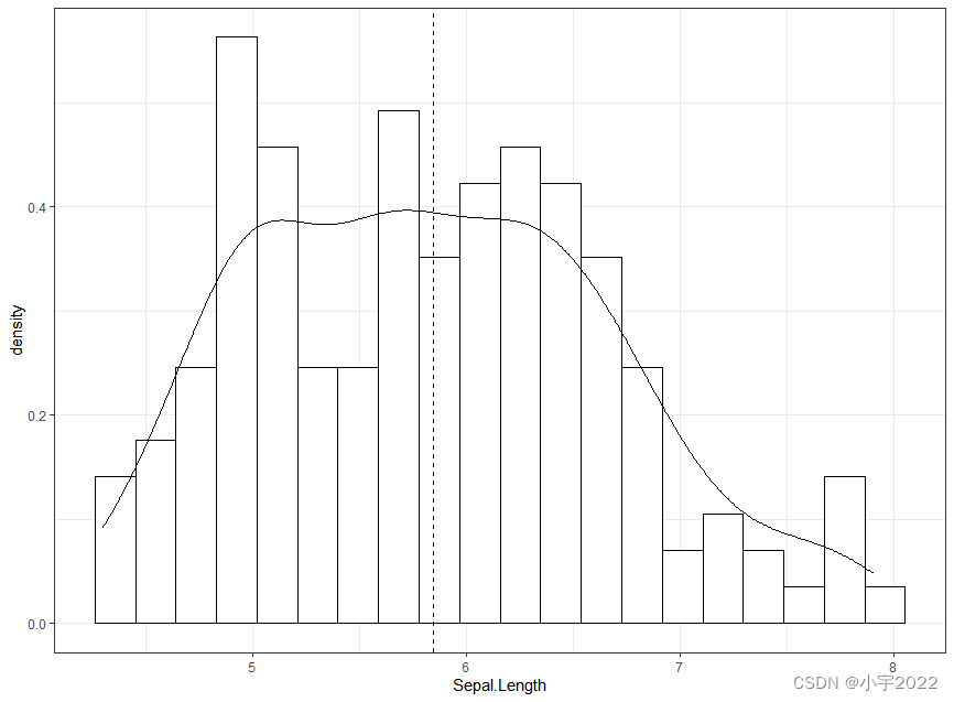
# Add density curves
ggplot(iris, aes(Sepal.Length, stat(density))) +
  geom_histogram(bins = 20, fill = "white", color = "black")  +
  geom_density() +
  geom_vline(aes(xintercept = mean(Sepal.Length)), linetype = 2)
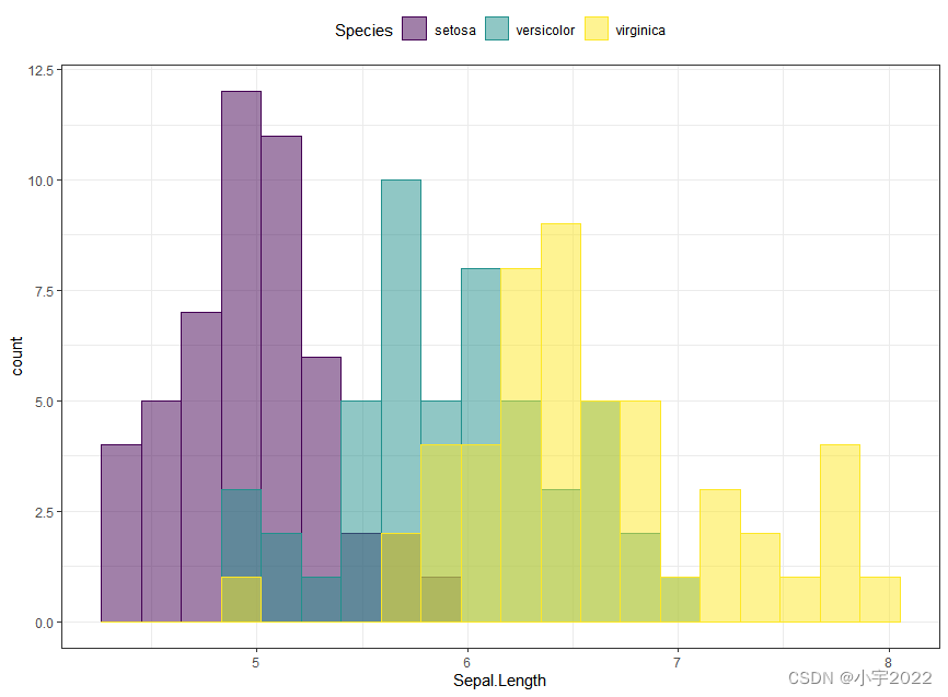
ggplot(iris, aes(Sepal.Length)) +
  geom_histogram(aes(fill = Species, color = Species), bins = 20,
                 position = "identity", alpha = 0.5) +
  scale_fill_viridis_d() +
  scale_color_viridis_d()
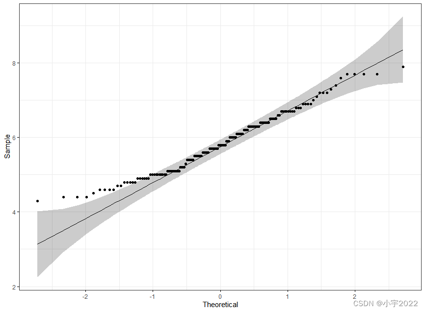
library(ggpubr)
ggqqplot(iris, x = "Sepal.Length",
         ggtheme = theme_bw())
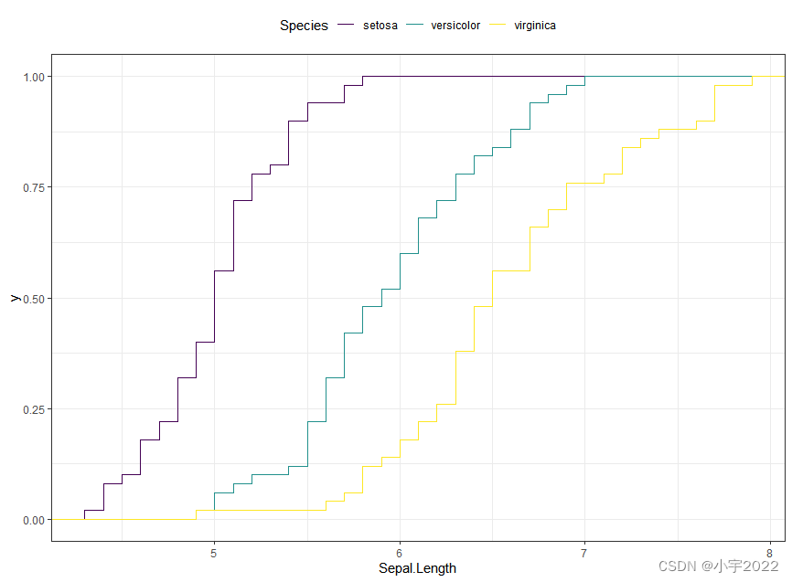
ggplot(iris, aes(Sepal.Length)) +
  stat_ecdf(aes(color = Species)) +
  scale_color_viridis_d()
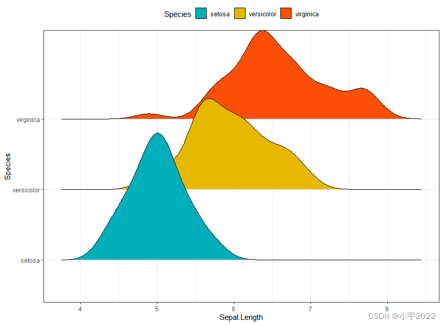
library(ggridges)
ggplot(iris, aes(x = Sepal.Length, y = Species)) +
  geom_density_ridges(aes(fill = Species)) +
  scale_fill_manual(values = c("#00AFBB", "#E7B800", "#FC4E07"))
df <- mtcars %>%
  rownames_to_column() %>%
  as_data_frame() %>%
  mutate(cyl = as.factor(cyl)) %>%
  select(rowname, wt, mpg, cyl)
# Basic bar plots
ggplot(df, aes(x = rowname, y = mpg)) +
  geom_col() +
  rotate_x_text(angle = 45)

df <- mtcars %>%
  rownames_to_column() %>%
  as_data_frame() %>%
  mutate(cyl = as.factor(cyl)) %>%
  select(rowname, wt, mpg, cyl)
# Reorder row names by mpg values
ggplot(df, aes(x = reorder(rowname, mpg), y = mpg)) +
  geom_col()  +
  rotate_x_text(angle = 45)

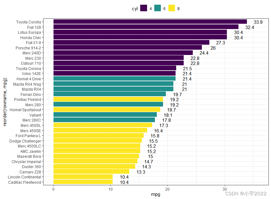
df <- mtcars %>%
  rownames_to_column() %>%
  as_data_frame() %>%
  mutate(cyl = as.factor(cyl)) %>%
  select(rowname, wt, mpg, cyl)
# Horizontal bar plots,
# change fill color by groups and add text labels
ggplot(df, aes(x = reorder(rowname, mpg), y = mpg)) +
  geom_col( aes(fill = cyl)) +
  geom_text(aes(label = mpg), nudge_y = 2) +
  coord_flip() +
  scale_fill_viridis_d()
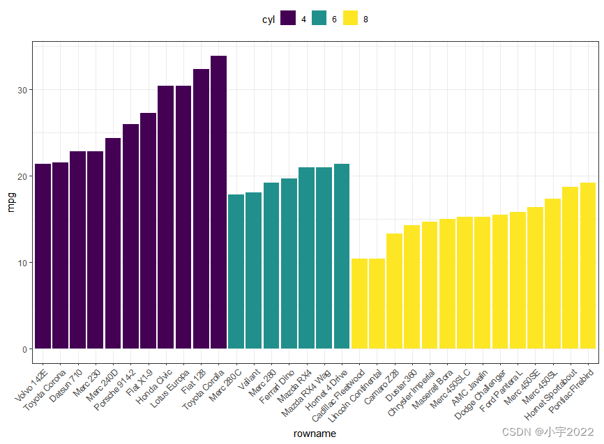
df <- mtcars %>%
  rownames_to_column() %>%
  as_data_frame() %>%
  mutate(cyl = as.factor(cyl)) %>%
  select(rowname, wt, mpg, cyl)
df2 <- df %>%
  arrange(cyl, mpg) %>%
  mutate(rowname = factor(rowname, levels = rowname))

ggplot(df2, aes(x = rowname, y = mpg)) +
  geom_col( aes(fill = cyl)) +
  scale_fill_viridis_d() +
  rotate_x_text(45)
df <- mtcars %>%
  rownames_to_column() %>%
  as_data_frame() %>%
  mutate(cyl = as.factor(cyl)) %>%
  select(rowname, wt, mpg, cyl)
df2 <- df %>%
  arrange(cyl, mpg) %>%
  mutate(rowname = factor(rowname, levels = rowname))

ggplot(df2, aes(x = rowname, y = mpg)) +
  geom_segment(
    aes(x = rowname, xend = rowname, y = 0, yend = mpg),
    color = "lightgray"
  ) +
  geom_point(aes(color = cyl), size = 3) +
  scale_color_viridis_d() +
  theme_pubclean() +
  rotate_x_text(45)

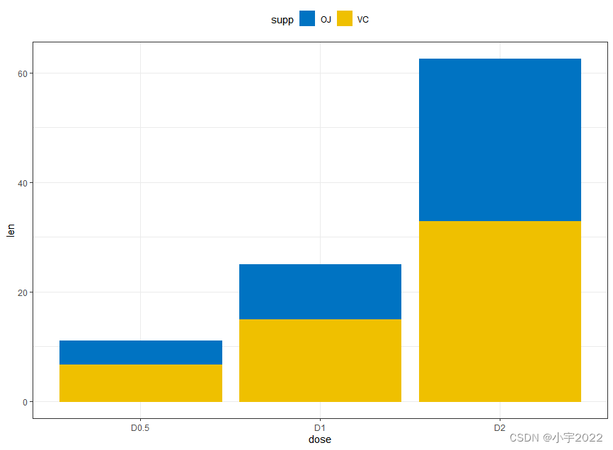
# Data
df3 <- data.frame(supp=rep(c("VC", "OJ"), each=3),
                  dose=rep(c("D0.5", "D1", "D2"),2),
                  len=c(6.8, 15, 33, 4.2, 10, 29.5))


# Stacked bar plots of y = counts by x = cut,
# colored by the variable color
ggplot(df3, aes(x = dose, y = len)) +
  geom_col(aes(color = supp, fill = supp), position = position_stack()) +
  scale_color_manual(values = c("#0073C2FF", "#EFC000FF"))+
  scale_fill_manual(values = c("#0073C2FF", "#EFC000FF"))
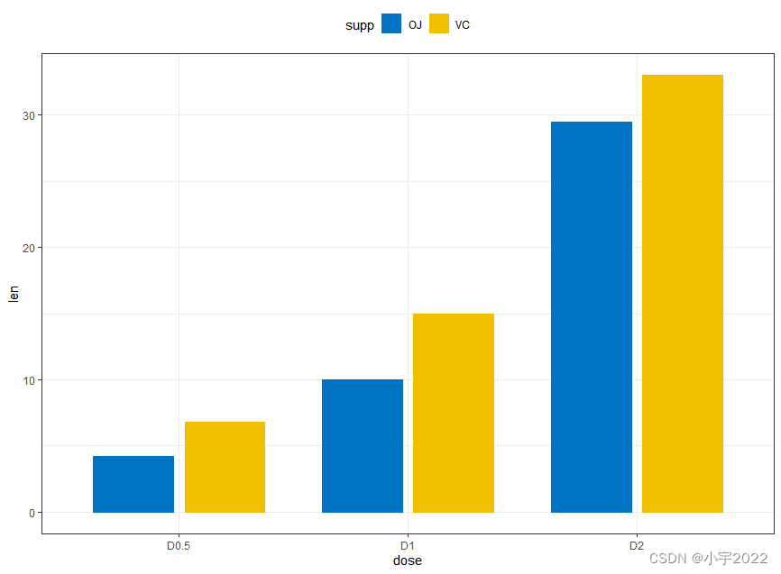
# Data
df3 <- data.frame(supp=rep(c("VC", "OJ"), each=3),
                  dose=rep(c("D0.5", "D1", "D2"),2),
                  len=c(6.8, 15, 33, 4.2, 10, 29.5))

# Use position = position_dodge()
ggplot(df3, aes(x = dose, y = len)) +
  geom_col(aes(color = supp, fill = supp), position = position_dodge(0.8), width = 0.7) +
  scale_color_manual(values = c("#0073C2FF", "#EFC000FF"))+
  scale_fill_manual(values = c("#0073C2FF", "#EFC000FF"))
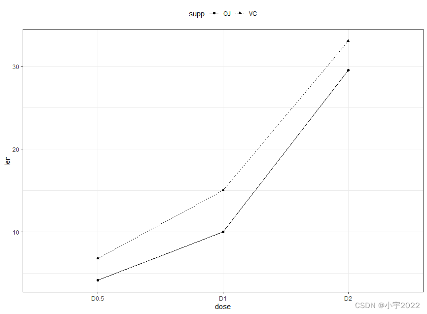
# Data
df3 <- data.frame(supp=rep(c("VC", "OJ"), each=3),
                  dose=rep(c("D0.5", "D1", "D2"),2),
                  len=c(6.8, 15, 33, 4.2, 10, 29.5))

# Line plot
ggplot(df3, aes(x = dose, y = len, group = supp)) +
  geom_line(aes(linetype = supp)) +
  geom_point(aes(shape = supp))
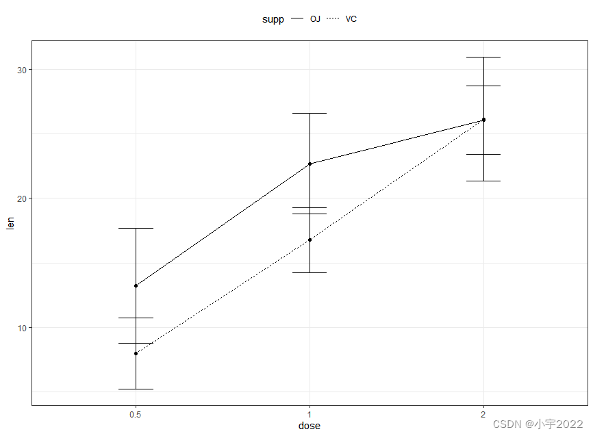
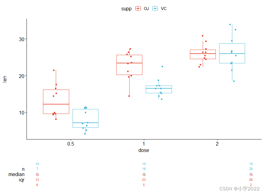
# Raw data
df <- ToothGrowth %>% mutate(dose = as.factor(dose))
head(df, 3)
# Summary statistics
df.summary <- df %>%
  group_by(dose) %>%
  summarise(sd = sd(len, na.rm = TRUE), len = mean(len))
df.summary
# (1) Line plot
ggplot(df.summary, aes(dose, len)) +
  geom_line(aes(group = 1)) +
  geom_errorbar( aes(ymin = len-sd, ymax = len+sd),width = 0.2) +
  geom_point(size = 2)

# Raw data
df <- ToothGrowth %>% mutate(dose = as.factor(dose))
head(df, 3)
# Summary statistics
df.summary <- df %>%
  group_by(dose) %>%
  summarise(sd = sd(len, na.rm = TRUE), len = mean(len))
df.summary

# (2) Bar plot
ggplot(df.summary, aes(dose, len)) +
  geom_bar(stat = "identity", fill = "lightgray", color = "black") +
  geom_errorbar(aes(ymin = len, ymax = len+sd), width = 0.2)

# Data preparation
df.summary2 <- df %>%
  group_by(dose, supp) %>%
  summarise( sd = sd(len), len = mean(len))
df.summary2
# (1) Line plot + error bars
ggplot(df.summary2, aes(dose, len)) +
  geom_line(aes(linetype = supp, group = supp))+
  geom_point()+
  geom_errorbar(
    aes(ymin = len-sd, ymax = len+sd, group = supp),
    width = 0.2
  )
# Data preparation
df.summary2 <- df %>%
group_by(dose, supp) %>%
summarise( sd = sd(len), len = mean(len))
df.summary2
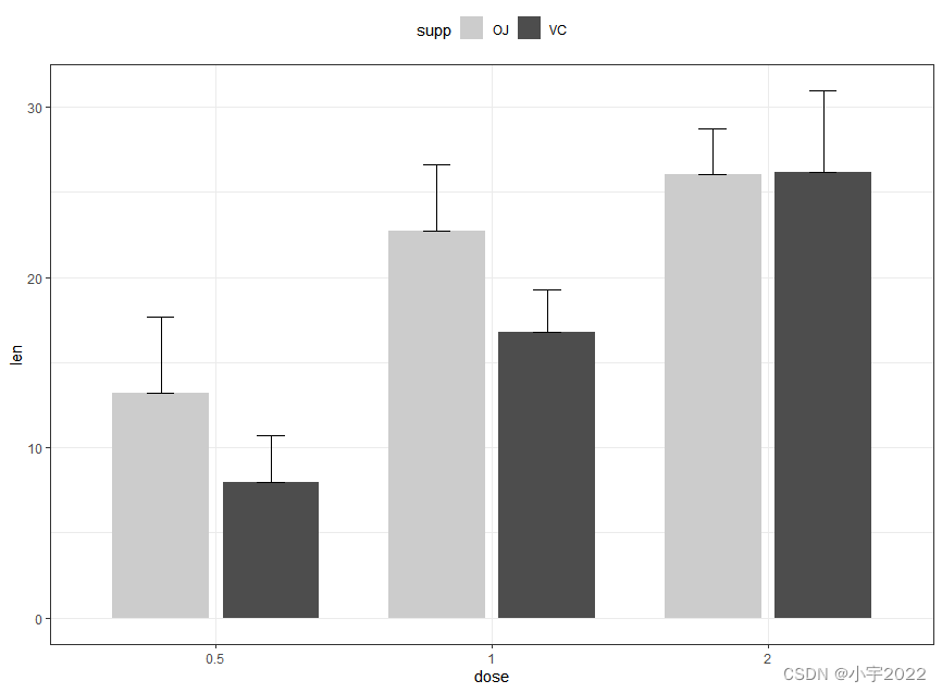
# (2) Bar plots + upper error bars.
ggplot(df.summary2, aes(dose, len)) +
geom_bar(aes(fill = supp), stat = "identity",
position = position_dodge(0.8), width = 0.7)+
geom_errorbar(
aes(ymin = len, ymax = len+sd, group = supp),
width = 0.2, position = position_dodge(0.8)
)+
scale_fill_manual(values = c("grey80", "grey30"))
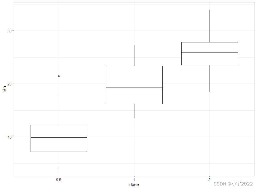
ToothGrowth$dose <- as.factor(ToothGrowth$dose)
# Basic
ggplot(ToothGrowth, aes(dose, len)) +
  geom_boxplot()
ToothGrowth$dose <- as.factor(ToothGrowth$dose)

# Box plot + violin plot
ggplot(ToothGrowth, aes(dose, len)) +
  geom_violin(trim = FALSE) +
  geom_boxplot(width = 0.2)

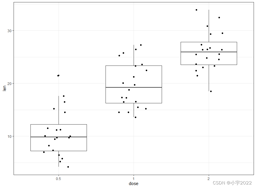
ToothGrowth$dose <- as.factor(ToothGrowth$dose)

# Add jittered points
ggplot(ToothGrowth, aes(dose, len)) +
  geom_boxplot() +
  geom_jitter(width = 0.2)
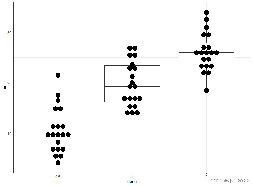
ToothGrowth$dose <- as.factor(ToothGrowth$dose)

# Dot plot + box plot
ggplot(ToothGrowth, aes(dose, len)) +
  geom_boxplot() +
  geom_dotplot(binaxis = "y", stackdir = "center")
ToothGrowth$dose <- as.factor(ToothGrowth$dose)
# Box plots
ggplot(ToothGrowth, aes(dose, len)) +
  geom_boxplot(aes(color = supp)) +
  scale_color_viridis_d()

ToothGrowth$dose <- as.factor(ToothGrowth$dose)
# Add jittered points
ggplot(ToothGrowth, aes(dose, len, color = supp)) +
  geom_boxplot() +
  geom_jitter(position = position_jitterdodge(jitter.width = 0.2)) +
  scale_color_viridis_d()

# Data preparation
df <- economics %>%
  select(date, psavert, uempmed) %>%
  gather(key = "variable", value = "value", -date)
head(df, 3)
# Multiple line plot
ggplot(df, aes(x = date, y = value)) +
  geom_line(aes(color = variable), size = 1) +
  scale_color_manual(values = c("#00AFBB", "#E7B800")) +
  theme_minimal()

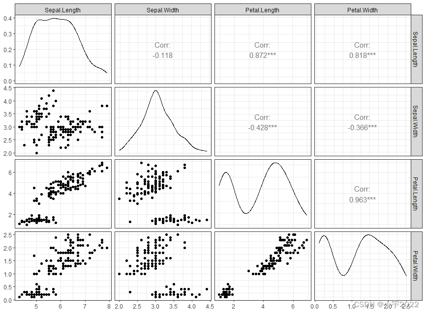
library(GGally)
ggpairs(iris[,-5])+ theme_bw()
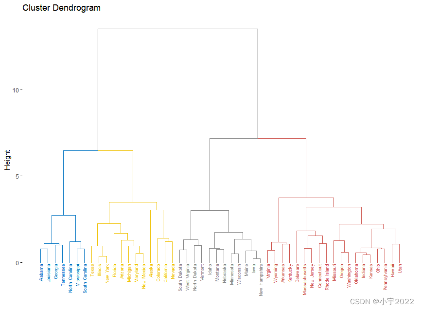
library(factoextra)
USArrests %>%
  scale() %>%                           # Scale the data
  dist() %>%                            # Compute distance matrix
  hclust(method = "ward.D2") %>%        # Hierarchical clustering
  fviz_dend(cex = 0.5, k = 4, palette = "jco") # Visualize and cut
# into 4 groups
library(ggpubr)
# Data preparation
housetasks <- read.delim(
  system.file("demo-data/housetasks.txt", package = "ggpubr"),
  row.names = 1
)
head(housetasks, 4)
# Visualization
ggballoonplot(housetasks, fill = "value")+
  scale_fill_viridis_c(option = "C")

边栏推荐
- [idea] use the plug-in to reverse generate code with one click
- 基于 Openzeppelin 的可升级合约解决方案的注意事项
- 【多线程】主线程等待子线程执行完毕在执行并获取执行结果的方式记录(有注解代码无坑)
- JS -- take a number randomly from the array every call, and it cannot be the same as the last time
- HOW TO ADD P-VALUES ONTO A GROUPED GGPLOT USING THE GGPUBR R PACKAGE
- Analyse de l'industrie
- 行业的分析
- deepTools对ChIP-seq数据可视化
- CTF record
- QT meter custom control
猜你喜欢

How to Create a Beautiful Plots in R with Summary Statistics Labels
Research on and off the Oracle chain

Attribute acquisition method and operation notes of C # multidimensional array

Summary of data export methods in powerbi
How to Create a Nice Box and Whisker Plot in R
map集合赋值到数据库

JS -- take a number randomly from the array every call, and it cannot be the same as the last time

The computer screen is black for no reason, and the brightness cannot be adjusted.
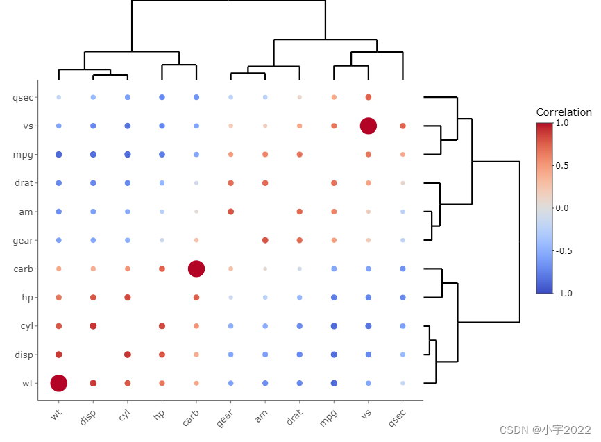
HOW TO CREATE AN INTERACTIVE CORRELATION MATRIX HEATMAP IN R

文件操作(详解!)
随机推荐
C#基于当前时间,获取唯一识别号(ID)的方法
Mmrotate rotation target detection framework usage record
Industry analysis
Seriation in R: How to Optimally Order Objects in a Data Matrice
【2022 ACTF-wp】
Implementation of address book (file version)
deepTools对ChIP-seq数据可视化
Homer forecast motif
MySQL basic statement
CTF record
Installation of ROS gazebo related packages
SSRF
GGPLOT: HOW TO DISPLAY THE LAST VALUE OF EACH LINE AS LABEL
Digital transformation takes the lead to resume production and work, and online and offline full integration rebuilds business logic
How to Add P-Values onto Horizontal GGPLOTS
R HISTOGRAM EXAMPLE QUICK REFERENCE
easyExcel和lombok注解以及swagger常用注解
MySQL linked list data storage query sorting problem
ROS lacks xacro package
Easyexcel and Lombok annotations and commonly used swagger annotations