当前位置:网站首页>Data analysis - Matplotlib sample code
Data analysis - Matplotlib sample code
2022-07-02 11:48:00 【yinshuilan】
import pandas as pd
import numpy as np
import matplotlib.pyplot as plt


x = np.linspace(-2, 2, 100)
y1 = np.cos(np.pi * x)
y2 = np.sin(np.pi * x)
plt.plot(x, y1, "go", label=r"$y1=\cos(\pi \times x)$", alpha=0.8, linewidth=0.7)
plt.plot(x, y2, "r-", label=r"$y2=\sin(\pi \times x)$", alpha=0.8, linewidth=0.7)
df = pd.DataFrame(np.random.randint(0, 100, size=(100, 1)), columns=list('A'))

plt.annotate("important Point", (0, 1), xytext=(-1.5, 1.1), arrowprops=dict(arrowstyle='->'))

plt.xlabel("x-axis")
plt.ylabel("y-axis")

#  Set the coordinate range [xmin, xmax, ymin, ymax]
plt.axis([-2.1, 2.1, -1.2, 1.2])

#  Show labels
plt.legend()
#  Show grid
plt.grid(alpha=0.4)
plt.title("Two Plots", color=(0.1, 0.3, 0.5))
plt.show()
The operation input is shown in the figure below :

import matplotlib as mpl
mpl.rcParams["font.sans-serif"] = ["Microsoft YaHei"]
mpl.rcParams['axes.unicode_minus'] = False
about Ubuntu System , You need to manually specify the font to realize the display of Chinese . The setup code is as follows .

边栏推荐
- Tiktok overseas tiktok: finalizing the final data security agreement with Biden government
- Order by injection
- qt 仪表自定义控件
- K-Means Clustering Visualization in R: Step By Step Guide
- MTK full dump grab
- Never forget, there will be echoes | hanging mirror sincerely invites you to participate in the opensca user award research
- ESP32音频框架 ESP-ADF 添加按键外设流程代码跟踪
- PHP query distance according to longitude and latitude
- 抖音海外版TikTok:正与拜登政府敲定最终数据安全协议
- [cloud native] 2.5 kubernetes core practice (Part 2)
猜你喜欢
![[visual studio 2019] create and import cmake project](/img/51/6c2575030c5103aee6c02bec8d5e77.jpg)
[visual studio 2019] create and import cmake project
动态内存(进阶四)

C#多维数组的属性获取方法及操作注意

在连接mysql数据库的时候一直报错
![[visual studio 2019] create MFC desktop program (install MFC development components | create MFC application | edit MFC application window | add click event for button | Modify button text | open appl](/img/6a/111da81436659c7502648907ec1367.jpg)
[visual studio 2019] create MFC desktop program (install MFC development components | create MFC application | edit MFC application window | add click event for button | Modify button text | open appl

RPA advanced (II) uipath application practice
![[idea] use the plug-in to reverse generate code with one click](/img/b0/00375e61af764a77ea0150bf4f6d9d.png)
[idea] use the plug-in to reverse generate code with one click
VS2019代码中包含中文内容导致的编译错误和打印输出乱码问题
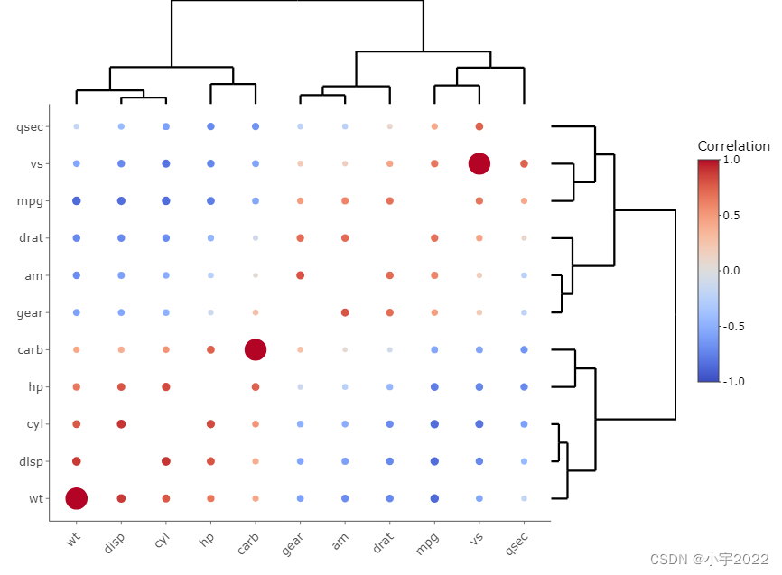
HOW TO CREATE AN INTERACTIVE CORRELATION MATRIX HEATMAP IN R
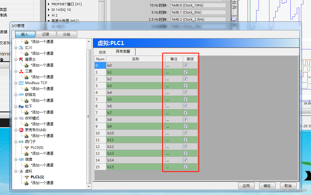
PLC-Recorder快速监控多个PLC位的技巧
随机推荐
Precautions for scalable contract solution based on openzeppelin
How to Visualize Missing Data in R using a Heatmap
C file and folder operation
Never forget, there will be echoes | hanging mirror sincerely invites you to participate in the opensca user award research
制造业数字化转型和精益生产什么关系
MySQL比较运算符IN问题求解
map集合赋值到数据库
预言机链上链下调研
Research on and off the Oracle chain
STM32 single chip microcomputer programming learning
在连接mysql数据库的时候一直报错
Attribute acquisition method and operation notes of C # multidimensional array
Eight sorting summaries
RPA advanced (II) uipath application practice
Installation of ROS gazebo related packages
What week is a date obtained by QT
Seriation in R: How to Optimally Order Objects in a Data Matrice
Summary of flutter problems
QT获取某个日期是第几周
vant tabs组件选中第一个下划线位置异常