当前位置:网站首页>Matplotlib drawing interface settings
Matplotlib drawing interface settings
2022-07-07 21:43:00 【En^_^ Joy】
List of articles
Coordinate limits and titles
| Code | meaning | Parameters |
|---|---|---|
| plt.xlim() | Definition x Axis coordinate limit | Leftmost value , The rightmost value |
| plt.ylim() | Definition y Axis coordinate limit | The lowest value , The top value |
| plt.axis() | Set coordinate limits | [xmin,xmax,ymin,ymax] |
plt.axis('tight') | Tighten the axis , Leave no blank | |
plt.axis('equal') | Set the resolution of the graphics displayed on the screen ( Ratio of unit length of two axes ) | |
| plt.title() | Graphic title | |
| plt.xlabel() | x Axis title | |
| plt.ylabel() | y Axis title | |
| plt.style.use() | Table style | |
ax.spines['top'].set_color('none') | Hide the axis top boundary | |
ax.spines['right'].set_color('none') | Hide the right boundary of the coordinate axis | |
| ax.xaxis.set_major_locator(MultipleLocator(2)) | Definition x The scale unit of the coordinate axis | Need to be from matplotlib.pyplot import MultipleLocator |
| ax.yaxis.set_major_locator(MultipleLocator(0.1)) | Definition y The scale unit of the coordinate axis | Need to be from matplotlib.pyplot import MultipleLocator |
| plt.xticks() | Change the scale | coordinates , Substitute data ([0.2, 0.4, 0.6], ['A', 'B', 'C']) |
Table style
Use plt.style.available You can see all the styles
| Solarize_Light2 | _classic_test_patch | bmh | classic | dark_background |
| fast | fivethirtyeight | ggplot | grayscale | seaborn |
| seaborn-bright | seaborn-colorblind | seaborn-dark | seaborn-dark-palette | seaborn-darkgrid |
| seaborn-deep | seaborn-muted | seaborn-notebook | seaborn-paper | seaborn-pastel |
| seaborn-poster | seaborn-talk | seaborn-ticks | seaborn-white | seaborn-whitegrid |
| tableau-colorblind10 |
How to use style sheets
plt.style.use('fivethirtyeight')
This will change the style of all tables , if necessary , You can use the style context manager to temporarily change to another style :
with plt.style.context('fivethirtyeight'):
    plt.plot([1,2,3], [3,1,2])
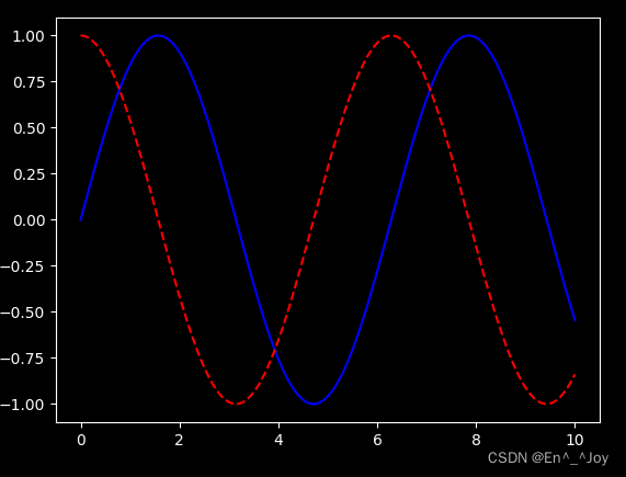
dark_background style
plt.style.use('dark_background')

x = np.linspace(0,10,1000)
fig, ax = plt.subplots()
ax.plot(x, np.sin(x),'-b')
ax.plot(x, np.cos(x), '--r')
Words and notes
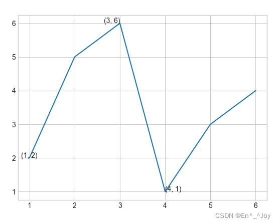
plt.text(): Add notes ( be equal to ax.text())
This method requires x Axis position 、y Axis position 、 character string 、 And some optional parameters , Such as the color of the text 、 Font size 、 style 、 Alignment, etc
plt.plot([1,2,3,4,5,6], [2,5,6,1,3,4])

#  Add text to the diagram
ax.text(1,2,(1,2), ha='center')
ax.text(3,6,'(3, 6)', ha='right')
ax.text(4,1,str((4,1)))
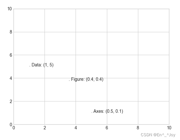
transform Parameters : Coordinate transformation and text position
ax.transData: Coordinate transformation based on data ( Axis )ax.transAxes: Coordinate transformation based on coordinate axis ( In axis dimensions )( Coordinate system scale )fig.transFigure: Coordinate transformation based on graphics ( In drawing dimensions )( Figure scale )
ax.set_xlim(0,10)
ax.set_ylim(0,10)

#  Add text to the diagram
ax.text(1, 5, ". Data: (1, 5)", transform=ax.transData)
ax.text(0.5, 0.1, ". Axes: (0.5, 0.1)", transform=ax.transAxes)
ax.text(0.4, 0.4, ". Figure: (0.4, 0.4)", transform=fig.transFigure)
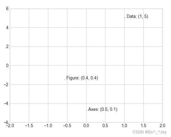
When changing the coordinate axis , Only ax.transData Your point will change
ax.set_xlim(-2,2)
ax.set_ylim(-6,6)
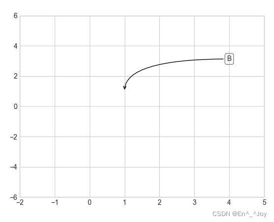
Arrows and notes
plt.annotate(): Draw arrows and notes
ax.set_xlim(-2,5)
ax.set_ylim(-6,6)

ax.annotate('A', xy=(3, 1), xytext=(4, 4), arrowprops=dict(facecolor='black', shrink=0.05))
ax.annotate('B', xy=(1, 1), xytext=(4, 3), arrowprops=dict(arrowstyle="->", connectionstyle="angle3,angleA=0,angleB=-90"))
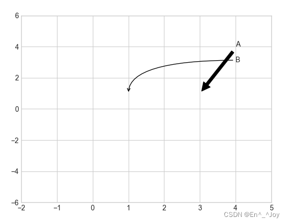
ax.annotate('B', xy=(1, 1), bbox=dict(boxstyle="round",fc="none",ec="gray"), xytext=(4, 3),
            ha='center',arrowprops=dict(arrowstyle="->", connectionstyle="angle3,angleA=0,angleB=-90"))
Custom coordinate scale
Define the scale unit of the coordinate axis
ax.xaxis.set_major_locator(MultipleLocator(0.2))
ax.yaxis.set_major_locator(MultipleLocator(0.3))
Hide the upper boundary right boundary
ax.spines['top'].set_color('none')
ax.spines['right'].set_color('none')
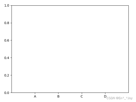
Change the scale
plt.xticks([0.2, 0.4, 0.6, 0.8], ['A', 'B', 'C', 'D'])
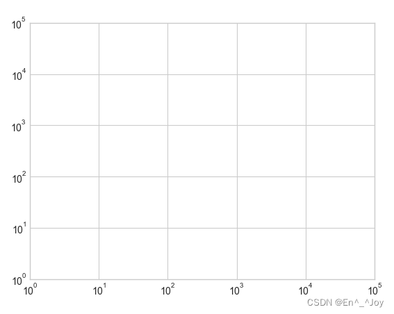
Major and minor scales
The main scale tends to be larger , Secondary scales tend to be smaller , For example, logarithmic graph
#  Create graphics
fig = plt.figure()
#  Axis
ax = plt.axes(xscale='log', yscale='log')
ax.set_xlim(10**0,10**5)
ax.set_ylim(10**0,10**5)
Set the formatter and locator Custom scale properties
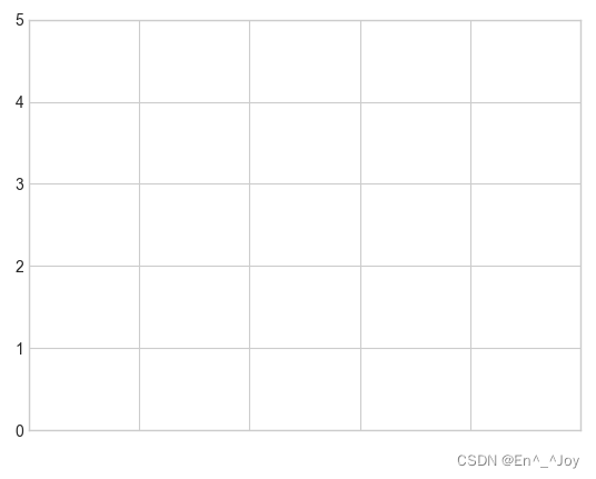
Hide scales and labels
Hidden scales and labels are usually used plt.NullLocator() And plt.NullFormatter() Realization
Below we remove X Axis labels ( But the tick marks are preserved / Gridlines ),Y Axis scale ( The label is also removed )
#  Create graphics
fig = plt.figure()
#  Axis
ax = plt.axes()
ax.set_xlim(0,5)
ax.set_ylim(0, 5)

ax.yaxis.set_major_locator(plt.NullLocator())
ax.xaxis.set_major_formatter(plt.NullFormatter())
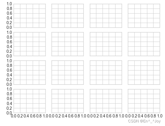
Increase or decrease the number of scales
adopt plt.MaxNLocator() Set the maximum number of scales displayed
fig, ax = plt.subplots(4, 4, sharex=True, sharey=True)
for axi in ax.flat:
    axi.xaxis.set_major_locator(plt.MaxNLocator(5))
    axi.yaxis.set_major_locator(plt.MaxNLocator(5))
Summary of format generator and locator
| Locator class | describe |
|---|---|
| NullLocator | No scale |
| FixedLocator | The scale position is fixed |
| IndexLocator | Use index as locator ( Such as x=range(len(y)) |
| LinearLocator | from min To max Command the scale evenly |
| LogLocator | from min To max Scale by logarithmic distribution |
| MultipleLocator | Scale and range are cardinal numbers (base) Multiple |
| MaxNLocator | Find the best position for the maximum scale |
| AutoLocator | ( Default ) With MaxNLocator Simple configuration |
| AutoMinorLocator | Locator for minor scale |
| Format generator class | describe |
|---|---|
| NullFormatter | There is no label on the scale |
| IndexFormatter | Set a set of labels as a string |
| FixedFormatter | Manually label the scale |
| FuncFormatter | Set labels with custom functions |
| FormatStrFormatter | Set the string format for each scale value |
| ScalarFormatter | ( Default ) Set the label for the label value |
| LogFormatter | Default format generator for logarithmic axes |
Explanation of the meaning of the figure and line ( legend )
| function | Parameters | meaning |
|---|---|---|
| ax.legend() | There can be no parameters , You can also have the following parameters | Create line meaning |
loc='upper left' | The drawing line shows the position | |
frameon=False | Cancel the legend outline | |
ncol=2 | Number of legend label columns | |
fancybox=True | Legend rounded border | |
framealpha=0.5 | Border transparency | |
borderpad=1 | Text spacing | |
shadow=True | Add shadow |
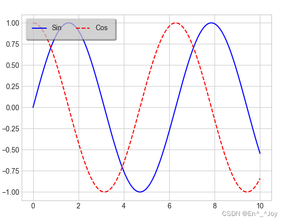
plt.legend(): Create a legend containing each graphic element
x = np.linspace(0,10,1000)
fig, ax = plt.subplots()
ax.plot(x, np.sin(x),'-b', label='Sin')
ax.plot(x, np.cos(x), '--r', label='Cos')

leg = ax.legend(loc='upper left', frameon=True, ncol=2, fancybox=True, framealpha=0.5, borderpad=1, shadow=True)
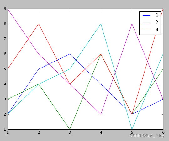
Select the element shown in the legend
By means of plt.plot() Use or not use label Parameter to determine whether the icon is displayed
x = [1,2,3,4,5,6]
plt.plot(x, [2,5,6,4,2,3], label='1')
plt.plot(x, [3,4,1,6,2,5], label='2')
plt.plot(x, [5,8,4,6,2,9])
plt.plot(x, [2,4,5,8,1,6], label='4')
plt.plot(x, [9,6,4,2,8,3])

#  Show icons
plt.legend()
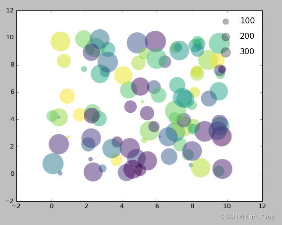
Show points of different sizes in the legend
la = np.random.uniform(0,10,100) #  Abscissa
lo = np.random.uniform(0,10,100)  #  Ordinate
po = np.random.randint(0,100,100)  #  Color
ar = np.random.randint(0,1000,100)  #  size

#  drawing
plt.scatter(lo, la, label=None, c=po, cmap='viridis', s=ar,linewidth=0, alpha=0.5)
#  Draw a legend
for ar in [100,200,300]:
    plt.scatter([],[],c='k',alpha=0.3, s=ar,label=str(ar))


#  Show icons
plt.legend(scatterpoints=1, frameon=False, labelspacing=1)
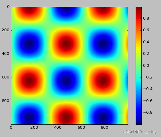
Configure color bar
Add a title to the color bar
cd = plt.colorbar()
cb.set_label('label')
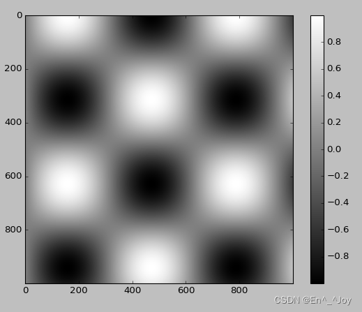
adopt plt.colorbat Function to create a color bar
#  drawing
x = np.linspace(0,10,1000)
I = np.sin(x)*np.cos(x[:,np.newaxis])

plt.imshow(I)
plt.colorbar()
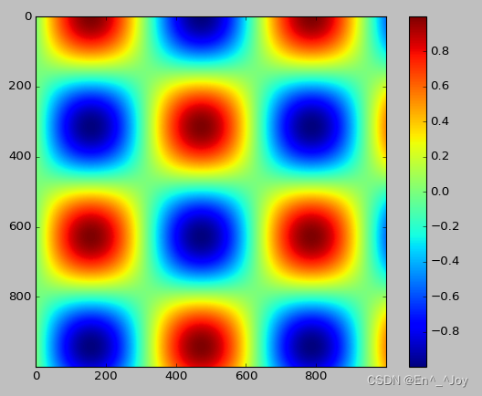
Configure color bar
cmap Parameters : Set the color scheme of the color bar
plt.imshow(I, cmap='gray')
Sequential color scheme : A color scheme consisting of a continuous set of colors ( for example binary or viridis) Reciprocal color scheme : It consists of two complementary colors , Indicates two meanings ( for example RdBu or PuOr) Qualitative color schemes : A set of colors in random order ( for example rainbow or jet)
plt.imshow(I,cmap='jet')
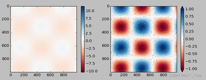
Limitation of color bar scale and setting of extended function
It can shorten the upper and lower limits of color values , For data beyond the upper and lower limits , adopt extend Parameters use triangle arrows to represent numbers larger or smaller than the upper limit
x = np.linspace(0,10,1000)
I = np.sin(x)*np.cos(x[:,np.newaxis])
#  Set... For the image 1% noise
speckles = (np.random.random(I.shape)<0.01)
I[speckles] = np.random.normal(0,3,np.count_nonzero(speckles))

plt.figure(figsize=(10,3.5))

plt.subplot(1,2,1)
plt.imshow(I, cmap='RdBu')
plt.colorbar()

plt.subplot(1,2,2)
plt.imshow(I, cmap='RdBu')
plt.colorbar(extend='both')
plt.clim(-1,1)
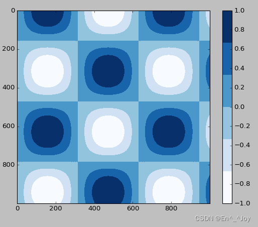
Discrete color bar
Sometimes it is necessary to represent discrete data , have access to plt.cm.get_cmap() Parameters
x = np.linspace(0,10,1000)
I = np.sin(x)*np.cos(x[:,np.newaxis])

plt.imshow(I, cmap=plt.cm.get_cmap('Blues', 6))
plt.colorbar()
plt.clim(-1,1)
Manually configure the drawing
# With a gray background
ax = plt.axes(fc='#E6E6E6')
ax.set_axisbelow(True)
# Draw a white grid line
plt.grid(color='w', linestyle='solid')
# Hide the lines of the axis
for spine in ax.spines.values():
spine.set_visible(False)
# Hide the upper and right scales
ax.xaxis.tick_bottom()
ax.yaxis.tick_left()
# Weaken scale and label
ax.tick_params(colors='gray', direction='out')
for tick in ax.get_xticklabels():
tick.set_color('gray')
for tick in ax.get_yticklabels():
tick.set_color('gray')
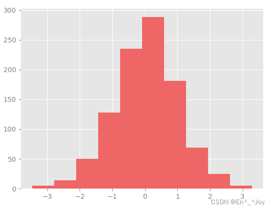
# Set the frequency histogram contour setting and fill color
ax.hist(x, edgecolor='#E6E6E6', color='#EE6666')
This method is very troublesome to configure , The following method only needs to be configured once and can be used on all graphics
Modify default configuration :rcParams
import matplotlib as mpl
import matplotlib.pyplot as plt
import numpy as np
from matplotlib import cycler
#fig, ax = plt.subplots()
# Copy the current rcParams Dictionaries , Change enough to restore
Ipython_default = plt.rcParams.copy()
# use plt.rc Function to modify configuration parameters
colors = cycler('color', ['#EE6666', '#3388BB', '#9988DD', '#EECC55', '#88BB44', '#FFBBBB'])
plt.rc('axes', facecolor='#E6E6E6', edgecolor='none', axisbelow=True, grid=True, prop_cycle=colors)
plt.rc('grid', color='w', linestyle='solid')
plt.rc('xtick', direction='out', color='gray')
plt.rc('ytick', direction='out', color='gray')
plt.rc('patch', edgecolor='#E6E6E6')
plt.rc('lines', linewidth=2)
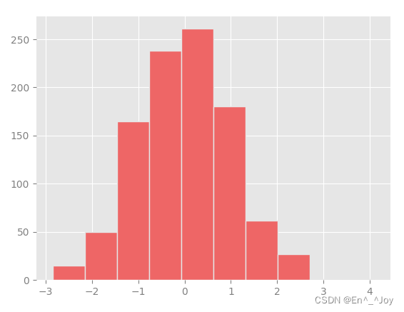
x = np.random.randn(1000)
plt.hist(x)
# display picture
plt.show()
Draw some line drawings to see rc Parameter effect
import matplotlib as mpl
import matplotlib.pyplot as plt
import numpy as np
from matplotlib import cycler
#fig, ax = plt.subplots()
# Copy the current rcParams Dictionaries , Change enough to restore
Ipython_default = plt.rcParams.copy()
# use plt.rc Function to modify configuration parameters
colors = cycler('color', ['#EE6666', '#3388BB', '#9988DD', '#EECC55', '#88BB44', '#FFBBBB'])
plt.rc('axes', facecolor='#E6E6E6', edgecolor='none', axisbelow=True, grid=True, prop_cycle=colors)
plt.rc('grid', color='w', linestyle='solid')
plt.rc('xtick', direction='out', color='gray')
plt.rc('ytick', direction='out', color='gray')
plt.rc('patch', edgecolor='#E6E6E6')
plt.rc('lines', linewidth=2)
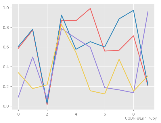
for i in range(4):
plt.plot(np.random.rand(10))
# display picture
plt.show()
stay Matplotlib file There is more information in it
Visual exception handling
The accepted range of certain data is 70±5, I measured that it was 75±10, Is my data consistent with accepted values
In the result of graphic visualization, the error is displayed by graphics , Can provide sufficient information
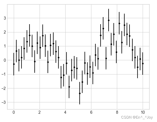
Basic error line (errorbar)
fmt Parameters : Control the appearance of lines and points
x = np.linspace(0,10,50)
dy = 0.8
y = np.sin(x)+dy*np.random.randn(50)

plt.errorbar(x,y,yerr=dy,fmt='.k')
errorbar You can define the style of error line graphics
x = np.linspace(0,10,50)
dy = 0.8
y = np.sin(x)+dy*np.random.randn(50)

plt.errorbar(x,y,yerr=dy,fmt='o',color='black',ecolor='lightgray',elinewidth=3,capsize=0)
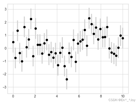
You can also set the horizontal error (xerr)、 Unilateral error (one-sidederrorbar)、 And other forms of error
边栏推荐
- Virtual machine network configuration in VMWare
- How polardb-x does distributed database hotspot analysis
- Automatic classification of defective photovoltaic module cells in electronic images
- Demon daddy guide post - simple version
- Debugging and handling the problem of jamming for about 30s during SSH login
- Jerry's configuration of TWS cross pairing [article]
- Jerry's about TWS channel configuration [chapter]
- Can I open a stock account directly online now? Is it safe?
- Is private equity legal in China? Is it safe?
- Use br to back up tidb cluster data to azure blob storage
猜你喜欢
QT compile IOT management platform 39 alarm linkage
Win11游戏模式怎么开启?Win11开启游戏模式的方法
Open source OA development platform: contract management user manual
Redis - basic use (key, string, list, set, Zset, hash, geo, bitmap, hyperloglog, transaction)
Default constraint and zero fill constraint of MySQL constraint

嵌入式开发:如何为项目选择合适的RTOS?
NVR硬盤錄像機通過國標GB28181協議接入EasyCVR,設備通道信息不顯示是什麼原因?
Win11时间怎么显示星期几?Win11怎么显示今天周几?
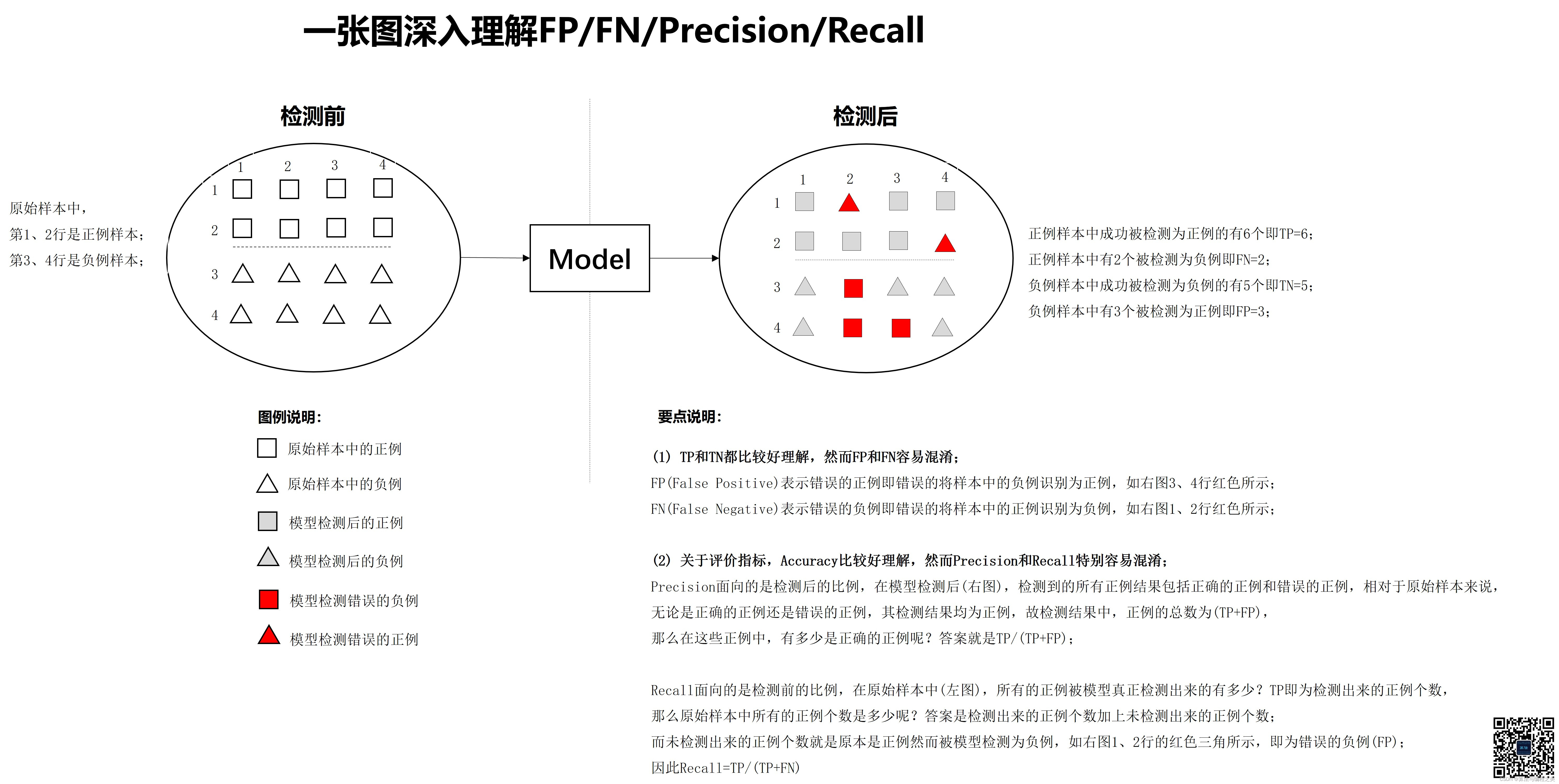
An in-depth understanding of fp/fn/precision/recall

2022 how to evaluate and select low code development platforms?
随机推荐
Codeforces 474 F. Ant colony
Meta force force meta universe system development fossage model
[开源] .Net ORM 访问 Firebird 数据库
开户必须往账户里面赚钱吗,资金安全吗?
现在网上开户安全么?想知道我现在在南宁,到哪里开户比较好?
Le capital - investissement est - il légal en Chine? C'est sûr?
Insufficient permissions
Jerry's about TWS pairing mode configuration [chapter]
POJ 3140 Contestants Division「建议收藏」
The new version of onespin 360 DV has been released, refreshing the experience of FPGA formal verification function
How polardb-x does distributed database hotspot analysis
UVA 12230 – crossing rivers (probability) "suggested collection"
What stocks can a new account holder buy? Is the stock trading account safe
Codeforces Round #275 (Div. 2) C – Diverse Permutation (构造)[通俗易懂]
Tupu digital twin coal mining system to create "hard power" of coal mining
【矩阵乘】【NOI 2012】【cogs963】随机数生成器
Demon daddy C
Win11游戏模式怎么开启?Win11开启游戏模式的方法
Restapi version control strategy [eolink translation]
特征生成