当前位置:网站首页>(4) Data visualization of R language -- matrix chart, histogram, pie chart, scatter chart, linear regression and strip chart
(4) Data visualization of R language -- matrix chart, histogram, pie chart, scatter chart, linear regression and strip chart
2022-07-06 12:21:00 【EricFrenzy】
notes : This blog aims to share personal learning experience , Please forgive me for any irregularities !
Catalog
Histogram Rectangle
In statistics , Rectangular graphs are often used to show a continuous variable ( Such as length 、 Weight and other measured values ) The distribution of . stay R In language, rectangular graph is constructed with hist() function , See the following example for details :
#hist() The first parameter of the function is data , It's used here sampleData The column title in the list is length The data of
#main Is the title of the diagram ;xlab yes x Axis title ;ylab yes y Axis title
#freq yes TRUE What I draw is frequency , yes FALSE What I draw is probability density
#breaks Determine the number of rectangles . there 20 There will be 20 A rectangle
#xlim and ylim Determine the scope of the drawing
hist(sampleData$length, main = "Histogram of Protein Lengths",
	xlab = "Length (AA)", ylab = "Frequency", freq = TRUE,breaks = 20,
	xlim = c(0,10000), ylim = c(0,7000))
The following figure shows the effect drawn :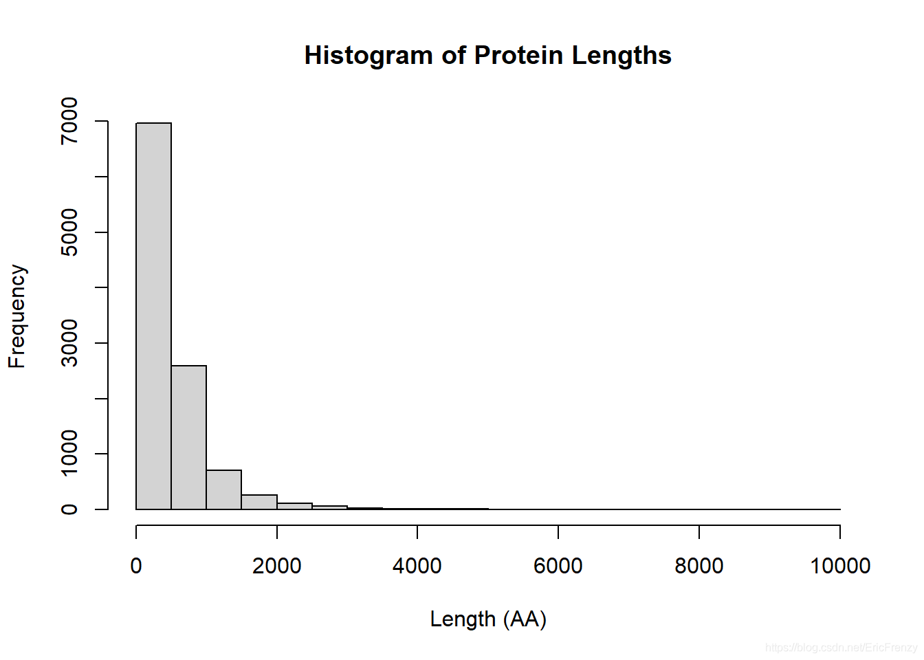
In this picture , We can find most protein length All in 2000 following , It is a very obvious positive skewness distribution .
Bar plot Histogram
Histogram is often used in statistics to show discontinuous variables ( Such as number 、 Count and measure money ) The distribution of . stay R The construction of histograms in language uses barplot() function , See the following example for details :
#barplot() The first parameter of is also the data used . Here is education The column title in the list is spending The data of
#names.arg It is equivalent to x value . This vector Corresponding to each year spending
#ylab yes y Axis title ;main Is the title of the diagram ;ylim yes y The scope of the shaft
#width Adjust the width of each column ;space Adjust the distance between columns
barplot(education$spending,
			names.arg = education$year,
			ylab = "Spending per student($)",
			main = "Education Spending per Student",
			ylim=c(0,7000))
The following figure shows the effect drawn :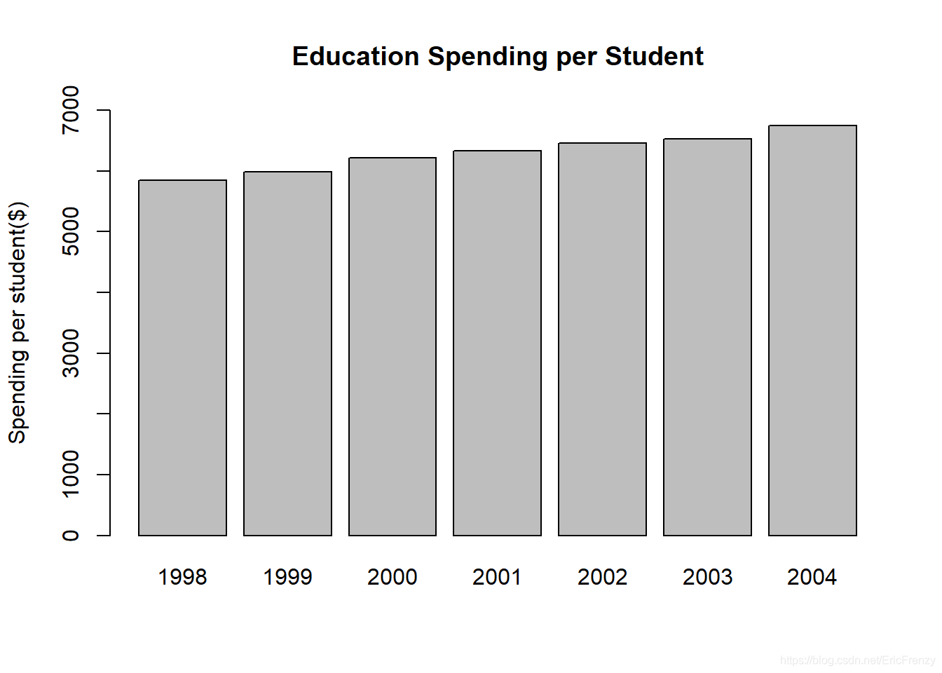
Visible in the sample data , The average number of students in education is increasing year by year .
Pie chart The pie chart
Pie chart can intuitively show the proportion of different kinds of data .R Language comes with pie() Function function is not very powerful . stay R See the following example for constructing pie charts in language :
#pie() The first parameter of is data , It can be the percentage of various classes in the total , It can also be the quantity of various kinds
#labels Is the data marked outside each sector , The format is vector
#main Is the title of the diagram
#col Adjust the color of each sector .rainbow() yes R Built in functions , It can divide rainbow colors into a specified number
#clockwise Adjust whether the drawing is clockwise or counterclockwise ;init.angle Adjust where the fan starts to draw
percentage <- c(36, 8, 17, 52)
desserts <- c("Ice cream", "Cookie", "Brownie", "Cake")
pie(percentage, labels = desserts,
		main = "Dessert Preference",
		col = rainbow(length(percentage)),
		clockwise = FALSE, init.angle = 0)
The following figure shows the effect drawn :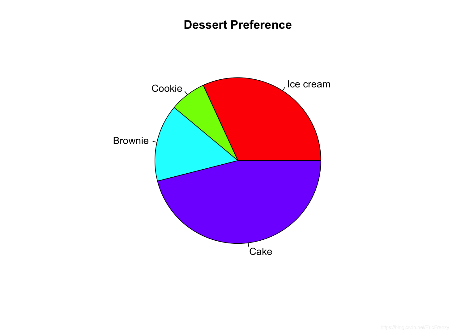
Dot plot Scatter plot
Scatter charts are often used in scientific experiments , Further analysis is carried out on the basis of visualizing independent variables and dependent variables . stay R In language, it is used to construct scatter diagram plot() function , See the following example for details :
a <- c(12, 17, 25, 33, 39, 45) # The independent variables (x)
b <- c(10, 13, 17, 20, 26, 31) # The dependent variable (y)
#plot() The first parameter of is the argument (x value ) data , The second parameter is the dependent variable (y value ) data
#main Set the title of the diagram ;xlab and ylab Set the title of the horizontal and vertical coordinates
plot(a, b, main="My Plot", xlab="x variable", ylab="y variable")

#lm(Y~X) Will generate a linear regression data , Including intercept and slope of regression function
#abline() This regression line will be drawn on the map ;col Set the color of the line
#summary() Will generate details about the regression line
abline(lm(b~a), col="red")
summary(lm(b~a))
The following figure shows the effect drawn :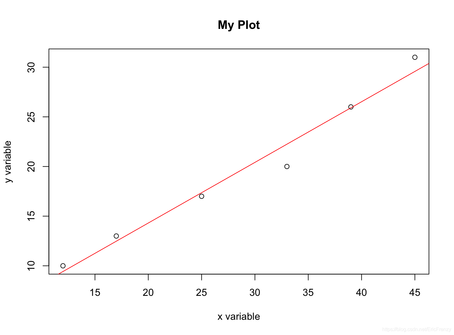
The following figure for summary() stay Console Output result :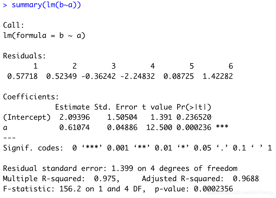
In the picture Estimate Below is the intercept of the regression line (2.09396) And the slope (0.61074).Multiple R-squared It's what we often use R Square value (0.975).
Box-and-whisker plot Box chart
The box chart can well show the distribution of data .R It is used to construct box graph in language boxplot() function , See the following example for details :
# The first few items of Fibonacci series are selected for the data
#boxplot() The first parameter of is data ;horizontal Whether the control chart is drawn horizontally
# It can also be used. main Set the title and xlab Set the horizontal axis title
data <- c(1, 1, 2, 3, 5, 8, 13, 21, 34)
boxplot(data, horizontal=TRUE)
The following figure shows the effect drawn :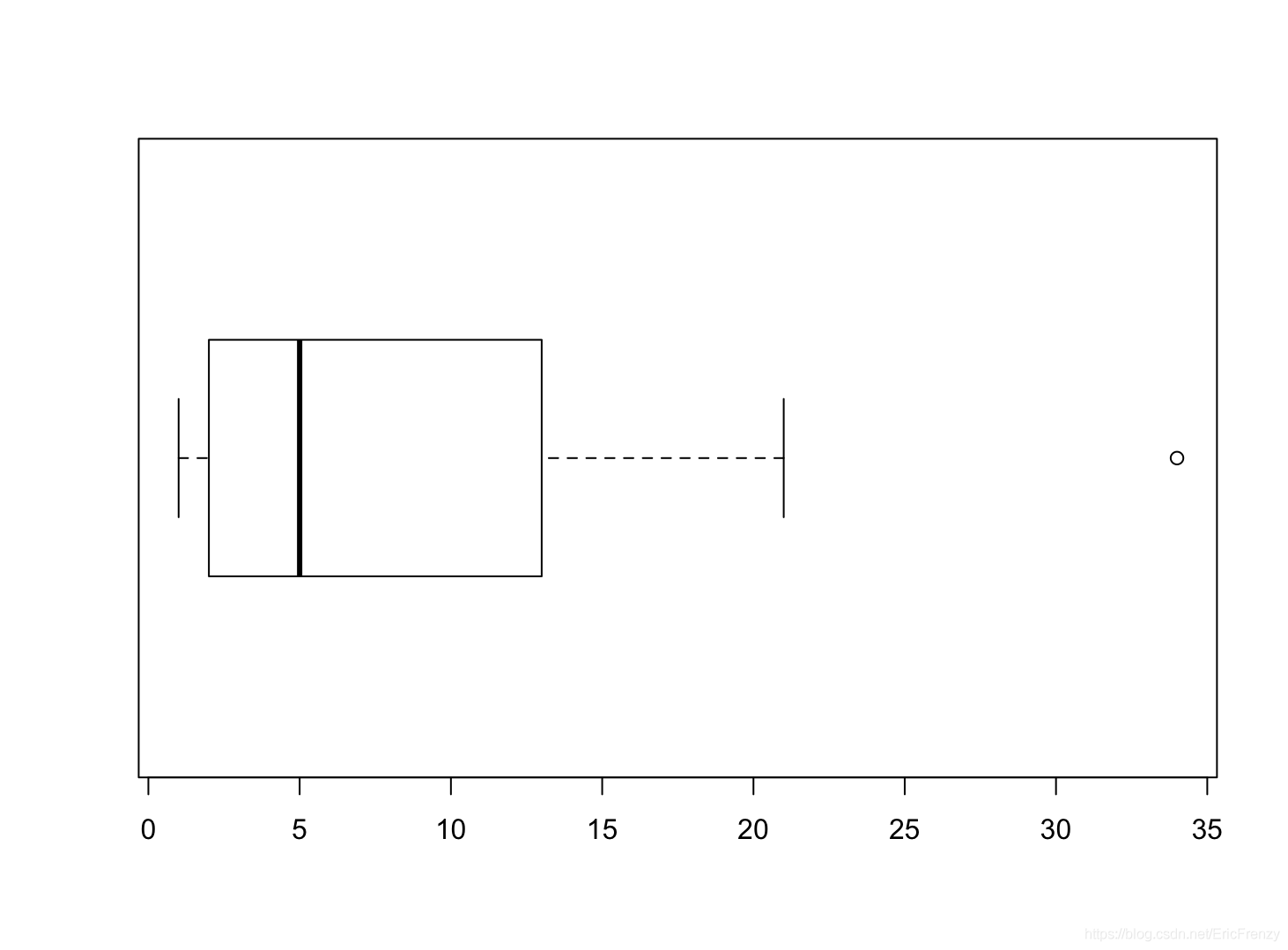
Look at the vertical line in the picture from left to right , We can see the lower edge of the data 、 Lower quartile 、 Median 、 Upper quartile 、 The upper edge , And circles represent outliers . It can be seen that this group of data has a positive skew distribution 、 It has characteristics such as outliers .
Strip chart Strip chart
A strip chart is similar to a one-dimensional scatter chart , The function is close to the box diagram , It can visually display the distribution of data under a small amount of data .R In language, banded graphs are constructed with stripchart() function , See the following example for details :
#stripchart() The first parameter of the function is data
#method Control the coincidence of data points ."jitter" To avoid overlapping ,"stack" To display points with the same value side by side , default "overplot" All the data generated is on a straight line ,
# If method="jitter",jitter Adjust the degree of dispersion of data points to avoid coincidence
# If method="stack",offset The interval between points with the same parameter adjustment value
# It can also be used main Set chart title ,xlab Set the horizontal axis title
data <- c(1, 1, 2, 3, 5, 8, 13, 21, 34)
par(mfrow=c(1, 2)) # Set two pictures to display side by side , The format here is 1 That's ok 2 Column
stripchart(data, method = "jitter", jitter=1)
stripchart(data, method = "stack", offset=1)
The following figure shows the effect drawn :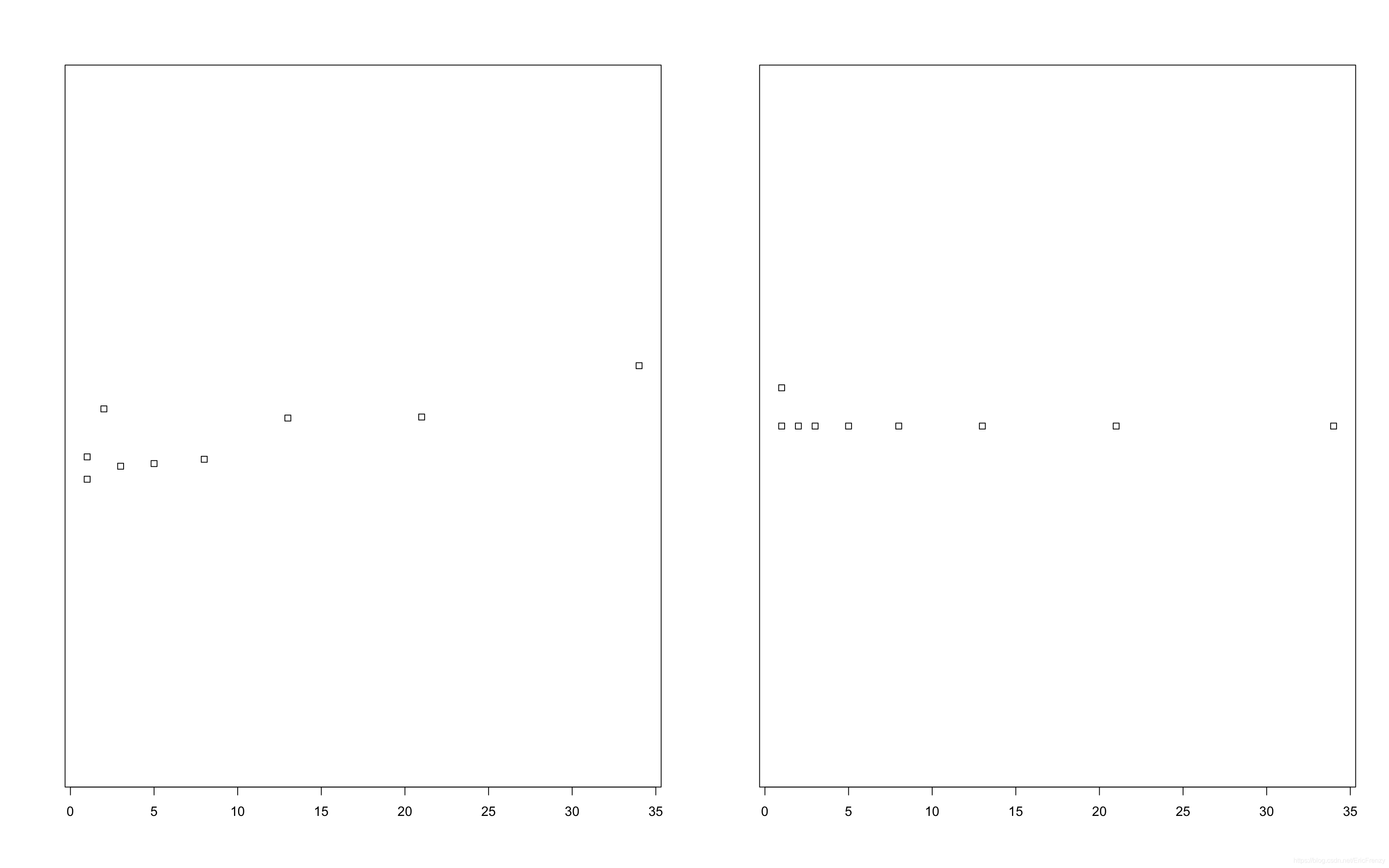
It can be seen that , Most of the data is more compact on the left , The more to the right, the more scattered .
Conclusion
Introduced so many uses R Language is a way to visualize data , The most important thing to do data analysis is to choose a graph suitable for data type and analysis purpose . If you have any questions or ideas, please leave messages and comments !
边栏推荐
- 嵌入式启动流程
- E-commerce data analysis -- salary prediction (linear regression)
- Pytorch four commonly used optimizer tests
- Arduino JSON data information parsing
- Several declarations about pointers [C language]
- Inline detailed explanation [C language]
- Selective sorting and bubble sorting [C language]
- ESP8266通过Arduino IDE连接Onenet云平台(MQTT)
- Priority inversion and deadlock
- Pat 1097 duplication on a linked list (25 points)
猜你喜欢

RT thread API reference manual
Mp3mini playback module Arduino < dfrobotdfplayermini H> function explanation
ORA-02030: can only select from fixed tables/views
MySQL占用内存过大解决方案
JS regular expression basic knowledge learning
![[golang] leetcode intermediate - fill in the next right node pointer of each node & the k-smallest element in the binary search tree](/img/6e/0802a92511ac50a652afa1678ad28c.jpg)
[golang] leetcode intermediate - fill in the next right node pointer of each node & the k-smallest element in the binary search tree
E-commerce data analysis -- salary prediction (linear regression)
JS 函数提升和var变量的声明提升
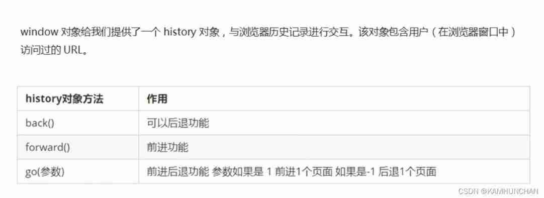
History object
JS function promotion and declaration promotion of VaR variable
随机推荐
Several declarations about pointers [C language]
程序设计大作业:教务管理系统(C语言)
JS正则表达式基础知识学习
Talking about the startup of Oracle Database
open-mmlab labelImg mmdetection
A possible cause and solution of "stuck" main thread of RT thread
JS function promotion and declaration promotion of VaR variable
ES6 grammar summary -- Part 2 (advanced part es6~es11)
The dolphin scheduler remotely executes shell scripts through the expect command
Single chip Bluetooth wireless burning
数据库课程设计:高校教务管理系统(含代码)
(四)R语言的数据可视化——矩阵图、柱状图、饼图、散点图与线性回归、带状图
單片機藍牙無線燒錄
Fashion-Gen: The Generative Fashion Dataset and Challenge 论文解读&数据集介绍
arduino获取随机数
【ESP32学习-2】esp32地址映射
MySQL占用内存过大解决方案
ESP8266使用arduino连接阿里云物联网
Redis cache update strategy, cache penetration, avalanche, breakdown problems
Oppo vooc fast charging circuit and protocol