当前位置:网站首页>An article will introduce you to CSS3 background knowledge
An article will introduce you to CSS3 background knowledge
2020-11-06 20:48:00 【Python advanced】
CSS3 Contains several new background properties , Provides greater control of background elements .
One 、 Browser support
The number in the table specifies the first browser version that fully supports this property .
After the number -webkit- perhaps -moz- You need to specify the prefix when you use it .
| attribute | Chrome | Firefox | Safari | Opera | IE |
|---|---|---|---|---|---|
| background-image ( Multi background ) | 4.0 | 9.0 | 3.6 | 3.1 | 11.5 |
| background-size | 4.0 1.0 -webkit- | 9.0 | 4.0 3.6 -moz- | 4.1 3.0 -webkit- | 10.5 10.0 |
| background-origin | 1.0 | 9.0 | 4.0 | 3.0 | 10.5 |
| background-clip | 4.0 | 9.0 | 4.0 | 3.0 | 10.5 |
Two 、CSS3 Multi background
CSS3 Allows you to add multiple background images to an element , By using background-image attribute . Different background images are separated by commas , The images are superimposed together ,
example : There are two background images , The first image is the background image ( In the lower right corner ) And the second image is a GIF Moving graph ( In the upper left corner ).
The code is as follows :
<!DOCTYPE HTML>
<meta charset="utf-8">
<title> project </title>
<head>
<style>
    #example1 {

    background-image: url(img/fy_indexBg.jpg), url(img/17I_hd.mp4.gif);
    background-position: right bottom, left top;
    background-repeat: no-repeat, repeat;
}
</style>
</head>
<html>

<body>
 <div id="example1">
    <h1>Lorem Ipsum Dolor</h1>
    <p>Lorem ipsum dolor sit amet, consectetuer adipiscing elit, sed diam nonummy nibh euismod tincidunt ut laoreet dolore magna aliquam erat volutpat.</p>
    <p>Ut wisi enim ad minim veniam, quis nostrud exerci tation ullamcorper suscipit lobortis nisl ut aliquip ex ea commodo consequat.</p>
  </div>
</body>

</html>

You can use separate background properties ( As shown above ) Or background abbreviation property to specify multiple background images .
The following example uses background shorthand
( The above example , It has the same result )
#example1 {
    background: url(img_flwr.gif) right bottom no-repeat, url(paper.gif) left top repeat;
}
1. CSS3 Background dimensions
CSS3 background-size Property allows you to specify the size of the background image .
stay CSS3 The previous background image size is the actual size of the image .CSS3 Allows us to use background images in different contexts .
size You can specify the length 、 percentage , Or by using a keyword : contain perhaps cover.
Example : The background image of the picture is much smaller than the original image ( In pixels ):
The code is as follows :
<!DOCTYPE html>
<html lang="en">
<head>
  <meta charset="UTF-8">
  <title> project </title>
  <style>
    #example1 {
        border: 1px solid black;
        background:url(img_flwr.gif);
        background-repeat: no-repeat;
        padding:15px;
    }

    #example2 {
        border: 1px solid black;
        background:url(img_flwr.gif);
        background-size: 100px 80px;
        background-repeat: no-repeat;
        padding:15px;
    }
</style>
</head>
<body>

  <p> Original background :</p>
  <div id="example1">
    <h2>Lorem Ipsum Dolor</h2>
    <p>Lorem ipsum dolor sit amet, consectetuer adipiscing elit, sed diam nonummy nibh euismod tincidunt ut laoreet dolore magna aliquam erat volutpat.</p>
    <p>Ut wisi enim ad minim veniam, quis nostrud exerci tation ullamcorper suscipit lobortis nisl ut aliquip ex ea commodo consequat.</p>
  </div>

  <p> Zoom background image :</p>
  <div id="example2">
    <h2>Lorem Ipsum Dolor</h2>
    <p>Lorem ipsum dolor sit amet, consectetuer adipiscing elit, sed diam nonummy nibh euismod tincidunt ut laoreet dolore magna aliquam erat volutpat.</p>
    <p>Ut wisi enim ad minim veniam, quis nostrud exerci tation ullamcorper suscipit lobortis nisl ut aliquip ex ea commodo consequat.</p>
  </div>

</body>
</html>
background-size The two possible values for an attribute are :contain and cover.
The background image with keyword scale should be as large as possible ( But its width and height must be in the content area ). therefore , According to the scale of the background image and the location of the background area , It may not be covered by the background image .
cover Key words zoom background image , The content area completely covers the background image ( Its width and height are equal to or greater than the content of the range ). therefore , Some parts of the background image may not be visible in the background area .
The following example demonstrates the use of contain and cover:
#div1 {
    background: url(img_flower.jpg);
    background-size: contain;
    background-repeat: no-repeat;
}
#div2 {
    background: url(img_flower.jpg);
    background-size: cover;
    background-repeat: no-repeat;
}

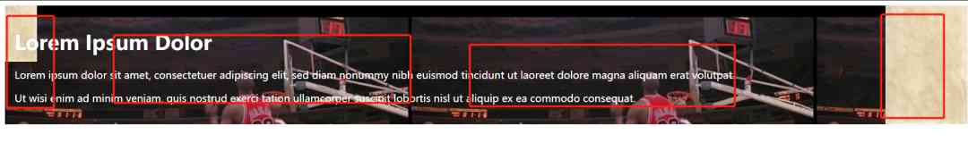
2. Define background images of multiple sizes
background-size Property also accepts multiple background values ( Separate the list with commas ), When dealing with multiple backgrounds .
The following example specifies three background images , Each image has a different background-size value :
<!DOCTYPE html>
<html lang="en">

    <head>
        <meta charset="UTF-8">
        <title> project </title>
        <style>
            #example1 {
                background: url(img/fy_indexBg.jpg) left top no-repeat, url(img/fy_indexBg.jpg) right bottom no-repeat, url(img/17I_hd.mp4.gif) left top repeat;
                padding: 15px;
                background-size: 50px, 130px, auto;
                color: white;
            }
</style>
    </head>

    <body>

        <div id="example1">
            <h1>Lorem Ipsum Dolor</h1>
            <p>Lorem ipsum dolor sit amet, consectetuer adipiscing elit, sed diam nonummy nibh euismod tincidunt ut laoreet dolore magna aliquam erat volutpat.</p>
            <p>Ut wisi enim ad minim veniam, quis nostrud exerci tation ullamcorper suscipit lobortis nisl ut aliquip ex ea commodo consequat.</p>
        </div>

    </body>

</html>
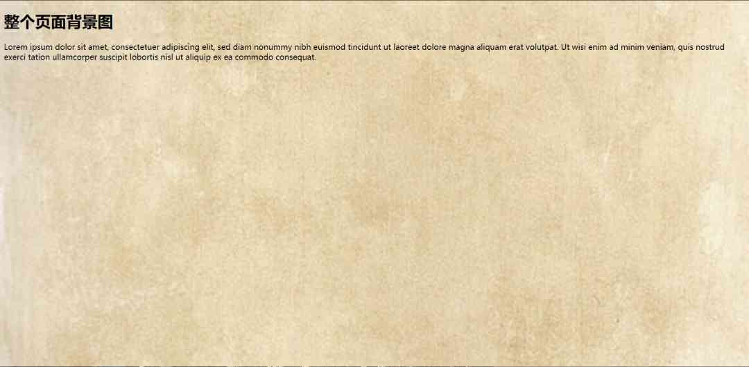
3. Full size background image
If you want to have a background image on a website that covers the entire browser window ..
Requirements are as follows :
Images that fill the entire page ( There is no blank space )
-
Zoom image
-
Image center page
-
No scroll bar
The following example shows how to use HTML Elements (HTML The element is always the height of the browser window ). Then set a fixed center on the background . And then use background-size Property to adjust its size :
<!DOCTYPE html>
<html lang="en">
<head>
  <meta charset="UTF-8">
  <title> project </title>
  <style>
    html {
      background: url(img/fy_indexBg.jpg) no-repeat center fixed;
      background-size: cover;
    }
</style>
</head>
<body>

  <h1> Background image of the whole page </h1>
  <p>Lorem ipsum dolor sit amet, consectetuer adipiscing elit, sed diam nonummy nibh euismod tincidunt ut laoreet dolore magna aliquam erat volutpat. Ut wisi enim ad minim veniam, quis nostrud exerci tation ullamcorper
    suscipit lobortis nisl ut aliquip ex ea commodo consequat.</p>

</body>
</html>
3、 ... and 、 attribute
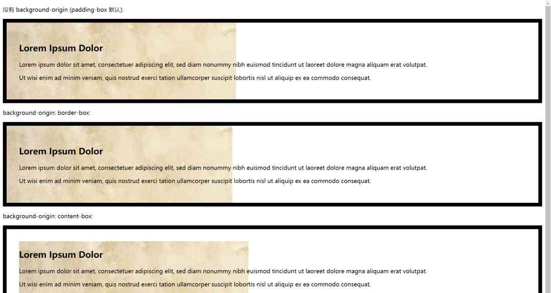
1. background-origin attribute
CSS3 background-origin Property specifies where to locate in the background image .
This property has three different values :
border-box : The background image starts at the top left corner of the frame .
padding-box :( Default ) Background image from the top left corner of the filled edge .
content-box : Background image from the top left corner of the content
The following example illustrates background-origin attribute :
#example1 {
        border: 10px solid black;
        padding: 35px;
        background: url(img/fy_indexBg.jpg);
        background-repeat: no-repeat;
    }

    #example2 {
        border: 10px solid black;
        padding: 35px;
        background: url(img/fy_indexBg.jpg);
        background-repeat: no-repeat;
        background-origin: border-box;
    }

    #example3 {
        border: 10px solid black;
        padding: 35px;
        background: url(img/fy_indexBg.jpg);
        background-repeat: no-repeat;
        background-origin: content-box;
    }
Complete code :
<!DOCTYPE html>
<html lang="en">
<head>
<meta charset="UTF-8">
<title> Programming dictionary </title>
<style>
#example1 {
border: 10px solid black;
padding: 35px;
background: url(img/fy_indexBg.jpg);
background-repeat: no-repeat;
}
#example2 {
border: 10px solid black;
padding: 35px;
background: url(img/fy_indexBg.jpg);
background-repeat: no-repeat;
background-origin: border-box;
}
#example3 {
border: 10px solid black;
padding: 35px;
background: url(img/fy_indexBg.jpg);
background-repeat: no-repeat;
background-origin: content-box;
}
</style>
</head>
<body>
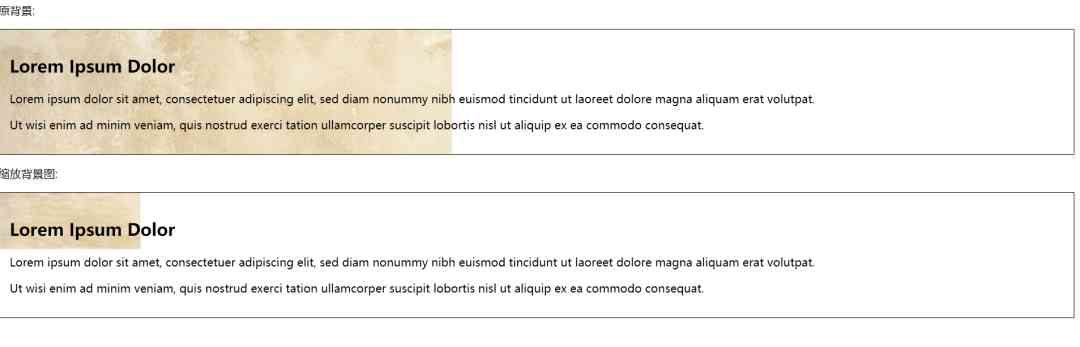
<p> No, background-origin (padding-box Default ):</p>
<div id="example1">
<h2>Lorem Ipsum Dolor</h2>
<p>Lorem ipsum dolor sit amet, consectetuer adipiscing elit, sed diam nonummy nibh euismod tincidunt ut laoreet dolore magna aliquam erat volutpat.</p>
<p>Ut wisi enim ad minim veniam, quis nostrud exerci tation ullamcorper suscipit lobortis nisl ut aliquip ex ea commodo consequat.</p>
</div>
<p>background-origin: border-box:</p>
<div id="example2">
<h2>Lorem Ipsum Dolor</h2>
<p>Lorem ipsum dolor sit amet, consectetuer adipiscing elit, sed diam nonummy nibh euismod tincidunt ut laoreet dolore magna aliquam erat volutpat.</p>
<p>Ut wisi enim ad minim veniam, quis nostrud exerci tation ullamcorper suscipit lobortis nisl ut aliquip ex ea commodo consequat.</p>
</div>
<p>background-origin: content-box:</p>
<div id="example3">
<h2>Lorem Ipsum Dolor</h2>
<p>Lorem ipsum dolor sit amet, consectetuer adipiscing elit, sed diam nonummy nibh euismod tincidunt ut laoreet dolore magna aliquam erat volutpat.</p>
<p>Ut wisi enim ad minim veniam, quis nostrud exerci tation ullamcorper suscipit lobortis nisl ut aliquip ex ea commodo consequat.</p>
</div>
</body>
</html>
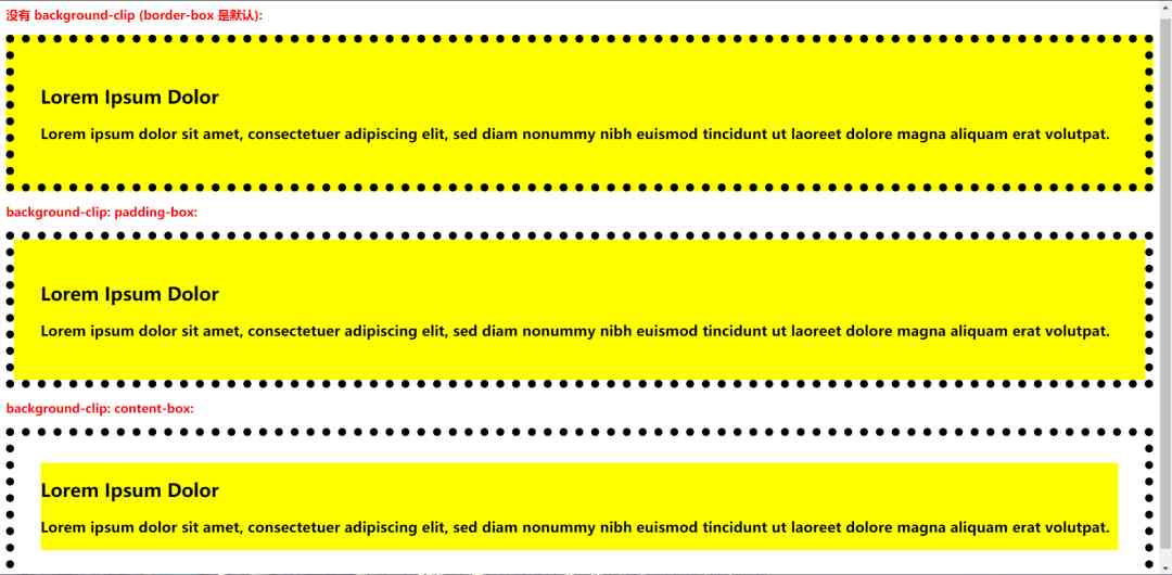
2. background-clip attribute
CSS3 background-clip Property specifies the drawing area of the background .
The attribute has three different values :
border-box - ( Default ) The background is the outer edge of the frame of the painting padding-box- The background is shown to the outer edge of the filler .content-box - The background is painted in the content box
Here's an example of background-clip attribute :
#example1 {
    border: 10px dotted black;
    padding: 35px;
    background: yellow;
    background-clip: content-box;
}
Four 、 summary
This paper mainly introduces CSS background , adopt CSS Realize multi background display , Customize some size display format ,background-origin And the application of multiple attributes , A wealth of cases to help you better understand .
I hope you can try it yourself , When it's done , There will always be all kinds of problems , Don't hold your eyes high or your hands low , Do it frequently , Can understand more deeply .
Want to learn more Python Web crawler and data mining knowledge , Go to a professional website :http://pdcfighting.com/ Want to learn more Python Web crawler and data mining knowledge , Go to a professional website :http://pdcfighting.com/
版权声明
本文为[Python advanced]所创,转载请带上原文链接,感谢
边栏推荐
- Helping financial technology innovation and development, atfx is at the forefront of the industry
- 面试官: ShardingSphere 学一下吧
- Bitcoin once exceeded 14000 US dollars and is about to face the test of the US election
- An article will take you to understand SVG gradient knowledge
- It's time for your financial report to change to a more advanced style -- financial analysis cockpit
- What knowledge do Python automated testing learn?
- Diamond standard
- 美团内部讲座|周烜:华东师范大学的数据库系统研究
- 常用SQL语句总结
- Network programming NiO: Bio and NiO
猜你喜欢
DRF JWT authentication module and self customization

Swagger 3.0 brushes the screen every day. Does it really smell good?

大道至简 html + js 实现最朴实的小游戏俄罗斯方块
C#和C/C++混合编程系列5-内存管理之GC协同
常用SQL语句总结
C + + and C + + programmers are about to be eliminated from the market
2020年第四届中国 BIM (数字建造)经理高峰论坛即将在杭举办
ERD-ONLINE 免费在线数据库建模工具
Building a new generation cloud native data lake with iceberg on kubernetes
Filecoin has completed a major upgrade and achieved four major project progress!
随机推荐
Basic usage of Vue codemirror: search function, code folding function, get editor value and verify in time
Analysis of query intention recognition
How to understand Python iterators and generators?
PHP application docking justswap special development kit【 JustSwap.PHP ]
What knowledge do Python automated testing learn?
DC-1靶機
html+vue.js 實現分頁可相容IE
What course of artificial intelligence? Will it replace human work?
Isn't data product just a report? absolutely wrong! There are university questions in this category
小游戏云开发入门
hdu3974 Assign the task線段樹 dfs序
检测证书过期脚本
【應用程式見解 Application Insights】Application Insights 使用 Application Maps 構建請求鏈路檢視
大道至简 html + js 实现最朴实的小游戏俄罗斯方块
How does filecoin's economic model and future value support the price of fil currency breaking through thousands
An article will take you to understand CSS3 fillet knowledge
Tron smart wallet PHP development kit [zero TRX collection]
Unity性能优化整理
WeihanLi.Npoi 1.11.0/1.12.0 Release Notes
快速排序为什么这么快?