当前位置:网站首页>大小屏适配
大小屏适配
2022-08-05 05:24:00 【MoXinXueWEB】
方案一:lib-flexible
移动端适配:
一般而言,lib-flexible 并不独立出现,而是搭配 px2rem-loader 一起做适配方案,目的是 自动将 CSS 中的 px 转换成 rem。以下为它在 vue 中的使用
1、安装
npm install lib-flexible --save-dev
2、在 main.js 中引入 lib-flexible
// px2rem 自适应
import 'lib-flexible'
3、安装 px2rem-loader
npm install px2rem-loader --save-dev
4、配置 px2rem-loade
vue-cli 2.x版本
4.1、在 build/utils.js 中,找到 exports.cssLoaders,作出如下修改:
const px2remLoader = {

    loader: 'px2rem-loader',
    options: {

    	remUint: 75 // 以设计稿 750 为例, 750 / 10 = 75
    }
}
4.2、找到 generateLoaders 中的 loaders 配置,作出如下:
// 注 释 掉 这 一 行
// const loaders = options.usePostCSS ? [cssLoader,postcssLoader] : [cssLoader]
// 修改为
const loaders = [cssLoader, px2remLoader]
if (options.usePostCSS) {

	loaders.push(postcssLoader)
}
vue-cli 3.x版本
在项目根目录新建文件 vue.config.js,然后如下配置:
module.exports = {

    css: {

        loaderOptions: {
     css: {
    },
        postcss: {

                plugins: [
                	require('postcss-px2rem')({

                		// 以设计稿 750 为例, 750 / 10 = 75
                		remUnit: 75
                	}),
                ]
            }
        }
    },
};
重新 npm run dev,完
大屏适配
假如我们屏幕尺寸要做以 3840 x 2160 为设计稿的适配,那么我们的 remUnit 的值则 改为 384。此时就需要修改源码啦!
1、找到源码
打开./node_modules/lib-flexible/flexible.js,找到如下片段源码:
function refreshRem(){

	var width = docEl.getBoundingClientRect().width;
    if (width / dpr > 540) {

    	width = 540 * dpr;
    }
    var rem = width / 10;
    docEl.style.fontSize = rem + 'px';
    flexible.rem = win.rem = rem;
}
**解决:**当屏幕宽度除以 dpr(dpr 是一个倍数,此处一般为 1) 大于 540 这个特定值的时候,那么就不再进行适配了问题
2、修改源码
假如我要适配的大屏幕尺寸是基于 3840 的设计稿, 而要求最小范围是 1980,最大为 5760,那么我们要修改的则变为
function refreshRem(){

	var width = docEl.getBoundingClientRect().width;
	if (width / dpr < 1980) {

		width = 1980 * dpr;
    } else if (width / dpr > 5760) {

    	width = 5760 * dpr;
    }
    var rem = width / 10;
    docEl.style.fontSize = rem + 'px';
    flexible.rem = win.rem = rem;
}
**注:**修改完成后,重启项目,则会适配到相应的尺寸。此外还有一个提示,当脱离掉 node_modules 重新 npm install 项目依赖时还是需要重新修改一遍的!
方案二:监听浏览器的窗口大小
1、初始化的时候获得大屏幕的比例
2、把这个比例设置给CSS的scale变量
3、监听浏览器的窗口大小,将新的比例赋给scale变量
<div class="ScaleBox" ref="ScaleBox" >

mounted() {
    this.setScale();
    window.addEventListener("resize", this.setScale);
},
methods: {
    getScale() {
    	const { width, height } = this;
        let ww = window.innerWidth / width;
        let wh = window.innerHeight / height;
        return ww < wh ? ww : wh;
    },
    setScale() {
        this.scale = this.getScale();
        this.$refs.ScaleBox.style.setProperty("--scale", this.scale);
    },
}

#ScaleBox {
  --scale: 1;
}
.ScaleBox {
	transform: scale(var(--scale)) ;
}
VUE 组件就封装
<template>
    <div class="wrap">
        <div class="ScaleBox" ref="ScaleBox" :style="{width, height}">
        	<BigScreen></BigScreen>
        </div>
    </div>
</template>
<script>
export default {
    name: "ScaleBox",
    props: {
       width: {
           type: Number,
           default: 1920
       },
       height: {
           type: Number,
           default: 1080
       }
    },
    data() {
        return {
            scale: null
        };
    },
    mounted() {
        this.setScale(); 								    window.addEventListener("resize", this.setScale);
    },
    methods: {
        // 获取较小比例的一条边, 这样较大比例的一条边就可以按照既定的比例缩放了, width 和 height 是设置的默认比例,window.innerWidth 和window.innerHeight 是大屏幕的缩放尺寸.
        getScale() {
            const { width, height } = this;
            let ww = window.innerWidth / width;
            let wh = window.innerHeight / height;
            return ww < wh ? ww : wh;
        },
        setScale() {
            this.scale = this.getScale();
            this.$refs.ScaleBox.style.setProperty("--scale", this.scale);
        },
        debounce(fn, delay) {
            let delays = delay || 500;
            let timer;
            return function() {
                let th = this;
                let args = arguments;
                if (timer) { clearTimeout(timer);
            }
            timer = setTimeout(function() {
                timer = null;
                fn.apply(th, args);
            }, delays);
        };
    }
 }
};
</script>
<style >
#ScaleBox {
	--scale: 1;
}
.wrap {
    background: #eee; width: 100%;
    height: 5000px;
}
.ScaleBox {
    transform: scale(var(--scale)) translate(-50%, -50%);
    display: flex;
    height: 100%;
    flex-direction: column;
    transform-origin: 0 0;
    position: absolute;
    left: 50%;
    top: 50%;
    transition: 0.3s;
    z-index: 999;
}
</style>
边栏推荐
- markdown editor template
- Logical volume creation
- TCP/IP four-layer model
- Hard Disk Partitioning and Permanent Mounting
- Growth: IT Operations Trends Report
- The idea of commonly used shortcut key
- Tencent Cloud Message Queue CMQ
- 程序员应该这样理解I/O
- Operation and maintenance engineer, come and pick up the wool
- 路由器和静态路由的配置
猜你喜欢
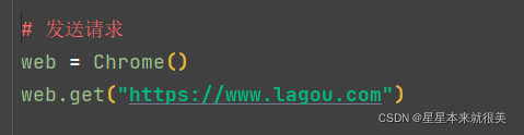
selenium模块的操作之拉钩
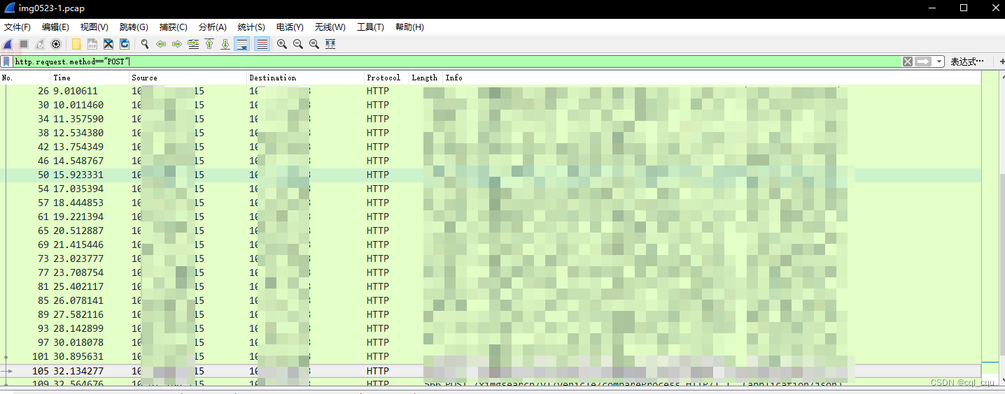
Wireshark packet capture and common filtering methods
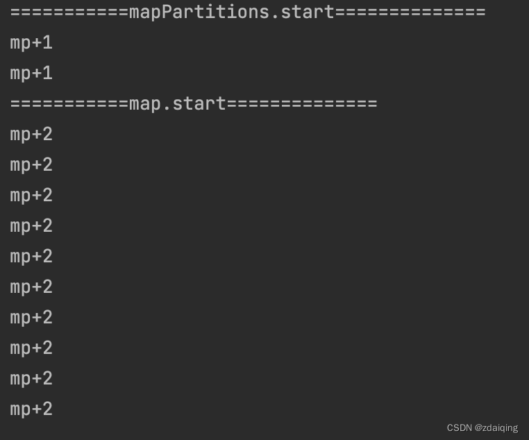
spark operator - map vs mapPartitions operator

What are some things that you only know when you do operation and maintenance?
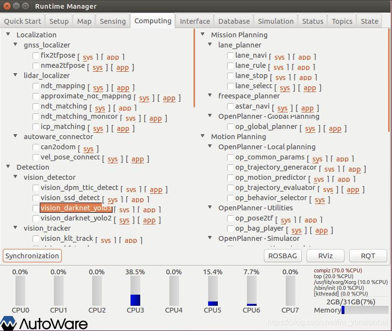
Problems encountered in installing Yolo3 target detection module in Autoware
Account and Permission Management
Mina的长连接和短连接
干货!教您使用工业树莓派结合CODESYS配置EtherCAT主站
el-autocomplete使用

Hugo builds a personal blog
随机推荐
One-arm routing and 30% switch
This is indeed the best article on microservice architecture I have read!
[Problem has been resolved]-Virtual machine error contains a file system with errors check forced
OpenCV3.0 is compatible with VS2010 and VS2013
flink cdc 目前支持Gauss数据库源吗
交换机原理
time complexity and space complexity
Account and Permission Management
Cloud computing - osi seven layers and TCP\IP protocol
运维工程师,快来薅羊毛
时间复杂度和空间复杂度
spark source code - task submission process - 3-ApplicationMaster
Call the TensorFlow Objection Detection API for object detection and save the detection results locally
深度 Zabbix 使用指南——来自惨绿少年
Getting Started Document 09 Standalone watch
network issue?Service packet loss?This is enough
spark source code-RPC communication mechanism
[问题已处理]-jenkins流水线checkout超时
媒体查询、rem移动端适配
Spark source code-task submission process-6.1-sparkContext initialization-create spark driver side execution environment SparkEnv