当前位置:网站首页>弹性布局(二)
弹性布局(二)
2022-07-07 03:22:00 【鹿蹊zz】
目录
一、轴说明
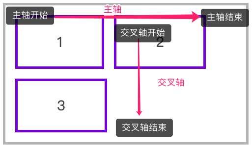
水平排列
下面是使用 flex-flow: row wrap 的主轴与交叉轴说明。
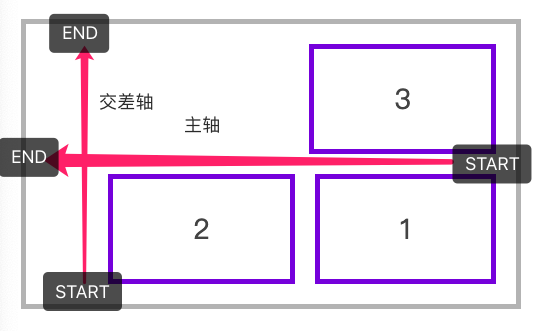
下面是使用 flex-flow: row-reverse wrap-reverse 的主轴与交叉轴说明。
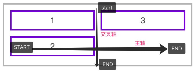
垂直排列
下面是使用 flex-flow: column wrap 的主轴与交叉轴说明。
二、justify-content
用于控制元素在主轴上的排列方式,再次强调是主轴的排列方式。
| 选项 | 说明 |
|---|---|
| flex-start | 元素紧靠主轴起点 |
| flex-end | 元素紧靠主轴终点 |
| center | 元素从弹性容器中心开始 |
| space-between | 第一个元素靠起点,最后一个元素靠终点,余下元素平均分配空间 |
| space-around | 每个元素两侧的间隔相等。所以,元素之间的间隔比元素与容器的边距的间隔大一倍 |
| space-evenly | 元素间距离平均分配 |
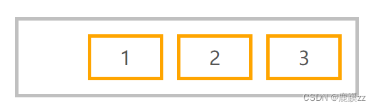
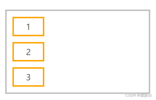
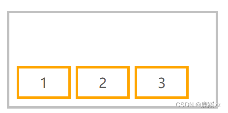
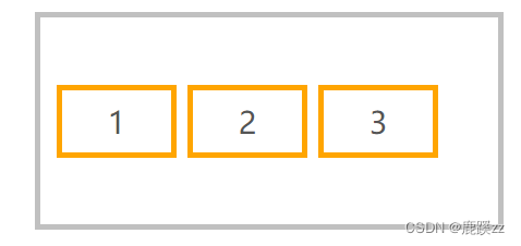
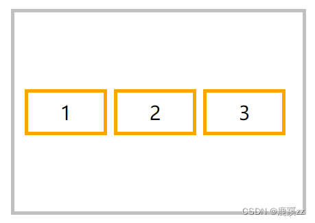
水平排列元素,并使用 justify-content: flex-end 对齐到主轴终点
<style>
* {
padding: 0;
margin: 0;
padding: 10px;
margin: 10px;
}
body {
font-size: 14px;
color: #555;
}
article {
border: solid 5px silver;
box-sizing: border-box;
display: flex;
flex-flow: row wrap;
justify-content: flex-end;
}
article div {
width: 80px;
border: solid 5px orange;
text-align: center;
font-size: 28px;
}
</style>
...
<article>
<div>1</div>
<div>2</div>
<div>3</div>
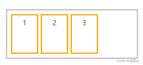
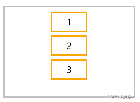
</article> 使用 space-evenly 平均分配容器元素

flex-flow: row wrap;
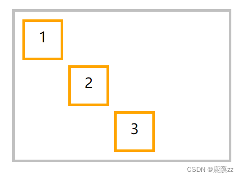
justify-content: space-evenly;垂直排列时对齐到主轴终点
 flex-flow: column wrap;
 justify-content: flex-end;
三、交叉轴行
1.align-items
用于控制容器元素在交叉轴上的排列方式。
| 选项 | 说明 |
|---|---|
| stretch | 元素被拉伸以适应容器(默认值) |
| center | 元素位于容器的中心 |
| flex-start | 元素位于容器的交叉轴开头 |
| flex-end | 元素位于容器的交叉轴结尾 |
(1)横向排列
拉伸适应交叉轴
如果设置了 width | height | min-height | min-width | max-width | max-height ,将影响stretch 的结果,因为 stretch 优先级低于你设置的宽高。
<style>
  * {
    padding: 0;
    margin: 0;
    padding: 10px;
    margin: 5px;
  }
  head {
    display: block;
  }
  body {
    font-size: 14px;
    color: #555;
  }
  article {
    height: 200px;
    border: solid 5px silver;
    box-sizing: border-box;
    display: flex;
    flex-direction: row;
    align-items: stretch;
  }
  article div {
    width: 80px;
    border: solid 5px orange;
    text-align: center;
    font-size: 28px;
  }
</style>
...

<article>
    <div>1</div>
    <div>2</div>
    <div>3</div>
</article>
对齐到交叉轴的顶部

flex-direction: row;
align-items: flex-start;
对齐到交叉轴底部
flex-direction: row;
align-items: flex-end;
对齐到交叉轴中心
flex-direction: row;
align-items: center;
(2)纵向排列
纵向排列时交叉轴排列

<style>
  * {
    padding: 0;
    margin: 0;
    padding: 10px;
    margin: 5px;
  }

  article {
    height: 400px;
    border: solid 5px silver;
    box-sizing: border-box;
    display: flex;
    flex-direction: column;
    align-items: center;
  }

  article div {
    height: 50px;
    min-width: 100px;
    border: solid 5px orange;
    text-align: center;
    font-size: 28px;
  }
</style>
...

<article>
  <div>1</div>
  <div>2</div>
  <div>3</div>
</article>
2.align-content
只适用于多行显示的弹性容器,用于控制行(而不是元素)在交叉轴上的排列方式。
| 选项 | 说明 |
|---|---|
| stretch | 将空间平均分配给元素 |
| flex-start | 元素紧靠主轴起点 |
| flex-end | 元素紧靠主轴终点 |
| center | 元素从弹性容器中心开始 |
| space-between | 第一个元素靠起点,最后一个元素靠终点,余下元素平均分配空间 |
| space-around | 每个元素两侧的间隔相等。所以,项目之间的间隔比项目与边框的间隔大一倍 |
| space-evenly | 元素间距离平均分配 |
水平排列在交叉轴中居中排列
<style>
        * {
            padding: 0;
            margin: 0;
            padding: 10px;
            margin: 5px;
        }

        article {
            height: 300px;
            border: solid 5px silver;
            box-sizing: border-box;
            display: flex;
            flex-direction: row;
            flex-wrap: wrap;
            align-items: flex-start;
            align-content: center;
        }

        article div {
            width: 90px;
            border: solid 5px orange;
            text-align: center;
            font-size: 28px;
        }
    </style>
.......

    <article>
        <div>1</div>
        <div>2</div>
        <div>3</div>
    </article>
垂直排列时交叉轴的排列
flex-direction: column;
flex-wrap: wrap;
align-items: flex-start;
align-content: center;
四、弹性元素
放在容器盒子中的元素即为容器元素。
- 不能使用 float 与 clear 规则
- 弹性元素均为块元素
- 绝对定位的弹性元素不参与弹性布局
1. align-self
用于控制单个元素在交叉轴上的排列方式,align-items 用于控制容器中所有元素的排列,而 align-self 用于控制一个弹性元素的交叉轴排列。
| 选项 | 说明 |
|---|---|
| stretch | 将空间平均分配给元素 |
| flex-start | 元素紧靠主轴起点 |
| flex-end | 元素紧靠主轴终点 |
| center | 元素从弹性容器中心开始 |
<style>
        * {
            padding: 0;
            margin: 0;
            padding: 10px;
            margin: 5px;
        }

        article {
            height: 400px;
            border: solid 5px silver;
            box-sizing: border-box;
            display: flex;
            flex-direction: row;
            align-items: center;
        }

        article div {
            height: 50px;
            min-width: 50px;
            border: solid 5px orange;
            text-align: center;
            font-size: 28px;
        }

        article div:nth-of-type(1) {
            /* 元素紧靠主轴起点 */
            align-self: flex-start;
        }

        article div:nth-of-type(3) {
            /* 	元素紧靠主轴终点 */
            align-self: flex-end;
        }
    </style>

...

    <article>
        <div>1</div>
        <div>2</div>
        <div>3</div>
    </article>
五、作用于子标签的6大属性
1 order属性定义项目的排列顺序。数值越小,排列越靠前,默认为0。
2 flex-grow属性定义项目的放大比例,默认为0,即如果存在剩余空间,也不放大。
3 flex-shrink属性定义了项目的缩小比例,默认为1, 即如果空间不足,该项目将缩小 设置为0,父级空间不足,该项目将不缩小,其他子。
4 flex-basis定义项目占据的主轴空间 。如果主轴为水平,则设置这个属性,相当于设置项目的宽度。 原width将会失效。
5 flex属性是flex-grow, flex-shrink 和 flex-basis的简写,默认值为0 1 auto。后两个属性可选。
6 align-self:定义单个项目自身在交叉轴上的排列方式,可以覆盖掉容器上的align-items属性。
边栏推荐
猜你喜欢
MOS管参数μCox得到的一种方法
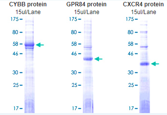
Abnova membrane protein lipoprotein technology and category display

Academic report series (VI) - autonomous driving on the journey to full autonomy

2022年全国所有A级景区数据(13604条)
关于数据库数据转移的问题,求各位解答下
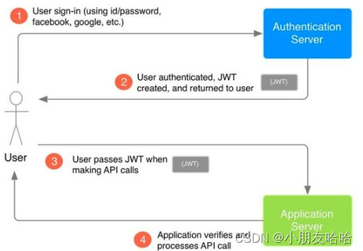
JWT的基础介绍
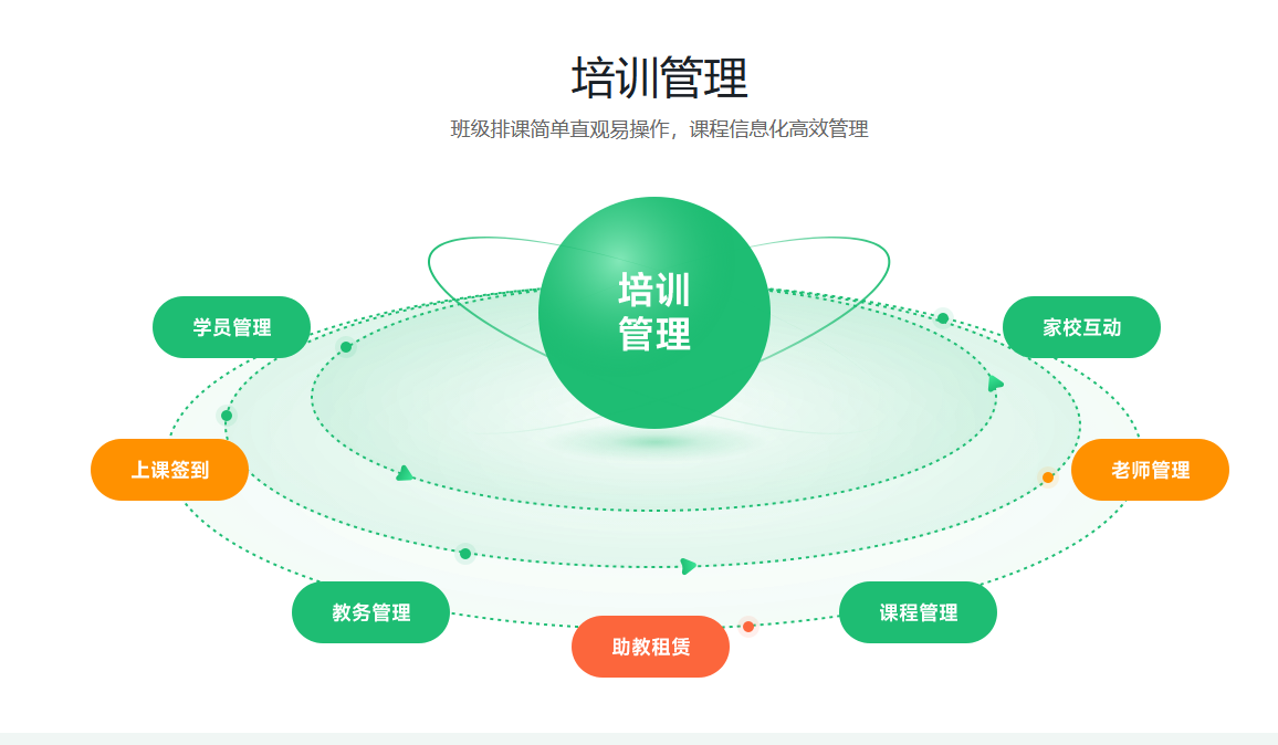
How to do sports training in venues?
2018年江苏省职业院校技能大赛高职组“信息安全管理与评估”赛项任务书

Take you to brush (niuke.com) C language hundred questions (the first day)
Basic process of network transmission using tcp/ip four layer model
随机推荐
from . onnxruntime_ pybind11_ State Import * noqa ddddocr operation error
CompletableFuture使用详解
多个kubernetes集群如何实现共享同一个存储
How Oracle backs up indexes
Mysql---- import and export & View & Index & execution plan
ViewModelProvider. Of obsolete solution
华为机试题素数伴侣
Common function detect_ image/predict
transform-origin属性详解
带你刷(牛客网)C语言百题(第一天)
毕业设计游戏商城
【NOI模拟赛】区域划分(结论,构造)
Take you to brush (niuke.com) C language hundred questions (the first day)
Reflection (II)
Basic introduction of JWT
Paranoid unqualified company
.net 5 FluentFTP连接FTP失败问题:This operation is only allowed using a successfully authenticated context
ANR 原理及实践
Leetcode t1165: log analysis
MySQL user permissions