当前位置:网站首页>Overflow: the combination of auto and Felx
Overflow: the combination of auto and Felx
2022-07-04 16:45:00 【Elephants and ants】
overflow:auto; If the content is trimmed , The browser will display a scroll bar , To see the rest .
flex Properties in
display: flex;
flex-direction: column; The principal axis is perpendicular , The starting point is at the top .
1、overflow and flex Layout collocation
<!DOCTYPE html>
<html>
<head>
    <meta charset="utf-8">
    <title>overflow:auto Usage of </title>
    <meta name="viewport" content="width=device-width, initial-scale=1, maximum-scale=1, user-scalable=no" />
    <link rel="stylesheet" type="text/css" href="css/reset.css" />

    <style type="text/css">
        html,body{

            width: 100%;
            height: 100%;
        }
        .container{

            width: 100%;
            height: 100%;
            display: flex;
            flex-direction: column;
        }
        .header{

            width: 100%;
            height: 100px;
            background: #f99;
        }
        .content{

            width: 100%;
            height: 100%;
            overflow: auto;
            background: yellow;
            flex: 1;
        }
        .footer{

            width: 100%;
            height: 100px;
            background: #99f;
        }
    </style>
</head>
<body>
    <div class="container">
        <div class="header">

        </div>
        <div class="content">
            <ul>
                <li>111111</li>
                <li>111111</li>
                <li>111111</li>
                <li>111111</li>
                <li>111111</li>
                <li>111111</li>
                <li>111111</li>
                <li>111111</li>
                 there li Write more , This will show the effect , I'm here to save space .
            </ul>
        </div>

        <div class="footer">
        </div>
    </div>
</body>
</html>
To achieve overflow: auto; This effect , First, layout , Then write the style .
The outermost parent box in the style container, Add the following style :
.container{

    width: 100%;
    height: 100%;
    display: flex;
    flex-direction: column;
}
Also, you must give html and body Give width and height 100%;
html,body{

    width: 100%;
    height: 100%;
}
The head and bottom are given a fixed height , General app The head and bottom of the are fixed , Like wechat chat record .
.header{

    width: 100%;
    height: 100px;
    background: #f99;
}
.footer{

    width: 100%;
    height: 100px;
    background: #99f;
}
In the middle of the content Given flex:1, And add our protagonist overflow:auto; Excess content is automatically cropped .
.content{

    width: 100%;
    height: 100%;
    overflow: auto;
    background: yellow;
    flex: 1;
    }
The renderings are as follows :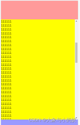
The middle content area can slide up and down , The excess part is automatically cropped .
边栏推荐
- Socks agent tools earthworm, ssoks
- PR FAQ: how to set PR vertical screen sequence?
- . Net applications consider x64 generation
- Actual combat | use composite material 3 in application
- 中位数与次序统计量
- 对人胜率84%,DeepMind AI首次在西洋陆军棋中达到人类专家水平
- Redis: SDS source code analysis
- Hidden communication tunnel technology: intranet penetration tool NPS
- 高度剩余法
- error: ‘connect‘ was not declared in this scope connect(timer, SIGNAL(timeout()), this, SLOT(up
猜你喜欢

How to decrypt worksheet protection password in Excel file
Application of clock wheel in RPC

Using celery in projects
Model fusion -- stacking principle and Implementation
Principle and general steps of SQL injection
![[North Asia data recovery] a database data recovery case where the disk on which the database is located is unrecognized due to the RAID disk failure of HP DL380 server](/img/79/3fab19045e1ab2f5163033afaa4309.jpg)
[North Asia data recovery] a database data recovery case where the disk on which the database is located is unrecognized due to the RAID disk failure of HP DL380 server
从数数开始
![[tutorial] yolov5_ DeepSort_ The whole process of pytoch target tracking and detection](/img/a7/92d670776e3fd3d5add3aa144617c7.jpg)
[tutorial] yolov5_ DeepSort_ The whole process of pytoch target tracking and detection

overflow:auto与felx结合的用法

PR FAQ: how to set PR vertical screen sequence?
随机推荐
Understand asp Net core - Authentication Based on jwtbearer
2021 Google vulnerability reward program review
JS to realize the countdown function
Software Engineer vs Hardware Engineer
.Net 应用考虑x64生成
Market trend report, technical innovation and market forecast of tetrabromophthalate (pht4 diol) in China
Research Report on surgical otorhinolaryngology equipment industry - market status analysis and development prospect prediction
Position encoding practice in transformer
Statistical learning: logistic regression and cross entropy loss (pytoch Implementation)
PR FAQ: how to set PR vertical screen sequence?
APOC custom functions and procedures
DC-2靶场搭建及渗透实战详细过程(DC靶场系列)
Variable cannot have type 'void'
Move, say goodbye to the past again
基于check-point实现图数据构建任务
程序员怎么才能提高代码编写速度?
Research Report on market supply and demand and strategy of China's plastics and polymer industry
Cypher task design and task locking mechanism of isomorphic and heterogeneous graphs
NoSQL之readis配置与优化(终章)
Firebird experience summary
