当前位置:网站首页>Seaborn data visualization
Seaborn data visualization
2022-07-07 17:02:00 【En^_^ Joy】
use Seaborn Data visualization
Seaborn And Matplotlib
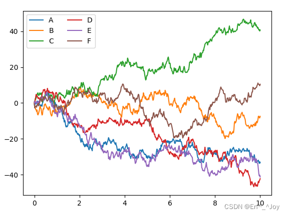
Matplotlib drawing
import matplotlib as mpl
import matplotlib.pyplot as plt
import numpy as np

plt.figure()

x = np.linspace(0, 10, 500)
y = np.cumsum(np.random.randn(500, 6), 0)

plt.plot(x, y)
plt.legend('ABCDEF', ncol=2, loc='upper left')

#  display picture
plt.show()
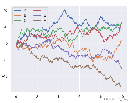
Seaborn There are many advanced drawing functions , And you can rewrite Matplotlib Default parameters , So as to use simple Matplotlib Get better results , It can be used Seaborn Of set() Method to set the style
Other codes are the same as above , Just add and import this module and use set() function
import matplotlib as mpl
import matplotlib.pyplot as plt
import numpy as np
import seaborn as sns

sns.set()
plt.figure()

x = np.linspace(0, 10, 500)
y = np.cumsum(np.random.randn(500, 6), 0)

plt.plot(x, y)
plt.legend('ABCDEF', ncol=2, loc='upper left')

#  display picture
plt.show()
Seaborn Graphic introduction
For many graphics Matplotlib Can be realized , Three uses Seaborn Will be more convenient
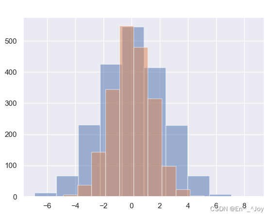
Frequency histogram 、KDE And density diagram
Frequency histogram
import matplotlib as mpl
import matplotlib.pyplot as plt
import numpy as np
import seaborn as sns
import pandas as pd

sns.set()
plt.figure()

data = np.random.multivariate_normal([0, 0], [[5, 2], [2, 2]], size=2000)
data = pd.DataFrame(data, columns=['x', 'y'])

for col in 'xy':
    plt.hist(data[col], alpha=0.5)

#  display picture
plt.show()
use KDE Get the smooth evaluation of variable distribution , adopt sns.kdeplot Realization
for col in 'xy':
    sns.kdeplot(data[col], shade=True)
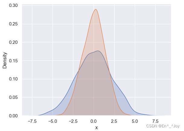
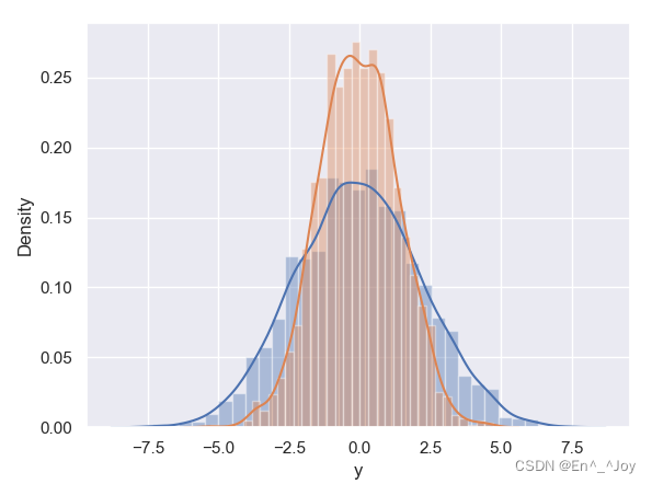
use distplot We can make the frequency histogram and KDE Combine
for col in 'xy':
    sns.distplot(data[col])
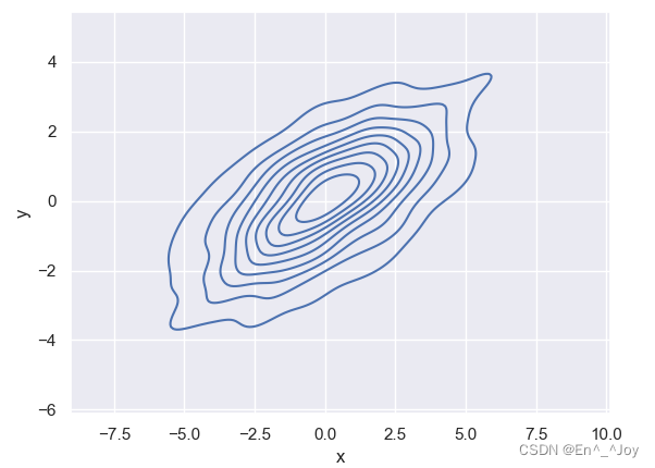
If you want to kdeplot The input is a two-dimensional data set , Then you can get a two-dimensional number visualization
sns.kdeplot(data['x'],data['y'])
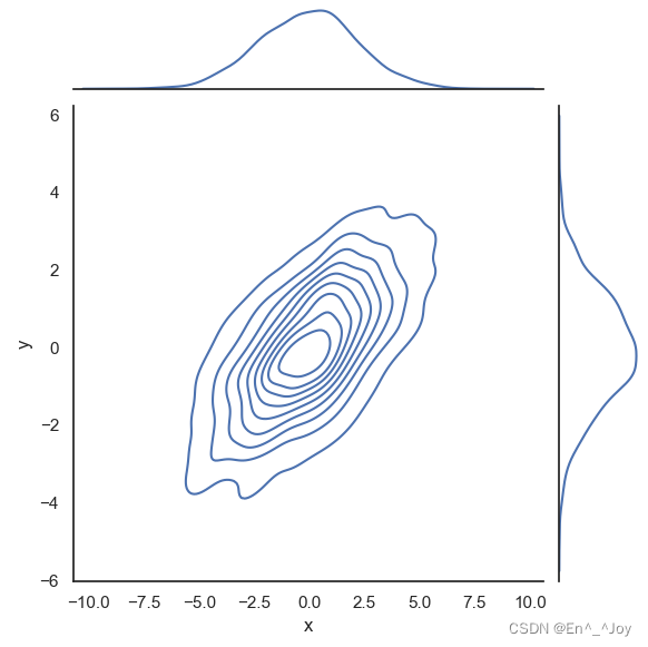
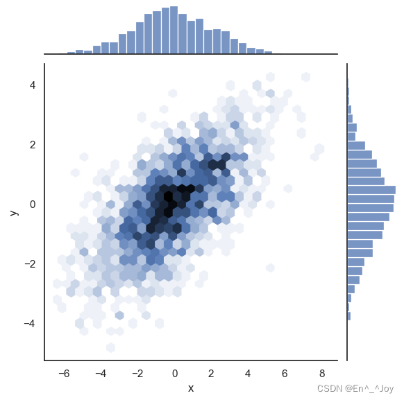
use sns.jointplot You can see the joint distribution of two variables and the independent distribution of one variable at the same time , Use a white background here
with sns.axes_style('white'):
    sns.jointplot("x", "y", data, kind='kde')
with sns.axes_style('white'):
    sns.jointplot("x", "y", data, kind='hex')
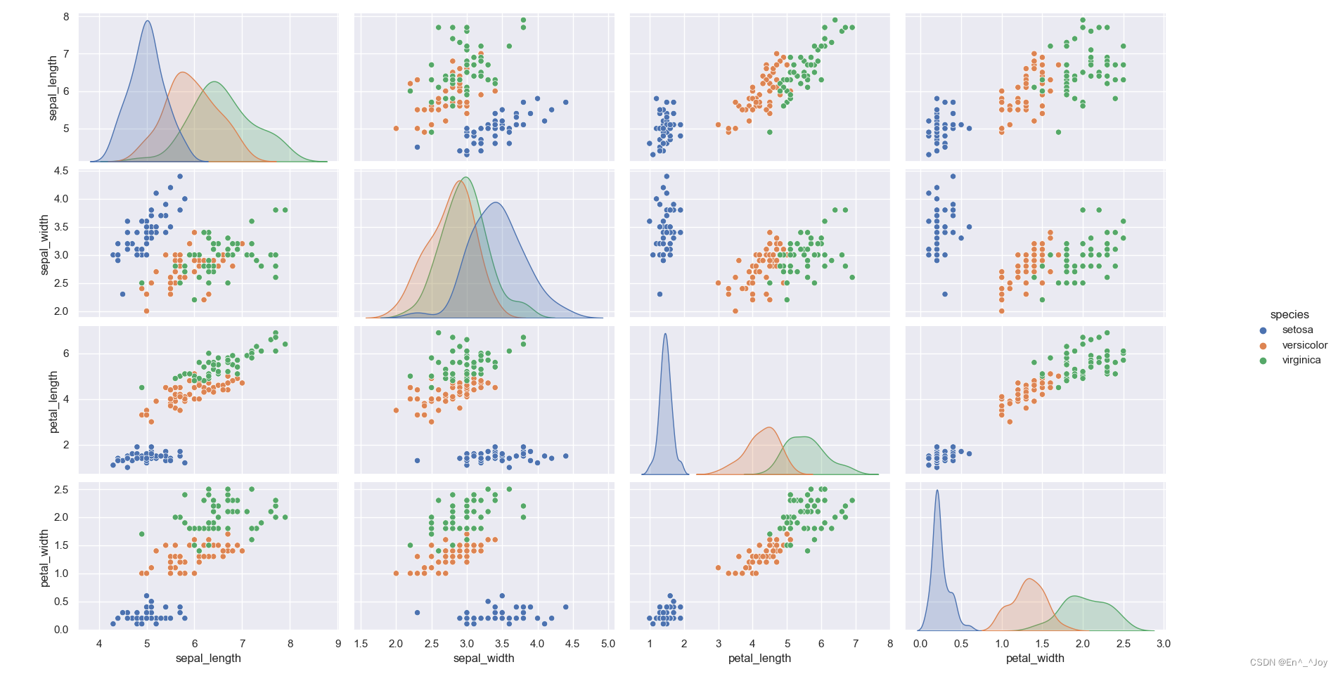
Matrix diagram
The following is a matrix diagram of the relationship between the four variables
import matplotlib as mpl
import matplotlib.pyplot as plt
import numpy as np
import seaborn as sns
import pandas as pd

sns.set()
plt.figure()

iris = sns.load_dataset("iris")
print(iris.head())
''' sepal_length sepal_width petal_length petal_width species 0 5.1 3.5 1.4 0.2 setosa 1 4.9 3.0 1.4 0.2 setosa 2 4.7 3.2 1.3 0.2 setosa 3 4.6 3.1 1.5 0.2 setosa 4 5.0 3.6 1.4 0.2 setosa '''
sns.pairplot(iris, hue='species', size=2.5)

#  display picture
plt.show()
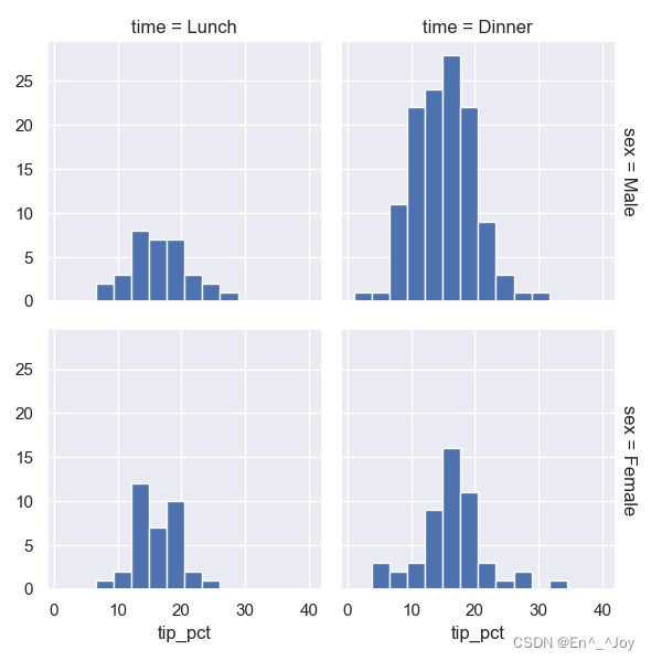
Faceted frequency histogram
import matplotlib as mpl
import matplotlib.pyplot as plt
import numpy as np
import seaborn as sns
import pandas as pd

sns.set()
plt.figure()

tips = sns.load_dataset("tips")
print(tips)
''' total_bill tip sex smoker day time size 0 16.99 1.01 Female No Sun Dinner 2 1 10.34 1.66 Male No Sun Dinner 3 2 21.01 3.50 Male No Sun Dinner 3 3 23.68 3.31 Male No Sun Dinner 2 4 24.59 3.61 Female No Sun Dinner 4 .. ... ... ... ... ... ... ... 239 29.03 5.92 Male No Sat Dinner 3 240 27.18 2.00 Female Yes Sat Dinner 2 241 22.67 2.00 Male Yes Sat Dinner 2 242 17.82 1.75 Male No Sat Dinner 2 243 18.78 3.00 Female No Thur Dinner 2 [244 rows x 7 columns] '''
tips['tip_pct'] = 100*tips['tip']/tips['total_bill']
grid = sns.FacetGrid(tips, row="sex", col="time", margin_titles=True)
grid.map(plt.hist, "tip_pct", bins=np.linspace(1, 40, 15))

#  display picture
plt.show()
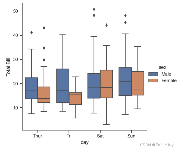
Factor map
import matplotlib as mpl
import matplotlib.pyplot as plt
import numpy as np
import seaborn as sns
import pandas as pd

sns.set()
plt.figure()

tips = sns.load_dataset("tips")
tips['tip_pct'] = 100*tips['tip']/tips['total_bill']

with sns.axes_style(style='ticks'):
    g = sns.factorplot("day", "total_bill", "sex", data=tips, kind="box")
    g.set_axis_labels("day", "Total Bill")

#  display picture
plt.show()
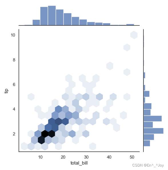
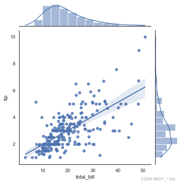
Joint distribution
with sns.axes_style('white'):
    sns.jointplot("total_bill", "tip", data=tips, kind='hex')
with sns.axes_style('white'):
    sns.jointplot("total_bill", "tip", data=tips, kind='reg')
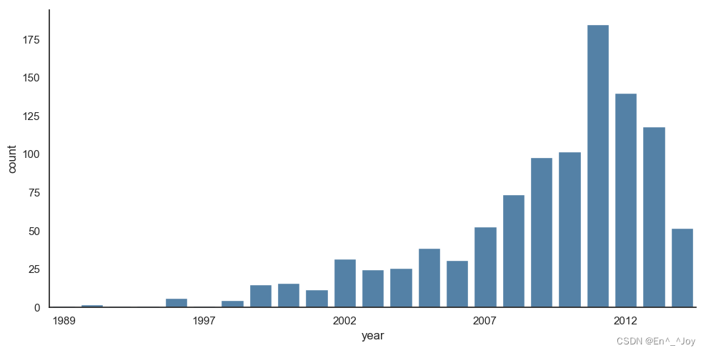
Bar chart :sns.factorplot Draw a bar chart
import matplotlib as mpl
import matplotlib.pyplot as plt
import numpy as np
import seaborn as sns
import pandas as pd

sns.set()
plt.figure()

planets = sns.load_dataset('planets')
print(planets.head())
''' method number orbital_period mass distance year 0 Radial Velocity 1 269.300 7.10 77.40 2006 1 Radial Velocity 1 874.774 2.21 56.95 2008 2 Radial Velocity 1 763.000 2.60 19.84 2011 3 Radial Velocity 1 326.030 19.40 110.62 2007 4 Radial Velocity 1 516.220 10.50 119.47 2009 '''
with sns.axes_style('white'):
    g = sns.factorplot("year", data=planets, aspect=2, kind="count", color='steelblue')
    g.set_xticklabels(step=5)

#  display picture
plt.show()
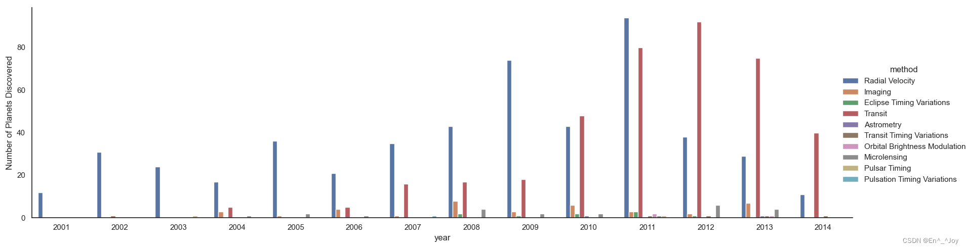
with sns.axes_style('white'):
    g = sns.factorplot("year", data=planets, aspect=4.0, kind="count", hue='method', order=range(2001, 2015))
    g.set_ylabels('Number of Planets Discovered')
边栏推荐
- LeetCode 1155. N ways to roll dice one question per day
- LeetCode 1049. Weight of the last stone II daily question
- Temperature sensor chip used in temperature detector
- Tidb cannot start after modifying the configuration file
- 两类更新丢失及解决办法
- A tour of gRPC:03 - proto序列化/反序列化
- 【图像传感器】相关双采样CDS
- 二叉搜索树(基操篇)
- 最新Android面试合集,android视频提取音频
- Imitate the choice of enterprise wechat conference room
猜你喜欢
两类更新丢失及解决办法
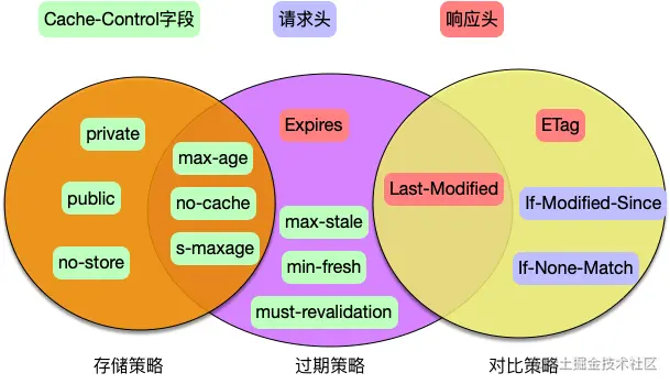
3000 words speak through HTTP cache
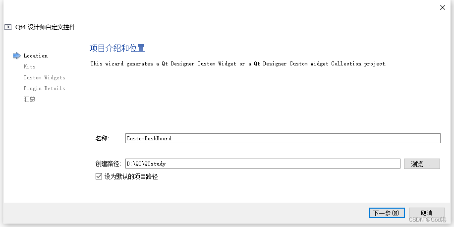
Process from creation to encapsulation of custom controls in QT to toolbar (I): creation of custom controls
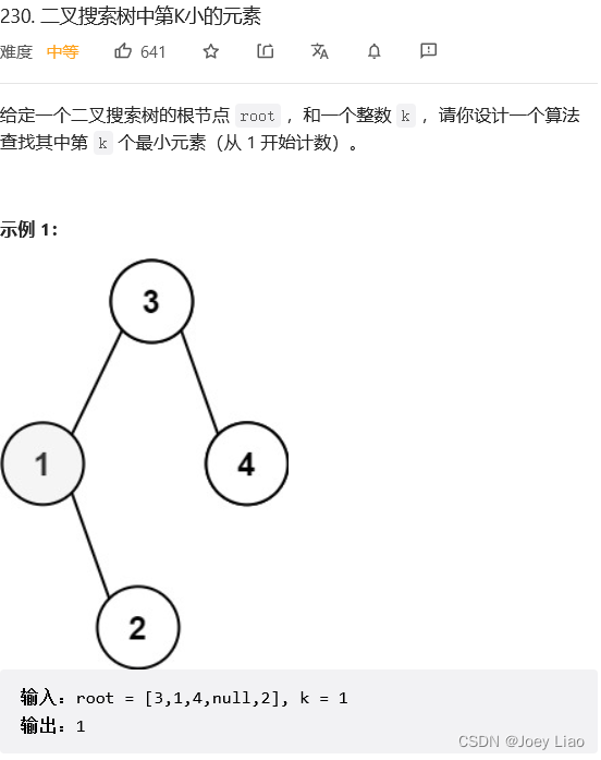
二叉搜索树(特性篇)
字节跳动高工面试,轻松入门flutter
Three. JS series (1): API structure diagram-1

网关Gateway的介绍与使用
字节跳动Android金三银四解析,android面试题app

Lowcode: four ways to help transportation companies enhance supply chain management
整理几个重要的Android知识,高级Android开发面试题
随机推荐
Process from creation to encapsulation of custom controls in QT to toolbar (I): creation of custom controls
dapp丨defi丨nft丨lp单双币流动性挖矿系统开发详细说明及源码
3000 words speak through HTTP cache
在哪个期货公司开期货户最安全?
ATM系统
QT中自定义控件的创建到封装到工具栏过程(一):自定义控件的创建
[designmode] template method pattern
数据中台落地实施之法
LeetCode 120. 三角形最小路径和 每日一题
【图像传感器】相关双采样CDS
A tour of gRPC:03 - proto序列化/反序列化
字节跳动Android面试,知识点总结+面试题解析
Localstorage and sessionstorage
LeetCode 152. 乘积最大子数组 每日一题
LeetCode 312. Poke balloon daily
Master this promotion path and share interview materials
Spark Tuning (III): persistence reduces secondary queries
LeetCode 403. 青蛙过河 每日一题
QT中自定义控件的创建到封装到工具栏过程(二):自定义控件封装到工具栏
第九届 蓝桥杯 决赛 交换次数