当前位置:网站首页>Deep understanding of P-R curve, ROC and AUC
Deep understanding of P-R curve, ROC and AUC
2022-07-02 12:07:00 【raelum】
Catalog
One 、 Mean square error 、 Accuracy and error rate
Evaluate the generalization performance of the model , We need to have evaluation criteria to measure the generalization ability of the model , This is it. Performance metrics (Performance Measure).
When evaluating the generalization ability of the same model , Using different performance measures often leads to different evaluation results , This means that the model “ Good or bad ” Is relative . What kind of model is good , It's not just about algorithms and data , It also depends on performance metrics .
In the prediction task , Given size is m m m Data set of
D = { ( x 1 , y 1 ) , ⋯ , ( x m , y m ) } D=\{(\boldsymbol{x}_1,y_1),\cdots,(\boldsymbol{x}_m,y_m)\} D={ (x1,y1),⋯,(xm,ym)}
among y i y_i yi yes x i \boldsymbol{x}_i xi The true mark of . To evaluate the model f f f Performance of , We need to put the prediction results f ( x ) f(\boldsymbol{x}) f(x) With real markers y y y Compare .
There are three simplest performance measures :
- Mean square error (MSE): m s e ( f ; D ) = 1 m ∑ i = 1 m ( f ( x i ) − y i ) 2 \displaystyle mse(f;D)=\frac1m \sum_{i=1}^m (f(\boldsymbol{x}_i)-y_i)^2 mse(f;D)=m1i=1∑m(f(xi)−yi)2;
- precision (Accuracy): a c c ( f ; D ) = 1 m ∑ i = 1 m I ( f ( x i ) = y i ) \displaystyle acc(f;D)=\frac1m \sum_{i=1}^m \mathbb{I}(f(\boldsymbol{x}_i)=y_i) acc(f;D)=m1i=1∑mI(f(xi)=yi);
- Error rate (Error): e r r ( f ; D ) = 1 m ∑ i = 1 m I ( f ( x i ) ≠ y i ) \displaystyle err(f;D)=\frac1m \sum_{i=1}^m \mathbb{I}(f(\boldsymbol{x}_i)\neq y_i) err(f;D)=m1i=1∑mI(f(xi)=yi).
among I ( ⋅ ) \mathbb{I}(\cdot) I(⋅) Is an indicator function , And the accuracy and error rate meet the following relationship
a c c ( f ; D ) + e r r ( f ; D ) = 1 acc(f;D)+err(f;D)=1 acc(f;D)+err(f;D)=1
Mean square error is often used in regression tasks , Accuracy and error rate are often used in classification tasks .
sklearn.metrics Common performance metrics are provided in , Mean square error 、 The accuracy and error rate are as follows :
"""  Mean square error  """
from sklearn.metrics import mean_squared_error
mse = mean_squared_error(y_true, y_pred)

"""  precision  """
from sklearn.metrics import accuracy_score
acc = accuracy_score(y_true, y_pred)

"""  Error rate  """
from sklearn.metrics import accuracy_score
err = 1 - accuracy_score(y_true, y_pred)
Two 、 Precision rate 、 Recall and F 1 F1 F1
2.1 Precision rate (Precision) And recall (Recall)
Error rate and precision are commonly used , But it can't meet all the task needs .
Consider such a scenario , Suppose we trained a model that can judge good melon or bad melon according to watermelon data set . Now there's a new load of watermelon , We use the trained model to distinguish these watermelons , Naturally , The error rate measures how much of the melon is judged wrong .
But if what we care about is :
- Pick out the melon ( The good melon judged by the model ) How many proportions are really good melons .
- How many of all the really good melons have been singled out ( The model is judged as good ).
Then the error rate is obviously not enough , Therefore, it is necessary to introduce new performance measures .
The above words seem a little tongue twister , Next, let's explain it vividly with a few more pictures .
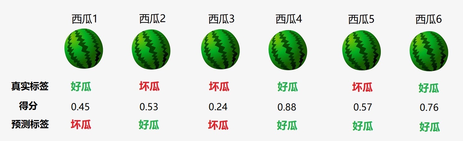
Suppose the melon farmer pulls a cart of watermelon as follows ( Only 6 individual ):

Above the watermelon is its number , Below is its Real label . We use the learned model f f f The judgment results of the six watermelons are as follows :

It can be seen that , The number is 1 , 2 , 5 1,2,5 1,2,5 All the watermelons were misjudged , So the error rate is 3 / 6 = 0.5 3/6=0.5 3/6=0.5, The accuracy is also 0.5 0.5 0.5.
- Pick out the melon ( That is, the good melon judged by the model ) by 2 , 4 , 5 , 6 2,4,5,6 2,4,5,6, The four melons selected are only 4 4 4 and 6 6 6 It's really a good melon , Proportion 0.5 0.5 0.5.
- All really good melons are 1 , 4 , 6 1,4,6 1,4,6, These three are really good melons , Only 4 4 4 and 6 6 6 Was singled out ( That is, the model is judged as good ), Proportion 0.67 0.67 0.67.
Next, we can define the precision and recall , But before that , We need to introduce Confusion matrix (Confusion Matrix).
For dichotomies , The sample can be divided into four categories according to the combination of its real category and the category predicted by the model :
- T P TP TP(True Positive): The real mark is just , The prediction flag is also just .
- F P FP FP(False Positive): The real mark is negative , But the forecast is marked just .
- T N TN TN(True Negative): The real mark is negative , The prediction flag is also negative .
- F N FN FN(False Negative): The real mark is just , But the forecast is marked negative .
Obviously there is T P + F P + T N + F N = m TP+FP+TN+FN=m TP+FP+TN+FN=m. The confusion matrix form of the classification results is as follows :
[ T N F P F N T P ] \begin{bmatrix} TN & FP \\ FN& TP \\ \end{bmatrix} [TNFNFPTP]
our Precision rate (Precision) And Recall rate (Recall) They are defined as :
P = T P T P + F P , R = T P T P + F N P=\frac{TP}{TP+FP},\quad R=\frac{TP}{TP+FN} P=TP+FPTP,R=TP+FNTP
for example , For the example we gave before , The accuracy and accuracy are respectively
P = 0.5 , R = 0.67 P=0.5,\quad R=0.67 P=0.5,R=0.67
Now calculate the confusion matrix :
- Really good melon , What is judged as good by the model is 4 4 4 and 6 6 6, therefore T P = 2 TP=2 TP=2;
- Really bad melon , What is judged as good by the model is 2 2 2 and 5 5 5, therefore F P = 2 FP=2 FP=2;
- Really good melon , What is judged as bad by the model is 1 1 1, therefore F N = 1 FN=1 FN=1;
- For the last one , We can apply the formula directly , namely T N = 6 − T P − F P − F N = 1 TN=6-TP-FP-FN=1 TN=6−TP−FP−FN=1;
So the confusion matrix is
[ 1 2 1 2 ] \begin{bmatrix} 1 & 2 \\ 1& 2 \\ \end{bmatrix} [1122]
It's not hard to see. , Precision and recall are applicable to classification tasks , The corresponding implementation is as follows :
"""  Precision rate  """
from sklearn.metrics import precision_score
precision = precision_score(y_true, y_pred)

"""  Recall rate  """
from sklearn.metrics import recall_score
recall = recall_score(y_true, y_pred)
For the example at the beginning of this section , Let's remember that melon is 1 1 1, The bad melon is 0 0 0, be :
from sklearn.metrics import precision_score, recall_score, accuracy_score

y_true = [1, 0, 0, 1, 0, 1]
y_pred = [0, 1, 0, 1, 1, 1]
print(accuracy_score(y_true, y_pred))
# 0.5
print(precision_score(y_true, y_pred))
# 0.5
print(recall_score(y_true, y_pred))
# 0.6666666666666666
The result is consistent with our original calculation .
2.2 Visualization of confusion matrix
For dichotomies , Our confusion matrix is a 2 × 2 2\times 2 2×2 matrix . Then we can know , about N N N Classification problem , Our confusion matrix is a N × N N\times N N×N matrix .
sklearn.metrics The calculation of the confusion matrix is provided :confusion_matrix(). We still use 2.1 The example in Section , Use confusion_matrix() To calculate the corresponding confusion matrix :
from sklearn.metrics import confusion_matrix

y_true = [1, 0, 0, 1, 0, 1]
y_pred = [0, 1, 0, 1, 1, 1]
C = confusion_matrix(y_true, y_pred)
print(C)
# [[1 2]
# [1 2]]
The output results are consistent with our 2.1 Same as calculated in section .
For multi classification problems , confusion_matrix() The confusion matrix returned C C C Satisfy : C i j C_{ij} Cij The representative real category is i i i But it is predicted by the model as a category j j j Number of samples .
In order to better show the confusion matrix , Let's consider three categories , Corresponding y_true and y_pred Set to :
y_true = [2, 0, 2, 2, 0, 1]
y_pred = [0, 0, 2, 2, 0, 2]
Now use ConfusionMatrixDisplay() To realize the visualization of confusion matrix
from sklearn.metrics import confusion_matrix, ConfusionMatrixDisplay
import matplotlib.pyplot as plt

y_true = [2, 0, 2, 2, 0, 1]
y_pred = [0, 0, 2, 2, 0, 2]
C = confusion_matrix(y_true, y_pred)
disp = ConfusionMatrixDisplay(C)
disp.plot()
plt.show()

2.3 P-R Curve and BEP
Precision and recall are a pair of contradictory measures . Generally speaking , When the accuracy is high , The recall rate is often low ; When recall is high , Precision is often low . Usually only in some simple tasks , Can make the precision and recall rate are very high .
go back to 2.1 The example in Section , The model we trained based on watermelon data set is essentially a two classifier . in fact , The principle of many binary classifiers , Is to set a threshold , Then grade each sample , Examples with scores greater than or equal to this threshold are classified as positive classes , Examples with scores less than this threshold are classified as negative .
for example , Set the threshold to 0.5 0.5 0.5, For a new sample ( watermelon ), If it scores higher than 0.5 0.5 0.5, Is considered a good melon , Otherwise, it is considered a bad melon .
in fact , The accuracy mentioned above 、 Precision rate 、 Recall rates all depend on specific thresholds . Sometimes , We hope that the threshold is not fixed , But according to the actual needs to adjust .
Still used 2.1 The example in Section , Suppose the threshold is 0.5 0.5 0.5, Our two classifiers score six samples as follows :
We classify the six watermelons according to their scores From high to low Sort :
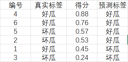
Now? , We Traverse from top to bottom . For the example of the first line , Set its score 0.88 0.88 0.88 Threshold value , Greater than or equal to The prediction of this threshold is a positive example , Less than The prediction of this threshold is a counterexample , The corresponding results are as follows :

The calculated precision and recall are P = 1 , R = 0.33 P=1,\, R=0.33 P=1,R=0.33.
For the example of the second line , Set its score 0.76 0.76 0.76 Threshold value , Greater than or equal to The prediction of this threshold is a positive example , Less than The prediction of this threshold is a counterexample , The corresponding results are as follows :
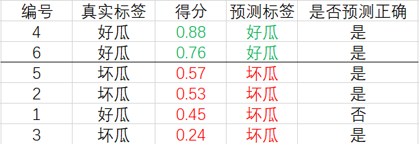
The calculated precision and recall are P = 1 , R = 0.67 P=1,\, R=0.67 P=1,R=0.67.
And so on , We can finally get 6 6 6 individual ( R , P ) (R, P) (R,P) value . The code implementation is as follows :
from sklearn.metrics import precision_score, recall_score

y_true = [1, 1, 0, 0, 1, 0]

for i in range(len(y_true)):
    y_pred = [1] * (i + 1) + [0] * (len(y_true) - i - 1)
    P = precision_score(y_true, y_pred)
    R = recall_score(y_true, y_pred)
    print((R, P))
Output results :
(0.3333333333333333, 1.0)
(0.6666666666666666, 1.0)
(0.6666666666666666, 0.6666666666666666)
(0.6666666666666666, 0.5)
(1.0, 0.6)
(1.0, 0.5)
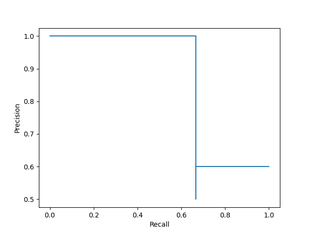
Let's connect these six points to draw a curve :
from sklearn.metrics import precision_score, recall_score
import matplotlib.pyplot as plt

y_true = [1, 1, 0, 0, 1, 0]
R, P = [], []

for i in range(len(y_true)):
    y_pred = [1] * (i + 1) + [0] * (len(y_true) - i - 1)
    P += [precision_score(y_true, y_pred)]
    R += [recall_score(y_true, y_pred)]

plt.plot(R, P)
plt.xlabel('Recall')
plt.ylabel('Precision')
plt.show()

The picture above is called P-R chart , The curve is called P-R curve .
P-R Further discussion of curves : First, let's remember that the number of samples marked as positive and negative is m + m^+ m+ and m − m^- m−, namely
m + = T P + F N , m − = T N + F P m^+=TP+FN,\quad m^-=TN+FP m+=TP+FN,m−=TN+FP
Precision and recall can be written as
P = T P T P + F P , R = T P m + P=\frac{TP}{TP+FP},\quad R=\frac{TP}{m^+} P=TP+FPTP,R=m+TP
Now consider the more general case , We will m m m The score of a watermelon ( Before that, the score of six watermelons ) From high to low Arrange to get a Ordered list :
s c o r e = [ h 1 h 2 ⋮ h m ] \mathrm{score}= \begin{bmatrix} h_1 \\ h_2 \\ \vdots \\ h_m \end{bmatrix} score=⎣⎢⎢⎢⎡h1h2⋮hm⎦⎥⎥⎥⎤
Set the threshold to h h h, When h > h 1 h>h_1 h>h1 when , All watermelons are predicted to be bad , That is, no watermelon is predicted to be a good melon , therefore T P = F P = 0 TP=FP=0 TP=FP=0, here P = 0 / 0 P=0/0 P=0/0 meaningless , So our next discussion will be based on h ≤ h 1 h\leq h_1 h≤h1. generally speaking , We'll put the threshold h h h Set the score of each sample separately , So there will be m m m A threshold .
We Take the minimum threshold first , namely h = h m h=h_m h=hm, Then all melons will be predicted to be good melons , That is, no melon is predicted to be bad , therefore T N = F N = 0 TN=FN=0 TN=FN=0, At this time there is T P = m + TP=m^+ TP=m+ and F P = m − FP=m^- FP=m−, thus R = 1 R=1 R=1 And P = m + / ( m + + m − ) = m + / m P=m^+/(m^++m^-)=m^+/m P=m+/(m++m−)=m+/m, This is reflected in P-R On the curve The last point The coordinates of the for
( 1 , m + m ) \Big(1,\frac{m^+}{m}\Big) (1,mm+)
If ( 1 , m + / m ) → ( 1 , 0 ) (1,m^+/m)\to(1,0) (1,m+/m)→(1,0), Then there are m + ≪ m m^+\ll m m+≪m, therefore m − ≫ 0 m^-\gg0 m−≫0, Combined with the above T N = 0 TN=0 TN=0, This explanation There are a lot of Counterexamples in the sample , And they were all mispredicted . Again because F N = 0 FN=0 FN=0, explain There are a few positive examples in the sample , And they were predicted correctly . Thus it , If P-R The last point of the curve tends to ( 1 , 0 ) (1,0) (1,0), So the sample distribution Extremely uneven ( There are many counter examples and few positive examples ), And the classifier is for Counter examples are all mispredicted , about All the predictions of the positive examples are correct , So this kind of P-R The classifier corresponding to the curve It's terrible .
We Then take the maximum threshold , namely h = h 1 h=h_1 h=h1, Then only the first watermelon will be predicted as a good melon , The remaining watermelons are predicted to be bad . Let's discuss it in the following two cases :
- The first watermelon itself is a good melon , that T P = 1 TP=1 TP=1, F P = 0 FP=0 FP=0, thus P = 1 P=1 P=1, R = 1 / m + R=1/m^+ R=1/m+,P-R On the curve The first point The coordinates of the for ( 1 / m + , 1 ) (1/m^+,1) (1/m+,1);
- The first watermelon itself is a bad melon , that F P = 1 FP=1 FP=1, T P = 0 TP=0 TP=0, thus P = R = 0 P=R=0 P=R=0,P-R On the curve The first point The coordinates of the for ( 0 , 0 ) (0, 0) (0,0).
In most cases, our data sets are relatively large , namely m + ≫ 0 m^+\gg0 m+≫0. therefore , When the example with the highest score is a positive example ,P-R The coordinates of the first point on the curve Very close to ( 0 , 1 ) (0,1) (0,1) But not equal to ( 0 , 1 ) (0,1) (0,1); When the example with the highest score is a counterexample ,P-R The coordinates of the first point on the curve yes ( 0 , 0 ) (0,0) (0,0).
More intuitively , Let's say that each one h i h_i hi All correspond to one melon , When we will h h h from h 1 h_1 h1 Down to h m h_m hm when , Corresponding P-R The curve will be drawn from the first point to the last point in turn . When h h h from h i − 1 h_{i-1} hi−1 Down to h i h_i hi when , if h i h_i hi The corresponding melon itself is a positive example , be T P ↑ TP \uparrow TP↑, F P FP FP unchanged , F N ↓ FN \downarrow FN↓, thus P ↑ P\uparrow P↑, R ↑ R\uparrow R↑, This is reflected in P-R The curve will produce a Right up The line segment . if h i h_i hi The melon itself is a counterexample , be F P ↑ FP\uparrow FP↑, T P TP TP unchanged , F N FN FN Also the same , thus P ↓ P\downarrow P↓, R R R unchanged , This is reflected in P-R The curve will produce a Vertical down The line segment .
Based on the above discussion, it can be concluded that : We from ( 0 , 0 ) (0,0) (0,0) or ( 1 / m + , 1 ) (1/m^+,1) (1/m+,1) Start , Lower the threshold according to the sequence table . Every time after a positive example , Let's draw a line segment diagonally upward to the right ; Every time after a counterexample , Let's draw a line segment vertically down . Go on like this until you reach ( 1 , m + / m ) (1, m^+/m) (1,m+/m), here P-R The curve is drawn .
From the drawing process, we can see , our P-R The curve is Serrate Of , And present “ falling ” trend .
Of course ,sklearn.metrics Drawing is provided in P-R A function of a curve , We will list the real tags y_true and Score list y_score Pass in precision_recall_curve() The accuracy can be obtained in 、 Recall and threshold , as follows :
from sklearn.metrics import precision_recall_curve

y_true = [1, 0, 0, 1, 0, 1]
y_score = [0.45, 0.53, 0.24, 0.88, 0.57, 0.76]
precision, recall, thresholds = precision_recall_curve(y_true, y_score)
print(precision)
# [0.6 0.5 0.66666667 1. 1. 1. ]
print(recall)
# [1. 0.66666667 0.66666667 0.66666667 0.33333333 0. ]
print(thresholds)
# [0.45 0.53 0.57 0.76 0.88]
And then use PrecisionRecallDisplay() To draw :
from sklearn.metrics import precision_recall_curve, PrecisionRecallDisplay
import matplotlib.pyplot as plt

y_true = [1, 0, 0, 1, 0, 1]
y_score = [0.45, 0.53, 0.24, 0.88, 0.57, 0.76]
precision, recall, _ = precision_recall_curve(y_true, y_score)
disp = PrecisionRecallDisplay(precision, recall)
disp.plot()
plt.show()
Readers may wonder , Why is the curve here the same as the curve we drew before Dissimilarity , And why thresholds in There are only five thresholds Well ?
Let's not use PrecisionRecallDisplay(), Only precision_recall_curve() Get the results to draw :
from sklearn.metrics import precision_recall_curve
import matplotlib.pyplot as plt

y_true = [1, 0, 0, 1, 0, 1]
y_score = [0.45, 0.53, 0.24, 0.88, 0.57, 0.76]
precision, recall, _ = precision_recall_curve(y_true, y_score)
plt.plot(recall, precision)
plt.show()

It can be seen that this picture is compared with the previous one , It's just that the way you connect has changed .PrecisionRecallDisplay() The oblique upward connection mode is cancelled in , For the sake of beauty “ Horizontal and vertical ” The way to draw , Let's take another look PrecisionRecallDisplay() in plot() Partial source code of function :
def plot(self, ax=None, *, name=None, **kwargs):

	...
	line_kwargs = {
    "drawstyle": "steps-post"}
	...
	(self.line_,) = ax.plot(self.recall, self.precision, **line_kwargs)
	...
	return self
"step-post" This parameter indicates P-R The curve will be Ladder form Drawing , For details, see file .
The three above P-R In the figure , We already know that the second picture and the third picture are just the difference in the way they are drawn , Next, let's compare the third picture with the first picture .
You can see , Compared to the first picture , The third picture Removed the last point , also Add... Before the first point ( 0 , 1 ) (0,1) (0,1) This point , What is the purpose of this practice ?
So let's see precision_recall_curve() Source code :
def precision_recall_curve(y_true, probas_pred, pos_label=None, sample_weight=None):

    fps, tps, thresholds = _binary_clf_curve(y_true, probas_pred,
                                             pos_label=pos_label,
                                             sample_weight=sample_weight)

    precision = tps / (tps + fps)
    precision[np.isnan(precision)] = 0
    recall = tps / tps[-1]

    # stop when full recall attained
    # and reverse the outputs so recall is decreasing
    last_ind = tps.searchsorted(tps[-1])
    sl = slice(last_ind, None, -1)
    return np.r_[precision[sl], 1], np.r_[recall[sl], 0], thresholds[sl]
from return One line shows ( 0 , 1 ) (0,1) (0,1) This point is Force Plus , That was P-R Why is the last point on the curve removed ?
Notice this line of comment :
# stop when full recall attained
When R = 1 R=1 R=1 Stop counting , And the abscissa of the last two points of our first graph All for 1 1 1, So the last point will not be calculated , The corresponding minimum threshold is not added to thresholds in .
In fact, it can be proved that , If the example with the lowest score is Counter example , Then the abscissa of the last two points All for 1 1 1; If the example with the lowest score is Example , be The second last point The abscissa of is 1 − 1 / m + 1-1/m^+ 1−1/m+.
As for why ( 0 , 1 ) (0,1) (0,1) Will be forcibly added to P-R In the curve , Because sklearn Want to make P-R Curve from y y y The axis begins to draw .
For the convenience of the following description , We will P-R The curve is drawn into a monotonous and smooth curve ( Be careful , In real tasks P-R The curve is usually Nonmonotonic , Not smooth , It fluctuates up and down in many parts , Please refer to the picture above ), Here's the picture :

P-R The figure intuitively shows the recall and precision of the classifier in the sample population . When comparing , If a classifier P-R The curve is completely transformed by the curve of another classifier encase , It can be asserted that the performance of the latter is better than the former . for example , Above picture B B B Better than C C C.
If two classifiers P-R The curves cross , For example, in the figure above A A A and B B B, At this time, a more reasonable criterion is comparison P-R The size of the area under the curve , To some extent, it represents the relative accuracy and recall of the classifier “ Double high ” The proportion of , But this value is not easy to estimate , Therefore, we need to design some performance measures that can comprehensively investigate the precision and recall .
Balance point (Break-Even Point, abbreviation BEP) Is such a measure , It is P = R P=R P=R The value of time . For the example mentioned at the beginning of this section , Its equilibrium point is 0.67 0.67 0.67.
2.4 F 1 F1 F1 And F β F_{\beta} Fβ
As mentioned above BEP Oversimplified some , What we use more often is F 1 F1 F1 Measure , It is based on precision and recall Harmonic mean Defined :
1 F 1 = 1 2 ( 1 P + 1 R ) \frac{1}{F1}=\frac12\left(\frac1P+\frac1R\right) F11=21(P1+R1)
Simplify to get
F 1 = 2 ⋅ P ⋅ R P + R F1=\frac{2\cdot P\cdot R}{P+R} F1=P+R2⋅P⋅R
In some applications , We pay different attention to precision and recall , So we need to introduce F 1 F1 F1 The general form of measurement —— F β F_{\beta} Fβ, It allows us to express the accuracy / / / Different preferences for recall . It is defined as the of precision and recall Weighted harmonic average :
1 F β = 1 1 + β 2 ( 1 P + β 2 R ) , β > 0 \frac{1}{F_{\beta}}=\frac{1}{1+\beta^2}\left(\frac1P+\frac{\beta^2}{R}\right),\quad \beta>0 Fβ1=1+β21(P1+Rβ2),β>0
Simplify to get
F β = ( 1 + β 2 ) ⋅ P ⋅ R β 2 ⋅ P + R , β > 0 F_{\beta}=\frac{(1+\beta^2)\cdot P\cdot R}{\beta^2\cdot P+R},\quad \beta>0 Fβ=β2⋅P+R(1+β2)⋅P⋅R,β>0
- β = 1 \beta=1 β=1, F β F_{\beta} Fβ Degenerate to F 1 F1 F1;
- β > 1 \beta>1 β>1, Recall has a greater impact ;
- β < 1 \beta<1 β<1, Precision has a greater impact .
F 1 F1 F1 And F β F_{\beta} Fβ Is applicable to Classification task Performance metrics for , The corresponding implementation is as follows :
""" F1 """
from sklearn.metrics import f1_score
f1 = f1_score(y_true, y_pred)

""" Fbeta """
from sklearn.metrics import fbeta_score
fbeta = fbeta_score(y_true, y_pred, beta=0.5) #  With beta=0.5 For example
3、 ... and 、ROC And AUC
3.1 ROC(Receiver Operating Characteristic)
We have already mentioned , Yes m m m Ranking the scores of samples from high to low can get a sequential table . In different application tasks , We can set different settings according to the task requirements threshold ( Cut off point ). If we pay more attention to accuracy , Can be truncated at the top of the list ; If we pay more attention to recall , Can be truncated at the back of the list .
therefore , The quality of sorting itself , It reflects the comprehensive consideration of the learning machine under different tasks Expected generalization performance The stand or fall of ,ROC Curve is a powerful tool to study the generalization performance of learners from this point of view .
ROC The full name is Work characteristics of subjects (Receiver Operating Characteristic), It originated from the radar signal analysis technology used for enemy aircraft detection in World War II , Since then, it has been introduced into the field of machine learning .
ROC Curve and P-R The curves are very similar . stay P-R In the curve , The ordinate adopts the precision , The abscissa uses recall , But in ROC In the curve , The ordinate is True case rate (True Positive Rate, abbreviation TPR), The abscissa is The false positive rate is (False Positive Rate, abbreviation FPR), The two are defined as
T P R = T P T P + F N = R , F P R = F P T N + F P TPR=\frac{TP}{TP+FN}=R,\quad FPR=\frac{FP}{TN+FP} TPR=TP+FNTP=R,FPR=TN+FPFP
We will ( F P R , T P R ) (FPR,TPR) (FPR,TPR) The points are connected by line segments to get ROC curve .
sklearn.metrics Implementation is provided in ROC A function of a curve roc_curve(), The corresponding usage is as follows :
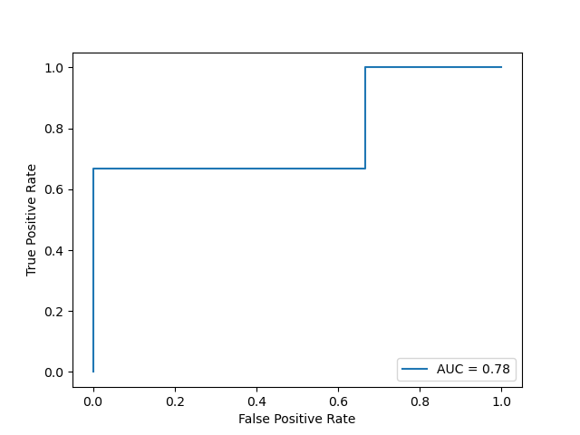
from sklearn.metrics import roc_curve
import matplotlib.pyplot as plt

y_true = [1, 0, 0, 1, 0, 1]
y_score = [0.45, 0.53, 0.24, 0.88, 0.57, 0.76]
fpr, tpr, _ = roc_curve(y_true, y_score)
plt.plot(fpr, tpr)
plt.xlabel('False Positive Rate')
plt.ylabel('True Positive Rate')
plt.show()

Of course, we can also use RocCurveDisplay() To quickly draw :
from sklearn.metrics import roc_curve, RocCurveDisplay
import matplotlib.pyplot as plt

y_true = [1, 0, 0, 1, 0, 1]
y_score = [0.45, 0.53, 0.24, 0.88, 0.57, 0.76]
fpr, tpr, _ = roc_curve(y_true, y_score)
disp = RocCurveDisplay(fpr=fpr, tpr=tpr)
disp.plot()
plt.show()
The output result is consistent with the figure above .
As you can see from the diagram ,ROC It also shows a curve Serrate , And each section is horizontal and vertical . Besides ,ROC The curve is “ rising ” trend , Its first and last points must be located at ( 0 , 0 ) (0,0) (0,0) and ( 1 , 1 ) (1,1) (1,1). The better the performance of the learner ,ROC The closer the curve is to the upper left corner of the graph .
Set the point corresponding to the current threshold as ( x , y ) (x,y) (x,y), We lower the threshold in turn . When passing a positive example , The coordinates of the next point are ( x , y + 1 / m + ) (x,y+1/m^+) (x,y+1/m+); After a counterexample , The coordinates of the next point are ( x + 1 / m − , y ) (x+1/m^-,y) (x+1/m−,y).
3.2 AUC(Area Under roc Curve)
When comparing learners , And P-R The picture is similar , If a learner ROC The curve is completely changed by the curve of another learner encase , It can be asserted that the performance of the latter is better than the former . If two learners ROC The curves cross , Then we have to compare ROC The area under the curve , namely AUC(Area Under roc Curve), As shown in the figure below

Assume ROC The curve is made up of coordinates ( x 1 , y 1 ) , ( x 2 , y 2 ) , ⋯ , ( x m , y m ) (x_1,y_1),(x_2,y_2),\cdots,(x_m,y_m) (x1,y1),(x2,y2),⋯,(xm,ym) The sequential connection of forms , among ( x 1 , y 1 ) = ( 0 , 0 ) , ( x m , y m ) = ( 1 , 1 ) (x_1,y_1)=(0,0),\,(x_m,y_m)=(1,1) (x1,y1)=(0,0),(xm,ym)=(1,1), be AUC by
A U C = ∑ i = 1 m − 1 ( x i + 1 − x i ) ⋅ y i + 1 + y i 2 \mathrm{AUC}=\sum_{i=1}^{m-1}(x_{i+1}-x_i)\cdot \frac{y_{i+1}+y_i}{2} AUC=i=1∑m−1(xi+1−xi)⋅2yi+1+yi
sklearn.metrics Medium auc() It is calculated according to the above formula , The corresponding codes are as follows :
from sklearn.metrics import roc_curve, auc

y_true = [1, 0, 0, 1, 0, 1]
y_score = [0.45, 0.53, 0.24, 0.88, 0.57, 0.76]
fpr, tpr, _ = roc_curve(y_true, y_score)
print(auc(fpr, tpr))
# 0.7777777777777778
But the above method needs to calculate the abscissa and ordinate first fpr、tpr, A faster way is to use roc_auc_score():
from sklearn.metrics import roc_auc_score

y_true = [1, 0, 0, 1, 0, 1]
y_score = [0.45, 0.53, 0.24, 0.88, 0.57, 0.76]
print(roc_auc_score(y_true, y_score))
# 0.7777777777777778
If we want to ROC The graph shows AUC, You need to AUC Pass in RocCurveDisplay() Medium roc_auc in :
from sklearn.metrics import roc_curve, RocCurveDisplay, auc
import matplotlib.pyplot as plt

y_true = [1, 0, 0, 1, 0, 1]
y_score = [0.45, 0.53, 0.24, 0.88, 0.57, 0.76]
fpr, tpr, _ = roc_curve(y_true, y_score)
roc_auc = auc(fpr, tpr)
disp = RocCurveDisplay(fpr=fpr, tpr=tpr, roc_auc=roc_auc)
disp.plot()
plt.show()
AUC Further discussion of : Ignore situations where different examples have the same score , Make D + D^+ D+ and D − D^- D− They are positive 、 Set of counterexamples , And ∣ D + ∣ = m + , ∣ D − ∣ = m − |D^+|=m^+,\, |D^-|=m^- ∣D+∣=m+,∣D−∣=m−, be AUC It can be expressed as :
A U C = 1 m + m − ∑ x + ∈ D + ∑ x − ∈ D − I [ f ( x + ) > f ( x − ) ] \mathrm{AUC}=\frac{1}{m^+m^-}\sum_{\boldsymbol{x}^+\in D^+}\sum_{\boldsymbol{x}^-\in D^-}\mathbb{I}[f(\boldsymbol{x}^+)>f(\boldsymbol{x}^-)] AUC=m+m−1x+∈D+∑x−∈D−∑I[f(x+)>f(x−)]
As can be seen from the above expression ,AUC In fact, it reflects that the score of a positive case in the sample is greater than that of a negative case probability , That is, the sample predicted Sort quality .
Definition Sort loss by
ℓ r a n k = 1 m + m − ∑ x + ∈ D + ∑ x − ∈ D − I [ f ( x + ) < f ( x − ) ] \ell_{rank}=\frac{1}{m^+m^-}\sum_{\boldsymbol{x}^+\in D^+}\sum_{\boldsymbol{x}^-\in D^-}\mathbb{I}[f(\boldsymbol{x}^+)<f(\boldsymbol{x}^-)] ℓrank=m+m−1x+∈D+∑x−∈D−∑I[f(x+)<f(x−)]
Easy to see A U C + ℓ r a n k = 1 \mathrm{AUC}+\ell_{rank}=1 AUC+ℓrank=1, namely ℓ r a n k \ell_{rank} ℓrank yes ROC The area above the curve .
边栏推荐
- YYGH-10-微信支付
- 深入理解P-R曲线、ROC与AUC
- pgsql 字符串转数组关联其他表,匹配 拼接后原顺序展示
- PyTorch搭建LSTM实现服装分类(FashionMNIST)
- (C语言)输入一行字符,分别统计出其中英文字母、空格、数字和其它字符的个数。
- 【C语言】十进制数转换成二进制数
- Analyse de l'industrie
- Dynamic memory (advanced 4)
- PgSQL string is converted to array and associated with other tables, which are displayed in the original order after matching and splicing
- 【2022 ACTF-wp】
猜你喜欢
Natural language processing series (I) -- RNN Foundation
Jenkins user rights management

基于Arduino和ESP8266的Blink代码运行成功(包含错误分析)

Take you ten days to easily finish the finale of go micro services (distributed transactions)
jenkins 凭证管理
H5, add a mask layer to the page, which is similar to clicking the upper right corner to open it in the browser

mysql索引和事务
CONDA common command summary
GGHIGHLIGHT: EASY WAY TO HIGHLIGHT A GGPLOT IN R
How to Add P-Values onto Horizontal GGPLOTS
随机推荐
YYGH-BUG-04
[QT] Qt development environment installation (QT version 5.14.2 | QT download | QT installation)
Larvel modify table fields
JZ63 股票的最大利润
HOW TO CREATE AN INTERACTIVE CORRELATION MATRIX HEATMAP IN R
【工控老马】西门子PLC Siemens PLC TCP协议详解
还不会安装WSL 2?看这一篇文章就够了
HOW TO ADD P-VALUES ONTO A GROUPED GGPLOT USING THE GGPUBR R PACKAGE
Take you ten days to easily finish the finale of go micro services (distributed transactions)
CMake交叉编译
小程序链接生成
数据分析 - matplotlib示例代码
字符串回文hash 模板题 O(1)判字符串是否回文
[visual studio 2019] create MFC desktop program (install MFC development components | create MFC application | edit MFC application window | add click event for button | Modify button text | open appl
PyTorch搭建LSTM实现服装分类(FashionMNIST)
SVO2系列之深度濾波DepthFilter
How does Premiere (PR) import the preset mogrt template?
Filtre de profondeur de la série svo2
子线程获取Request
Leetcode209 subarray with the smallest length