当前位置:网站首页>QT system learning series: 1.2 style sheet sub control lookup
QT system learning series: 1.2 style sheet sub control lookup
2022-07-06 16:52:00 【Flower dog fdog】
| Category | Child control name | explain | View the child control style sheet application |
|---|---|---|---|
| Slider bar , Slide block related | ::handle | QScrollBar、QSplitter,QSlider The handle of ( slider ) | |
| Slider bar , Slide block related | ::groove | QSlider The groove of | |
| Slider bar , Slide block related | ::corner | QAbstractScrollArea The corner between the two scrollbars in | |
| Slider bar , Slide block related | ::add-line | QScrollBar Add line button , Press this button to add a line to the scroll bar | |
| Slider bar , Slide block related | ::add-page | QScrollBar In the handle ( slider ) And increase the area between rows | |
| Slider bar , Slide block related | ::sub-line | QScorllBar Button to reduce rows , Press this button to scroll down one line | |
| Slider bar , Slide block related | ::sub-page | QScrollBar In the handle ( slider ) And reduce the area between rows | |
| Arrow related | ::down- arrow | QComboBox、QHeaderView Sort indicator 、QScrollBar. QSpinBox The downward arrow of the | |
| Arrow related | ::down-button | QScrollBar or QSpinBox The down button for | |
| Arrow related | ::up-arrow | QHeaderVew( Sort indicator )、QScrollBar、QSpinBox The up arrow of | |
| Arrow related | ::up-button | QSpinBox Up button for | |
| Arrow related | ::left-arrow | QScrollBar The left arrow of | |
| Arrow related | ::right-arrow | QMenu or QScrollBar The right arrow of | |
| Model view | ::branch | QTreeView Branch indicator for | |
| Model view | ::section | QHearderVhew Section of | |
| Model view | ::text | QAbstractItemVew The text of | |
| other | ::chunk | QProgressBar Progress block for | |
| other | ::drop-down | QComboBox The pull-down button | |
| other | ::indicator | QAbstractItemView、QCheckBox、 QRadioButton、 QMenu( Can be selected )、QGroupBox( Can be selected ) It's a good indicator | |
| Tab bar , Tab parts , Dockable windows | ::pane | QTabWidget The panel ( Frame ) | |
| Tab bar , Tab parts , Dockable windows | ::right-comer | QTabWidget The right corner of , This control can be used for control QTabWidget The location of the center right corner part | |
| Tab bar , Tab parts , Dockable windows | ::left-comer | QTabWidget The left corner of , This control can be used for control QTabWidget The location of the left corner part in the center | |
| Tab bar , Tab parts , Dockable windows | ::tab-bar | QTabWidget The tab bar of , This child control is only used to control QTabBar stay QTabWidget Position in , Use ::tab Style tabs | |
| Tab bar , Tab parts , Dockable windows | ::tab | OTabBar or QToolBox The tab of | |
| Tab bar , Tab parts , Dockable windows | ::tear | QTabBar Detachable indicator for | |
| Tab bar , Tab parts , Dockable windows | ::close-button | QTabBar or QDockWidget The close button on | |
| Tab bar , Tab parts , Dockable windows | ::float-button | QDockWidget The floating button of | |
| Tab bar , Tab parts , Dockable windows | ::title | QDockWidget or QGroupBox The title of the | |
| Menu related | ::scroller | QMenu or QTabBar Scroll bar | |
| Menu related | ::separator | QMenu or QMainWndow The separator in | |
| Menu related | ::tearoff | QMenu Detachable indicator for | |
| Menu related | ::item | QAbstractITtemView、QMenuBar、 QMenu、 QStatusBar One of the items in | |
| Menu related | ::icon | QAbstractItemView or QMenu The icon | |
| Menu related | ::cmenu-arrow | With a menu QToolButton Arrows | |
| Menu related | ::menu-button | QToolButton Menu button for | |
| Menu related | ::menu-indicator | QPushButton Menu indicator for |
边栏推荐
- 谢邀,人在工区,刚交代码,在下字节跳动实习生
- Investigation report of bench type Brinell hardness tester industry - market status analysis and development prospect prediction
- How to generate six digit verification code
- Research Report on market supply and demand and strategy of Chinese table lamp industry
- 第6章 DataNode
- Solve the problem of intel12 generation core CPU [small core full, large core onlookers] (win11)
- Native JS realizes the functions of all selection and inverse selection -- Feng Hao's blog
- Chapter III principles of MapReduce framework
- Cmake Express
- ~82 style of table
猜你喜欢
![Saw local status change event StatusChangeEvent [timestamp=1644048792587, current=DOWN, previous=UP]](/img/e6/c53ad67ead1793a2acb93c26e8d377.jpg)
Saw local status change event StatusChangeEvent [timestamp=1644048792587, current=DOWN, previous=UP]
![[unsolved]7-14 calculation diagram](/img/33/39802c0106f2bef4b9979e5ae12b83.jpg)
[unsolved]7-14 calculation diagram

Redis standalone startup

~68 Icon Font introduction
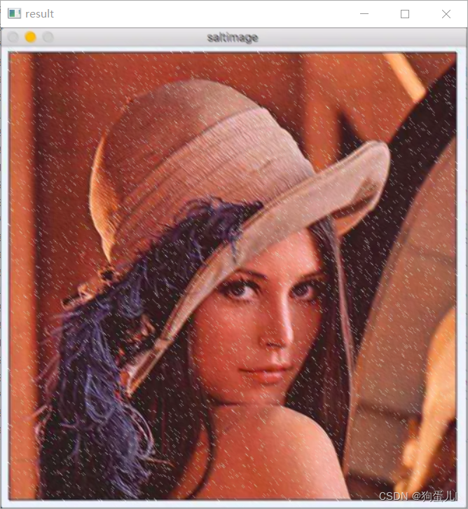
图像处理一百题(11-20)
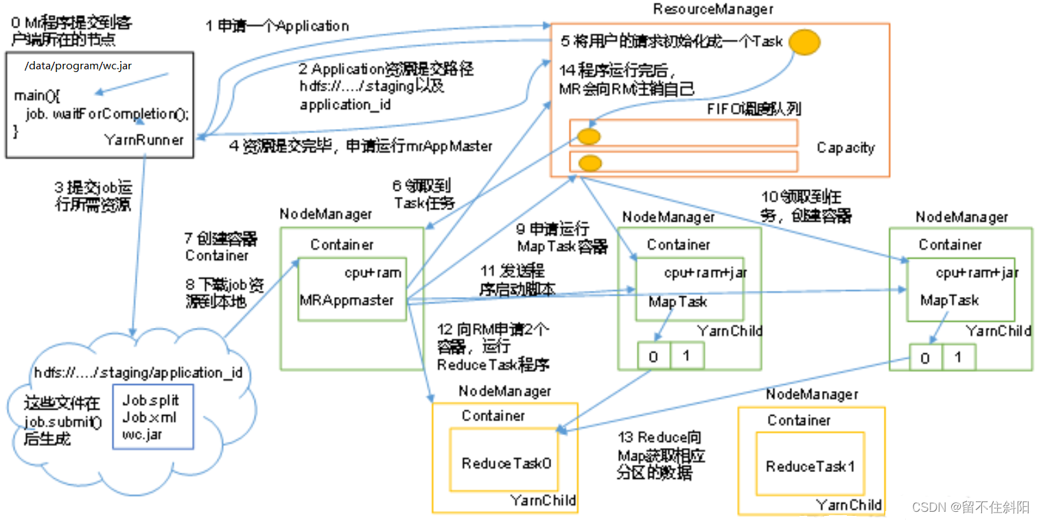
Chapter 5 yarn resource scheduler
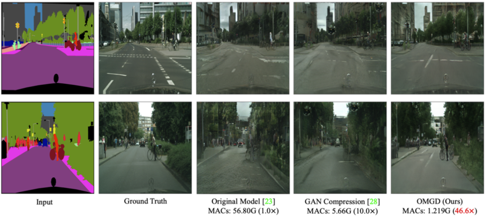
ByteDance open source Gan model compression framework, saving up to 97.8% of computing power - iccv 2021

~Introduction to form 80
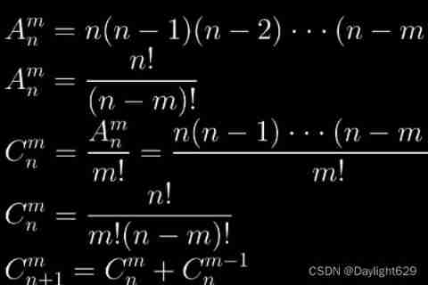
LeetCode 1641. Count the number of Lexicographic vowel strings
Chapter III principles of MapReduce framework
随机推荐
第三章 MapReduce框架原理
Basic principles of video compression coding and audio compression coding
Codeforces Global Round 19
~77 linear gradient
Research Report on market supply and demand and strategy of China's tetraacetylethylenediamine (TAED) industry
Cmake Express
~82 style of table
字节跳动开源GAN模型压缩框架,算力最高节省97.8%丨ICCV 2021
Data config problem: the reference to entity 'useunicode' must end with ';' delimiter.
~87 animation
LeetCode 1638. Count the number of substrings with only one character difference
第五章 Yarn资源调度器
Codeforces Round #771 (Div. 2)
Research Report on market supply and demand and strategy of China's four seasons tent industry
Shell_ 02_ Text three swordsman
CMake速成
Jedis
亮相Google I/O,字节跳动是这样应用Flutter的
Codeforces Round #771 (Div. 2)
我走過最迷的路,是字節跳動程序員的腦回路