当前位置:网站首页>Detailed explanation of transform origin attribute
Detailed explanation of transform origin attribute
2022-07-07 07:14:00 【Luqi zz】
transform-origin Base point for animating ( Center point ) , Applicable to all block level elements and some inline elements .
Must cooperate transform Use By default , The action reference point of the element is the center of the element box
You can set the value of nine positions : horizontal direction : left center right
0 50% 100%
vertical direction : top center bottom
The default value is :50% 50% , be relative to center center
Two ways of writing ,
eg:
transform-origin: left;
transform-origin:0;
grammar :
transform-origin: x-axis y-axis z-axis;
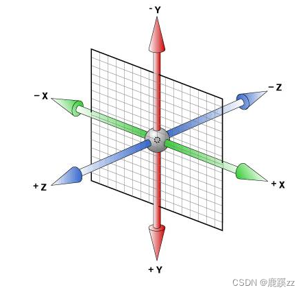
Attribute value details
 <div class="outer">
        <div class="inner"></div>
        <div class="inner"></div>
    </div>
1. The default value is , Rotate at its origin 45deg
       .outer {
            width: 100px;
            height: 100px;
            background-color: #6a5acd8c;
            margin: 200px;
            position: relative;
        }
         /* (1) Default rotation , Red is the base point    The default value is  transform-origin: 50% 50% 0;*/
        .inner {
            transform: rotate(45deg);
            /* transform-origin: 50% 50% 0; */
            width: 100%;
            height: 100%;
            background-color: #6a5acdeb;
        }
        .outer .inner:nth-child(2){
            width: 5px;
            height: 5px;
            background-color: red;
            transform: none;
            position: absolute;
            top: 50px;
            left: 50px;
        }
2. Rotate at the top 180deg
       .outer {
            width: 100px;
            height: 100px;
            background-color: #6a5acd8c;
            margin: 200px;
            position: relative;
        }

        /* (2) Rotate at the top 180deg */
        .inner {
            transform: rotate(180deg);
            transform-origin: 50% 0;
            width: 100%;
            height: 100%;
            background-color: #6a5acdeb;
        }

        .inner:nth-child(2) {
            width: 5px;
            height: 5px;
            background-color: red;
            transform: none;
            position: absolute;
            top: -2.5px;
            left: 50px;
} 
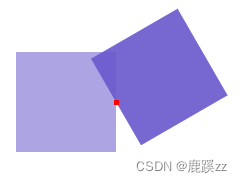
3. Rotate on the right 150deg
 /*   Rotate on the right 150deg  Red is the base point  */
        .inner {
            transform: rotate(150deg);
            transform-origin: 100% 50%;
            width: 100%;
            height: 100%;
            background-color: #6a5acdeb;
        }
        .inner:nth-child(2) {
            width: 5px;
            height: 5px;
            background-color: red;
            transform: none;
            position: absolute;
            top: 47.5px;
            left: 97.5px;
        }
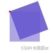
4. Rotate in the upper left corner 20deg Red is the base point
.inner {
            transform: rotate(-20deg);
            transform-origin: 0 0;
            width: 100%;
            height: 100%;
            background-color: #6a5acdeb;
        }
        .inner:nth-child(2) {
            width: 5px;
            height: 5px;
            background-color: red;
            transform: none;
            position: absolute;
            top: -2.5px;
            left: -2.5px;
        }
From the above example, we can see , The offset position represented by the attribute value , Knowing the offset position represented by each attribute value can flexibly make the element rotate according to a certain benchmark .
边栏推荐
- Mysql---- import and export & View & Index & execution plan
- MySQL binlog related commands
- js小练习
- Basic introduction of JWT
- AVL树的实现
- Please tell me how to monitor multiple schemas and tables by listening to PgSQL
- 请问 flinksql对接cdc时 如何实现计算某个字段update前后的差异 ?
- Jetpack compose is much more than a UI framework~
- ViewModelProvider. Of obsolete solution
- Composition API 前提
猜你喜欢
Fast quantitative, abbkine protein quantitative kit BCA method is coming!

sql中对集合进行非空校验
The currently released SKU (sales specification) information contains words that are suspected to have nothing to do with baby
Implementation of AVL tree
Introduction to abnova's in vitro mRNA transcription workflow and capping method
Reflection (II)
Network foundation - header, encapsulation and unpacking

Non empty verification of collection in SQL
Communication between non parent and child components
Abnova immunohistochemical service solution
随机推荐
Stack Title: nesting depth of valid parentheses
点亮显示屏的几个重要步骤
From zero to one, I will teach you to build the "clip search by text" search service (2): 5 minutes to realize the prototype
Pass child component to parent component
父组件传递给子组件:Props
leetcode 509. Fibonacci number
Initial experience of addresssanitizer Technology
Sword finger offer high quality code
Apache AB stress test
选择商品属性弹框从底部弹出动画效果
Abnova membrane protein lipoprotein technology and category display
Reflection (II)
Non empty verification of collection in SQL
Abnova immunohistochemical service solution
mips uclibc 交叉编译ffmpeg,支持 G711A 编解码
Circulating tumor cells - here comes abnova's solution
$parent (get parent component) and $root (get root component)
Tool class: object to map hump to underline underline hump
readonly 只读
The latest trends of data asset management and data security at home and abroad