当前位置:网站首页>QT style settings of qcobobox controls (rounded corners, drop-down boxes, up expansion, editable, internal layout, etc.)
QT style settings of qcobobox controls (rounded corners, drop-down boxes, up expansion, editable, internal layout, etc.)
2022-07-06 16:16:00 【Larry_ Yanan】
Preface
QT When designing the interface , It is inevitable to encounter modifications QCombobox The question of style . Compared with other QLabel、QPushButton Other controls ,QCobobox The style setting of is obviously difficult and complicated . The following is an introduction to the present , I refer to the online code , Made a QCobobox The style of the drop-down box .
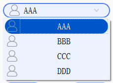
design sketch :
Text
One 、 Basic style sheet
/*QCombobox The main body */
QComboBox {

    border: 2px solid #f3f3f3;/* Set the line width */
	background-color: rgb(237, 242, 255);/* The background color */
    border-radius: 15px;/* Round corners */
    padding: 1px 2px 1px 2px;  /* For the text content in the combo box */
	text-align:bottom;
    min-width: 9em;   /*#  Minimum width of combo box */
    /*min-height: 5em;*/

	border-style:solid;/* The border is solid */
	border-width:2px;/* Border width */
	border-color:rgb(77, 123, 255);/* Border color */

	padding-left: 10px;/* Left margin */
}
/*QCombobox Right button */
QComboBox::drop-down {

    subcontrol-origin: padding;
    subcontrol-position: top right;/* Put it on the top of the right */
    width: 50px;/* Set the width of the button range */
 	/*border-radius: 15px; border-left-width: 1px; border-left-color: darkgray; border-left-style: solid;*/

    border-top-right-radius: 3px;/* Make the border rounded */
    border-bottom-right-radius: 3px;
/*padding-right: 50px;*/
}
/*QCombobox Arrow icon of the right button */
QComboBox::down-arrow {

	border-image: url(:/image/down_list.png);/* Custom picture filling */
	width: 10px;/* Set the width and height of the icon */
	height: 10px;
}


/*  Drop it down , The whole drop-down form style  */
QComboBox QAbstractItemView {

    border: 2px solid #f3f3f3;/* Border width 、 Linear 、 Color */
	background-color: rgba(237, 242, 255, 1);/* The background color */
    border-radius: 15px;/* Round corners */
    padding: 1px 2px 1px 2px;  /* For the text content in the combo box */
    min-width: 9em;   /*#  Minimum width of combo box */
}

/*  Drop it down , The style of each item in the whole drop-down form  */
QComboBox QAbstractItemView::item {

	border-radius: 15px;/* Round corners */
    height: 30px;   /*  The height of the item ( Set up pComboBox->setView(new QListView()); after , This item only works ) */
	background-color: rgb(237, 242, 255);

}

/* I don't know why the following parts don't take effect , To be debugged */
/*  Drop it down , The entire drop-down form crosses the style of each item  */
QComboBox QAbstractItemView::item:hover {

    color: #FFFFF0;
       /*  The entire drop-down form crosses the background color of each item  */
	background-color: rgb(98, 0, 255);
}

/*  Drop it down , The style of each item selected in the whole drop-down form  */
QComboBox QAbstractItemView::item:selected {

    color: #FFFFF0;
	background-color: rgb(0, 85, 200);
}
Add :
1. use border-radius: 15px; When setting the fillet , The height of the control should at least ensure 30px, To show the fillet , Otherwise, it is rectangular .
2. In the corresponding parent window class initialization code , add to setView(new QListView());, The expansion box style of the drop-down box will take effect .
	//combobox The drop-down box style sheet takes effect
    ui->comboBox->setView(new QListView());
problem :
1. The rounded corner and transparent color style of the drop-down box cannot be realized
/*  Drop it down , The whole drop-down form style  */
QComboBox QAbstractItemView {

    border: 2px solid #f3f3f3;/* Border width 、 Linear 、 Color */
	background-color: rgba(237, 242, 255, 1);/* The background color */
    border-radius: 15px;/* Round corners */
    padding: 1px 2px 1px 2px;  /* For the text content in the combo box */
    min-width: 9em;   /*#  Minimum width of combo box */
}
This problem , The preliminary guess is that the expansion box belongs to QWidget, You may need to customize this expansion box again , Set the transparent property for it .( To be verified )
2. Optional suspension and selected state styles are not effective
/* I don't know why the following parts don't take effect , To be debugged */
/*  Drop it down , The entire drop-down form crosses the style of each item  */
QComboBox QAbstractItemView::item:hover {

    color: #FFFFF0;
       /*  The entire drop-down form crosses the background color of each item  */
	background-color: rgb(98, 0, 255);
}

/*  Drop it down , The style of each item selected in the whole drop-down form  */
QComboBox QAbstractItemView::item:selected {

    color: #FFFFF0;
	background-color: rgb(0, 85, 200);
}
3.QCombobox The text of cannot be centered
I seem to have checked it a little before , It's more difficult to realize . Successful friends can communicate in the comment area ~~
Two 、ui designer Add options directly
Pictured :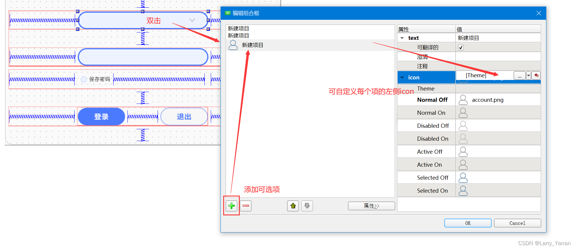
You can set icon size 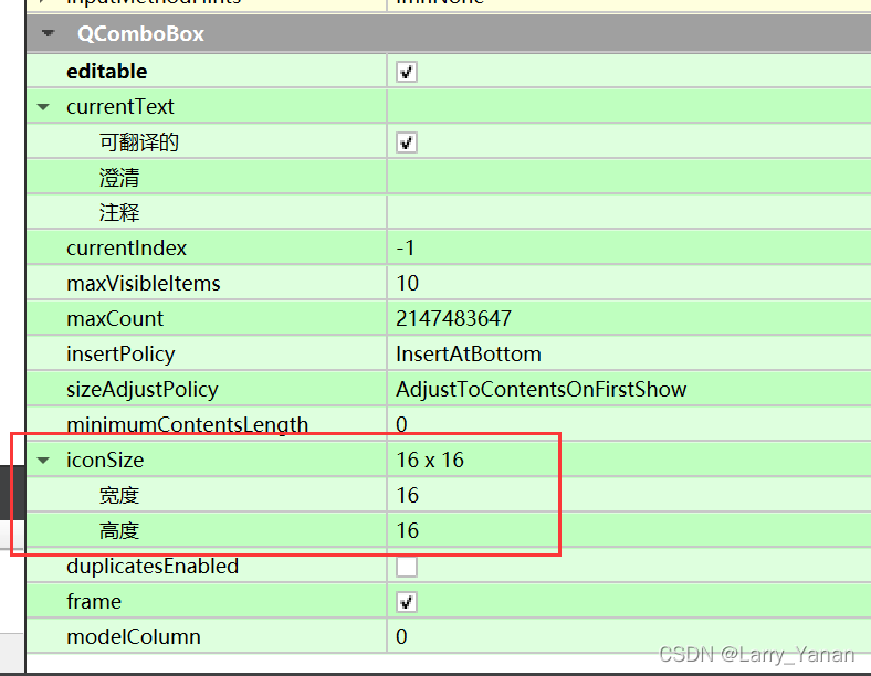
3、 ... and 、 Code addition options
More common , In fact, the program is running , Dynamic to QCombobox Fill options . For example, fill in the person name data when logging in 、 The resolution list when selecting the camera resolution and other non fixed elements .
The following is the specific operation code , A little more, but very simple :
	// Fill the drop-down options
    ui->comboBox->clear();// Empty combobox
    QStandardItemModel *pItemModel = qobject_cast<QStandardItemModel*>(ui->comboBox->model());

    // Font settings
    int combobox_item_fontsize = 9;
    QFont font;
    //font.setPixelSize(combobox_item_fontsize*scale);
    font.setPointSize(combobox_item_fontsize);
    font.setFamily(" In black ");

    // Fill in the default ( When there is no data , You can first make a default prompt item for the user , Then let the user input by himself )
    QString tip_string(u8" Please select user name ");
    ui->comboBox->addItem(tip_string);
    pItemModel->item(0)->setIcon(QIcon(":/image/account.png"));    // Modify an icon
    pItemModel->item(0)->setForeground(QColor(255, 0, 0));            // Change a text color
    pItemModel->item(0)->setBackground(QColor(220,220,220));    // Change a background color
    pItemModel->item(0)->setFont(font);
    pItemModel->item(0)->setTextAlignment(Qt::AlignVCenter | Qt::AlignHCenter);    // Modify the alignment of a text

    // Fill in formal items
    if(ui->comboBox->currentText() == tip_string)
        ui->comboBox->clear();

    int i= 0;
    QStringList m_list;// Feel free to fill in the data
    m_list<<"AAA"<<"BBB"<<"CCC"<<"DDD";
    foreach (QString name, m_list)
    {

        qDebug()<<"combobox additem:"<<name;
        ui->comboBox->addItem(name);

        pItemModel->item(i)->setIcon(QIcon(":/image/account.png"));    // Modify an icon
        //pItemModel->item(i)->setText(" Modified text  " + QString::number(i + 1)); // Modify a text
        //pItemModel->item(i)->setForeground(QColor(255, 0, 0)); // Change a text color
        //pItemModel->item(i)->setBackground(QColor(220,220,220)); // Change a background color ( If the background color of the table item has been set in the style sheet , It will not take effect )
        pItemModel->item(i)->setFont(font);
        pItemModel->item(i)->setTextAlignment(Qt::AlignVCenter | Qt::AlignHCenter);    // Modify the alignment of a text
        i++;
    }

    // After the above settings , The first item will be selected by default . Can be selected manually -1 term , It is unselected
    //ui->comboBox->setCurrentIndex(-1);
Four 、 The drop-down box expands upward
Sometimes , We expect QCombobox The drop-down box of expands upwards , For example, the control has come to the bottom edge of the screen , If you follow the original downward expansion , Is partially blocked by the taskbar .( Although it is beyond the edge of the screen , It seems to expand upward automatically , But there is always a need to expand upwards hh)
The method is to customize a class again , Inherit QCombobox class , And then reload showPopup(); function
void showPopup() override;

void myCombox::showPopup()
{

    QComboBox::showPopup();
    QWidget *popup = this->findChild<QFrame*>();

	// Aiming at the present ui Layout , Calculation QCombobox Global coordinates
    int combobox_y = static_cast<MainWindow *>(this->parent()->parent()->parent()->parent())->y() +
            static_cast<QWidget *>(this->parent()->parent()->parent())->y() +
            static_cast<QWidget *>(this->parent()->parent())->y()+
            static_cast<QWidget *>(this->parent())->y()+
            this->y();
    if(popup->y() > combobox_y)
    {

        popup->move(popup->x(),popup->y()-this->height()-popup->height());//x The axis does not change ,y Move up axially  list The height of +combox The height of

    }else{

        //popup->move(popup->x(),popup->y()-this->height()-popup->height());//x The axis does not change ,y Move up axially  list The height of +combox The height of
    }
}
The unfolding behavior is QComboBox::showPopup();, The expanded window is QWidget ( So in fact, it can be further optimized )
Then there is the movement of this window . It must have a default location for the expansion box .
Logic is simply , First calculate QCombobox Overall situation y coordinate . Then compare the current actual expansion box y value , Judge whether it is expanded upward or downward .
If it is down , Then manually move Hit him ,y Value reduction QCombobox And the height of the expansion box , You can achieve upward expansion .
in addition , I calculate QCombobox I'm so stupid when it comes to global coordinates hh, In fact, there are other algorithms , Try it yourself .
5、 ... and 、 Detailed style sheets ( Edit the state of the mode )
( Reference resources Qt.QComboBox Style sheets )
/*  When not pulled down ,QComboBox The style of  */
QComboBox {

    border: 1px solid gray;   /*  Frame  */
    border-radius: 3px;   /*  Round corners  */
    padding: 1px 18px 1px 3px;   /*  Font padding  */
    color: #000;
    font: normal normal 15px "Microsoft YaHei";
    background: transparent;
}

/*  Drop it down , The whole drop-down form style  */
QComboBox QAbstractItemView {

    outline: 0px solid gray;   /*  The empty box of the selected item  */
    border: 1px solid yellow;   /*  The border of the whole drop-down form  */
    color: green;
    background-color: red;   /*  The background color of the whole drop-down form  */
    selection-background-color: lightgreen;   /*  The background color of the selected item in the whole drop-down form  */
}

/*  Drop it down , The style of each item in the whole drop-down form  */
QComboBox QAbstractItemView::item {

    height: 50px;   /*  The height of the item ( Set up pComboBox->setView(new QListView()); after , This item only works ) */
}

/*  Drop it down , The entire drop-down form crosses the style of each item  */
QComboBox QAbstractItemView::item:hover {

    color: #FFFFFF;
    background-color: lightgreen;   /*  The entire drop-down form crosses the background color of each item  */
}

/*  Drop it down , The style of each item selected in the whole drop-down form  */
QComboBox QAbstractItemView::item:selected {

    color: #FFFFFF;
    background-color: lightgreen;
}

/* QComboBox Vertical scroll bar in  */
QComboBox QAbstractScrollArea QScrollBar:vertical {

    width: 10px;
    background-color: #d0d2d4;   /*  The background color of the blank area   gray green */
}

QComboBox QAbstractScrollArea QScrollBar::handle:vertical {

    border-radius: 5px;   /*  Round corners  */
    background: rgb(160,160,160);   /*  The background color of the small square is dark gray lightblue */
}

QComboBox QAbstractScrollArea QScrollBar::handle:vertical:hover {

    background: rgb(90, 91, 93);   /*  Cross the background color of the small square yellow */
}

/*  Set to editable (setEditable(true))editable when , Edit the style of the area  */
QComboBox:editable {

    background: green;
}

/*  Set to non editable (setEditable(false))!editable when , Whole QComboBox The style of  */
QComboBox:!editable {

     background: blue;
}

/*  Set to editable editable when , Click on the whole QComboBox The style of  */
QComboBox:editable:on {

    background: green;
}

/*  Set to non editable !editable when , Click on the whole QComboBox The style of  */
QComboBox:!editable:on {

     background: blue;
}

/*  Set to editable editable when , The style of the drop-down box  */
QComboBox::drop-down:editable {

    background: lightblue;
}

/*  Set to editable editable when , Click the style of the drop-down box  */
QComboBox::drop-down:editable:on {

    background: lightgreen;
}

/*  Set to non editable !editable when , The style of the drop-down box  */
QComboBox::drop-down:!editable {

    background: lightblue;
}

/*  Set to non editable !editable when , Click the style of the drop-down box  */
QComboBox::drop-down:!editable:on {

    background: lightgreen;
}

/*  Click on QComboBox */
QComboBox:on {

}

/*  Drop down box style  */
QComboBox::drop-down {

    subcontrol-origin: padding;   /*  The origin rectangle of the child control in the parent element . If this property is not specified , The default is padding. */
    subcontrol-position: top right;   /*  The position of the drop-down box ( The upper right ) */
    width: 15px;   /*  The width of the drop-down box  */

    border-left-width: 1px;   /*  The width of the left boundary of the drop-down box  */
    border-left-color: darkgray;   /*  The left boundary color of the drop-down box  */
    border-left-style: solid;   /*  The left boundary of the drop-down box is a solid line  */
    border-top-right-radius: 3px;   /*  The fillet radius of the upper right boundary line of the drop-down box ( Should be consistent with the whole QComboBox The fillet radius of the upper right boundary line is the same ) */
    border-bottom-right-radius: 3px;   /*  ditto  */
}

/*  Drop down arrow style  */
QComboBox::down-arrow {

    width: 15px;   /*  The width of the drop-down arrow ( Suggestions and drop-down boxes drop-down Consistent width of ) */
    background: transparent;   /*  The background color of the drop-down arrow  */
    padding: 0px 0px 0px 0px;   /*  Top inner margin 、 Inside right margin 、 Bottom inside margin 、 Left inner margin  */
    image: url(:/images/combobox_arrow_down.png);
}

/*  Click the drop-down arrow  */
QComboBox::down-arrow:on {

    image: url(:/images/combobox_arrow_up.png);   /*  Show the drop-down arrow  */
}
In this version, he takes into account the state of editing mode , And the division is very detailed , You can learn .
1. Pit encountered
We know , If you want to change QCombobox The font of , It only needs setFont() That's all right. , That is to say
ui->comboBox->setFont(font);
But when we select editable status , Often the font of the displayed text has not changed
ui.comboBox->setEditable(true);
// After that, the font setting is invalid
This is because the normal text display is different from the editable display , As I understand it , One is embedded QLabel Show text , The other is embedded QLineEdit, Used for text input . So then , Our modification object has become QCombobox The children of QLineEdit:
ui->comboBox->lineEdit()->setFont(font);
In this case , To really respond to the successful setting
6、 ... and 、QCombobox The layout of the interior
Follow step 5 , I finally realized that QCombobox Just a collection of container parts , It actually encapsulates many other things , That's why it has lineedit and qicon Something .
Then another style setting method is derived , That is to set the internal layout directly , as follows :
	QLabel *man = new QLabel(this);
    man->setFixedSize(20*scale, 20*scale);
    man->setCursor(QCursor(Qt::ArrowCursor));
    man->setPixmap(QPixmap(":/login/icon_account.png"));
    man->setScaledContents(true);

    QSpacerItem *spaceItem_name = new QSpacerItem(100, 10, QSizePolicy::Expanding);
    QHBoxLayout *editLayout_name = new QHBoxLayout();
    editLayout_name->setContentsMargins(14*scale, 0, 0, 0);
    editLayout_name->addWidget(man);
    editLayout_name->addSpacerItem(spaceItem_name);
    ui.comboBox->setLayout(editLayout_name);
If you have experience in manual code layout , You should be able to easily understand this way of setting . My code , First use QLabel Create an icon , Then add a spring , In the layout Set it in . In this way , The effect is the same as that of the direct style sheet , Even better and more flexible .
For example, if the drag window changes QCombobox The size of the , You can also change the size of the icon with it , If you don't want to change, just Fix Set dead , But this way is cross screen 、 Display under different resolutions , When perfect fit is needed , It can save a lot of work .
You can also make the left Icon , Middle spring , The icon of the right drop-down arrow , In this way, you only need to set the left and right spacing of the text in the style sheet , You can achieve any layout you want perfectly .
边栏推荐
- [exercise-4] (UVA 11988) broken keyboard = = (linked list)
- 605. Planting flowers
- Is the sanic asynchronous framework really so strong? Find truth in practice
- [exercise-7] (UVA 10976) fractions again?! (fraction split)
- Codeforces Round #803 (Div. 2)A~C
- frida hook so层、protobuf 数据解析
- Candy delivery (Mathematics)
- Opencv learning log 24 -- Hough transform 2 (maximum interval and minimum length can be limited)
- Date plus 1 day
- MySQL grants the user the operation permission of the specified content
猜你喜欢

605. Planting flowers
拉取分支失败,fatal: ‘origin/xxx‘ is not a commit and a branch ‘xxx‘ cannot be created from it
Codeforces Round #799 (Div. 4)A~H
1013. Divide the array into three parts equal to and
QT按钮点击切换QLineEdit焦点(含代码)
1903. Maximum odd number in string
QT模拟鼠标事件,实现点击双击移动拖拽等
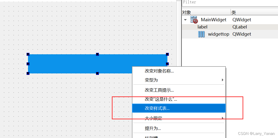
QWidget代码设置样式表探讨
7-1 understand everything (20 points)

“鬼鬼祟祟的”新小行星将在本周安全掠过地球:如何观看
随机推荐
[exercise-4] (UVA 11988) broken keyboard = = (linked list)
Codeforces Round #799 (Div. 4)A~H
Codeforces round 797 (Div. 3) no f
QT实现圆角窗口
Opencv learning log 27 -- chip positioning
[exercise-9] Zombie's Treasury test
[exercise-5] (UVA 839) not so mobile (balance)
antd upload beforeUpload中禁止触发onchange
Codeforces Round #803 (Div. 2)A~C
[exercise-6] (PTA) divide and conquer
Auto. Getting started with JS
Date plus 1 day
QNetworkAccessManager实现ftp功能总结
Suffix expression (greed + thinking)
Shell Scripting
Pytorch extract skeleton (differentiable)
Opencv learning log 29 -- gamma correction
[exercise-1] (UVA 673) parentheses balance/ balanced brackets (stack)
Differential (one-dimensional, two-dimensional, three-dimensional) Blue Bridge Cup three body attack
Problem - 922D、Robot Vacuum Cleaner - Codeforces