当前位置:网站首页>Matplotlib绘图界面设置
Matplotlib绘图界面设置
2022-07-07 15:38:00 【En^_^Joy】
坐标界限与标题
| 代码 | 含义 | 参数 |
|---|---|---|
| plt.xlim() | 定义x轴坐标界限 | 最左边的值,最右边的值 |
| plt.ylim() | 定义y轴坐标界限 | 最下边的值,最上边的值 |
| plt.axis() | 设置坐标界限 | [xmin,xmax,ymin,ymax] |
plt.axis('tight') | 收紧坐标轴,不留空白 | |
plt.axis('equal') | 设置屏幕显示图形的分辨率(两轴单位长度比例) | |
| plt.title() | 图形标题 | |
| plt.xlabel() | x轴坐标标题 | |
| plt.ylabel() | y轴坐标标题 | |
| plt.style.use() | 表格风格 | |
ax.spines['top'].set_color('none') | 隐藏坐标轴顶边界 | |
ax.spines['right'].set_color('none') | 隐藏坐标轴右边界 | |
| ax.xaxis.set_major_locator(MultipleLocator(2)) | 定义x坐标轴的刻度单位 | 需from matplotlib.pyplot import MultipleLocator |
| ax.yaxis.set_major_locator(MultipleLocator(0.1)) | 定义y坐标轴的刻度单位 | 需from matplotlib.pyplot import MultipleLocator |
| plt.xticks() | 更换刻度 | 坐标位置,替代数据([0.2, 0.4, 0.6], ['A', 'B', 'C']) |
表格风格
使用plt.style.available可以看到所有的风格
| Solarize_Light2 | _classic_test_patch | bmh | classic | dark_background |
| fast | fivethirtyeight | ggplot | grayscale | seaborn |
| seaborn-bright | seaborn-colorblind | seaborn-dark | seaborn-dark-palette | seaborn-darkgrid |
| seaborn-deep | seaborn-muted | seaborn-notebook | seaborn-paper | seaborn-pastel |
| seaborn-poster | seaborn-talk | seaborn-ticks | seaborn-white | seaborn-whitegrid |
| tableau-colorblind10 |
样式表的使用方法
plt.style.use('fivethirtyeight')
这样会改变所有表格的风格,如果需要,可以使用风格上下文管理器临时更换至另一种风格:
with plt.style.context('fivethirtyeight'):
    plt.plot([1,2,3], [3,1,2])
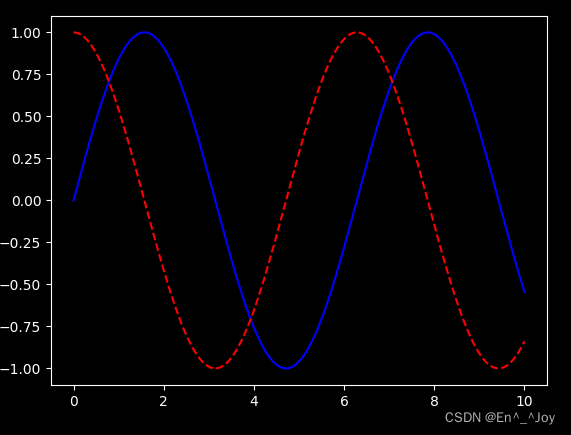
dark_background风格
plt.style.use('dark_background')

x = np.linspace(0,10,1000)
fig, ax = plt.subplots()
ax.plot(x, np.sin(x),'-b')
ax.plot(x, np.cos(x), '--r')
文字与注释
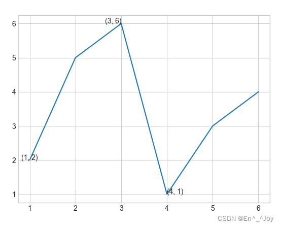
plt.text():添加注释(等于ax.text())
该方法需要x轴位置、y轴位置、字符串、以及一些可选参数,如文字颜色、字号、风格、对齐方式等
plt.plot([1,2,3,4,5,6], [2,5,6,1,3,4])

# 在图中添加文字
ax.text(1,2,(1,2), ha='center')
ax.text(3,6,'(3, 6)', ha='right')
ax.text(4,1,str((4,1)))
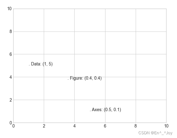
transform参数:坐标变换与文字位置
ax.transData:以数据为基准的坐标变换(坐标轴)ax.transAxes:以坐标轴为基准的坐标变换(以坐标轴维度为单位)(坐标系比例)fig.transFigure:以图形为基准的坐标变换(以图形维度为单位)(图比例)
ax.set_xlim(0,10)
ax.set_ylim(0,10)

# 在图中添加文字
ax.text(1, 5, ". Data: (1, 5)", transform=ax.transData)
ax.text(0.5, 0.1, ". Axes: (0.5, 0.1)", transform=ax.transAxes)
ax.text(0.4, 0.4, ". Figure: (0.4, 0.4)", transform=fig.transFigure)
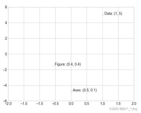
当改变坐标轴时,只有ax.transData的点会变
ax.set_xlim(-2,2)
ax.set_ylim(-6,6)
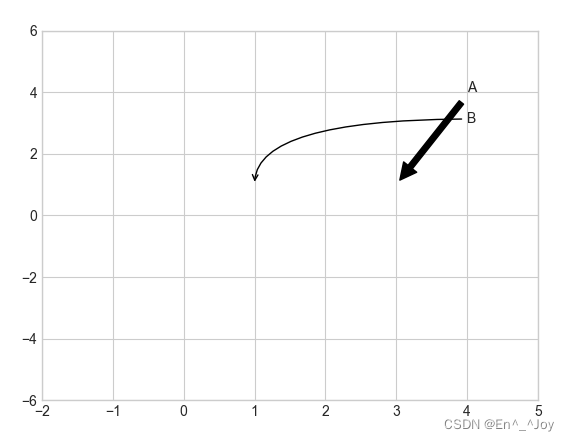
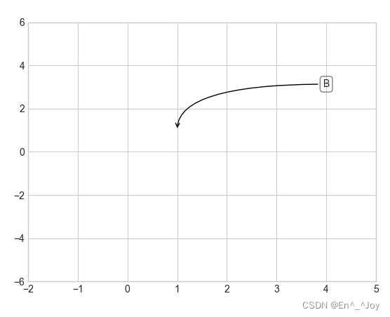
箭头与注释
plt.annotate():画箭头及注释
ax.set_xlim(-2,5)
ax.set_ylim(-6,6)

ax.annotate('A', xy=(3, 1), xytext=(4, 4), arrowprops=dict(facecolor='black', shrink=0.05))
ax.annotate('B', xy=(1, 1), xytext=(4, 3), arrowprops=dict(arrowstyle="->", connectionstyle="angle3,angleA=0,angleB=-90"))
ax.annotate('B', xy=(1, 1), bbox=dict(boxstyle="round",fc="none",ec="gray"), xytext=(4, 3),
            ha='center',arrowprops=dict(arrowstyle="->", connectionstyle="angle3,angleA=0,angleB=-90"))
自定义坐标刻度
定义坐标轴的刻度单位
ax.xaxis.set_major_locator(MultipleLocator(0.2))
ax.yaxis.set_major_locator(MultipleLocator(0.3))
隐藏上边界右边界
ax.spines['top'].set_color('none')
ax.spines['right'].set_color('none')
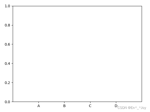
更换刻度
plt.xticks([0.2, 0.4, 0.6, 0.8], ['A', 'B', 'C', 'D'])
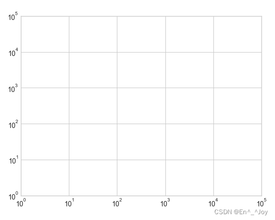
主要刻度与次要刻度
主要刻度往往更大,次要刻度往往更小,比如对数图
# 创建图形
fig = plt.figure()
# 坐标轴
ax = plt.axes(xscale='log', yscale='log')
ax.set_xlim(10**0,10**5)
ax.set_ylim(10**0,10**5)
设置每个坐标轴的formatter和locator自定义刻度属性
隐藏刻度与标签
隐藏刻度与标签通常使用plt.NullLocator()与plt.NullFormatter()实现
下列我们除去了X轴标签(但是保留了刻度线/网格线),Y轴的刻度(标签也一并移除)
# 创建图形
fig = plt.figure()
# 坐标轴
ax = plt.axes()
ax.set_xlim(0,5)
ax.set_ylim(0, 5)

ax.yaxis.set_major_locator(plt.NullLocator())
ax.xaxis.set_major_formatter(plt.NullFormatter())

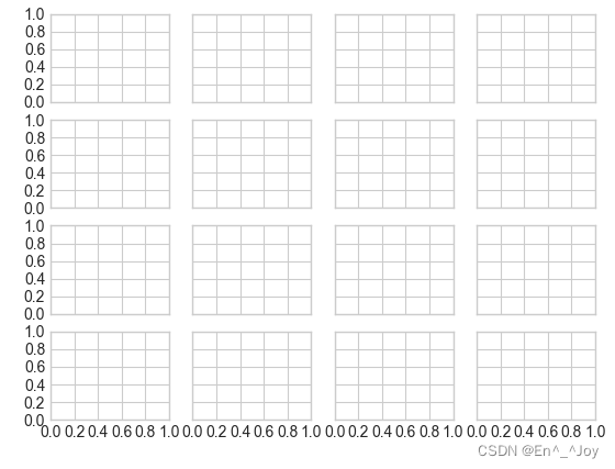
增减刻度数量
通过plt.MaxNLocator()设置最多显示多少刻度
fig, ax = plt.subplots(4, 4, sharex=True, sharey=True)
for axi in ax.flat:
    axi.xaxis.set_major_locator(plt.MaxNLocator(5))
    axi.yaxis.set_major_locator(plt.MaxNLocator(5))
格式生成器与定位器小结
| 定位器类 | 描述 |
|---|---|
| NullLocator | 无刻度 |
| FixedLocator | 刻度位置固定 |
| IndexLocator | 用索引作为定位器(如x=range(len(y)) |
| LinearLocator | 从min到max均匀吩咐刻度 |
| LogLocator | 从min到max按对数分布刻度 |
| MultipleLocator | 刻度和范围都是基数(base)的倍数 |
| MaxNLocator | 为最大刻度找到最优位置 |
| AutoLocator | (默认)以MaxNLocator进行简单配置 |
| AutoMinorLocator | 次要刻度的定位器 |
| 格式生成器类 | 描述 |
|---|---|
| NullFormatter | 刻度上无标签 |
| IndexFormatter | 将一组标签设置为字符串 |
| FixedFormatter | 手动为刻度设置标签 |
| FuncFormatter | 用自定义函数设置标签 |
| FormatStrFormatter | 为每个刻度值设置字符串格式 |
| ScalarFormatter | (默认)为标签值设置标签 |
| LogFormatter | 对数坐标轴的默认格式生成器 |
图线含义说明(图例)
| 函数 | 参数 | 含义 |
|---|---|---|
| ax.legend() | 可以没有参数,也可以有以下参数 | 创建图线含义 |
loc='upper left' | 图线说明位置 | |
frameon=False | 取消图例外框 | |
ncol=2 | 图例标签列数 | |
fancybox=True | 图例圆角边框 | |
framealpha=0.5 | 边框透明度 | |
borderpad=1 | 文字间距 | |
shadow=True | 增加阴影 |
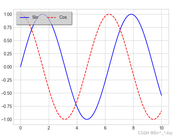
plt.legend():创建包含每个图形元素的图例
x = np.linspace(0,10,1000)
fig, ax = plt.subplots()
ax.plot(x, np.sin(x),'-b', label='Sin')
ax.plot(x, np.cos(x), '--r', label='Cos')

leg = ax.legend(loc='upper left', frameon=True, ncol=2, fancybox=True, framealpha=0.5, borderpad=1, shadow=True)
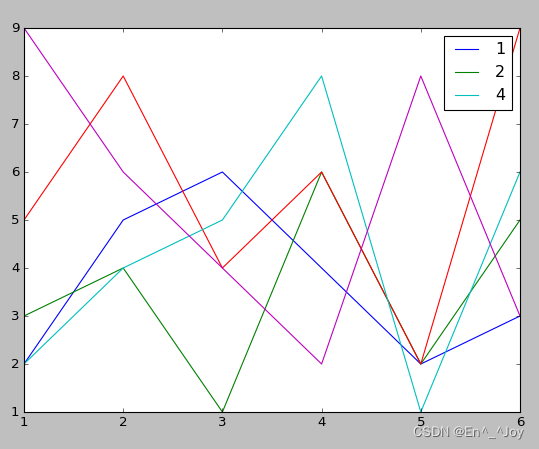
选择图例显示的元素
通过在plt.plot()里面使用或不使用label参数来确定是否显示图标
x = [1,2,3,4,5,6]
plt.plot(x, [2,5,6,4,2,3], label='1')
plt.plot(x, [3,4,1,6,2,5], label='2')
plt.plot(x, [5,8,4,6,2,9])
plt.plot(x, [2,4,5,8,1,6], label='4')
plt.plot(x, [9,6,4,2,8,3])

# 显示图标
plt.legend()
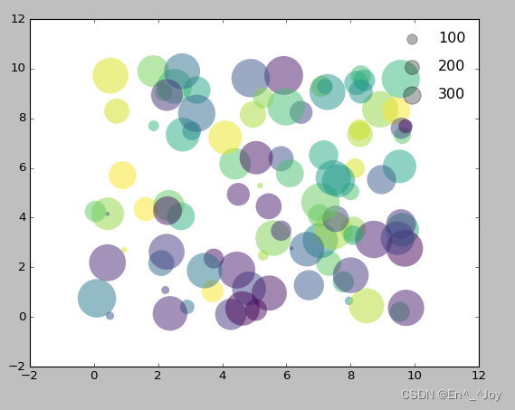
在图例中显示不同尺寸的点
la = np.random.uniform(0,10,100) # 横坐标
lo = np.random.uniform(0,10,100)  # 纵坐标
po = np.random.randint(0,100,100)  # 颜色
ar = np.random.randint(0,1000,100)  # 大小

# 画图
plt.scatter(lo, la, label=None, c=po, cmap='viridis', s=ar,linewidth=0, alpha=0.5)
# 画图例
for ar in [100,200,300]:
    plt.scatter([],[],c='k',alpha=0.3, s=ar,label=str(ar))


# 显示图标
plt.legend(scatterpoints=1, frameon=False, labelspacing=1)
配置颜色条
为颜色条添加标题
cd = plt.colorbar()
cb.set_label('label')
通过plt.colorbat函数创建颜色条
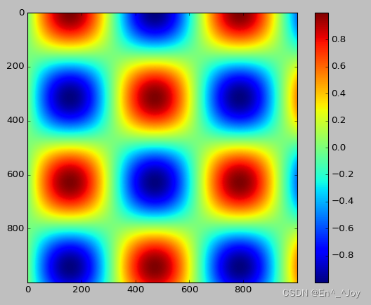
# 画图
x = np.linspace(0,10,1000)
I = np.sin(x)*np.cos(x[:,np.newaxis])

plt.imshow(I)
plt.colorbar()
配置颜色条
cmap参数:设置颜色条的配色方案
plt.imshow(I, cmap='gray')
顺序配色方案:一组连续的颜色构成的配色方案(例如binary或viridis)互逆配色方案:由两种互补的颜色构成,表示两种含义(例如RdBu或PuOr)定性配色方案:随机顺序的一组颜色(例如rainbow或jet)
plt.imshow(I,cmap='jet')
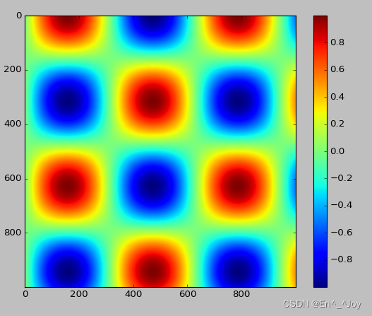
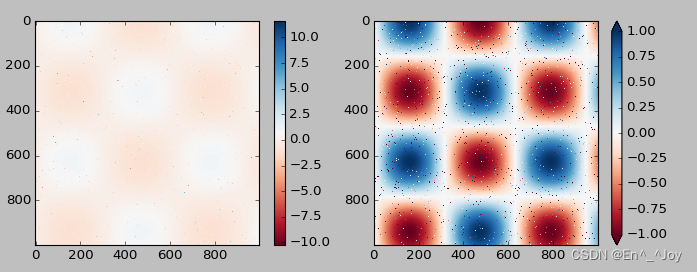
颜色条刻度的限制与扩展功能的设置
可以缩短颜色取值的上下限,对超出上下限的数据,通过extend参数用三角箭头表示比上限大或比上限小的数
x = np.linspace(0,10,1000)
I = np.sin(x)*np.cos(x[:,np.newaxis])
# 为图像设置1%噪点
speckles = (np.random.random(I.shape)<0.01)
I[speckles] = np.random.normal(0,3,np.count_nonzero(speckles))

plt.figure(figsize=(10,3.5))

plt.subplot(1,2,1)
plt.imshow(I, cmap='RdBu')
plt.colorbar()

plt.subplot(1,2,2)
plt.imshow(I, cmap='RdBu')
plt.colorbar(extend='both')
plt.clim(-1,1)
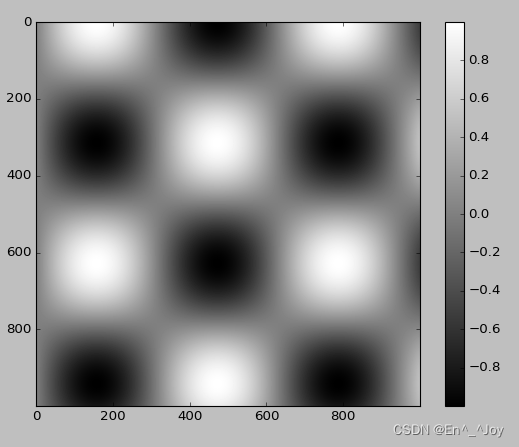
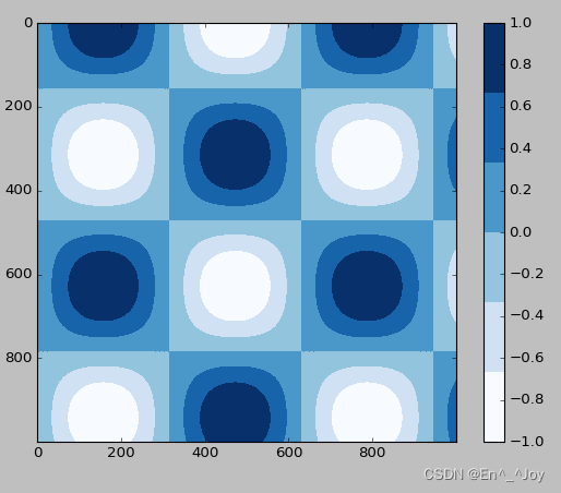
离散型颜色条
有时候需要表示离散的数据,可以使用plt.cm.get_cmap()参数
x = np.linspace(0,10,1000)
I = np.sin(x)*np.cos(x[:,np.newaxis])

plt.imshow(I, cmap=plt.cm.get_cmap('Blues', 6))
plt.colorbar()
plt.clim(-1,1)
手动配置图形
# 用灰色背景
ax = plt.axes(fc='#E6E6E6')
ax.set_axisbelow(True)

# 画上白色的网格线
plt.grid(color='w', linestyle='solid')

# 隐藏坐标轴的线条
for spine in ax.spines.values():
    spine.set_visible(False)

# 隐藏上边与右边的刻度
ax.xaxis.tick_bottom()
ax.yaxis.tick_left()

# 弱化刻度与标签
ax.tick_params(colors='gray', direction='out')
for tick in ax.get_xticklabels():
    tick.set_color('gray')
for tick in ax.get_yticklabels():
    tick.set_color('gray')

# 设置频次直方图轮廓设与填充色
ax.hist(x, edgecolor='#E6E6E6', color='#EE6666')
该方法配置起来很码麻烦,下面这种方法只需配置一次就可以用到所有图形上
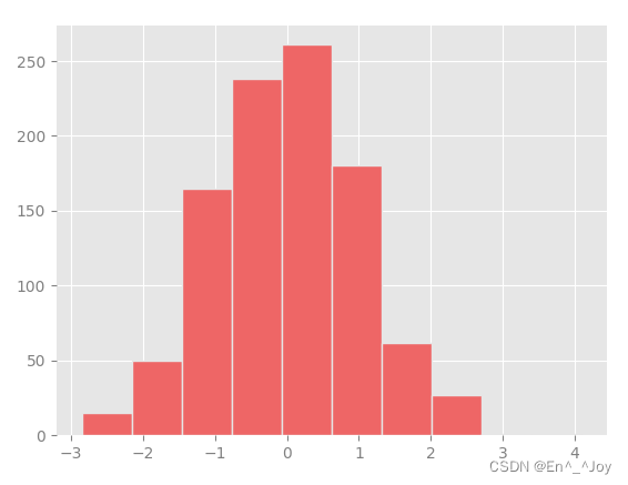
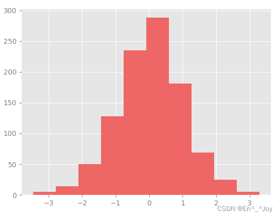
修改默认配置:rcParams
import matplotlib as mpl
import matplotlib.pyplot as plt
import numpy as np
from matplotlib import cycler

#fig, ax = plt.subplots()

# 先复制目前rcParams字典,修改够可以还原回来
Ipython_default = plt.rcParams.copy()

# 用plt.rc函数修改配置参数
colors = cycler('color', ['#EE6666', '#3388BB', '#9988DD', '#EECC55', '#88BB44', '#FFBBBB'])
plt.rc('axes', facecolor='#E6E6E6', edgecolor='none', axisbelow=True, grid=True, prop_cycle=colors)
plt.rc('grid', color='w', linestyle='solid')
plt.rc('xtick', direction='out', color='gray')
plt.rc('ytick', direction='out', color='gray')
plt.rc('patch', edgecolor='#E6E6E6')
plt.rc('lines', linewidth=2)

x = np.random.randn(1000)
plt.hist(x)

# 显示图片
plt.show()
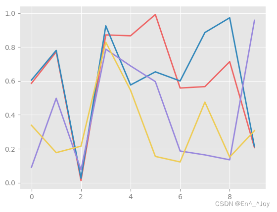
画一些线图看看rc参数的效果
import matplotlib as mpl
import matplotlib.pyplot as plt
import numpy as np
from matplotlib import cycler

#fig, ax = plt.subplots()

# 先复制目前rcParams字典,修改够可以还原回来
Ipython_default = plt.rcParams.copy()

# 用plt.rc函数修改配置参数
colors = cycler('color', ['#EE6666', '#3388BB', '#9988DD', '#EECC55', '#88BB44', '#FFBBBB'])
plt.rc('axes', facecolor='#E6E6E6', edgecolor='none', axisbelow=True, grid=True, prop_cycle=colors)
plt.rc('grid', color='w', linestyle='solid')
plt.rc('xtick', direction='out', color='gray')
plt.rc('ytick', direction='out', color='gray')
plt.rc('patch', edgecolor='#E6E6E6')
plt.rc('lines', linewidth=2)

for i in range(4):
    plt.plot(np.random.rand(10))

# 显示图片
plt.show()
在Matplotlib文档里面还有更多信息
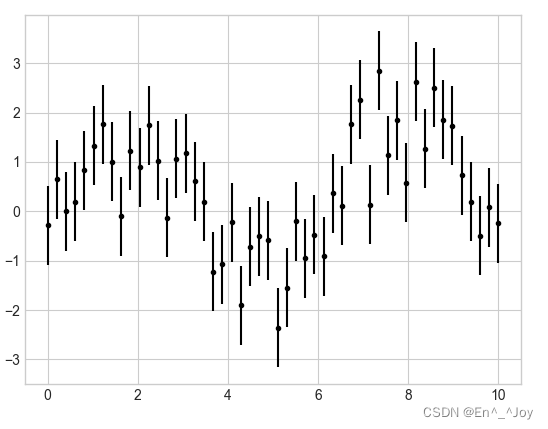
可视化异常处理
某数据公认范围是70±5,我测出来却是75±10,我的数据是否与公认值一致
在图形可视化的结果中用图形将误差显示出来,可以提供充分的信息
基本误差线(errorbar)
fmt参数:控制线条和点的外观
x = np.linspace(0,10,50)
dy = 0.8
y = np.sin(x)+dy*np.random.randn(50)

plt.errorbar(x,y,yerr=dy,fmt='.k')
errorbar可以定义误差线图形的风格
x = np.linspace(0,10,50)
dy = 0.8
y = np.sin(x)+dy*np.random.randn(50)

plt.errorbar(x,y,yerr=dy,fmt='o',color='black',ecolor='lightgray',elinewidth=3,capsize=0)
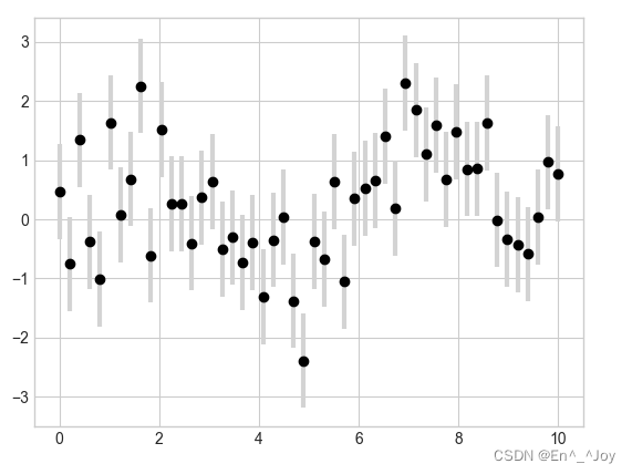
还可以设置水平方向的误差(xerr)、单侧误差(one-sidederrorbar)、以及其他形式的误差
边栏推荐
- Mrs offline data analysis: process OBS data through Flink job
- 【饭谈】Web3.0到来后,测试人员该何去何从?(十条预言和建议)
- Process from creation to encapsulation of custom controls in QT to toolbar (I): creation of custom controls
- Reflections on "product managers must read: five classic innovative thinking models"
- Pycharm IDE下载
- typescript ts 基础知识之类型声明
- The server is completely broken and cannot be repaired. How to use backup to restore it into a virtual machine without damage?
- Seaborn数据可视化
- Skimage learning (1)
- DevOps 的运营和商业利益指南
猜你喜欢

自定义View必备知识,Android研发岗必问30+道高级面试题
Skimage learning (2) -- RGB to grayscale, RGB to HSV, histogram matching

Sator推出Web3遊戲“Satorspace” ,並上線Huobi
如何在博客中添加Aplayer音乐播放器
QT picture background color pixel processing method
Pychart ide Download
Sator launched Web3 game "satorspace" and launched hoobi

管理VDI的几个最佳实践

SlashData开发者工具榜首等你而定!!!
Skimage learning (1)
随机推荐
SlashData开发者工具榜首等你而定!!!
skimage学习(2)——RGB转灰度、RGB 转 HSV、直方图匹配
centos7安装mysql笔记
LeetCode 1186. Delete once to get the sub array maximum and daily question
一文读懂数仓中的pg_stat
【Seaborn】组合图表:FacetGrid、JointGrid、PairGrid
Flash build API Service - generate API documents
Interface oriented programming
Pycharm IDE下载
[source code interpretation] | source code interpretation of livelistenerbus
[image sensor] correlated double sampling CDs
防火墙系统崩溃、文件丢失的修复方法,材料成本0元
Blue Bridge Cup final XOR conversion 100 points
A tour of gRPC:03 - proto序列化/反序列化
Arduino 控制的双足机器人
最新阿里P7技术体系,妈妈再也不用担心我找工作了
How to mount the original data disk without damage after the reinstallation of proxmox ve?
如何选择合适的自动化测试工具?
服务器彻底坏了,无法修复,如何利用备份无损恢复成虚拟机?
The server is completely broken and cannot be repaired. How to use backup to restore it into a virtual machine without damage?