当前位置:网站首页>Machine learning Seaborn visualization
Machine learning Seaborn visualization
2022-07-05 07:14:00 【RS&Hydrology】
Main records seaborn Visual learning notes ( Understand which functions to draw images are available ).
List of articles
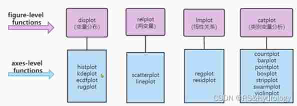
- One 、seaborn principle
- Two 、 Variable distribution
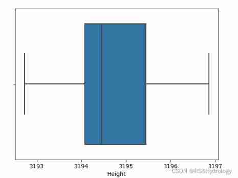
- 1.sns.boxplot(): View the value range of numeric variables
- 2.sns.displot(): View the distribution of variables
- 3.sns.jointplot(): Plot the joint distribution and respective distribution of two variables
- 4.sns.pairplot(): Plot the joint distribution of all numerical variables in pairs
- Reference material
One 、seaborn principle
picture source :https://www.bilibili.com/video/BV1VX4y1F76x/
- boxenplot: Suitable for big data
- Distribution diagram of numerical variables in different categories :stripplot;swarmplot;violinplot
- FaceGrid,PairGrid You can customize the drawing function
see seaborn edition :sns.__version__
Version update :pip install —upgrade seaborn
Two 、 Variable distribution
1.sns.boxplot(): View the value range of numeric variables
sns.boxplot(): View the value range of numeric variables , Whether there are outliers .
import numpy as np
import pandas as pd
import matplotlib.pyplot as plt
import seaborn as sns

print(sns.__version__)
# print(sns.get_dataset_names())

df = pd.read_excel('D:/1.xlsx')

sns.boxplot(data=df,x="Height")
plt.show()
2.sns.displot(): View the distribution of variables
- sns.displot(kind = hist) # Draw histogram
Histogram :sns.histplot(bins,hue,shrink)
bins: change bin numbers
hue: Category variable
shrink: Zoom factor - sns.displot(kind = kde) # Plotting kernel density estimates (kernel density estimate (KDE)), It is a method to visualize the distribution of observations in data sets , Similar to histogram .KDE Use a continuous probability density curve of one or more dimensions to represent data .
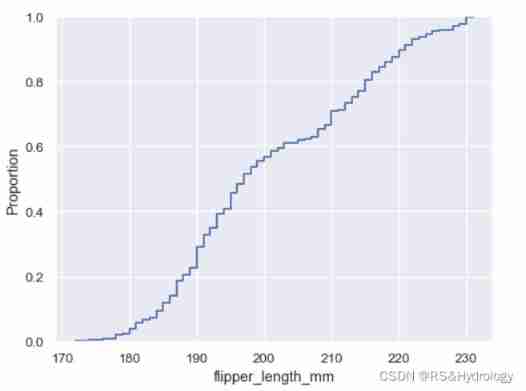
- sns.displot(kind = ecdf) # Represents the proportion or count of observations below each unique value in the dataset . Compare with histogram or density diagram , Its advantage is that each observation is directly visualized , This means that there is no need to adjust the box dividing or smoothing parameters .
penguins = sns.load_dataset("penguins")
sns.ecdfplot(data=penguins, x="flipper_length_mm")
- sns.countplot(data=df,x=“class”) Number of Statistics
3.sns.jointplot(): Plot the joint distribution and respective distribution of two variables
sns.jointplot(dataset,x,y,kind)
sns.jointplot() Function upgrade :
JoinGrid, Can pass g.plot() Custom function .g = sns.JoinGrid(); g.plot(sns.histplot,sns.boxplot)
4.sns.pairplot(): Plot the joint distribution of all numerical variables in pairs
sns.pairplot() Function upgrade :
PairGrid, Can pass g.map() Custom drawing function
Reference material
边栏推荐
- 并发编程 — 如何中断/停止一个运行中的线程?
- 扫盲-以太网MII接口类型大全-MII、RMII、SMII、GMII、RGMII、SGMII、XGMII、XAUI、RXAUI
- [vscode] prohibit the pylance plug-in from automatically adding import
- Unity UGUI不同的UI面板或者UI之间如何进行坐标匹配和变换
- NPM and package common commands
- [software testing] 05 -- principles of software testing
- PHY drive commissioning - phy controller drive (II)
- Logical structure and physical structure
- Use of Pai platform
- 1290_ Implementation analysis of prvtaskistasksuspended() interface in FreeRTOS
猜你喜欢

数学分析_笔记_第8章:重积分
PHY驱动调试之 --- PHY控制器驱动(二)
docker安装mysql并使用navicat连接
SD_CMD_RECEIVE_SHIFT_REGISTER
Docker installs MySQL and uses Navicat to connect
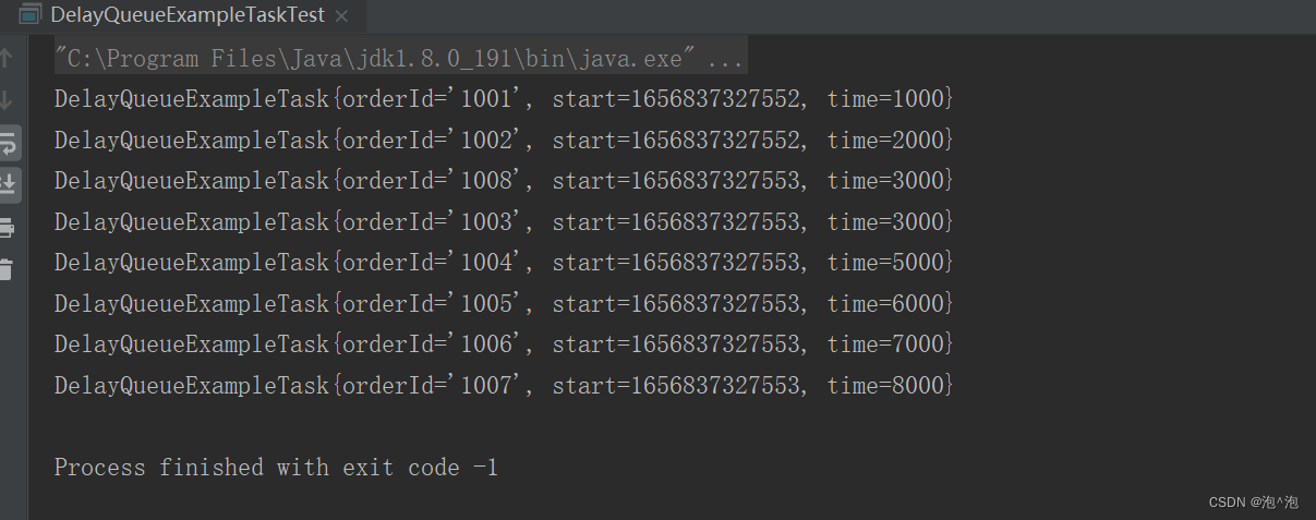
DelayQueue延迟队列的使用和场景
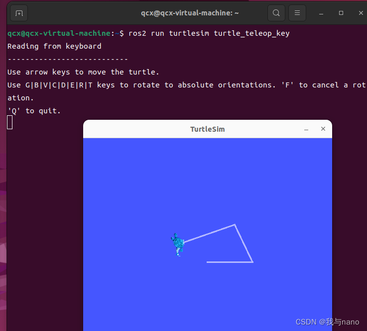
Ros2 - common command line (IV)
![[software testing] 04 -- software testing and software development](/img/bd/49bba7ee455ce59e726a2fdeafc7c3.jpg)
[software testing] 04 -- software testing and software development
目标检测系列——Faster R-CNN原理详解
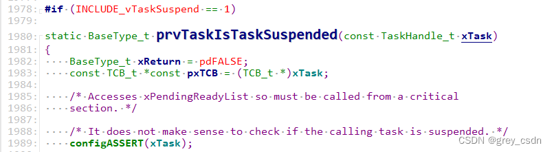
1290_FreeRTOS中prvTaskIsTaskSuspended()接口实现分析
随机推荐
Logical structure and physical structure
[framework] multi learner
Negative number storage and type conversion in programs
Brief description of inux camera (Mipi interface)
程序中的负数存储及类型转换
Install deeptools in CONDA mode
SOC_ SD_ DATA_ FSM
Concurrent programming - deadlock troubleshooting and handling
【软件测试】02 -- 软件缺陷管理
SOC_ SD_ CMD_ FSM
DelayQueue延迟队列的使用和场景
Do you choose pandas or SQL for the top 1 of data analysis in your mind?
Empire help
摄像头的MIPI接口、DVP接口和CSI接口
【无标题】
Import CV2, prompt importerror: libcblas so. 3: cannot open shared object file: No such file or directory
Ros2 - Service Service (IX)
Inftnews | drink tea and send virtual stocks? Analysis of Naixue's tea "coin issuance"
2022年中纪实 -- 一个普通人的经历
C#学习笔记