当前位置:网站首页>Multi row and multi column flex layout
Multi row and multi column flex layout
2022-07-07 12:30:00 【Xiaoding Chong duck!】
1、 Three lines and three columns , Margins are all 20px, Every box Width and height are 200px
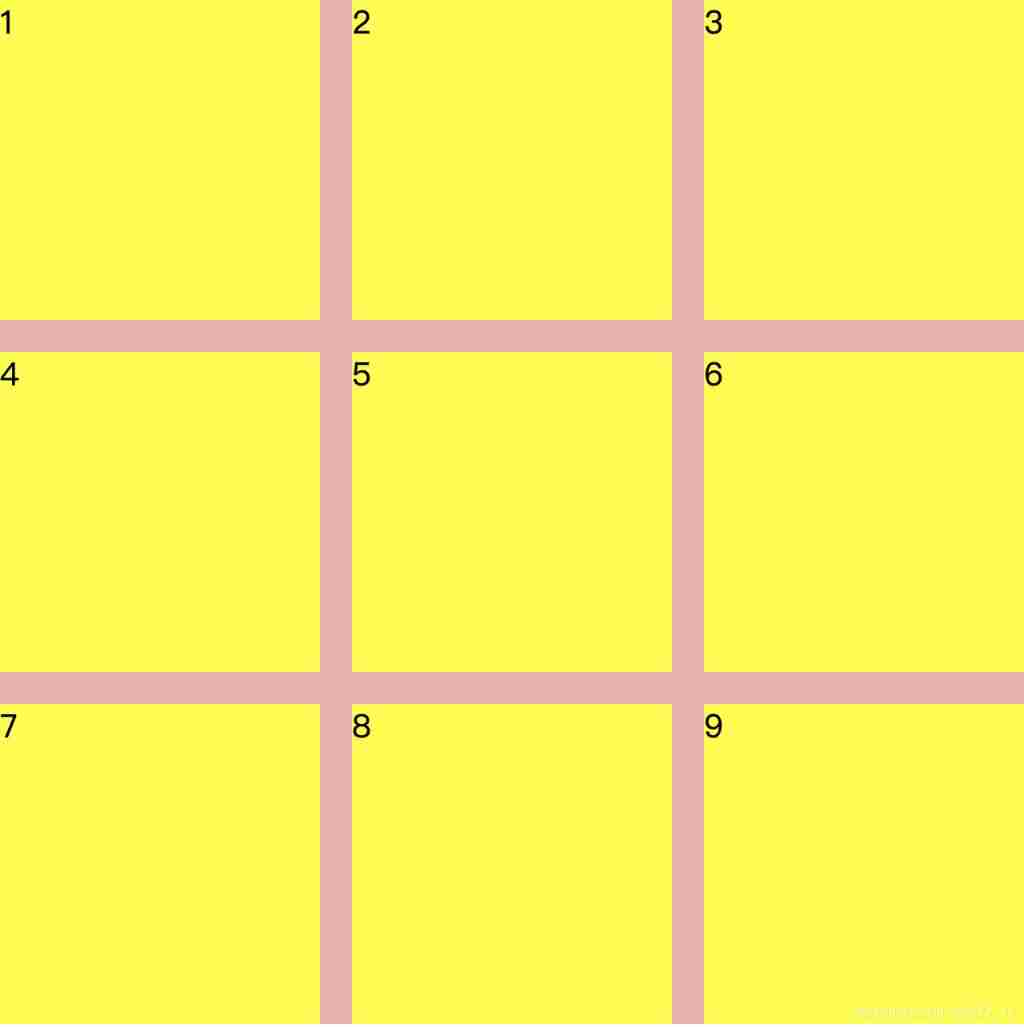
Use flex Layout , Set the width and height of the outer box to 640px(200*3+20*2), In the use of align-content: space-between and justify-content: space-between that will do , The code is as follows :
<style>
*{
padding:0;
margin: 0;
}
html,body{
width: 100%;
height: 100%;
}
.box{
width: 640px;
background: rgb(243, 171, 171);
height: 640px;
display: flex;
flex-wrap: wrap;
align-content: space-between;
justify-content: space-between;
}
.Abox{
background: yellow;
width: 200px;
height: 200px;
}
</style>
<body>
<div class="box">
<div class="Abox">1</div>
<div class="Abox">2</div>
<div class="Abox">3</div>
<div class="Abox">4</div>
<div class="Abox">5</div>
<div class="Abox">6</div>
<div class="Abox">7</div>
<div class="Abox">8</div>
<div class="Abox">9</div>
</div>
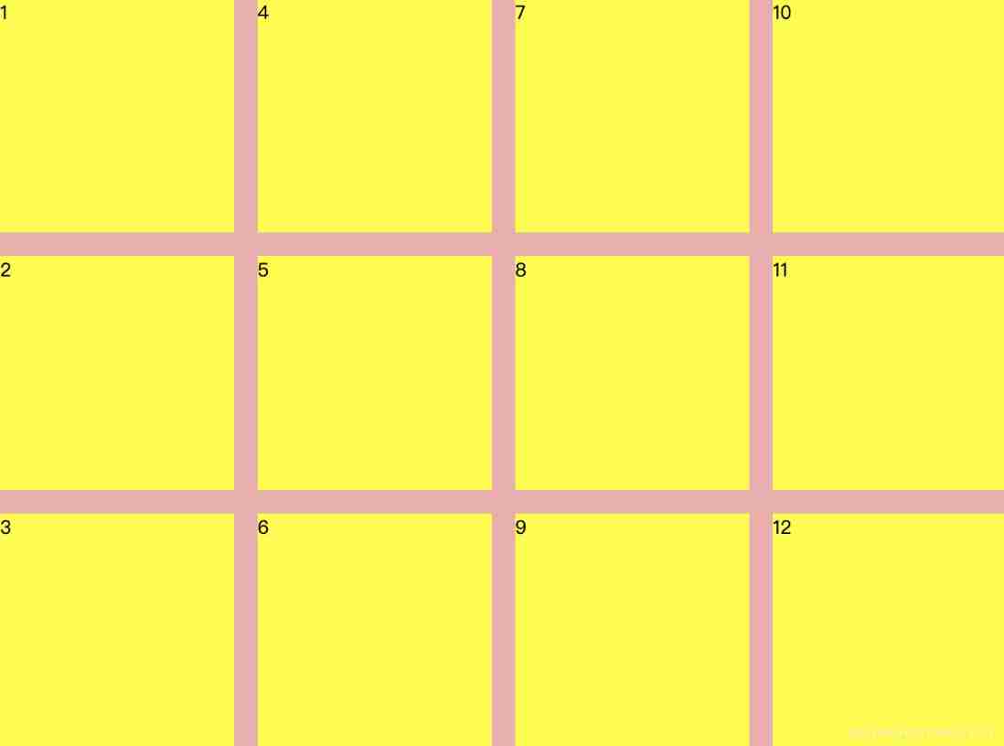
</body>2、 Multiple rows and three columns , Margins are all 20px, Every box Width and height are 200px, Highly adaptive content

Or use align-content: space-between and justify-content: space-between, Height has js calculated , In setting up to dom On :
<style>
*{
padding:0;
margin: 0;
}
html,body{
width: 100%;
height: 100%;
}
.box{
width: 640px;
background: rgb(243, 171, 171);
/* height: 640px; */
display: flex;
flex-wrap: wrap;
align-content: space-between;
justify-content: space-between;
}
.Abox{
background: yellow;
width: 200px;
height: 200px;
}
</style>
<body>
<div class="box">
<div class="Abox">1</div>
<div class="Abox">2</div>
<div class="Abox">3</div>
<div class="Abox">4</div>
<div class="Abox">5</div>
<div class="Abox">6</div>
<div class="Abox">7</div>
<div class="Abox">8</div>
<div class="Abox">9</div>
<div class="Abox">10</div>
<div class="Abox">11</div>
<div class="Abox">12</div>
</div>
</body>
<script>
let parentDom = document.querySelector('.box');
let children = parentDom.children;
let rowNums = Math.ceil(children.length / 3);
parentDom.style.height = rowNums * 200 + (rowNums - 1) * 20 + 'px';
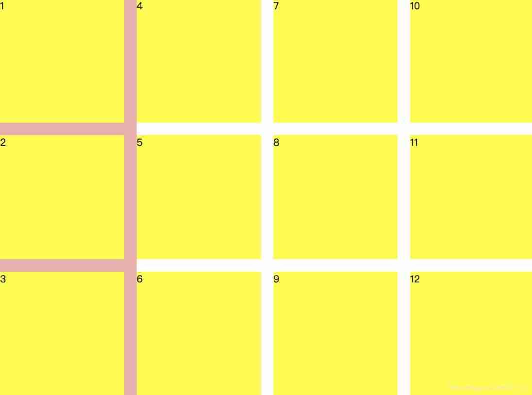
</script>3、 Three rows and many columns , Margins are all 20px, Every box Width and height are 200px, Width adaptive content
Law 1 :
Or use align-content: space-between and justify-content: space-between, At this time, the width is determined by the content , So you can go through js Calculate and dynamically set the width :
<style>
 *{
    padding:0;
    margin: 0;
  }
  html,body{
    width: 100%;
    height: 100%;
  }
  .box{
    background: rgb(243, 171, 171);
    height: 640px;
    display: flex;
    flex-wrap: wrap;
    flex-direction: column;
    align-content: space-between;
    justify-content: space-between;
  }
  .Abox{
    background: yellow;
    width: 200px;
    height: 200px;
  }
</style>
<body>
    <div class="box">
      <div class="Abox">1</div>
      <div class="Abox">2</div>
      <div class="Abox">3</div>
      <div class="Abox">4</div>
      <div class="Abox">5</div>
      <div class="Abox">6</div>
      <div class="Abox">7</div>
      <div class="Abox">8</div>
      <div class="Abox">9</div>
      <div class="Abox">10</div>
      <div class="Abox">11</div>
      <div class="Abox">12</div>
    </div>
</body>
<script>
  let parentDom = document.querySelector('.box');
  let children = parentDom.children;
  let columnNums = Math.ceil(children.length / 3);
  parentDom.style.width = columnNums * 200 + (columnNums - 1) * 20 + 'px';
</script>
Law two :
Spindle use justify-content: space-between, Cross axis use align-content: flex-start, At this time, there is margin control , Don't use js Control the width of the parent box ,width Set to fit-content:
The effect is as follows , At this time, the width of the parent box is only the width of a list of child elements , I have encountered this problem before , Namely flex-direction: column when , The width of multiple columns of child elements cannot expand the width of parent elements , Therefore, this plan cannot .
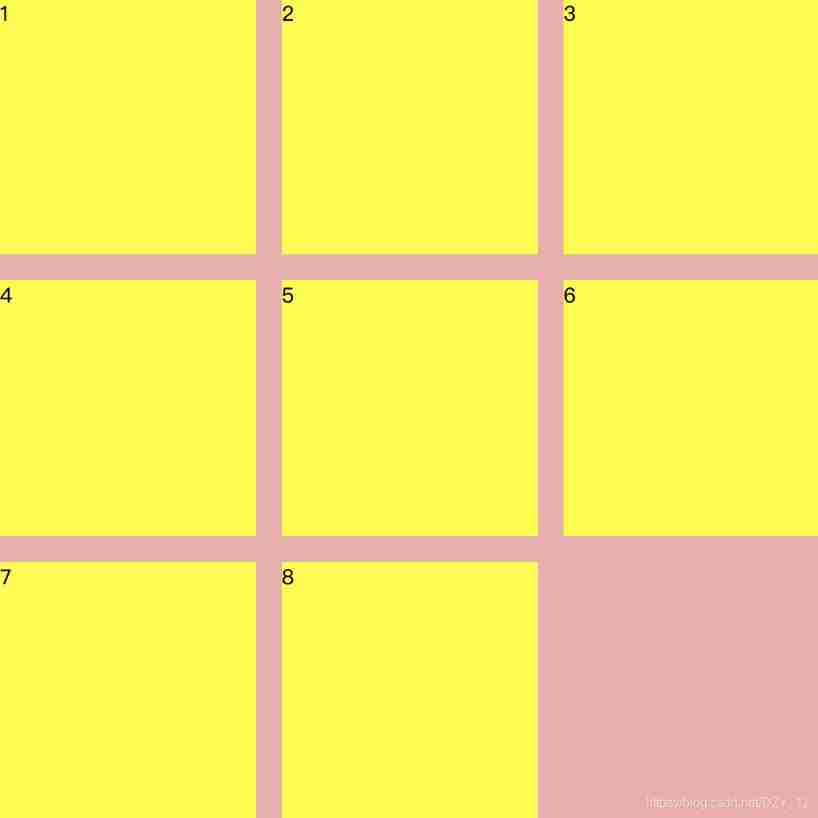
4、 Three lines and three columns , Margins are all 20px, Every box Width and height are 200px, Highly adaptive content , Child elements cannot be covered
The method of question two is used , If you find that the last line is less than three, there will be a space in the middle , It's not the effect we want :
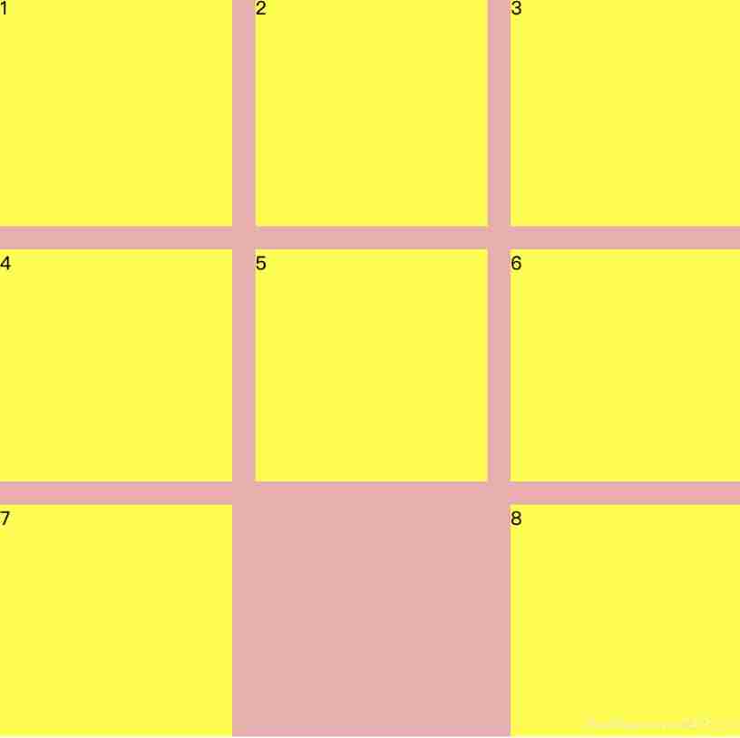
Law 1 :
Use not shown div fill , To carry on the placeholder :
<style>
  *{
     padding:0;
     margin: 0;
   }
   html,body{
     width: 100%;
     height: 100%;
   }
   .box{
     width: 640px;
     height: 640px;
     background: rgb(243, 171, 171);
     display: flex;
     flex-wrap: wrap;
     align-content: space-between;
     justify-content: space-between;
   }
   .Abox{
     background: yellow;
     width: 200px;
     height: 200px;
   }
 </style>
 <body>
     <div class="box">
       <div class="Abox">1</div>
       <div class="Abox">2</div>
       <div class="Abox">3</div>
       <div class="Abox">4</div>
       <div class="Abox">5</div>
       <div class="Abox">6</div>
       <div class="Abox">7</div>
       <div class="Abox">8</div>
     </div>
 </body>
 <script>
   let parentDom = document.querySelector('.box');
   let children = parentDom.children;
   let n = children.length % 3;
   //  Don't cover
   if (n) {
      while (3 - n > 0) {
        let div = document.createElement('div');
        div.className = 'Abox';
        div.style.visibility = 'hidden';
        parentDom.appendChild(div);
        n++;
      }
   }
 </script>
The effect is as follows :
Law two :
Spindle use justify-content: flex-start, Cross axis use align-content: space-between, The right margin is margin Set up , The last column nth-child(3n) Do not set the right margin :
<style>
  *{
     padding:0;
     margin: 0;
   }
   html,body{
     width: 100%;
     height: 100%;
   }
   .box{
     width: 640px;
     background: rgb(243, 171, 171);
     height: 640px;
     display: flex;
     flex-wrap: wrap;
     align-content: space-between;
     justify-content: flex-start;
   }
   .Abox{
     background: yellow;
     width: 200px;
     height: 200px;
     margin-right: 20px;
   }
   .Abox:nth-child(3n) {
      margin: 0;
   }
 </style>
 <body>
     <div class="box">
       <div class="Abox">1</div>
       <div class="Abox">2</div>
       <div class="Abox">3</div>
       <div class="Abox">4</div>
       <div class="Abox">5</div>
       <div class="Abox">6</div>
       <div class="Abox">7</div>
       <div class="Abox">8</div>
     </div>
 </body>
in addition , above 1、2、3 These situations that can be covered can also be realized by using the method of two .
边栏推荐
- An error occurred when vscade tried to create a file in the target directory: access denied [resolved]
- Cenos openssh upgrade to version 8.4
- 普乐蛙小型5d电影设备|5d电影动感电影体验馆|VR景区影院设备
- Introduction to three methods of anti red domain name generation
- wallys/Qualcomm IPQ8072A networking SBC supports dual 10GbE, WiFi 6
- (to be deleted later) yyds, paid academic resources, please keep a low profile!
- 2022 年第八届“认证杯”中国高校风险管理与控制能力挑战赛
- SQL head injection -- injection principle and essence
- AirServer自动接收多画面投屏或者跨设备投屏
- ENSP MPLS layer 3 dedicated line
猜你喜欢

(待会删)yyds,付费搞来的学术资源,请低调使用!

千人规模互联网公司研发效能成功之路
【PyTorch实战】用PyTorch实现基于神经网络的图像风格迁移
Customize the web service configuration file
The road to success in R & D efficiency of 1000 person Internet companies
![111.网络安全渗透测试—[权限提升篇9]—[Windows 2008 R2内核溢出提权]](/img/2e/da45198bb6fb73749809ba0c4c1fc5.png)
111.网络安全渗透测试—[权限提升篇9]—[Windows 2008 R2内核溢出提权]
Introduction and application of smoothstep in unity: optimization of dissolution effect

College entrance examination composition, high-frequency mention of science and Technology
Learning and using vscode
数据库系统原理与应用教程(011)—— 关系数据库
随机推荐
Tutorial on principles and applications of database system (007) -- related concepts of database
In the small skin panel, use CMD to enter the MySQL command, including the MySQL error unknown variable 'secure_ file_ Priv 'solution (super detailed)
About web content security policy directive some test cases specified through meta elements
【玩转 RT-Thread】 RT-Thread Studio —— 按键控制电机正反转、蜂鸣器
AirServer自动接收多画面投屏或者跨设备投屏
Pule frog small 5D movie equipment | 5D movie dynamic movie experience hall | VR scenic area cinema equipment
Dialogue with Wang Wenyu, co-founder of ppio: integrate edge computing resources and explore more audio and video service scenarios
Static vxlan configuration
Is it safe to open an account in Ping An Securities mobile bank?
BGP actual network configuration
什么是局域网域名?如何解析?
(待会删)yyds,付费搞来的学术资源,请低调使用!
Sonar:Cognitive Complexity认知复杂度
30. Feed shot named entity recognition with self describing networks reading notes
问题:先后键入字符串和字符,结果发生冲突
对话PPIO联合创始人王闻宇:整合边缘算力资源,开拓更多音视频服务场景
How to use PS link layer and shortcut keys, and how to do PS layer link
SQL Lab (46~53) (continuous update later) order by injection
关于 Web Content-Security-Policy Directive 通过 meta 元素指定的一些测试用例
数据库系统原理与应用教程(009)—— 概念模型与数据模型