当前位置:网站首页>Flexible layout (I)
Flexible layout (I)
2022-07-07 07:14:00 【Luqi zz】
Catalog
1 Declare block level elastic box display:flex
2 Declare inline elastic box display:inline-flex
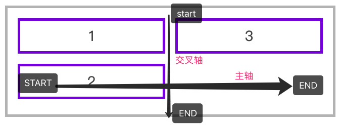
Two 、flex-direction: Used to control the arrangement direction of box elements .
row-reverse Arrange elements from right to left
column-reverse Arrange elements vertically from bottom to top
Vertical element wrap column 、wrap
Vertical elements wrap in reverse column wrap-reverse
One 、 Declaration definition
Container box contains container elements , Use display:flex or display:inline-flex Declared as an elastic box .
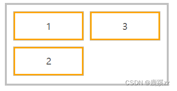
1 Statement Block level Elastic box display:flex
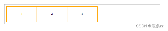
   <style>
        * {
            padding: 0;
            margin: 0;
        }

        article {
            height: 150px;
            margin-left: 100px;
            margin-top: 100px;
            outline: solid 5px silver;
            display: flex;
            padding: 20px;
        }

        article div {
            outline: solid 5px orange;
            text-align: center;
            font-size: 28px;
            line-height: 5em;
            width: 300px;
        }
    </style>

<!--  Declare block level elastic box  -->
<body>
    <article>
        <div>1</div>
        <div>2</div>
        <div>3</div>
    </article>
</body>
2 Declare inline elastic box display:inline-flex
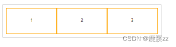
<style>
  ...
  article {
   	...
    display: inline-flex;
    ...
  }
  ...
</style>
Two 、flex-direction: Used to control the arrangement direction of box elements .
Use in display:flex In the parent container of , Change the direction of the horizontal axis :
| value | describe |
|---|---|
| row | Arrange elements horizontally from left to right ( The default value is ) |
| row-reverse | Arrange elements from right to left |
| column | Arrange elements vertically from top to bottom |
| column-reverse | Arrange elements vertically from bottom to top |
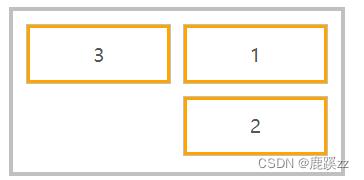
row-reverse Arrange elements from right to left
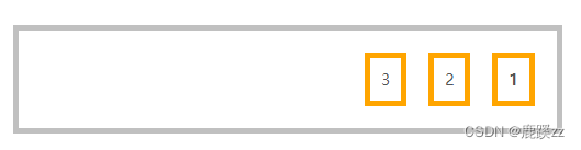
<style>
        * {
          padding: 0;
          margin: 0;
        }
        body {
          margin: 100px;
          font-size: 14px;
          color: #555;
        }
        article {
          width: 500px;
          border: solid 5px silver;
          display: flex;
          box-sizing: border-box;
          padding: 10px;
         /* row-reverse    Arrange elements from right to left  */
          flex-direction: row-reverse;
        }
        article * {
          border: solid 5px orange;
          padding: 10px;
          margin: 10px;
        }
      </style>
...
     <body>
       <article>
          <h4>1</h4>
          <span>2</span>
           <p>3</p>
       </article>
     </body>
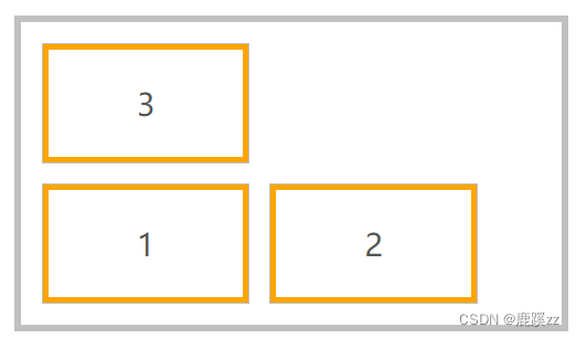
column-reverse Arrange elements vertically from bottom to top

<style>
        * {
          padding: 0;
          margin: 0;
        }
        body {
          margin: 100px;
          font-size: 14px;
          color: #555;
        }
        article {
          width: 500px;
          border: solid 5px silver;
          display: flex;
          box-sizing: border-box;
          padding: 10px;
         /* column-reverse   Arrange elements vertically from bottom to top  */
          flex-direction: column-reverse;
        }
        article * {
          border: solid 5px orange;
          padding: 10px;
          margin: 10px;
        }
      </style>
...
     <body>
       <article>
          <h4>1</h4>
          <span>2</span>
           <p>3</p>
       </article>
     </body>
3、 ... and 、flex-wrap
Regulations flex The container is one or more lines , At the same time, the direction of the horizontal axis determines the direction of the new row stack .
| Options | explain |
|---|---|
| nowrap | Elements do not split rows or columns ( The default value is ) |
| wrap | Container elements split rows or columns when necessary . |
| wrap-reverse | Container elements split rows or columns when necessary , But in reverse order |
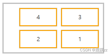
Line element wrap row 、wrap
 <style>
        * {
            padding: 0;
            margin: 0;
            outline: solid 1px silver;
            padding: 10px;
            margin: 10px;
        }

        head {
            display: block;
        }

        body {
            font-size: 14px;
            color: #555;
        }

        article {
            width: 500px;
            height: 250px;
            border: solid 5px silver;
            box-sizing: border-box;
            padding: 10px;
            display: flex;
            flex-direction: row;
            flex-wrap: wrap;
        }

        article div {
            border: solid 5px orange;
            padding: 30px 80px;
            margin: 10px;
            text-align: center;
            font-size: 28px;
        }
    </style>
...

<article>
    <div>1</div>
    <div>2</div>
    <div>3</div>
</article>
Horizontal arrangement reverse line feed row 、wrap-reverse
flex-direction: row;
flex-wrap: wrap-reverse;
Vertical element wrap column 、wrap
flex-direction: column;
flex-wrap: wrap;
Vertical elements wrap in reverse column wrap-reverse
flex-direction: column;
flex-wrap: wrap-reverse;
Four 、flex-flow
yes flex-direction And flex-wrap The combination abbreviation mode of .
The following is arranged from right to left , Line breaking up branches .
flex-flow: row-reverse wrap-reverse;边栏推荐
- Hidden Markov model (HMM) learning notes
- Matlab tips (29) polynomial fitting plotfit
- 请问 flinksql对接cdc时 如何实现计算某个字段update前后的差异 ?
- Lm11 reconstruction of K-line and construction of timing trading strategy
- Composition API premise
- mips uclibc 交叉编译ffmpeg,支持 G711A 编解码
- from . onnxruntime_ pybind11_ State Import * noqa ddddocr operation error
- Readonly read only
- 云备份项目
- IP address
猜你喜欢
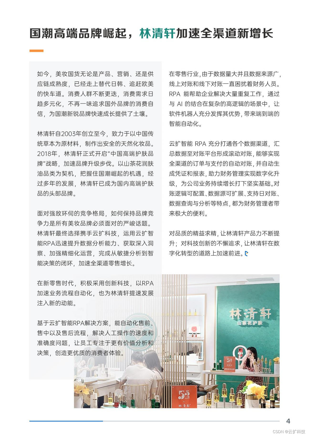
How can brand e-commerce grow against the trend? See the future here!
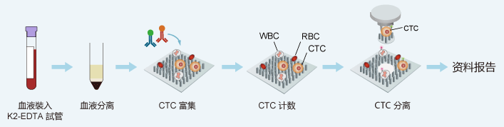
Circulating tumor cells - here comes abnova's solution
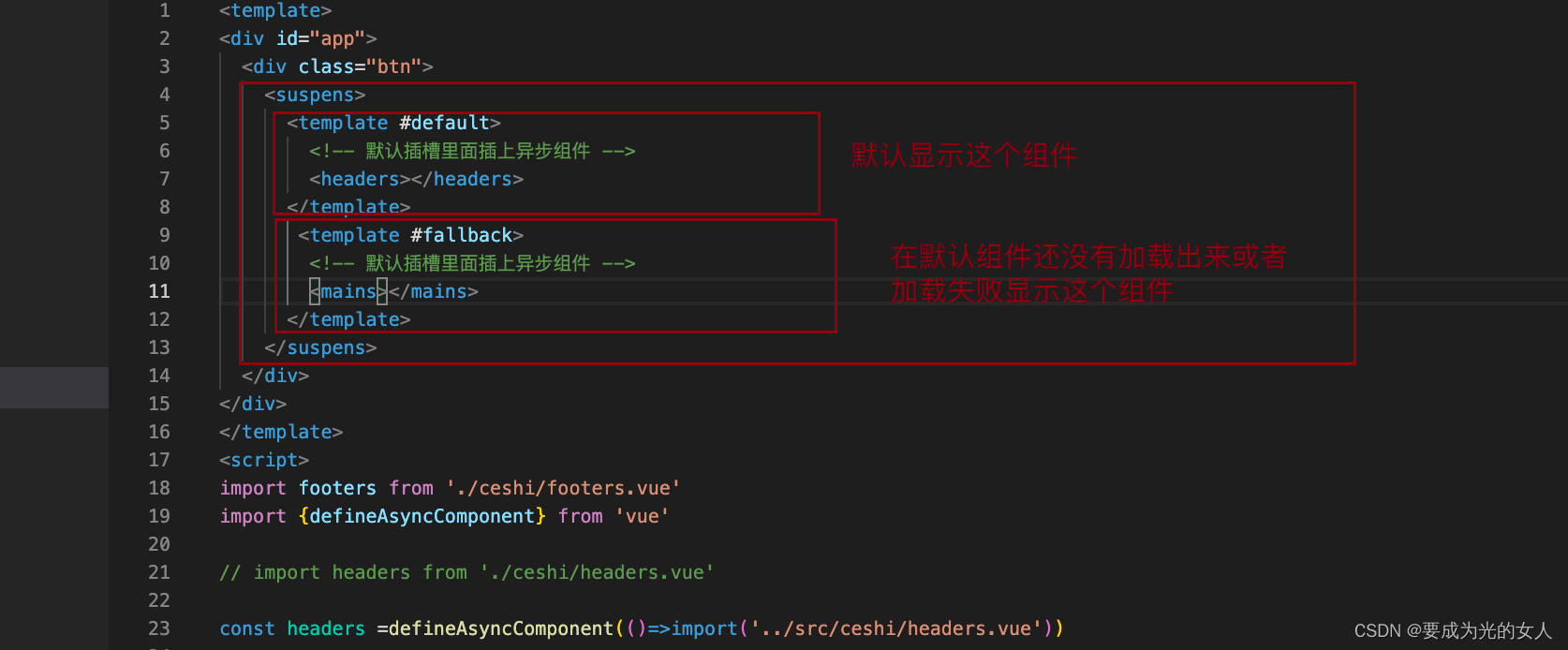
Asynchronous components and suspend (in real development)
弹性布局(二)
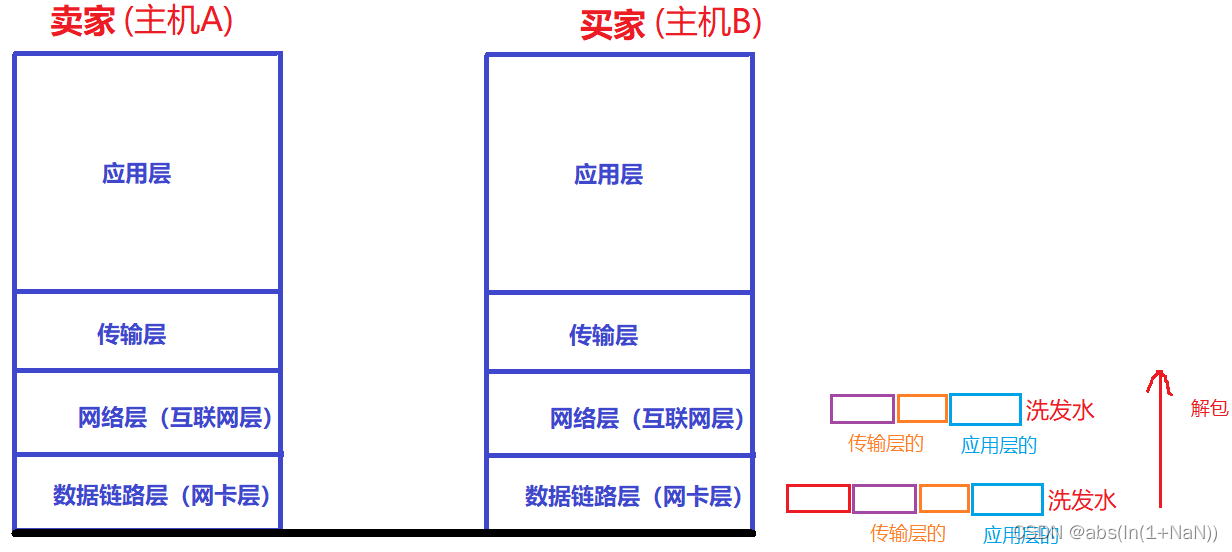
Network foundation - header, encapsulation and unpacking
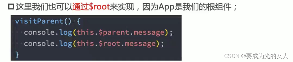
$parent (get parent component) and $root (get root component)
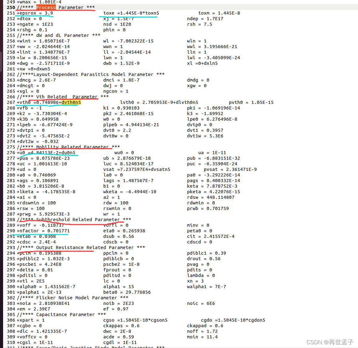
MOS tube parameters μ A method of Cox
At the age of 20, I got the ByteDance offer on four sides, and I still can't believe it
Sword finger offer high quality code
Graduation design game mall
随机推荐
修改Jupyter Notebook文件路径
The latest trends of data asset management and data security at home and abroad
Stack Title: nesting depth of valid parentheses
Communication between non parent and child components
2018 Jiangsu Vocational College skills competition vocational group "information security management and evaluation" competition assignment
Common function detect_ image/predict
readonly 只读
LVS+Keepalived(DR模式)学习笔记
$parent (get parent component) and $root (get root component)
Tujia, muniao, meituan... Home stay summer war will start
Chinese and English instructions prosci LAG-3 recombinant protein
详解机器翻译任务中的BLEU
MySQL的主从复制原理
Precise space-time travel flow regulation system - ultra-high precision positioning system based on UWB
[Luogu p1971] rabbit and egg game (bipartite game)
Basic introduction of JWT
oracle如何备份索引
Basic process of network transmission using tcp/ip four layer model
Test of transform parameters of impdp
main函数在import语句中的特殊行为