当前位置:网站首页>(四)R语言的数据可视化——矩阵图、柱状图、饼图、散点图与线性回归、带状图
(四)R语言的数据可视化——矩阵图、柱状图、饼图、散点图与线性回归、带状图
2022-07-06 09:17:00 【EricFrenzy】
注:本博客旨在分享个人学习心得,有不规范之处请多多包涵!
Histogram 矩形图
在统计学中,矩形图经常被用作展示某连续变量(如长度、重量等测量数值)的分布。在R语言中构造矩形图用hist()函数,具体请见下例:
#hist()函数第一个参数为数据,这里用的是sampleData列表中列标题为length的数据
#main是图的标题;xlab是x轴标题;ylab是y轴标题
#freq是TRUE时画的是频率,是FALSE时画的是概率密度
#breaks决定矩形的数量。这里的20设置图上会有20个矩形
#xlim和ylim决定画图的范围
hist(sampleData$length, main = "Histogram of Protein Lengths",
	xlab = "Length (AA)", ylab = "Frequency", freq = TRUE,breaks = 20,
	xlim = c(0,10000), ylim = c(0,7000))
下图为画出的效果: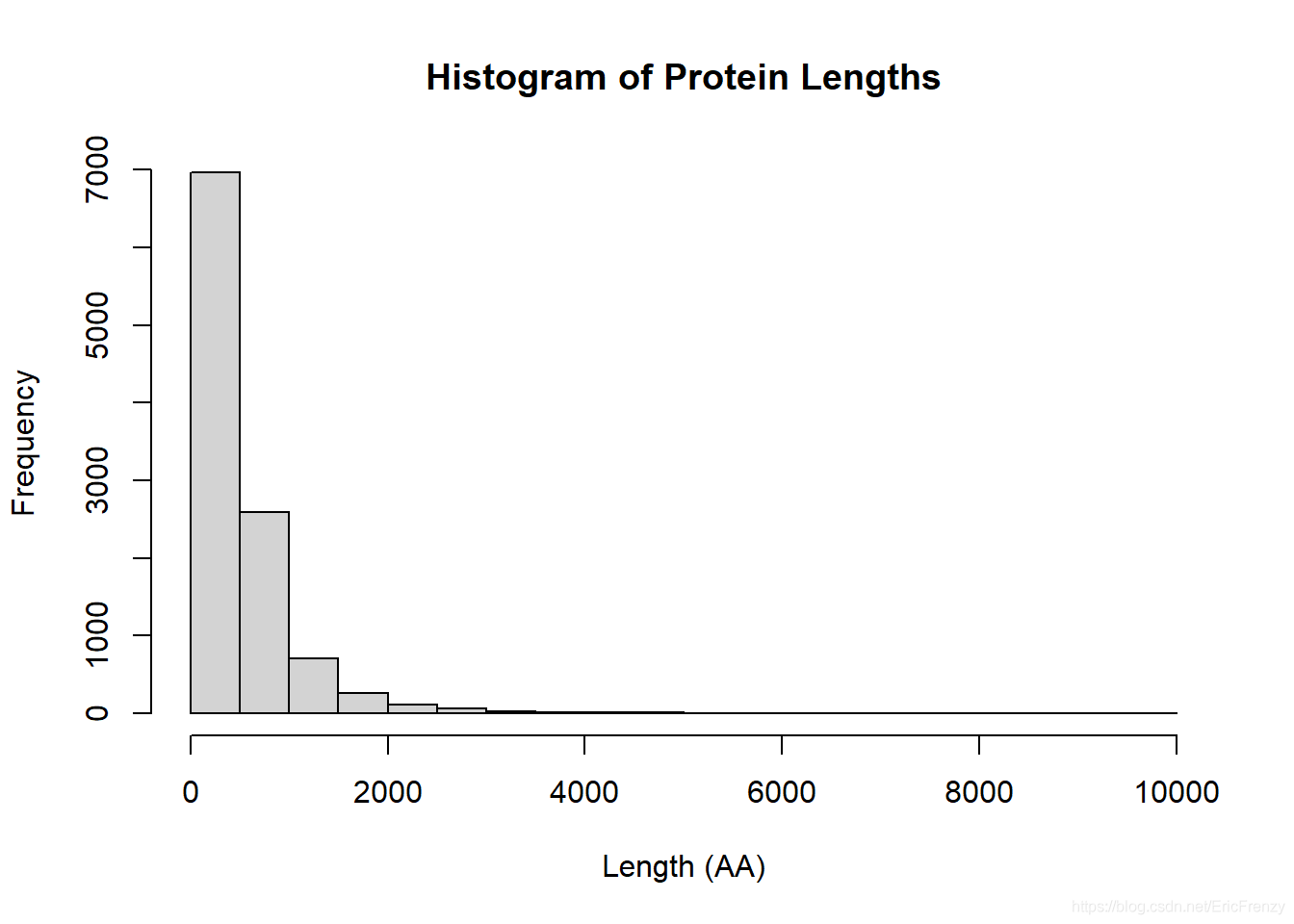
在这张图中,我们可以发现大部分的protein length都在2000以下,是一个很明显的正偏态分布。
Bar plot 柱状图
柱状图在统计学中经常被用作展示非连续变量(如人数、钱数等计数测量)的分布。在R语言中构造柱状图用barplot()函数,具体请见下例:
#barplot()的第一个参数也是用到的数据。这里是education列表里列标题为spending的数据
#names.arg相当于每条数据对应的x值。这个vector对应每一年的spending
#ylab是y轴标题;main是图的标题;ylim是y轴的范围
#width调整每个柱的宽度;space调整柱之间的距离
barplot(education$spending,
			names.arg = education$year,
			ylab = "Spending per student($)",
			main = "Education Spending per Student",
			ylim=c(0,7000))
下图为画出的效果: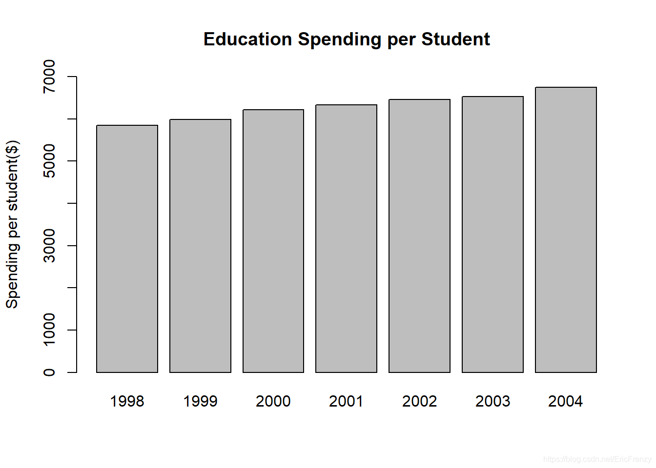
可见样本数据中,平均每学生在教育的逐年递增。
Pie chart 饼图
饼图能很直观地展示数据中不同种类的占比。R语言中自带的pie()函数功能并不是很强大。在R语言中构造饼图请见下例:
#pie()的第一个参数为数据,可以是各种类占总数的百分比,也可以是各种类的数量
#labels是标在每个扇形外的数据,格式为vector
#main是图的标题
#col调整每个扇形的颜色。rainbow()是R内置的函数,能把彩虹色分成指定数量
#clockwise调整画图是顺时针还是逆时针;init.angle调整扇形从什么位置开始画
percentage <- c(36, 8, 17, 52)
desserts <- c("Ice cream", "Cookie", "Brownie", "Cake")
pie(percentage, labels = desserts,
		main = "Dessert Preference",
		col = rainbow(length(percentage)),
		clockwise = FALSE, init.angle = 0)
下图为画出的效果: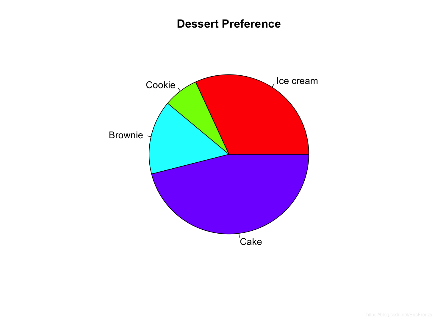
Dot plot 散点图
散点图经常被用在科学实验中,在把自变量和因变量可视化的基础上进行进一步分析。在R语言中构造散点图用plot()函数,具体请见下例:
a <- c(12, 17, 25, 33, 39, 45) #自变量(x)
b <- c(10, 13, 17, 20, 26, 31) #因变量(y)
#plot()的第一个参数为自变量(x值)数据,第二个参数为因变量(y值)数据
#main设置图的标题;xlab和ylab设置横纵坐标的标题
plot(a, b, main="My Plot", xlab="x variable", ylab="y variable")

#lm(Y~X)会生成一个线性回归的数据,包括回归函数的截距和斜率
#abline()会奖这条回归线画到图上;col设置线的颜色
#summary()会生成关于回归线的细节
abline(lm(b~a), col="red")
summary(lm(b~a))
下图为画出的效果: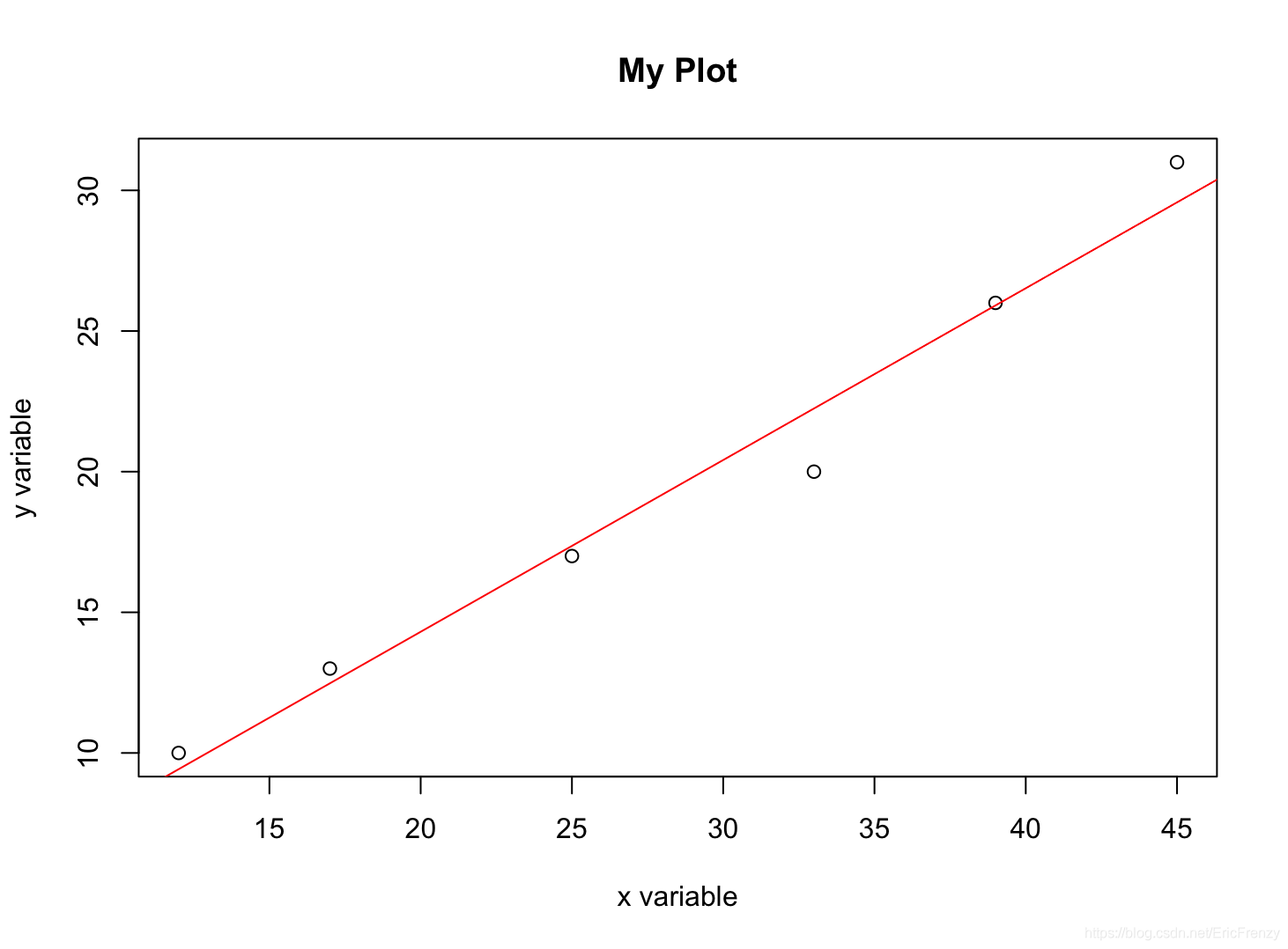
下图为summary()在Console输出的结果: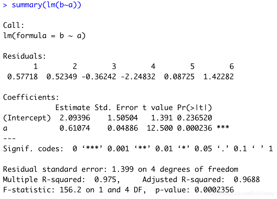
图中的Estimate下为回归线的截距(2.09396)和斜率(0.61074)。Multiple R-squared就是我们常用的R方值(0.975)。
Box-and-whisker plot 箱形图
箱形图能很好地展示数据的分布情况。R语言中构造箱形图用boxplot()函数,具体请见下例:
#数据选用斐波那契数列的前几项
#boxplot()的第一个参数为数据;horizontal控制图是否水平画
#也可以用main设置图的标题和xlab设置横轴标题
data <- c(1, 1, 2, 3, 5, 8, 13, 21, 34)
boxplot(data, horizontal=TRUE)
下图为画出的效果: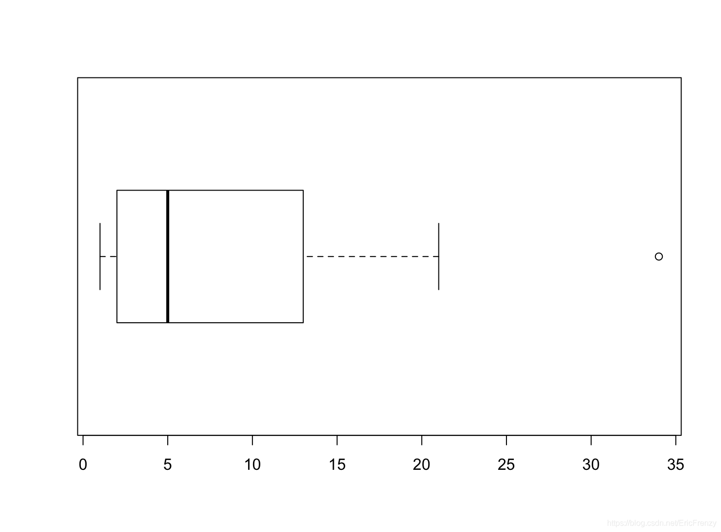
从左到右看图里竖直的线,我们可以看出数据的下边缘、下四分位数、中位数、上四分位数、上边缘,和圆圈代表的异常值。可以看出这组数据正偏态分布、有异常值等特点。
Strip chart 带状图
带状图类似于一维的散点图,功能接近于箱形图,能在较小的数据量下直观展示数据的分布。R语言中构造带状图用stripchart()函数,具体请见下例:
#stripchart()函数的第一个参数为数据
#method控制数据点的重合。"jitter"为避免互相重合,"stack"为将数值相同的点并列显示,默认的"overplot"生成的所有数据在一条直线上,
#如果method="jitter",jitter参数调整数据点为了避免重合进行分散的程度
#如果method="stack",offset参数调整数值相同的点之间的间隔
#同样可以用main设置图标题,xlab设置横轴标题
data <- c(1, 1, 2, 3, 5, 8, 13, 21, 34)
par(mfrow=c(1, 2)) #设置两张图并排显示,这里的格式为1行2列
stripchart(data, method = "jitter", jitter=1)
stripchart(data, method = "stack", offset=1)
下图为画出的效果: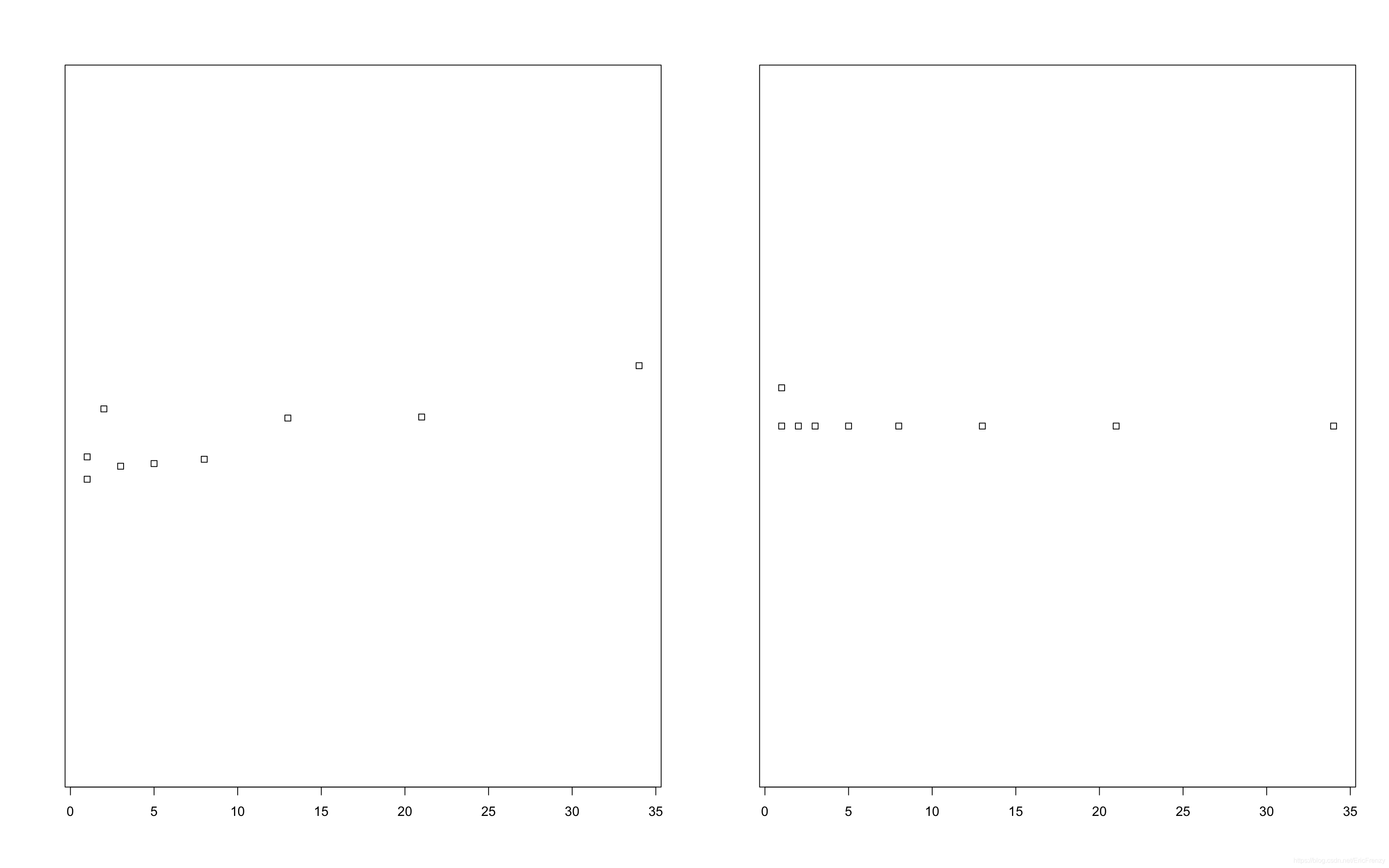
可以看出,大部分数据在左侧更加紧凑,越向右越分散。
结束语
介绍了这么多种用R语言做数据可视化的方式,做数据分析最重要的还是选择适合数据类型和分析目的的图。有任何问题或想法欢迎留言和评论!
边栏推荐
- C语言回调函数【C语言】
- [esp32 learning-2] esp32 address mapping
- Arduino gets the length of the array
- 【ESP32学习-2】esp32地址映射
- Postman 中级使用教程【环境变量、测试脚本、断言、接口文档等】
- JS變量類型以及常用類型轉換
- Common properties of location
- Comparison of solutions of Qualcomm & MTK & Kirin mobile platform USB3.0
- open-mmlab labelImg mmdetection
- 共用体(union)详解【C语言】
猜你喜欢

Reno7 60W super flash charging architecture
数据分析之缺失值填充(重点讲解多重插值法Miceforest)
Arm pc=pc+8 is the most understandable explanation
高通&MTK&麒麟 手機平臺USB3.0方案對比
MP3mini播放模块arduino<DFRobotDFPlayerMini.h>函数详解
MySQL时间、时区、自动填充0的问题
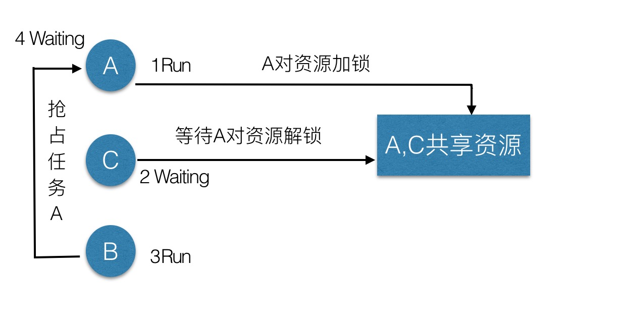
优先级反转与死锁
记一次云服务器被密码爆破的经历——关小黑屋、改密码、改端口
ESP learning problem record
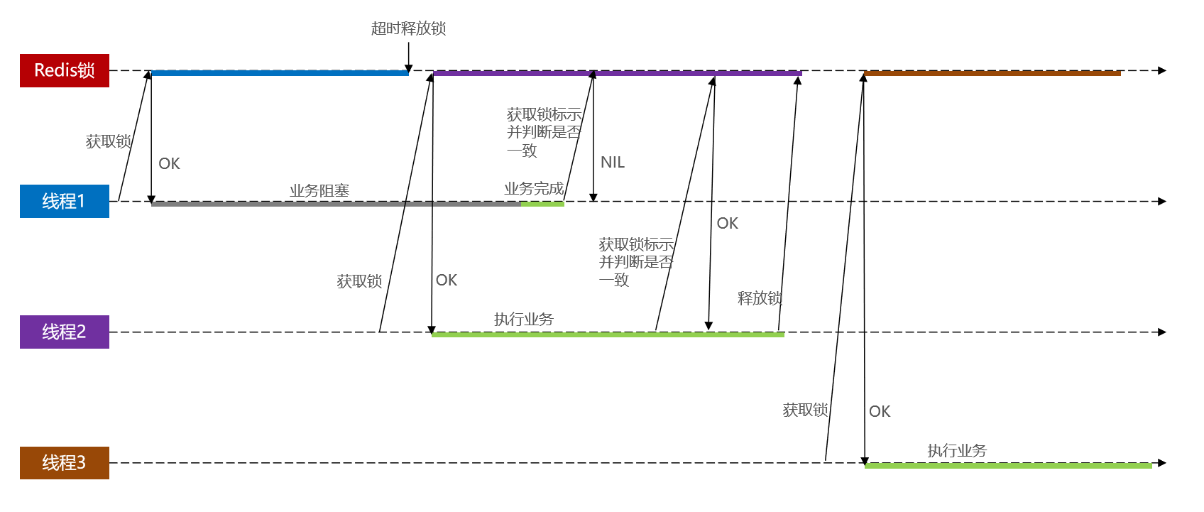
基于Redis的分布式锁 以及 超详细的改进思路
随机推荐
Cannot change version of project facet Dynamic Web Module to 2.3.
锂电池基础知识
列表的使用
Pytoch temperature prediction
Fashion Gen: the general fashion dataset and challenge paper interpretation & dataset introduction
Use of lists
Minio文件下载问题——inputstream:closed
C language, log print file name, function name, line number, date and time
2022.2.12 resumption
Analysis of charging architecture of glory magic 3pro
RT-Thread API参考手册
Arduino get random number
Vscode basic configuration
Basic knowledge of lithium battery
JS数组常用方法的分类、理解和运用
PT OSC deadlock analysis
Kaggle competition two Sigma connect: rental listing inquiries (xgboost)
Stm32f1+bc20+mqtt+freertos system is connected to Alibaba cloud to transmit temperature and humidity and control LED lights
Reno7 60W super flash charging architecture
Mp3mini playback module Arduino < dfrobotdfplayermini H> function explanation