当前位置:网站首页>Use Matplotlib to draw a preliminary chart
Use Matplotlib to draw a preliminary chart
2022-07-02 08:08:00 【Villanelle#】
Required libraries
matplotlibIn bagpyplotmodular , For drawing .numpymodular , Used to complete numerical operations 、 Matrix operations, etc .pandasmodular , For data manipulation and analysis 、 Import data files, etc .
import matplotlib.pyplot as plt
import numpy as np
import pandas as pd
notes : All project examples in this article are in Jupyter Notebook Operating in the environment .
Draw a curve plot
General steps
plt.figureSpecify the image display scale and pixels
#  Specify the image display scale and pixels  5*3  Every unit 200 Pixels , namely 1000*600
plt.figure(figsize=(5,3), dpi=200)
plt.style.useCustomize canvas style
#  Customize canvas style
plt.style.use('seaborn-whitegrid')
plt.plotDraw curve line
#  Draw curve line , You can set the legend 、 Color 、 Line width 、 Marker points 、 Mark point size 、 Mark point edge color 、 Line type, etc
plt.plot(x, y, label='blue', color='#6699ff', linewidth=4, marker='.', markersize=20, markeredgecolor='#3333ff', linestyle='-.')
#  Can pass fmt = '[marker][line][color]' Quickly set the marking point 、 Linetype and color , But be careful before keyword parameters
plt.plot(x, z, 'g^-.', label='green')
plt.titleplt.xlabelplt.ylabelSet chart title and axis title
#  Set chart title , You can set the title font 、 Font size ( The dictionary form )
plt.title("First graph!",fontdict={
    'fontname':'Comic Sans MS','fontsize':20})
#  Set the axis title , You can set the axis font 、 Font size ( The dictionary form )
plt.xlabel("X Axis",fontdict={
    'fontname':'Times New Roman','fontsize':10})
plt.ylabel("Y Axis",fontdict={
    'fontname':'Times New Roman','fontsize':10})
plt.xticksplt.yticksSet up x,y Axis scale point
#  Set up x Axis scale point
plt.xticks([1,2,3,4,5])
#  Set up y Axis scale point
plt.yticks([2,3,4,5,6,7])
plt.legend()Show Legend ( namelyplt.plotMedium label)
#  Show Legend
plt.legend()
plt.savefigSave the picture
#  Save the picture
plt.savefig('firstgraph.png',dpi=200)
plt.showDisplay images
#  Display images
plt.show()

Other commonly used numpy Method
np.linspace(start, stop, num=50)Generate an array at equal intervals according to the start and end data , from start Start to stop end , common num A little bit ( Default 50 individual ).np.sin(array)Calculate the sine of the array , Returns an array .
x = np.linspace(0, 10, 1000)
plt.plot(x,np.sin(x),'b--')
plt.show()

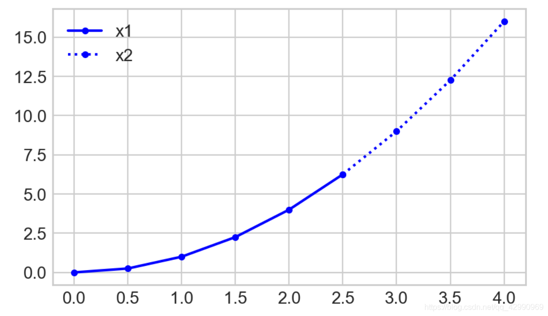
np.arange(start, stop, step)Andnp.linspace()similar , Generate an array at equal intervals according to the start and end data , But it is often used for step value step When known .
x2 = np.arange(0, 4.5, 0.5)

#  Piecewise functions
plt.plot(x2[:6], x2[:6]**2, 'b.-', label='x1')
plt.plot(x2[5:], x2[5:]**2, 'b.:', label='x2')

plt.legend()

plt.show()
Draw a column chart bar chart
General steps
plt.figureSpecify the image display scale and pixels
#  Specify the image display scale and pixels
plt.figure(figsize=(6,4),dpi=200)
plt.style.useCustomize canvas style
#  Customize canvas style ( Default )
plt.style.use('default')
- Set column name list and corresponding value list
labels = ['A','B','C']
values = [1, 4, 2]
plt.barDraw the column
#  Draw a column diagram and pass it to bars,bars[0] It means the first column
bars = plt.bar(labels, values)
bar.set_hatchSet the column pattern
#  Set the histogram pattern
patterns = ['*','/','O']
for bar in bars:
    bar.set_hatch(patterns.pop(0))
plt.titleSet the histogram Title
#  Set the histogram Title
plt.title("My Bars")
plt.savefigSave the picture
#  Save the picture
plt.savefig('bar.png',dpi=200)
plt.showDisplay images
#  Display images
plt.show()

Draw the pie chart pie chart
General steps
pd.read_csv()Reading data ( It's used herepandasMethod of library ) Return to table
fifa = pd.read_csv('fifa_data.csv')
fifa.head(5) #  View the data of the first five rows

plt.figureSpecify the image display scale and pixels
#  Specify image pixels
plt.figure(dpi=200)
plt.style.useCustomize canvas style
#  Customize canvas style
plt.style.use('ggplot')
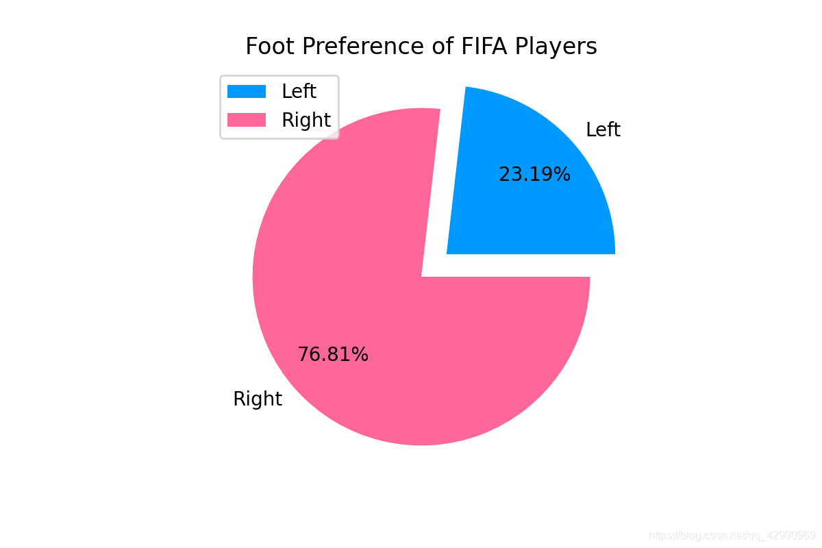
fifa.loc[]Set conditions , Filter data , Return to table ( Remove the lines that do not meet the conditions )fifa.loc[...].countGet the number of rows that meet the condition ( At this time, we only get the number of rows in each column , Need index 0 Subscripts get int Type line number )
#  Set conditions , Filter data
left = fifa.loc[fifa['Preferred Foot'] == 'Left'].count()[0]
right = fifa.loc[fifa['Preferred Foot'] == 'Right'].count()[0]
- Enter label parameters 、 Color parameters 、 Explosion parameters (0~1, The bigger it is, the farther it is from the center ) etc.
#  Tag parameters
labels=['Left','Right']
#  Color parameters
colors=['#0099ff','#ff6699']
#  Explosion parameters
explode=(0.2, 0)
plt.pieDraw the pie chart , Include label 、 Color and explosion parameters , Include the distance from the center point in the number (0~1, The bigger it is, the farther it is from the center ), Contains the number of decimal places displayed by default
#  Draw the pie chart , The default display is two decimal places plus %( Escape characters are used here %%)
plt.pie([left, right],labels=labels, colors=colors, explode=explode, pctdistance=0.7, autopct='%.2f%%')
plt.titleSet pie chart title
#  Set pie chart title
plt.title("Foot Preference of FIFA Players")
plt.legend()Show Legend ( namely label)
#  Show Legend
plt.legend()
plt.savefigSave the picture
#  Save the picture
plt.savefig('bar.png',dpi=200)
plt.showDisplay images
#  Display images
plt.show()
Draw a histogram hist
General steps
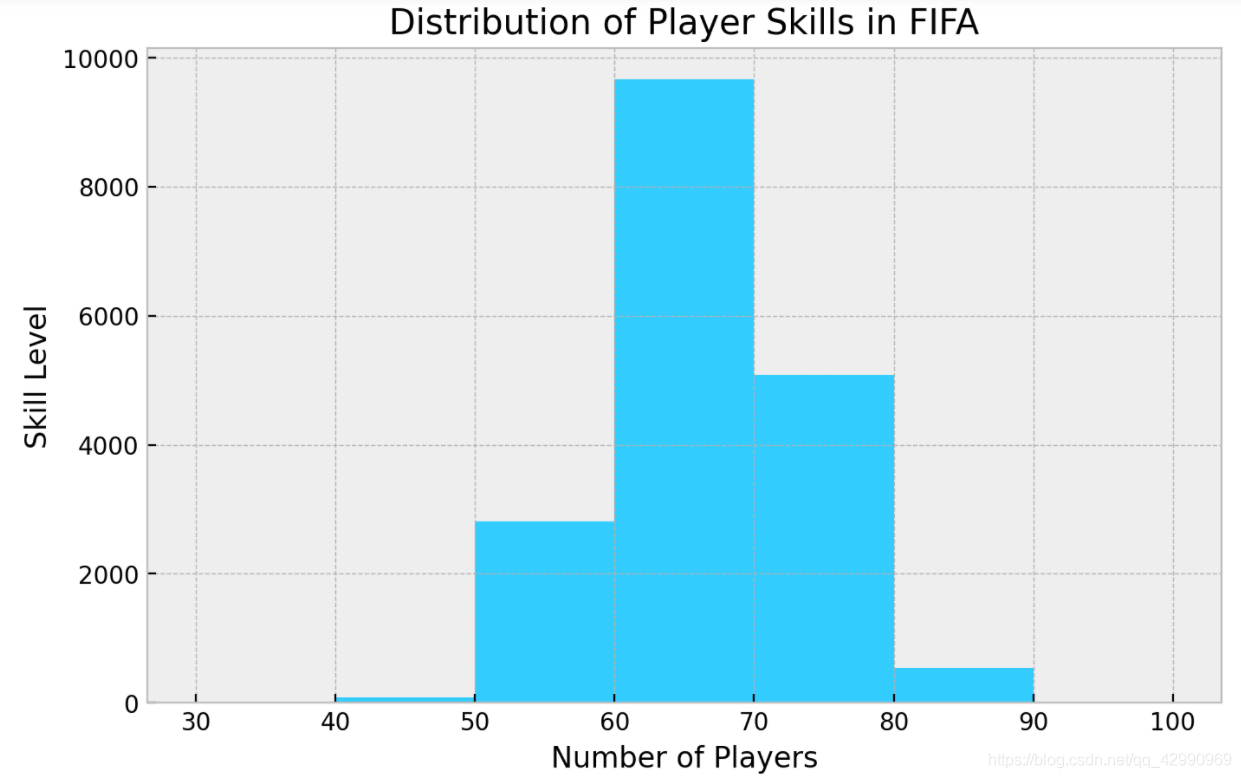
pd.read_csv()Reading data ( It's used herepandasMethod of library ) Return to tableplt.figureSpecify the image display scale and pixels- Enter the range of boxes
plt.figure(figsize=(8,5), dpi=200)
plt.histDraw a histogram , Given the detected columns and boxes , The histogram will be automatically generated
plt.hist(fifa.Overall, bins=bins, color='#33ccff')
plt.titleplt.xlabelplt.ylabelSet chart title and axis title
plt.title("Distribution of Player Skills in FIFA")
plt.xlabel("Number of Players")
plt.ylabel("Skill Level")
plt.xticksSet up x Axis scale point
plt.xticks(bins)
plt.savefigSave the picture
#  Save the picture
plt.savefig('bar.png',dpi=200)
plt.showDisplay images
#  Display images
plt.show()
边栏推荐
猜你喜欢
OpenCV3 6.3 用滤波器进行缩减像素采样

包图画法注意规范

Several methods of image enhancement and matlab code

Cvpr19 deep stacked hierarchical multi patch network for image deblurring paper reproduction
服务器的内网可以访问,外网却不能访问的问题
Graph Pooling 简析
![[learning notes] matlab self compiled image convolution function](/img/82/43fc8b2546867d89fe2d67881285e9.png)
[learning notes] matlab self compiled image convolution function
OpenCV3 6.2 低通滤波器的使用

用MLP代替掉Self-Attention

How to wrap qstring strings
随机推荐
MySQL优化
Multi site high availability deployment
Gensim如何冻结某些词向量进行增量训练
Wang extracurricular words
针对语义分割的真实世界的对抗样本攻击
Carsim-問題Failed to start Solver: PATH_ID_OBJ(X) was set to Y; no corresponding value of XXXXX?
Global and Chinese markets for magnetic resonance imaging (MRI) transmission 2022-2028: Research Report on technology, participants, trends, market size and share
Summary of solving the Jetson nano installation onnx error (error: failed building wheel for onnx)
jetson nano安装tensorflow踩坑记录(scipy1.4.1)
【MobileNet V3】《Searching for MobileNetV3》
Global and Chinese markets for Salmonella typhi nucleic acid detection kits 2022-2028: Research Report on technology, participants, trends, market size and share
Matlab数学建模工具
Constant pointer and pointer constant
[learning notes] matlab self compiled Gaussian smoother +sobel operator derivation
CVPR19-Deep Stacked Hierarchical Multi-patch Network for Image Deblurring论文复现
用MLP代替掉Self-Attention
用C# 语言实现MYSQL 真分页
install.img制作方式
AR系统总结收获
C语言的库函数