当前位置:网站首页>Get started with Matplotlib drawing
Get started with Matplotlib drawing
2022-07-06 14:34:00 【ブリンク】
Matplotlib Getting started with drawing
List of articles
- Matplotlib Getting started with drawing
- One 、 Process oriented drawing
- 1. Common drawing types
- (1) p l o t ( ) plot() plot(): diagram
- (2) s c a t t e r ( ) scatter() scatter(): Scatter plot
- (3) b a r ( ) / b a r h ( ) bar()/barh() bar()/barh(): Bar chart
- (4) p i e ( ) pie() pie(): The pie chart
- (5) s t e m ( ) stem() stem(): Stem map
- (6) s t e p ( ) step() step(): Stairs
- (7) h i s t ( ) hist() hist(): Histogram
- (8) f i l l _ b e t w e e n ( ) fill\_between() fill_between(): Fill both sides
- (9) i m s h o w ( ) imshow() imshow(): Pixel image
- (10) p c o l o r m e s h ( ) pcolormesh() pcolormesh(): Nonstandard pixel map
- (11) c o n t o u r ( ) contour() contour() and c o n t o u r f ( ) contourf() contourf(): Contour map
- (12) b a r b s ( ) barbs() barbs(): Wind pole diagram
- (13) q u i v e r ( ) quiver() quiver(): Vectorgraph
- (14) s t r e a m p l o t ( ) streamplot() streamplot(): Airflow diagram
- (15) b o x p l o t ( ) boxplot() boxplot(): boxplot
- (16) e r r o r b a r errorbar errorbar: Error bar graph
- (17) v i o l i n p l o t ( ) violinplot() violinplot(): Violin chart
- (18) h i s t 2 d ( ) hist2d() hist2d(): two-dimensional histogram
- (19) h e x b i n ( ) hexbin() hexbin(): Hexagon histogram
- (20) t r i c o n t o u r ( ) tricontour() tricontour() and t r i c o n t o u r f ( ) tricontourf() tricontourf(): Non isometric contour map
- (21) t r i p c o l o r ( ) tripcolor() tripcolor(): Color triangle
- (22) t r i p l o t ( ) triplot() triplot(): Two dimensional triangle
- 2. Common drawing options
- Two 、 Object oriented drawing
- 3、 ... and 、 Style beautification
It should be noted that , Before reading this article , You should be right. Numpy Have some understanding , If you are right about Numpy Not familiar with , Check out my other article : Click the link below :
Numpy Quick Start Guide
Before use , Let's import the modules we need first , Most of the drawing content is contained in matplotlib Of pyplot Module , and numpy Some data can be generated for drawing .
import matplotlib.pyplot as plt
import numpy as np
One 、 Process oriented drawing
The so-called process oriented drawing , It's programming step by step according to what you want to draw , be familiar with MATLAB Students should know its drawing method , such as : First draw a picture , Add a title 、 Abscissa label , Ordinate label , Legend and so on , Drawing in this way is process oriented drawing .
1. Common drawing types
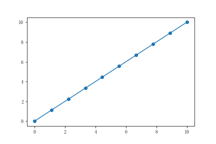
(1) p l o t ( ) plot() plot(): diagram
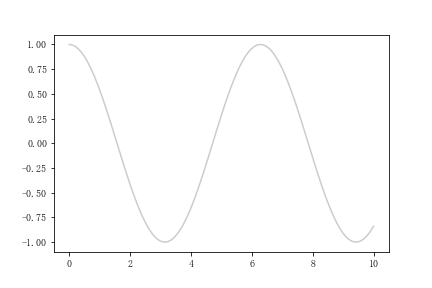
p l o t ( ) plot() plot() You can draw a curve , Please see the following example :
x = np.linspace(0,10,100)
y = np.cos(x)
plt.plot(x,y)
The results are shown in the following figure :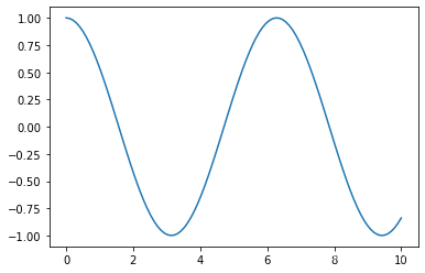
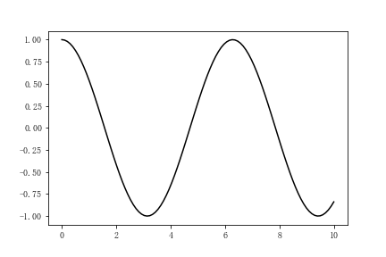
(1) Change the color
We can change the color of the curve :
plt.plot(x,y,'k') # Black curve
Other colors have the following four common patterns :
a. Use the English name or abbreviation of color
You can directly use the English name or abbreviation of common colors to express this color , Similar to the previous example , Here are some common color tables :
| Color | sign | Color | sign |
|---|---|---|---|
| Blue | ‘b’ | yellow | ‘y’ |
| green | ‘g’ | black | ‘k’ |
| Red | ‘r’ | white | ‘w’ |
| Cyan | ‘c’ | Magenta | ‘m’ |
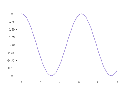
b.RGB/RGBA Pattern
Use a tuple input (R,G,B) perhaps (R,G,B,A) Represent the red,green,blue and alpha( transparency ), Please see the following example :
x = np.linspace(0,10,100)
y = np.cos(x)
plt.plot(x,y,c = (0.5,0.4,0.8,0.8))
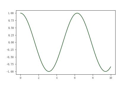
c. Hexadecimal RGB character string
Composed of hexadecimal code RGB String can replace a color , Please see the following example :
x = np.linspace(0,10,100)
y = np.cos(x)
plt.plot(x,y,c = '#0f5212')
d. Use 0-1 Between the gray values
have access to 0-1 The value between represents the grayscale ,0 It means pure black ,1 It means pure white ,0.5 Indicates gray , Please see the following example :
x = np.linspace(0,10,100)
y = np.cos(x)
plt.plot(x,y,c= '0.8')
(2) Set the line type
We can set the shape of the line :
plt.plot(x,y,'g--') # Draw a green dotted line
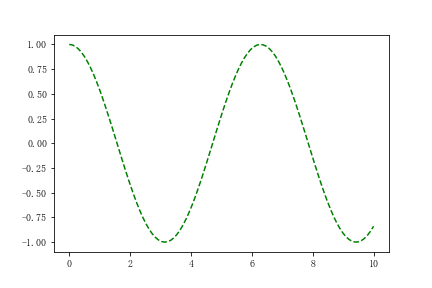
There are other kinds of line shapes as shown in the following table :
| line | sign |
|---|---|
| Solid line | ‘-’ |
| Dotted line | ‘–’ |
| spot | ‘:’ |
| Dotted line | ‘-.’ |
In addition to these commonly used linetypes , We can also define the linetype by ourselves , The specific method is as follows :
Use a tuple , Tuples contain an element and a tuple , Element represents offset , It's usually 0, A tuple represents its linetype , For example, it is easy to understand this :
x = np.linspace(0,10,100)
y = x
plt.plot(x,y,linestyle = (0,(1,2,5,1)))
This means 1 Pixel lines , Pick up 2 Space of pixels , Pick up 5 Pixel lines , Pick up 1 Pixel lines, and so on :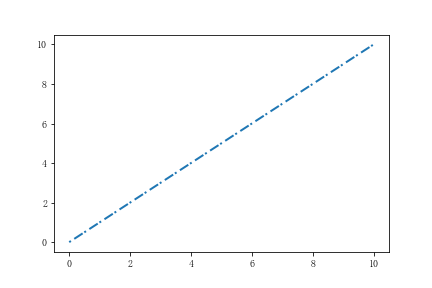
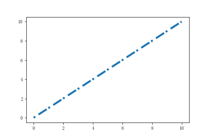
We can also adjust the thickness of the lines :
x = np.linspace(0,10,100)
y = x
plt.plot(x,y,linestyle = (0,(1,2,5,1)),linewidth = 4)
We can also trace the data :
x = np.linspace(0,10,10)
y = x
plt.plot(x,y,marker = 'o')
There are other symbols that can be referred to the following table :
| Symbol | sign | Symbol | sign |
|---|---|---|---|
| spot | ‘.’ | comma | ‘,’ |
| up arrow | ‘^’ | Down arrow | ‘v’ |
| left arrow | ‘<’ | Right arrow | ‘>’ |
| quadrilateral | ‘s’ | pentagon | ‘p’ |
| Stars | ‘*’ | Plus sign | ‘+’ |
| Multiplication sign | ‘x’ | Multiply sign filled shape | ‘X’ |
| Diamond shape | ‘D’ | Fine diamond shape | ‘d’ |
| Small vertical line | ‘|’ | Small horizontal line | ‘_’ |
We can use the following options to marker Make changes :
markeredgecolor perhaps mec: Edge color
markeredgewidth perhaps mew: Edge width
markerfacecolor perhaps mfc: Surface color *
markersize perhaps ms: The label size
There are not too many demonstrations here , It is roughly the same as the setting method demonstrated before .
(2) s c a t t e r ( ) scatter() scatter(): Scatter plot
s c a t t e r ( ) scatter() scatter() You can draw a scatter diagram , Please see the following example :
x = np.random.randint(0,10,size = 10)
y = np.random.randint(0,10,size = 10)
plt.scatter(x,y)
The results are shown in the following figure :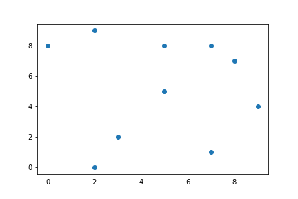
We can also set its color , Type of marking point , This is consistent with the previous part .
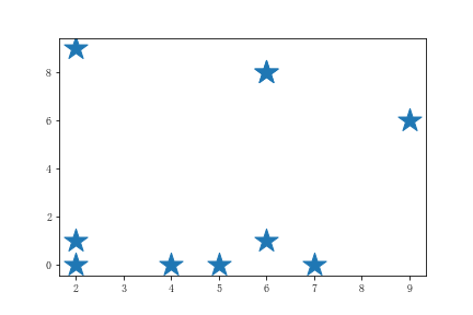
We can set s Parameter changes its tag size :
x = np.random.randint(0,10,size = 10)
y = np.random.randint(0,10,size = 10)
plt.scatter(x,y,s = 500,marker = '*')
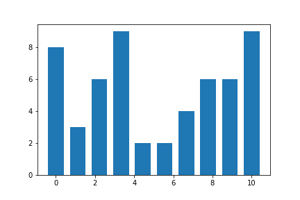
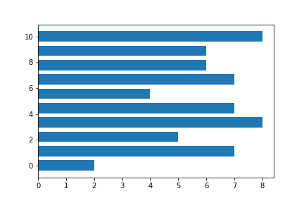
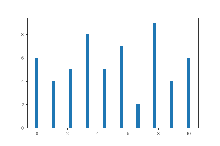
(3) b a r ( ) / b a r h ( ) bar()/barh() bar()/barh(): Bar chart
b a r ( ) bar() bar() You can draw with x Bar graph with axis as independent variable :
x = np.linspace(0,10,10)
y = np.random.randint(1,10,size = 10)
plt.bar(x,y)
b a r h ( ) barh() barh() Then you can draw y Bar graph with axis as independent variable :
x = np.linspace(0,10,10)
y = np.random.randint(1,10,size = 10)
plt.barh(x,y)
We can set the width of the bar graph :
x = np.linspace(0,10,10)
y = np.random.randint(1,10,size = 10)
plt.bar(x,y,width=0.2)
You can also set y The starting value at the bottom of the axis :
x = np.linspace(0,10,10)
y = np.random.randint(1,10,size = 10)
plt.bar(x,y,bottom=2)
You can also set the bar in x Axis alignment :
x = np.linspace(0,10,10)
y = np.random.randint(1,10,size = 10)
plt.bar(x,y,align='edge') #  Default to center
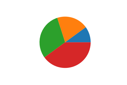
(4) p i e ( ) pie() pie(): The pie chart
x = [1,2,3,4]
plt.pie(x)
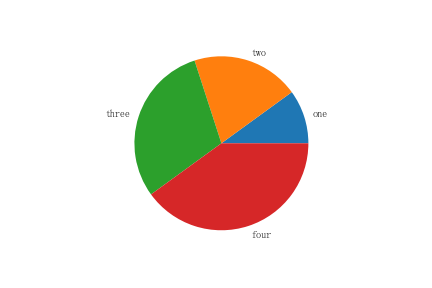
In addition to changing its color , You can also label pie charts :
x = [1,2,3,4]
plt.pie(x,labels=['one','two','three','four'])
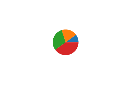
You can set its radius :
fig = plt.figure()
x = [1,2,3,4]
plt.pie(x,radius=0.5)
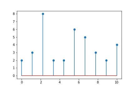
(5) s t e m ( ) stem() stem(): Stem map
s t e m ( ) stem() stem() You can draw a tree trunk :
x = np.linspace(0,10,10)
y = np.random.randint(1,10,size = 10)
plt.stem(x,y)
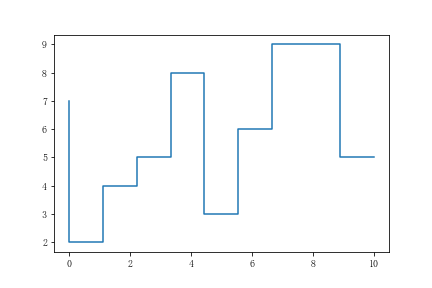
(6) s t e p ( ) step() step(): Stairs
s t e p ( ) step() step() You can draw a ladder diagram :
x = np.linspace(0,10,10)
y = np.random.randint(1,10,size = 10)
plt.step(x,y)
In addition to some basic modifications to the lines , It can also be associated with p l o t ( ) plot() plot() Use it together to set its data location , Please see the following example :
x = np.arange(14)
y = np.sin(x / 2)

plt.step(x, y + 2, label='pre (default)')
plt.plot(x, y + 2, 'o--', color='grey', alpha=0.3)

plt.step(x, y + 1, where='mid', label='mid')
plt.plot(x, y + 1, 'o--', color='grey', alpha=0.3)

plt.step(x, y, where='post', label='post')
plt.plot(x, y, 'o--', color='grey', alpha=0.3)
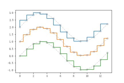
You can see , In the ladder diagram drawn , The position of the tracing point is located inside the ladder 、 Middle and outside .
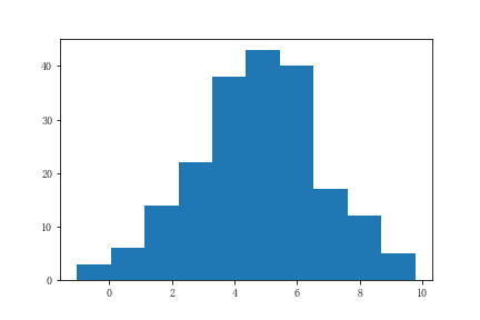
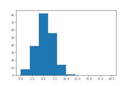
(7) h i s t ( ) hist() hist(): Histogram
h i s t ( ) hist() hist() Used to draw histogram
plt.figure()
r = np.random.normal(0,2,200)
x = 5+r
plt.hist(x)
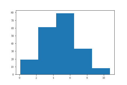
We can divide the data into several columns for display , If you pass in a positive number , Then it will be evenly distributed , You can also choose to pass in a sequence , Then it will be allocated according to the sequence you pass in :
r = np.random.normal(0,2,200)
x = 5+r
plt.hist(x,bins=5) #  Put the data in the quintuple histogram
We can also determine the range of bar column values :
r = np.random.normal(0,2,200)
x = 5+r
plt.hist(x,range=[0,20]) #
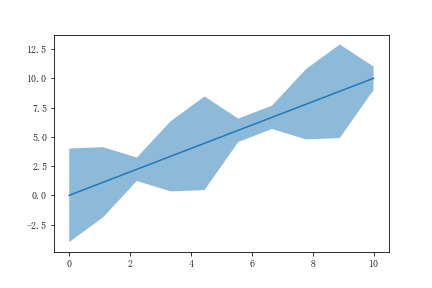
(8) f i l l _ b e t w e e n ( ) fill\_between() fill_between(): Fill both sides
f i l l _ b e t w e e n ( ) fill\_between() fill_between() You can draw the filling diagram on both sides :
x = np.linspace(0,10,10)
r = np.random.randint(1,5,size=10)
y1 = np.add(x,r)
y2 = np.add(x,-r)
plt.plot(x,x)
plt.fill_between(x,y1,y2,alpha = 0.5) # alpha Set transparency
Be careful : The following kinds of drawings may not be very common
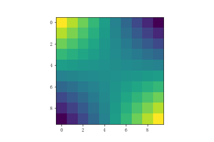
(9) i m s h o w ( ) imshow() imshow(): Pixel image
i m s h o w ( ) imshow() imshow() Pixel map can be generated
x, y = np.meshgrid(np.linspace(-3,3,10),np.linspace(-3,3,10))
z = x*y
plt.imshow(z)
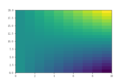
(10) p c o l o r m e s h ( ) pcolormesh() pcolormesh(): Nonstandard pixel map
p c o l o r m e s h ( ) pcolormesh() pcolormesh() Can generate non-standard pixel map , The difference between it and pixel graph is : Its pixels are not a square , It can be rectangular :
x, y = np.meshgrid(np.linspace(0,3,10),np.linspace(-3,3,15))
z = y * x
plt.pcolormesh(z)
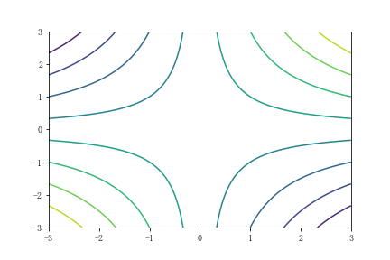
(11) c o n t o u r ( ) contour() contour() and c o n t o u r f ( ) contourf() contourf(): Contour map
c o n t o u r ( ) contour() contour() and c o n t o u r f ( ) contourf() contourf() Contour map can be drawn
x, y = np.meshgrid(np.linspace(-3,3,200),np.linspace(-3,3,200))
z = x**1/2 * y
level = np.linspace(z.min(),z.max(),10)
plt.contour(x,y,z,level)
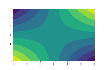
and c o n t o u r f ( ) contourf() contourf() Is the contour map with filling
x, y = np.meshgrid(np.linspace(-3,3,200),np.linspace(-3,3,200))
z = x**1/2 * y
level = np.linspace(z.min(),z.max(),10)
plt.contourf(x,y,z,level)
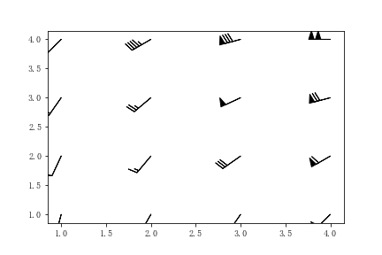
(12) b a r b s ( ) barbs() barbs(): Wind pole diagram
b a r b s ( ) barbs() barbs() Used to draw the wind pole diagram
X, Y = np.meshgrid([1, 2, 3, 4], [1, 2, 3, 4])
angle = np.pi / 180 * np.array([[15., 30, 35, 45],
                                [25., 40, 55, 60],
                                [35., 50, 65, 75],
                                [45., 60, 75, 90]]) #  Construction angle
amplitude = np.array([[5, 10, 25, 50],
                      [10, 15, 30, 60],
                      [15, 26, 50, 70],
                      [20, 45, 80, 100]]) #  Construction speed
U = amplitude * np.sin(angle) #  Construct vectors
V = amplitude * np.cos(angle)
Here is a brief introduction to the view of wind rod diagram :
On a pole like a small flag , A short line indicates 5 The sea / Hours , A long line indicates 10 The sea / Hours , A black triangle indicates 50 The sea / Hours , The direction pointed by the wind rod is the direction , That is, in which direction the wind blows . For example, the representation of the wind rod in the upper right corner in the figure below : The wind blowing from the West , Speed is 100 The sea / Hours .
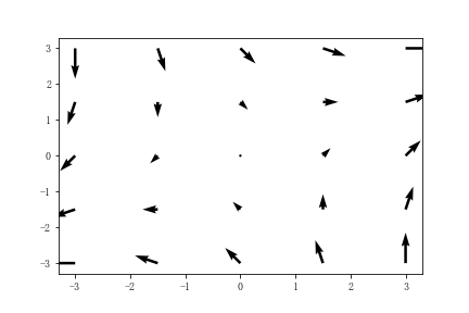
(13) q u i v e r ( ) quiver() quiver(): Vectorgraph
q u i v e r ( ) quiver() quiver() You can draw vector graphs with arrows
x, y = np.meshgrid(np.linspace(-3,3,5),np.linspace(-3,3,5))
u = x + y #  The arrow vector is x and y Component of direction
v = x - y
plt.quiver(x,y,u,v)
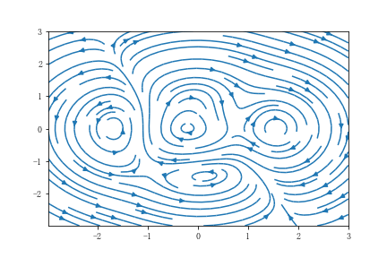
(14) s t r e a m p l o t ( ) streamplot() streamplot(): Airflow diagram
s t r e a m p l o t ( ) streamplot() streamplot() Used to draw airflow diagram
X, Y = np.meshgrid(np.linspace(-3, 3, 256), np.linspace(-3, 3, 256))
Z = (1 - X/2 + X**5 + Y**3) * np.exp(-X**2 - Y**2)
V = np.diff(Z[1:, :], axis=1)
U = -np.diff(Z[:, 1:], axis=0)
plt.streamplot(X[1:, 1:], Y[1:, 1:], U, V)
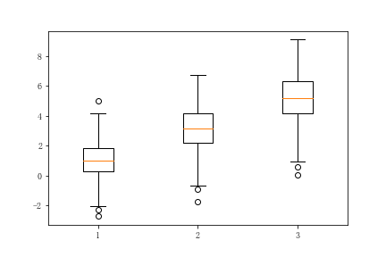
(15) b o x p l o t ( ) boxplot() boxplot(): boxplot
plt.figure()
x = np.random.normal((1,3,5),(1.25,1.5,1.75),(200,3))
plt.boxplot(x)
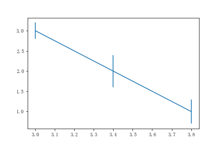
(16) e r r o r b a r errorbar errorbar: Error bar graph
x = [3,3.4,3.8]
y = [3,2,1]
error = [0.2,0.4,0.3]
plt.errorbar(x,y,error)
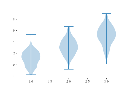
(17) v i o l i n p l o t ( ) violinplot() violinplot(): Violin chart
x = np.random.normal((1,3,5),(1.25,1.5,1.75),(200,3))
plt.violinplot(x)
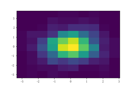
(18) h i s t 2 d ( ) hist2d() hist2d(): two-dimensional histogram
x = np.random.randn(1000)
y = np.random.randn(1000)
plt.hist2d(x,y)
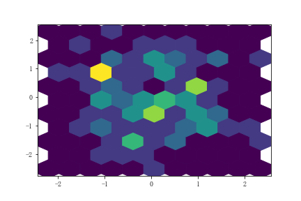
(19) h e x b i n ( ) hexbin() hexbin(): Hexagon histogram
x = np.random.randn(100)
y = np.random.randn(100)
plt.hexbin(x,y,gridsize=10)
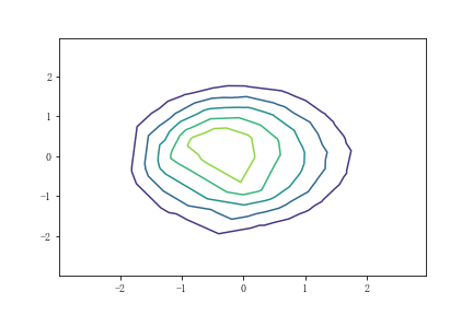
(20) t r i c o n t o u r ( ) tricontour() tricontour() and t r i c o n t o u r f ( ) tricontourf() tricontourf(): Non isometric contour map
x = np.random.uniform(-3, 3, 200)
y = np.random.uniform(-3, 3, 200)
z = (1 - x/2 + x**2 + y**2) * np.exp(-x**2 - y**2)
levels = np.linspace(z.min(), z.max(), 7)
plt.tricontour(x,y,z,levels)
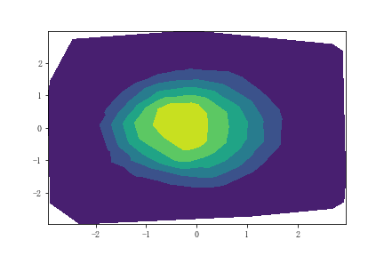
t r i c o n t o u r f ( ) tricontourf() tricontourf() Is an contour map with filling
x = np.random.uniform(-3, 3, 200)
y = np.random.uniform(-3, 3, 200)
z = (1 - x/2 + x**2 + y**2) * np.exp(-x**2 - y**2)
levels = np.linspace(z.min(), z.max(), 7)
plt.tricontourf(x,y,z,levels)
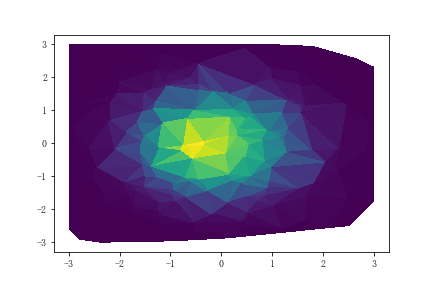
(21) t r i p c o l o r ( ) tripcolor() tripcolor(): Color triangle
x = np.random.uniform(-3, 3, 200)
y = np.random.uniform(-3, 3, 200)
z = (1 - x/2 + x**2 + y**2) * np.exp(-x**2 - y**2)
levels = np.linspace(z.min(), z.max(), 7)
plt.tripcolor(x,y,z,levels)
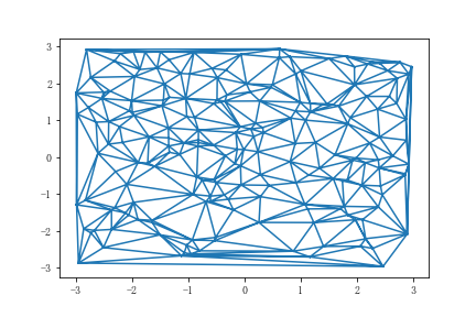
(22) t r i p l o t ( ) triplot() triplot(): Two dimensional triangle
x = np.random.uniform(-3, 3, 200)
y = np.random.uniform(-3, 3, 200)
plt.triplot(x,y)
2. Common drawing options
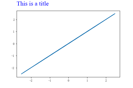
(1) Add the title
You can add a title to the drawn image , We can use fontdict Modify the title style , You can also adjust the position of the title ( Default to center ), You can also adjust the distance between the title and the image :
x = np.random.randn(100)
y = x
plt.plot(x,y)
plt.title('This is a title',
          fontdict=
          {
    'family':'Times New Roman', #  typeface
           'fontsize': 'xx-large', #  Font size
           'color': 'b' #  The font color
          },
          loc = 'left', #  be at the left side
          y=1.2 #  The distance between the title and the image
         )
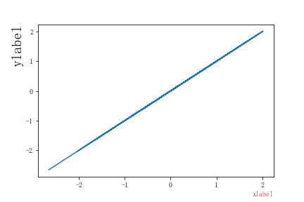
(2) Add axis label
You can add x and y The shaft label:
x = np.random.randn(100)
y = x
plt.plot(x,y)
plt.xlabel('xlabel',loc='right',c = 'r') #  Red on the right xlabel
plt.ylabel('ylabel',loc='top',fontsize = 20) #  Upper 20 Size ylabel
(3) Add legend
We can add labels to the same graph of multiple curves , In order to distinguish curves :
x = np.linspace(0,10,100)
y = x
z = x**2
plt.plot(x,y,x,z)
plt.legend(['$x$','$x^2$']) #  Setting labels can use Latex grammar
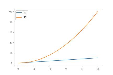
Of course, you can also set its location , The font color , Size equal parameter , This is consistent with the relevant setting methods mentioned above .
(4) Adding grid
We can set the image display grid , Or you can set to display only the grid on a certain axis :
x = np.linspace(0,10,100)
y = x
plt.plot(x,y)
plt.grid(axis='x',c = 'r',linestyle = '-.')
You can see and set parameters such as the color and linetype of the grid
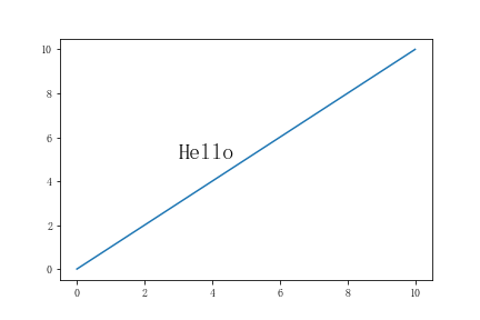
(5) To add text
You can add a text description to the image :
x = np.linspace(0,10,100)
y = x
plt.plot(x,y)
plt.text(3,5,'Hello',fontsize = 20)
(6) Set up x and y Axis range
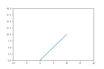
You can set it yourself x Axis and y The scope of the shaft , In order to achieve the desired visual effect :
x = np.linspace(0,10,100)
y = x
plt.plot(x,y)
plt.xlim(-10,20)
plt.ylim(0,20)
(7) Set up x Axis and y Axis scale
Sometimes the scale we need is not necessarily linear , It may perform better in logarithm ,
x = np.linspace(1,10,100)
y = x**10
plt.plot(x,y)
plt.yscale('symlog') #  Use scientific counting
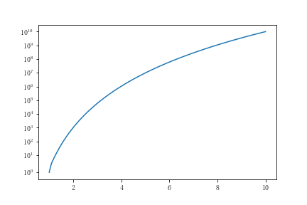
In addition, there are logarithmic types , Fractional logarithm
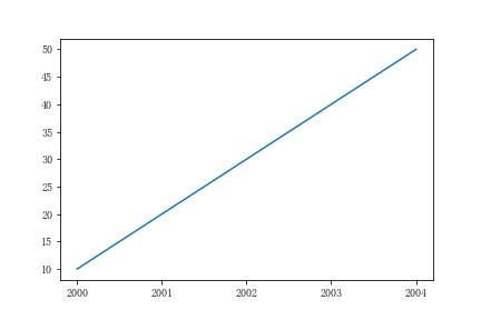
(8) Set up x Axis and y The label of the shaft
We can x or y The data of the axis gives special meaning , such as : Year, etc :
x = np.linspace(1,5,10)
y = x*10
plt.plot(x,y)
plt.xticks(ticks = [1,2,3,4,5],
           labels=['2000','2001','2002','2003','2004'])
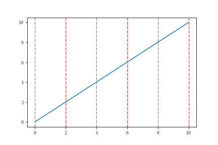
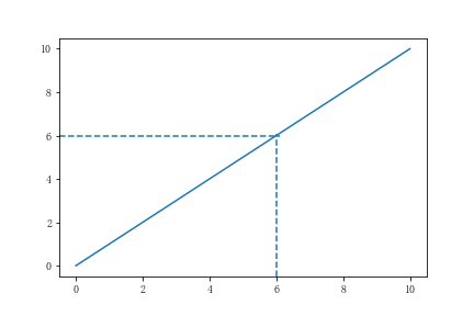
(9) Add an auxiliary alignment line
x = np.linspace(0,10,100)
y = x
plt.plot(x,y)
plt.axhline(6,0,0.6,linestyle = '--') #  stay 6 Draw a line at , from 0 To 60% It's about
plt.axvline(6,0,0.6,linestyle = '--')
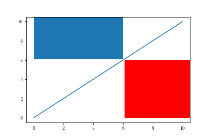
(10) Add span rectangle
x = np.linspace(0,10,100)
y = x
plt.plot(x,y)
plt.axhspan(6,0,0.6,color = 'r')
plt.axvspan(6,0,0.6)
Two 、 Object oriented drawing
Object oriented drawing is Matplotlib A major feature of , It divides a graph into window objects and axis objects , There is little ambiguity in the operation .
1. establish figure and axes object
Use s u b p l o t s ( ) subplots() subplots() You can create a figure Objects and axes object :
fig, ax = plt.subplots()
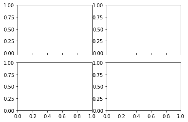
In fact, we can create , Set some of its parameters , such as , We can set multiple axes , That is, there are several rows and columns , And set whether their coordinates are shared with each other :
fig, ax = plt.subplots(2,2,sharex=True,sharey=False)
2. mapping
We can know from official documents figure and axes Actual meaning :
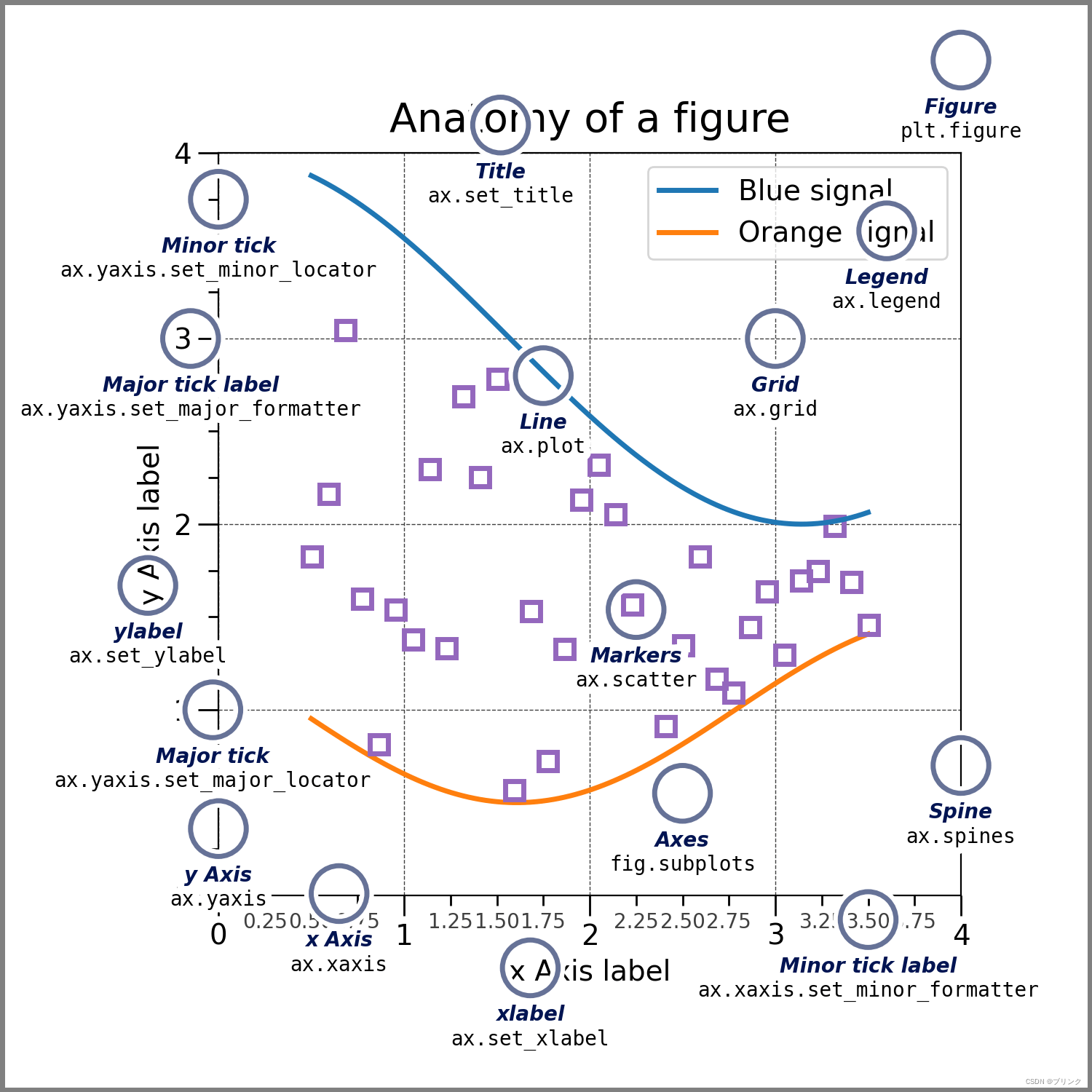
You can see ,figure It's actually canvas , and axes It is a part of a graph composed of coordinate axes . The picture also lists the method of drawing with this method . With the basis of previous process oriented drawing , Just migrate it to object-oriented drawing . Here's an example :
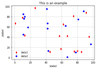
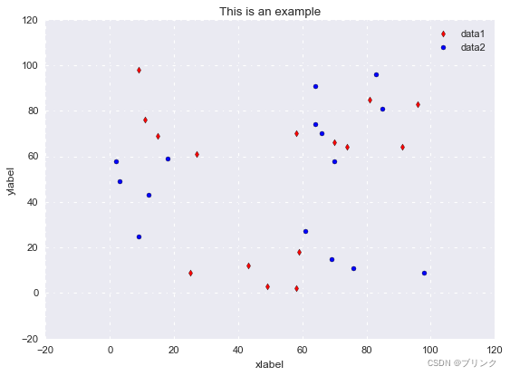
x = np.random.randint(0,100,15)
y = np.random.randint(0,100,15) #  Make some data

fig,ax = plt.subplots()
ax.scatter(x,y,c='r',label='data1','d') #  Draw a scatter diagram
ax.scatter(y,x,c='b',label='data2')
ax.set_title('This is an example') #  Set title
ax.set_xlabel('xlabel') #  Set up xlabel
ax.set_ylabel('ylabel')
ax.grid('-.') #  Open grid
ax.legend() #  Open the legend
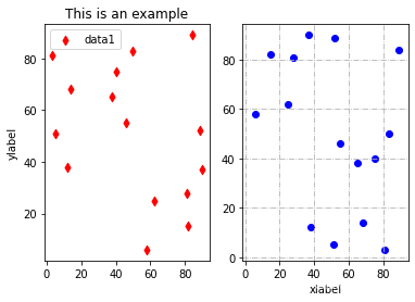
When we have multiple axes in a picture window , The object-oriented drawing method reflects its advantages , Please see the following example :
x = np.random.randint(0,100,15)
y = np.random.randint(0,100,15)
fig, (ax1,ax2) = plt.subplots(1,2,sharex=True,sharey=False)
ax1.scatter(x,y,c='r',label='data1',marker='d')
ax2.scatter(y,x,c='b',label='data2')
ax1.set_title('This is an example')
ax2.set_xlabel('xlabel')
ax1.set_ylabel('ylabel')
ax2.grid(linestyle='-.')
ax1.legend()
3、 ... and 、 Style beautification
When writing a paper , The unity of illustration style helps to increase the aesthetics of the article ,Matplotlib Next style The package provides the option to set a unified style .
First import the package :
from matplotlib import style
We can check what styles we can use first , Use
>>> style.available
['Solarize_Light2',
 '_classic_test_patch',
 '_mpl-gallery',
 '_mpl-gallery-nogrid',
 'bmh',
 'classic',
 'dark_background',
 'fast',
 'fivethirtyeight',
 'ggplot',
 'grayscale',
 'seaborn',
 'seaborn-bright',
 'seaborn-colorblind',
 'seaborn-dark',
 'seaborn-dark-palette',
 'seaborn-darkgrid',
 'seaborn-deep',
 'seaborn-muted',
 'seaborn-notebook',
 'seaborn-paper',
 'seaborn-pastel',
 'seaborn-poster',
 'seaborn-talk',
 'seaborn-ticks',
 'seaborn-white',
 'seaborn-whitegrid',
 'tableau-colorblind10']
here , We can use to set the global style
style.use('seaborn') # seaborn It's based on Matplotlib Drawing library of
that will do
边栏推荐
- Intel oneapi - opening a new era of heterogeneity
- Network layer - simple ARP disconnection
- 《统计学》第八版贾俊平第七章知识点总结及课后习题答案
- 图书管理系统
- Wei Shen of Peking University revealed the current situation: his class is not very good, and there are only 5 or 6 middle-term students left after leaving class
- 【指针】数组逆序重新存放后并输出
- [err] 1055 - expression 1 of order by clause is not in group by clause MySQL
- servlet中 servlet context与 session与 request三个对象的常用方法和存放数据的作用域。
- c语言学习总结(上)(更新中)
- Hcip -- MPLS experiment
猜你喜欢
循环队列(C语言)
网络基础之路由详解
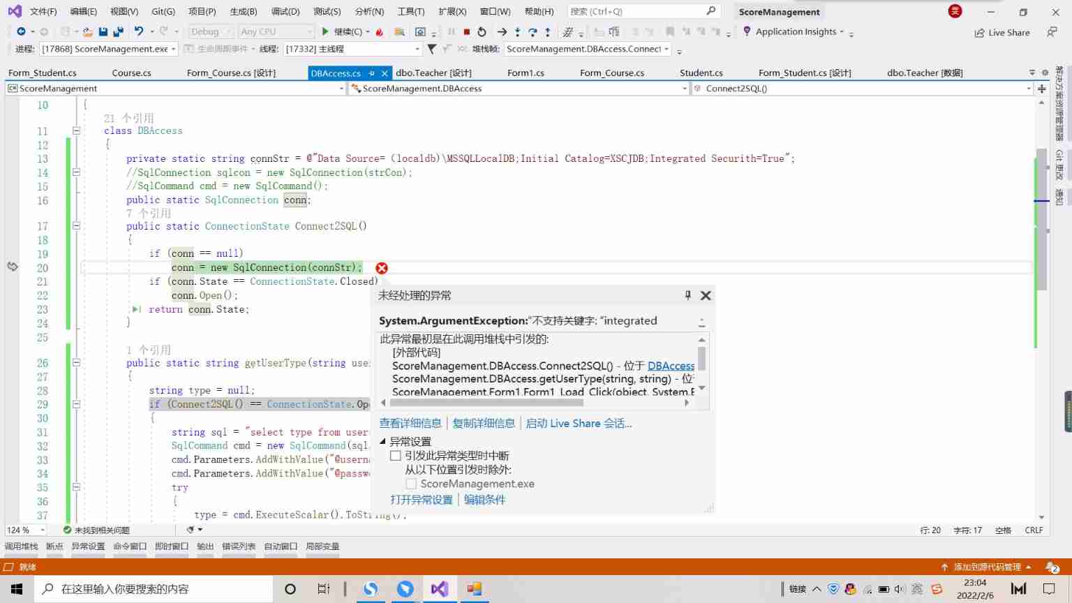
An unhandled exception occurred when C connected to SQL Server: system Argumentexception: "keyword not supported:" integrated
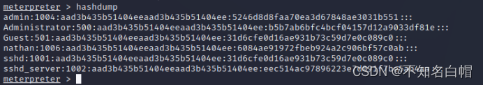
内网渗透之内网信息收集(五)
Record once, modify password logic vulnerability actual combat
《统计学》第八版贾俊平第十二章多元线性回归知识点总结及课后习题答案
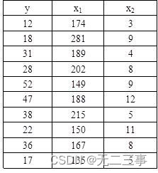
Statistics, 8th Edition, Jia Junping, Chapter 11 summary of knowledge points of univariate linear regression and answers to exercises after class

Wei Shen of Peking University revealed the current situation: his class is not very good, and there are only 5 or 6 middle-term students left after leaving class
《统计学》第八版贾俊平第七章知识点总结及课后习题答案
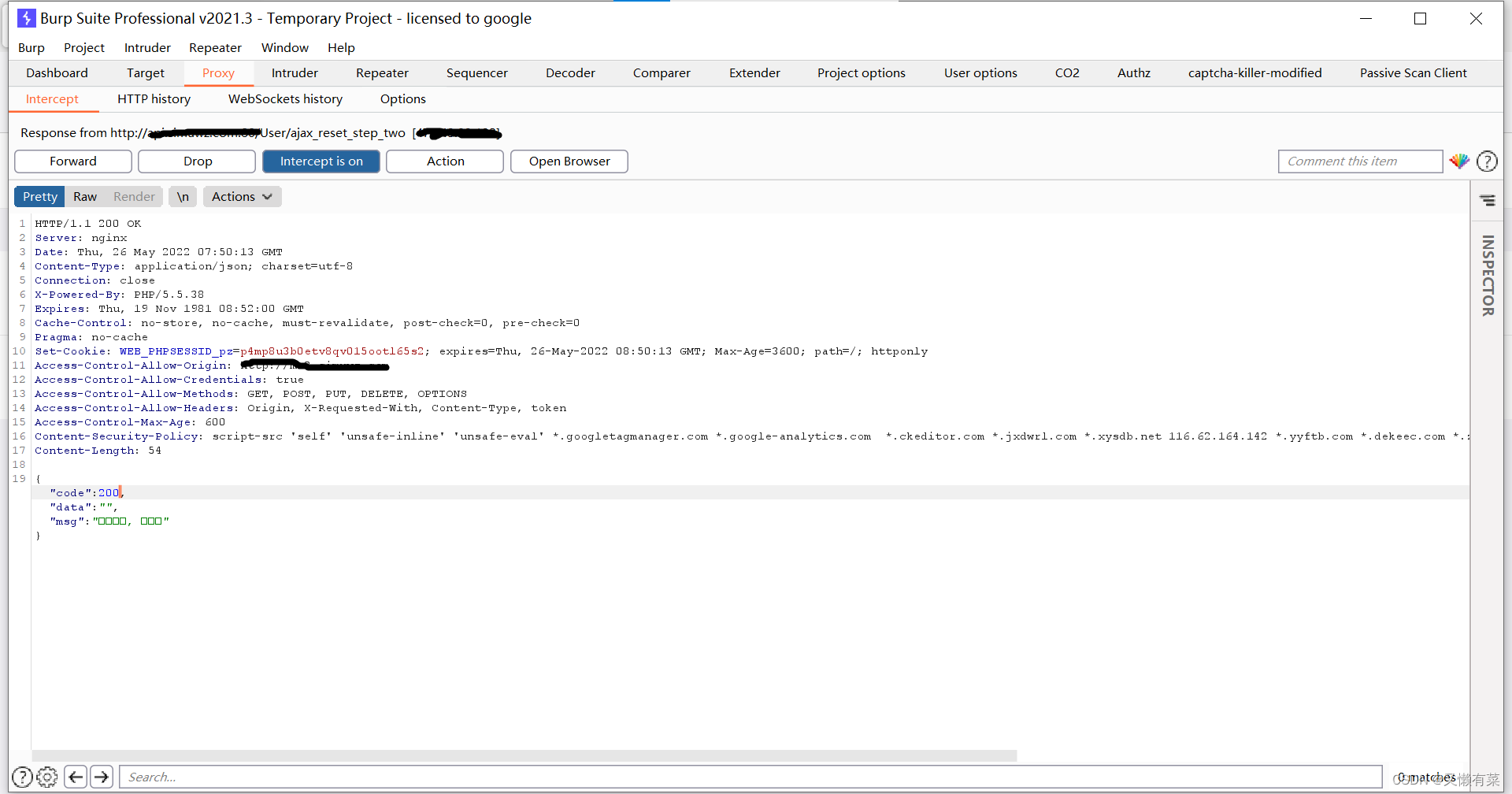
Xray and Burp linked Mining
随机推荐
函数:求方程的根
【指针】八进制转换为十进制
A complete collection of papers on text recognition
Captcha killer verification code identification plug-in
浅谈漏洞发现思路
内网渗透之内网信息收集(一)
Windows platform mongodb database installation
Record an edu, SQL injection practice
Sword finger offer 23 - print binary tree from top to bottom
Interview Essentials: what is the mysterious framework asking?
DVWA (5th week)
Statistics 8th Edition Jia Junping Chapter 12 summary of knowledge points of multiple linear regression and answers to exercises after class
Statistics 8th Edition Jia Junping Chapter XIII Summary of knowledge points of time series analysis and prediction and answers to exercises after class
指针:最大值、最小值和平均值
High concurrency programming series: 6 steps of JVM performance tuning and detailed explanation of key tuning parameters
Résumé des points de connaissance et des réponses aux exercices après la classe du chapitre 7 de Jia junping dans la huitième édition des statistiques
移植蜂鸟E203内核至达芬奇pro35T【集创芯来RISC-V杯】(一)
What language should I learn from zero foundation. Suggestions
函数:求1-1/2+1/3-1/4+1/5-1/6+1/7-…+1/n
MySQL interview questions (4)